10 Best Website Builders: Tried & Tested [2025 Update]
Website Builders Compared by Building Real Websites

A website builder is a great way to get a site online, but not all of them will offer the quality you need. I tested the major builders on the market to see which ones provide the best templates, features, and the best overall experience.


You don’t need me to tell you the importance of an effective website, or the convenience of using a website builder. But it seems like every builder out there promises to be the best: the easiest, the fastest, the one that will give you the most professional results. So, which of them deliver?
I decided to answer that question by signing up for a paid plan with each builder and building a full site. I carefully considered user experience, available features, the final product, and everything in between.
Below, you’ll find the only builders that met my strict standards. Whether you’re looking to build a personal site, a blog, a site for your business, or even an online store, you’re sure to find a great solution on this list.
A Quick Look at Our Top Website Builders
- 2000+ templates for any type of site
- Intuitive drag-and-drop editor with customization tools
- Design your entire site in seconds using Wix's AI builder
- Wix SEO Setup Checklist helps you improve your ranking on Google
- Extensive app market with 800+ extensions
- Download the Wix Stores app to create and manage an online store
- No technical skills required
- Slight learning curve based on the sheer volume of features
- 180+ professionally designed, responsive templates
- User-friendly block editor for easy customization
- Customize your site's template with Squarespace Blueprint
- Seamlessly integrate with Instagram, Facebook, and Pinterest
- Robust e-commerce and branding features
- Design your brand's logo for free
- Unlimited storage for images and up to 30 minutes of videos
- No free plan, only a 14-day trial
- 150 responsive templates across 17 categories
- Beginner-friendly AI features, including an AI-powered heatmap
- Automatically improve your SEO with AI tools
- Easily access marketing tools like Google Ads and Meta
- Get a free custom domain on its yearly plan
- File-sharing and map integrations without coding knowledge
- No free plan but offers a 7-day trial and a money-back guarantee
- Limited third-party integrations compared to other AI builders
-

![Wix homepage]()
- The best free plan with the most features
- Over 800 templates for any type of site
- User-friendly drag-and-drop editor
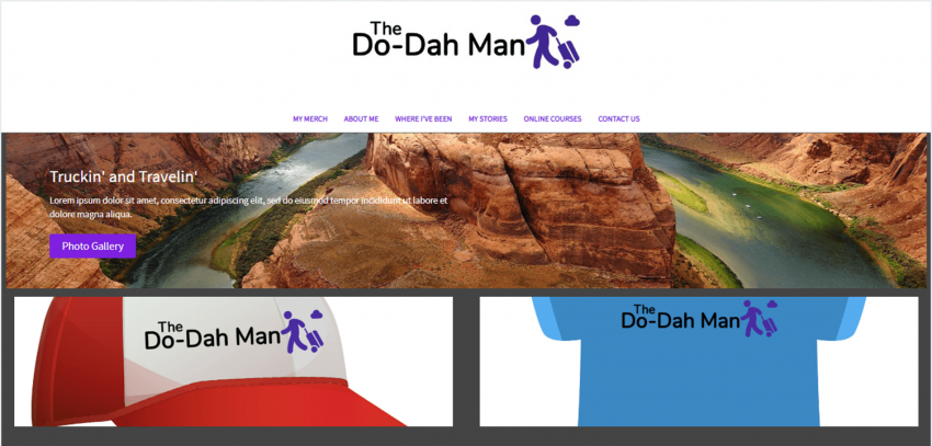
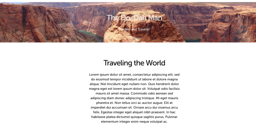
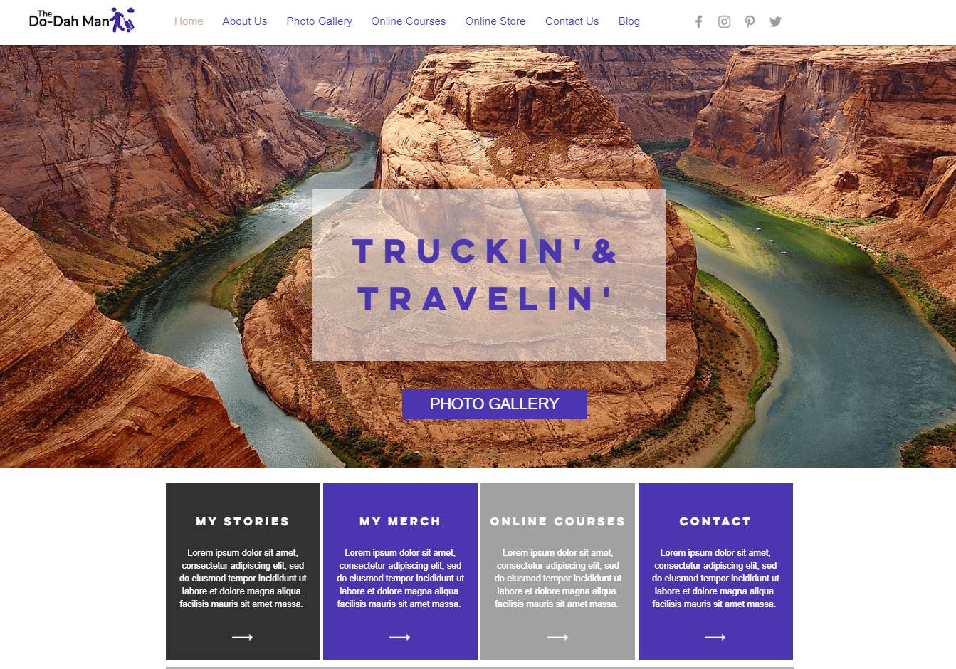
Wix offers an unparalleled level of design customization. Thanks to its responsive drag-and-drop editor and selection of hundreds of widgets for design and functionality, you can customize your website to a pixel-perfect level of detail. Its intuitive set of design tools also let you adjust colors, fonts, and the overall layout of a page with ease. If you have a really specific idea in mind for your site, you don’t have to start from scratch. Wix offers over 800 templates organized in 19 different categories and 70+ subcategories.
What that means, in short, is that Wix has a template for just about any kind of website that you could think of. But you don’t even have to use the designated template for your industry. Wix’s customization freedom meant that I could just choose my favorite design and adjust it to meet my needs.
What’s more, thanks to Wix’s AI website builder, you don’t even have to choose from one of the pre-selected templates. Wix’s AI lets you create a unique template specifically for your site, based on your answers to a brief questionnaire. If, on the other hand, you prefer even more creative control, Wix also offers Wix Studio, its alternative for professional designers that gives you access to a wide selection of advanced web-design tools.
If you ever need even more features for your site, Wix offers a massive app market with over 250 native and third-party extensions. Many of the apps are free, and you can use them to add things as basic as simple contact forms or social media integrations to more advanced functionalities like full-blown e-commerce features or integrations for podcast feeds and livestreams.
All of this might make it sound like Wix is made only for the tech-savvy, but that couldn’t be further from the truth. Whether you want to build an e-commerce site and sell online, take online books, create a portfolio or blog, or even take orders for your restaurant, Wix is incredibly easy to learn and use. Plus it has the business management tools to go with it. And thanks to the free plan, you can try it out and even publish your site without paying a dime.
The one caveat is that it’s easy to get lost in all these features. I spent hours on my site, not because I had to, but because there was so much to explore and I was enjoying the process so much. Are there simpler builders out there? For sure, but nothing is quite like Wix.
-
![best-website-builders-squarespace-2]()
- Professionally designed templates
- A popular choice for artists and creatives
- Great e-commerce features
Squarespace is a very design-focused builder. You can see that in its incredible attention to detail on templates, in the tools it gives you, and even in its sleek user interface. It has a block editor that allows you to customize your site with different levels of precision, from major layout changes to reorganizing specific page elements. Thanks to its user-friendly interface, I found the design process completely seamless.
While it is committed to attractive visuals, Squarespace doesn’t neglect business functionality. In fact, it includes powerful e-commerce tools, marketing integrations, and a slew of branding features. This makes Squarespace an excellent choice for all kinds of websites for professionals, from fully online stores to brick-and-mortar businesses, and even portfolio sites.
Squarespace doesn’t have a free plan (although it does offer a 14-day free trial), but you can access the majority of essential features on either of the lower tier plans, which are comparably priced to the other builders on this list.
-
![website-builders-new-category-page-content-4.png]()
- AI Tools to streamline website building
- Powerful features for e-commerce
- 150+ professionally-designed templates
The Hostinger Website Builder provides an impressively high degree of creative freedom while remaining easy to use. While it’s not as advanced as Wix, for example, you get more creative control than you would with other, simplicity-focused builders. Hostinger has two tricks that allow you to create custom sites fast: the first one is an incredibly user-friendly interface that requires almost no time to get accustomed to, and the second is the implementation of powerful AI features for design.
Hostinger Website Builder includes tools that can help you track which spots of your page are most likely to attract visitors’ attention, create custom brand-appropriate text and logos, and more. Its drag-and-drop editor is also extremely easy to use, and since all its sites are hosted on Hostinger’s servers, you’ll also get great performance speeds.
Hostinger also seeks to give you a hand wherever it can. The website builder comes with powerful tools to help you through every part of the building process, from AI-generated templates to an AI writer to help you populate your site with original content.
If you want to create an e-commerce site, Hostinger has widgets for categories, bookings, custom discounts, and even marketing from the get-go. Since it offers only one – relatively affordable – plan, the Hostinger Website Builder is one of the cheapest options for building your website.
Although there’s no app market, there are quite a few useful third-party integrations available. Overall, it’s still a great choice if you want to build a cheap, secure, and good-looking site in no time.
More on Hostinger Website Builder
Visit Hostinger Website Builder > Read our Hostinger Website Builder review -

![shopify homepage - best website builders]()
- Everything you need to sell online
- Thousands of proprietary and third-party themes to choose from
- Advanced business features and tools for international shipping
Shopify is great if you’re looking for a central dashboard where you can handle all your sales. It offers integrations with a variety of site builders like Wix or WordPress and even with social media platforms like Facebook and Instagram. This means that you can sell from a variety of different channels while keeping track of all your products. It also means that you can move them where you need them, when you need to.
If you want a dedicated site just for your store, Shopify offers a fully-fledged website builder with plenty of customization features and an app market containing thousands of options for extending your site’s functionality. What’s more, Shopify’s e-commerce tools are almost unrivaled.
Shopify has too many e-commerce features to name. But to give you a sense of what’s on offer, expect everything from abandoned cart recovery reminders and automatic shipping price calculation to customer profiles and advanced analytics for keeping track of your sales (in addition to all the e-commerce essentials, of course).
Though Shopify is more of an overarching e-commerce platform than a website builder, it still offers intuitive design tools. Sure, you don’t get the same range of options as you would with some dedicated website builders, but Shopify’s block editor definitely allows you to create a unique online store that fits your brand vision.
-
![ionos-featured-image]()
- Simple and easy-to-use editor, perfect for speedy site-building
- Well-designed, professional-looking templates
- Very affordable e-commerce plan
IONOS’ MyWebsite Now builder is one of the simpler builders on this list. Instead of overwhelming you with features, IONOS focuses on giving you control over the core aspects of your site’s design.
IONOS doesn’t have the same number of templates or features as other builders, and your customization options are relatively limited. Instead of placing individual elements on your page, like you would with other builders on this list, IONOS’s editor works by adding modular, premade sections to your site and altering their settings.
That doesn’t mean that your IONOS site will lack functionality or look “basic” though. Each section is tastefully designed and offers plenty of functionality for business websites. The options IONOS offers are professional and sleek, and thanks to its simple editor, building my site with IONOS was a smooth experience.
Instead of having dedicated plans for e-commerce, IONOS offers online store packages that you can add to any plan. This option also makes IONOS one of the cheapest e-commerce options available. It’s perfect for building a simple online store with all the necessary features.
-
![best-website-builders-site123-2]()
- Delightfully simple and easy to use
- The easiest website builder out there
- 80+ templates to choose from
SITE123 is definitively one of the simplest builders out there (hence the name – you should be able to build your site as quickly as one… two… you get the idea). That might make it a better choice if you’re just starting out. This website builder has more than 80 mobile-responsive templates and a strong selection of apps to expand your site’s functionality.
SITE123’s editor is point-and-click, meaning you’ll just be clicking a series of buttons and prompts to design your site inside a given framework. Instead of adjusting each element to the pixel, you’ll be adding and reordering sections for things like text, media galleries, and contact information. This type of editor ensures that your designs are always perfectly aligned.
Although there is a bit of a learning curve (especially if you’re used to drag-and-drop builders), once I figured out a few quirks, I was able to build my site in just a few minutes. There are also some cool automatic features like breadcrumbs navigation, auto-categorization of products in the online store, and a super-easy contact form builder that made the process even quicker.
-

![website-builders-new-category-page-content-1.png]()
- Lighting-fast drag-and-drop editor
- Straightforward blogging and marketing integrations
- Generous storage and bandwidth
Not everyone is looking to create the next do-it-all website that will define a generation. Sometimes, you just want to create something simple to promote your business without breaking the bank or compromising quality. That’s exactly what Webador is for.
Webador is outstandingly easy to use. It’s not the first builder to promise you a complete website in minutes, but thanks to its responsive UI, site-wide customization tools, and well-categorized drag-and-drop widgets, it’s one of the few that delivers on that promise.
But Webador doesn’t just offer speed. If you’re a beginner, I don’t think you’ll find a more straightforward dashboard for managing a small e-commerce shop or a blog. Webador also provides many high-quality widgets for engaging your visitors, such as custom forms, five-star product/service feedback buttons, and digital maps.
As one of the most affordable builders on the market, Webador is an excellent choice if you’re looking to create a simple, good-looking website on a budget.
-
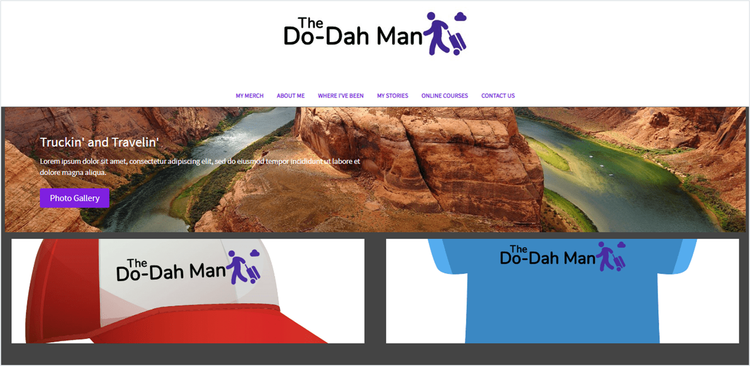
![BigCommerce Featured Image]()
- Best for large online retailers or dropshippers
- Huge suite of built-in e-commerce features that reduce reliance on third-party tools
- Robust marketing tools for driving sales
I’m going to be upfront: BigCommerce is not super beginner-friendly. If you’re serious about it, you will have to spend some time figuring out all the quirks of its (sometimes confusing) interface and immense variety of features.
Ultimately, though, this doesn’t have to be a bad thing. The time you spend getting to grips with this builder will be well spent if you have bold plans for your online store. That’s because BigCommerce offers one of the most (if not the most) extensive set of features for e-commerce of any website builder.
BigCommerce’s feature set is even larger and more granular than Shopify’s, which means you can adjust every single minute detail of your online store as you build it. However, it also means that you’re going to have to adjust every single minute detail of your online store.
You can find everything you’d expect from an e-commerce platform, including inventory management, payment integrations, discount codes and coupons, shipping solutions, and abandoned cart reminders. But it also offers advanced features, like staff accounts, multilingual websites, third-party sales integrations, and much more.
As this impressive roster makes clear, BigCommerce is designed for serious online stores, organizations with multiple team members, and experienced business owners. It’s also worth giving it a shot if you’re expecting your store to grow (a lot) over time, but keep in mind that it will require an important commitment both in terms of time and effort.
-
![wordpress homepage - best website builders]()
- The hassle-free way to use WordPress
- The best blogging platform
- Thousands of plugins to expand functionality
WordPress.org is the old-school giant of content management and website creation. Old-school doesn’t mean out-of-use, however – about a third of all sites on the internet still run on WordPress. Thankfully, WordPress.com makes the WordPress experience available for anyone by removing the need to self-host or have advanced knowledge of web development.
WordPress.com is the website builder version of WordPress, offering more intuitive access to most of WordPress’ features. That said, even this “easier website builder version” comes with a steep learning curve. On top of that, most of the really interesting features, like plugins and premium templates, are only accessible through the pricier plans.
WordPress.com has one great thing going for it, though: it offers nearly limitless opportunities to expand. That said, it’s far from the easiest or the cheapest website builder out there.
Though the WordPress.com block editor is still far from the market’s easiest to use, it’s gotten a lot better over the years, and it provides an easy way to create well-structured, simple pages that focus on text and visual media. If you don’t feel like fidgeting with its block system, WordPress.com also allows you to add pre-created content sections called “patterns.” That said, I’d be lying if I didn’t say it gave me some trouble at times.
-

![website-builders-new-category-page-content-2.png]()
- Expert design available for a fee
- A more advanced editor with plenty of customization options
- Hundreds of templates to choose from
Though it’s far from the most user-friendly builder on this list, Web.com delivers a good balance of user-friendliness with more powerful, advanced design features. Thanks to an editor that lets you decide how broad or how specific you want to get with each aspect of your site, you could use Web.com as a simple, basic option, or to make sure every element on your page is “just right.” This makes it a surprisingly versatile option for users of varying levels of experience.
It also comes with useful tools for websites of any kind. Web.com offers easy-to-use but powerful features for SEO, marketing, e-commerce, blogging, and more. If you don’t want to bother with design, you can even pay a small fee to hire an expert web designer to create the ideal site for you. You can still use the classic editor once the designer delivers. That way, you get all the benefits of professional design while always keeping the final say over your site.
It’s not a perfect editor. The same versatility that makes it impressive doesn’t allow it to excel at anything in particular.
For example, the editor is easy to use, but it hasn’t been created with absolute beginners in mind. And though it offers a rather extensive set of features for e-commerce, it can’t compete with dedicated e-commerce builders. Still, if you’re an intermediate user looking for a flexible builder, Web.com is a strong contender.
More on Web.com Website Builder
Visit Web.com Website Builder > Read our Web.com Website Builder review
What I Looked For In The Best Website Builders
Ease of Use
A good website builder will be intuitive, clear, and even enjoyable to use. Nearly all of these builders have some sort of “getting started” tour. Once you are past the setup phase, all the tools you need should be easy to find, and you shouldn’t have to struggle to learn what you can and can’t do with each of them. Editing the most crucial elements of a website should be easy. This means that customization options shouldn’t be hidden behind several layers of navigation. Additionally, there should be clear and robust support options that can provide timely answers. Bonus points if a builder autosaves your work and gives you continuous prompts for important steps, like publishing your website or connecting a domain.Design Flexibility
If you want your site to stand out, it can’t look like just another version of the same template visitors have seen a hundred times before. Chances are that you’ll have to start from a template, but the best website builders will not only give you a wide selection to choose from, they will also give you the customization tools to transform it into something that has a distinctive look and unique identity. Specifically, it should have:- Plenty of initial templates to choose from
- Full control over color scheme
- A wide range of fonts
- Lots of options for page layouts and/or blocks
Pricing
This criterion isn’t so much about absolute cost as it is about value. I ran a thorough website builder price comparison, and my conclusion was this: A site builder may have dirt cheap plans, but if its most expensive plan has only half the features you can find with a different builder’s most basic plan, that’s not really a point in its favor. A good value website builder will give you the most features for the lowest cost. It may have a variety of plans to choose from, allowing you to customize to your needs. Squarespace, for instance, may not be the cheapest builder out there, but since it has so much to offer, I consider it excellent value. Often (but not always), the higher-tier plans are one of two things: more bandwidth and storage, or access to advanced e-commerce features. Having a sense of what your site will need will help you better assess the value of these plans as you read through the results.Additional Considerations
While the criteria outlined above are the most important for comparing website builders, there are a few bonus features that I believe help elevate some site builders above the rest. Any of these individually wouldn’t earn a builder a higher spot, but when combined with other strong features, they make these builders even more powerful. These additional considerations must be actually useful – not just a flashy claim to good features. Here are some other things I looked at:- SEO capabilities: Most site builders help you optimize your title tags and meta descriptions, but the ones that have extra technical features, like auto-generating robots.txt files or sitemaps, are really helpful.
- Plenty of apps and integrations: This has more to do with function than design. A good site builder should be able to offer you the capabilities you need, ideally by integrating with other tools or software you’re already using, like MailChimp for email campaigns.
- A truly unique feature: Some builders have standout features that are unique to them and can’t really be compared with others. These are noted in the results for each builder.
E-Commerce Builder or Regular Builder with E-Commerce Features?
Some entries on our list, like Shopify or BigCommerce, are e-commerce platforms rather than traditional website builders. This means that the focus is almost exclusively on their online store capabilities, instead of design or customization. Their online store features surpass those of regular website builders by far, but you’ll find that nearly every other aspect of a website becomes somewhat unwieldy. Regular website builders with e-commerce capabilities provide these features as more of an add-on than a primary service – although some “regular” builders, like Squarespace, have started offering very impressive e-commerce features. With these, it’s much easier to have a robust blog, a series of landing pages, and a high quantity of photos or videos. I compared regular website builders and e-commerce builders, and I can say that there isn’t a single answer for all users. The type of builder you should choose depends on the primary purpose of your website. If the primary goal of your site is to sell products or services, then an e-commerce platform is the better choice. An e-commerce builder can provide extra payment options, more in-depth product settings and categorization, and sometimes even shipping deals. They also have the specific infrastructure that helps them better process large orders or high sales volumes. But if you’re running a blog or personal site like a portfolio with the goal of selling just a few products, such as books or online courses, a regular builder with e-commerce features will provide more of what you need while still keeping your online store in shape. Many e-commerce builders offer some kind of integration with other platforms or website builders, so your site can have the best of both worlds. If you are primarily a retailer but want to expand your site into a blog or other content, this combination may be the right choice.Website Builders Compared: The Testing Process
To compare these website builders, I started with a framework for a simple site that would include features covering what most websites would consider the essentials. Every site I built had to include:- Static text page (About page)
- Blog post
- Photo gallery
- Calendar or event page
- Contact page
- Online store
- Changing color and font schemes
- Adding images
- Embedding video
- Building a contact form
- Adding a button
- Editing a menu
- Updating alt text
- Testing SEO features
The Full Website Builder Comparison: How Each Builder Performed
Now it’s time for the fun part: the real results from the website building tests I performed. I’ve provided a detailed analysis of my experience using each website builder below, graded on the above criteria, but first, here’s a quick chart comparing some of the most important features. I used Google’s PageSpeed Insights to check which builders produce sites that just look pretty, and which are actually optimized for quick loading times. I tested the sites both on desktop and mobile. The scores you see here are between 1-100, with 100 being the highest possible.| Free plan | Templates | Mobile-responsiveness | Apps available | Time to Build My Site | Google Page Insights Score (desktop/mobile) |
Free Domain Name with Paid Plans | Free SSL | |
| Wix | ✔ | 800+ | ✔ | 300+ | 90 min | 80/52 | ✔ | ✔ |
| Squarespace | ✘ | 170+ | ✔ | 40+ | 50 min | 73/40 | ✔ | ✔ |
| Hostinger Web Builder |
✘ | 150 | ✔ | 5+ | 30 min | 90/63 | Only on top 3 plans |
✔ |
| Shopify | ✘ | 190+ native, Thousands of third-party themes |
✔ | 8000+ | 45 min | 99/63 | ✔ | ✔ |
| IONOS | ✘ | 20+ | ✔ | None | 30 min | 91/88 | ✔ | ✔ |
| SITE123 | ✔ | 80+ | ✔ | 90+ | 60 min | 93/60 | ✔ | ✔ |
| Webador | ✔ | 50+ | ✔ | None | 10 min | 82/53 | ✔ | ✔ |
| BigCommerce | ✘ | 190+ | ✔ | 1000+ | 75 min | 67/27 | ✔ | ✔ |
| WordPress | ✔ | 330+ native, Thousands of third-party templates |
✔ | 59,000+ | 75 min | 99/88 | ✔ | ✔ |
| Web.com | ✘ | 150+ | ✔ | None | 80 min | 71/75 | ✔ | ✔ |
#1 Wix – The Best Website Builder Overall
| Criteria | Score/Number |
|---|---|
| Ease of Use | 10/10 |
| Design Flexibility | 10/10 |
| Pricing | 9/10 |
| Templates Available | 800+ |
| Apps Available | 26 free/300 total |
Ease of Use
The Wix website builder is truly the easiest and most intuitive site editor I tested. Everything I needed was in the first place I looked, and at no point did I feel frustrated or even need to check the support center for help. I was able to build about half of the site in just 30 minutes, and it took around 75 minutes to build my full Wix site. To make it even easier, Wix has a whole suite of Artificial Intelligence (AI) features to help you create a website from scratch. You’ll be asked a few questions about the site you want to create, and that’s it – Wix will then build you a custom site in minutes. While there are some design limitations, you have full control to edit the site as you please. The AI can even import content from your social media accounts to make sure your branding is consistent. You can then use more AI tools to help you write your website’s content, touch up images and analyze how your site is doing. And you can always revert back to an earlier version of your site whenever you want, as Wix saves everything. First of all, all Wix sites are designed with best practices in mind to guarantee a solid SEO foundation. You’ll find that your site includes customizable meta tags, instant Google indexing, XML sitemaps, structured data markups and much more. All of this ensures it’s easy for people to find your site on search engines. You’ll also be able to connect your dashboard to Google Ads and Analytics so you can keep track of everything. And if you’re completely lost, there’s an ‘SEO Setup Checklist’ to guide you through all the steps you need to complete – no prior SEO knowledge needed. I also love that Wix directs you to this feature by saying “Get Found On Google” – it makes it truly accessible to all.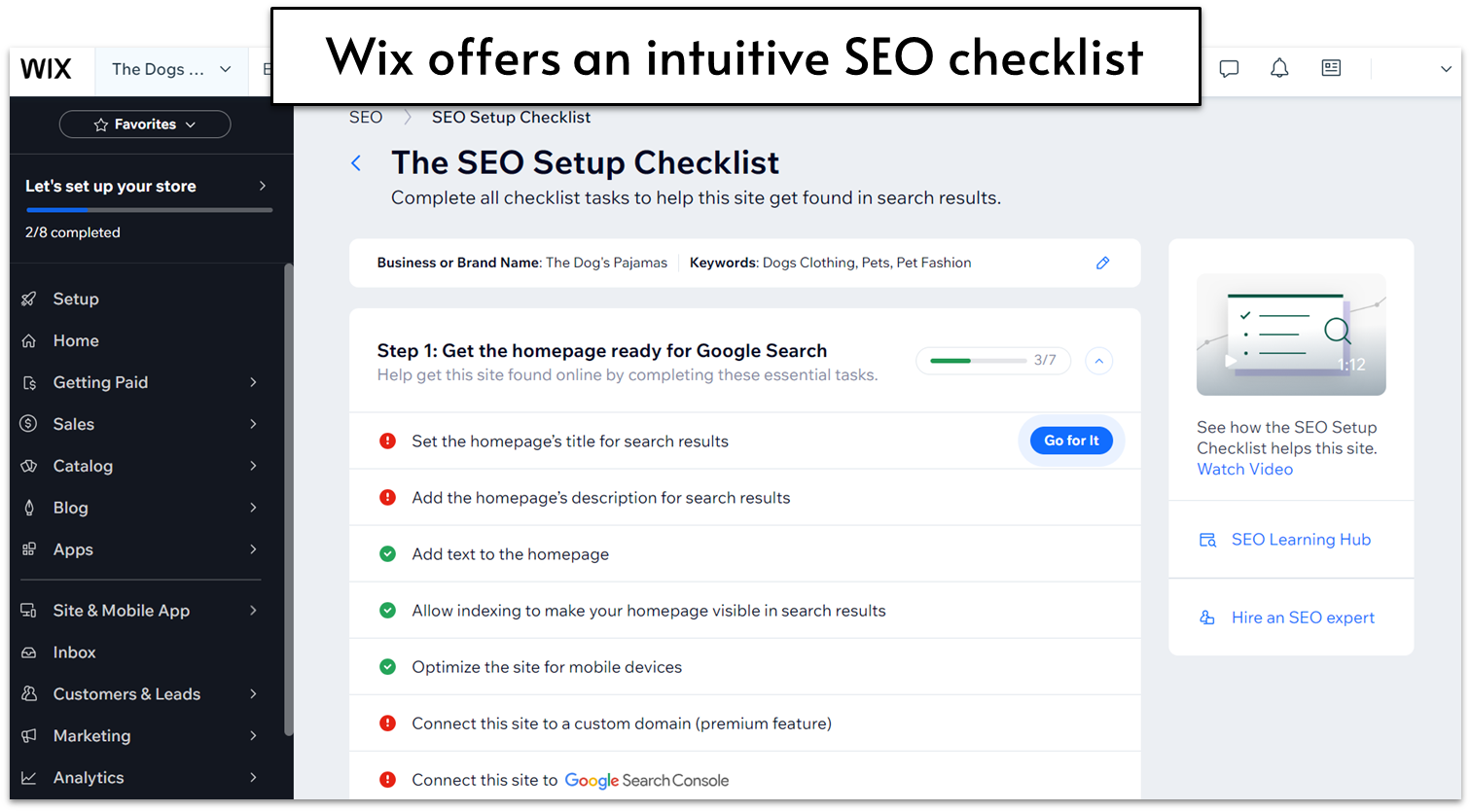
Design Flexibility
Wix certainly lives up to its promise of letting you edit every element of your site to customize it exactly how you want it. There are plenty of options for colors, font, blocks, and layouts, and you can save color palettes and font schemes easily for sitewide application.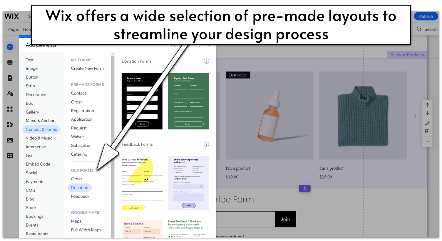
Pricing
The Wix free plan gives you a lot of customization options, with access to all 800+ templates and a wide selection of apps. If you want to connect a custom domain, add storage space, and remove Wix’s advertising, you’ll need to go for a paid plan. Wix currently offers four paid plans, “Light,” “Core,” “Business,” and “Business Elite.” With each upgrade, you get access to more storage space, video hours, and collaborator accounts. As for unique features, these plans offer, respectively: a light marketing suite, basic e-commerce functionalities, standard e-commerce and marketing options, and VIP support plus an “advanced developer platform.Other Features
There are a few other notable things about Wix that I loved:- Online store: The Wix Store interface is really user friendly, walking you through every step of adding product information, shipping and payment options, and more. You can also add apps to expand what your store can do, including things like Laybuy for flexible payments, Gifted for selling gift cards, and Shippo or ShipStation for printing shipping labels and getting lower shipping rates.
- Advanced SEO options: Beyond Wix SEO Wiz, the advanced SEO settings include options for structured data, canonical URLs, and custom meta tags. These help Google better understand your site on a technical level, without you having to take on any complex technical work. You can also set up AMP pages for a faster mobile experience.
- AI Website Builder: Even if you don’t find anything you like in Wix’s 800+ template selection, you can also allow Wix’s AI questionnaire to help you create a custom template specifically catered to your needs.
- Support center: Wix offers 24/7 phone and live chat support as well as support through its social media channels where you can use “@WixHelp” on Twitter and Reddit. But you can also get VIP care and avoid any possible queues if you upgrade to a higher-tier plan. Although I didn’t ever need the support center, the information and support available is where Wix really shines. It has a ton of self-guided articles, video tutorials, and trending topics.
#2 Squarespace – The Best Website Builder for Design
| Criteria | Score/Number |
|---|---|
| Ease of Use | 8/10 |
| Design Flexibility | 8/10 |
| Pricing | 6/10 |
| Number of Templates | 140+ |
| Number of Apps | 30+ |
Ease of Use
Squarespace is one of the easiest block editors to use. That’s partly because of its user-friendly interface, but also because you get a lot of different options for designing your site in a well-structured way. You can start by adding premade sections with specific purposes (which are as well-designed as you’d expect from Squarespace) and then move to more in-depth editing, either by changing the features of each element, or by adding new content blocks of your choosing.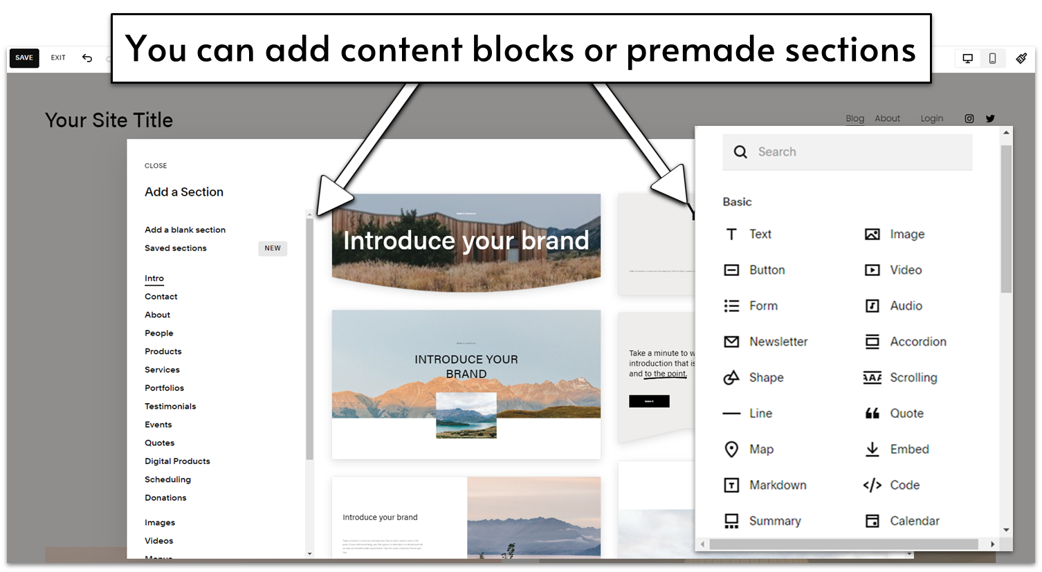
Design Flexibility
Squarespace has some of the best templates in the industry, and they offer impressive design flexibility. There are some natural limitations to the block editor, and you can’t every single color at will, but overall you can do a ton of customization, and it’s built so that anything you do looks pretty spectacular. One of my favorite design features is the color palette picker, where you choose three basic colors to match your site, and Squarespace generates broader color themes to be used throughout. Here’s the color palette for my Squarespace test site: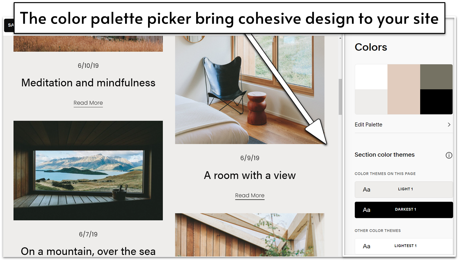
Pricing
Squarespace doesn’t have a free plan, but you get a lot of features even on the lower tiers. You can also test it out with a free 14-day trial before committing to the paid plan. As you move up in price point, you’ll get more advanced e-commerce features, so smaller blogs and online stores can use Squarespace affordably. The advanced e-commerce plans are generally a bit more affordable than those of e-commerce-specific builders. Overall, it seems like Squarespace is committed to ensuring you have the best possible site, and it knows a free plan just won’t cut it to get you the best experience and website there is.Other Features
Squarespace’s strongest point is its designs, but there are a few other points worth noting:- Powerful Marketing Features: The SEO features are pretty standard for a website builder, but there are a few other standout marketing features. There are direct integrations with Instagram, Facebook, and Pinterest, and even a URL builder to help you track paid search campaigns.
- Online Store: Adding products is a bit less intuitive than the store setups on other regular site builders, but it’s on par with the e-commerce-specific builders. After testing all of these builders and learning a lot about online stores, I’ve noticed that the more advanced and capable e-commerce functions come with a steeper learning curve. That’s true of Squarespace as well.
- Built-in Email Campaigns: When you publish a post, you can start building an email campaign with their email feature directly from the post. This is easily the most integrated email capability out of any of the website builders – you don’t have to add any integrations or extensions to access this.
- Squarespace Blueprint: If you have a very specific idea of what you want your site to be, you can also create your own template using Squarespace Blueprint, a modular, user-friendly template creator.
#3 Hostinger Website Builder – The Most Flexible Simple Website Builder
| Criteria | Score/Number |
|---|---|
| Ease of Use | 6/10 |
| Design Flexibility | 4/10 |
| Pricing | 4/10 |
| Templates Available | 140+ |
| Apps Available | none |
Ease of Use
Hostinger website builder is very, very easy to use. As a complete “Hostinger newbie,” it took me less than five minutes to get to grips with the basics. One potential downside is that Hostinger doesn’t give you a helpful start-up checklist or walkthrough wizard, but it doesn’t take more than a bit of clicking and scrolling to orientate yourself. Everything is pretty intuitive. That being said, since Hostinger does things slightly differently from other website builders, there were a few moments where I got a little stuck. Buttons, for instance, weren’t exactly where I expected them to be… but that might just be my prior experience speaking, and so not necessarily a problem for complete beginners. In an attempt to make life even easier for you, Hostinger offers a whole suite of AI tools. If inspiration is eluding you, there’s an AI business name generator, a slogan generator, a blog title generator, and even an AI writer that will generate pages of SEO-friendly content for you. The text it generated for me was definitely on the bland side – and on balance I think I’d prefer to write my own copy, thank you very much. But it could definitely help get the creative juices flowing if you’re suffering from blank page syndrome and don’t know where to start.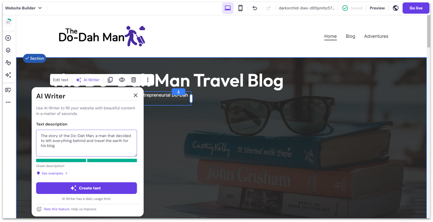
Design Flexibility
For a simple website builder, Hostinger actually offers a pretty decent amount of design flexibility. The templates are all nicely put-together, but you’re by no means locked into the way they are designed or laid out. For instance, you can choose an overall color scheme for your site to make life simple for yourself, but that doesn’t mean you’re then restricted to those colors. In fact, you can edit the color of every individual element as you see fit.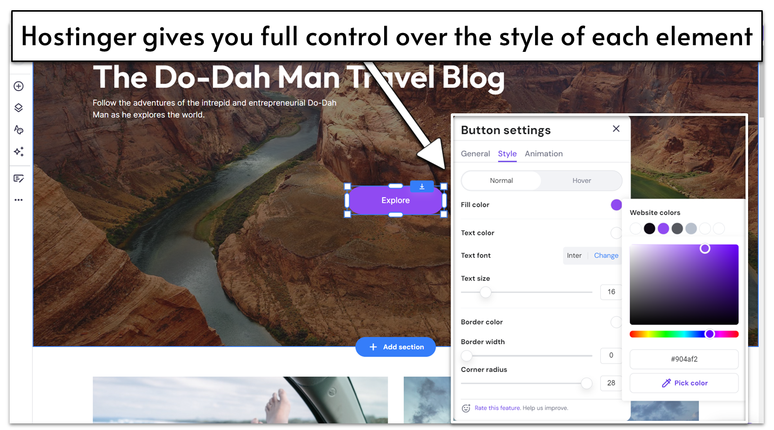
E-commerce Features
Hostinger ’s e-commerce features, available with the eCommerce plan upwards, are robust and easy to use. You have to exit the website editor and enter the Store Manager to start building your website store, but navigating between the two is very simple. Hostinger also gives you a helpful step-by-step list of tasks to complete to get your online store up and running. It guides you through the basic process of adding products, specifying delivery options, and setting up payments. It got a little trickier when it came to categorizing my products, tracking my inventory, and creating product variants (this last part in particular had me lost in a sea of error messages for a few minutes). Of course, tricky doesn’t mean impossible, and I was able to figure it out in the end. The main thing that bugged me, though, was that Hostinger doesn’t have a ready-made content block for displaying featured products on the homepage – a pretty standard feature on most other website builders. Instead, my only option was to insert an entire duplicate of my store page. Weird.
Pricing
Hostinger offers just two premium plans for its website builder: “Premium Website Builder” and “Business Website Builder.” You can also use the website builder to create your site with any of its hosting plans. Overall, Hostinger is surprisingly affordable, with incredibly low per-month pricing. But I don’t think it would be unfair to say that Hostinger is a little sneaky. For instance, the advertised price assumes you’ll pay upfront for a four-year contract. That’s one heck of a commitment. If you factor in the extra cost of paying monthly, you might find you get more for your money elsewhere – especially considering Hostinger’s below-average PageSpeed Insight Score. It’s also frustrating that there isn’t a free trial, which most of Hostinger ’s competitors offer if they don’t have a free plan. Personally, I was a bit put off by the prospect of having to get my credit card out without having tested the product first. That said, Hostinger does have a 30-day money-back guarantee, so… free trial in reverse?Other features
Hostinger isn’t as feature-packed as other builders, but it still offers an impressive number of tools to help you create any kind of website you want.- Comprehensive suite of SEO and marketing tools: This includes heat maps (for tracking how your users interact with your website), Facebook Pixel integration, Facebook Live Chat integration, Google Analytics, and Google Tag Manager.
- Dedicated mobile editor: You can use Hostinger’s mobile editor to fine-tune the mobile version of your site to your exact requirements.
- iOS and Android mobile app: With the app, you can manage your mobile store on-the-go.
- Website importer tool: If you have an existing website, the website importer tool can help you import text and images from your existing website.
#4 Shopify [E-commerce] – The Best Value-for-Money Website Builder for Online Stores
| Criteria | Score/Number |
|---|---|
| Ease of Use | 7/10 |
| Design Flexibility | 7/10 |
| Pricing | 7/10 |
| Number of Templates | 12 free/155 paid |
| Number of Apps | 8000+ |
Ease of Use
Shopify has a lot of features that are easy to use, but its page editor isn’t the most intuitive. Sometimes you have to hop back-and-forth between several menus to edit a page’s format, and it’s not always clear how to edit a page’s design.
Design Flexibility
Shopify has a lot of color and font options to customize your theme, as well as a strong selection of blocks from which you can build your homepage. The layout flexibility for other pages is more limited, but a handful of the thousands of available apps are page builders which may provide additional design flexibility to some store pages. (However, if you need a lot of site content and a lot of online store capability, you likely need a different website builder anyway.)E-Commerce Features
Shopify’s e-commerce features are intended to benefit brick-and-mortar retailers as well, so they have some cool features for adding locations and tracking inventory at each store, as well as transfers to and from locations.
Pricing
All of the e-commerce builders have similar pricing structures, but Shopify gives you a bit more bang for your buck (there’s also a free trial, though it’s only 3 days long). You can get massive shipping discounts, the ability to add store locations, and a few other goodies for essentially the same price as BigCommerce.#5 IONOS – The Best Builder for Businesses Just Starting Out

| Criteria | Score/Number |
|---|---|
| Ease of Use | 9/10 |
| Design Flexibility | 8/10 |
| Pricing | 8/10 |
| Number of Templates | 18 |
| Apps Available | 0 |
Ease of Use
Though it’s primarily a web hosting company, IONOS offers a simple website builder catered towards business websites called MyWebsite Now. Set-up is super simple. You just need to select a template and get clicking. It doesn’t take long to come to grips with MyWebsite Now, especially if you’ve used a site builder before. I did, however, occasionally find myself a bit confused with the way IONOS works. For instance, there’s a separation between adding things and editing them. You have to enter the Section editor to add something to your section (say, a button), then go back a step to customize it. It’s fine once you figure it out, albeit a bit counter-intuitive.
Design Flexibility
The MyWebsite Now builder has a selection of well-designed templates that are clean, modern, and mobile-friendly – there just aren’t many of them. Only 18 designs are available, basically one per industry. It’s not a lot of options, but it’s possible to make each your own. For a simple website builder, IONOS gives you a pretty good range of personalization options. You can set colors and fonts to apply across your entire website – there’s also an option to create your own custom color palette – as well as customize each element individually in terms of colors, fonts, and spacing.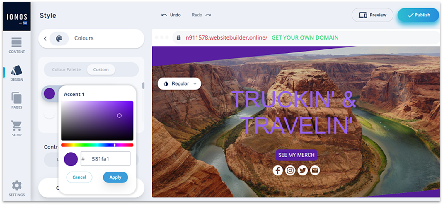
E-commerce Features
IONOS gives you the option to upgrade for e-commerce features – and it is one of the cheapest e-commerce plans out there. If you want a simple online store, this is good value for money. As you’d expect from the price, the e-commerce tools aren’t as robust as what you’d get with a dedicated e-commerce builder like Shopify or BigCommerce. But you do get light inventory management, product options, tax and shipping settings, and a content block for adding related products to your product pages. You can also sell both digital and physical goods. IONOS also lets you create discounts and coupons, set up abandoned cart emails, and use integrations to sell directly from your site via Facebook, Instagram, Google Shopping, eBay, and Amazon. Some builders on this list reserve these features for premium e-commerce plans, but IONOS includes them as standard.Pricing
If you’re opting for MyWebsite Now (which is my recommendation for a beginner), there are two plans: Starter and Online Store Starter. The right one for you simply depends on whether you want to sell online. Starter comes with all the templates, design options, color schemes, a free domain for one year, and a professional email. The Online Store Starter plan throws in online store tools like product listings, payment options, shipping and collection options, marketing tools, and integrations for selling your products via social media. You can try the builder at no cost – kind of. It’s a bit frustrating, but IONOS only offers no-cost plans to those who choose monthly subscriptions. If you opt for a yearly plan (which ends up being much less expensive), you don’t receive the free month but rather a reduced price for your initial 12 months. You do, however, get a 30-day money-back guarantee, so either way, you can cancel within 30 days for a full refund. But it would be nice not to have to get out your credit card to sign up. Just saying.Other features
IONOS isn’t exactly flush with extra features. There’s no app market for adding functionality, for example – but it does have most of the basics, including:- SEO tools: MyWebsite Now comes with some basic SEO tools, including setting page names, descriptions, and images for social media sharing.
- Analytics: You can keep track of visitors to your site with IONOS’ simple inbuilt analytics tool.
- GDPR: The pre-built cookie banner is a super simple way to make sure your website is GDPR-compliant.
- Image library: You can access a library of more than 17,000 royalty-free images, to help make your site visual even if you don’t have top photography skills.
#6 SITE123 – The Best Website Builder for Beginners
| Criteria | Score/Number |
|---|---|
| Ease of Use | 8/10 |
| Design Flexibility | 7/10 |
| Pricing | 8/10 |
| Number of Templates | 180+ |
| Number of Apps | 80+ |
Ease of Use
SITE123’s editor is simple to use and makes it easy to adjust your pages… if you know how it works. My site defaulted to a single page site, and it took me a good 20 minutes to figure out that when you add a block, you have to adjust its settings to not appear on the homepage but to remain in the navigation menus. Once I figured this out, building my SITE123 demo site went super fast. I build the complete site in under an hour (including the 20 minutes of troubleshooting).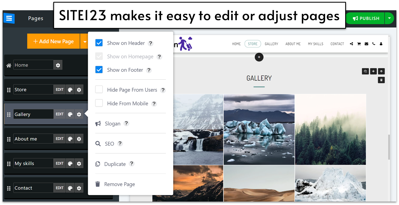
Design Flexibility
You cannot customize your site as liberally on SITE123 as you can on Wix, but you can still customize a heck of a lot. There over 180 design templates to start with, as well as 14 categories of page layouts, including text, photo galleries, events, and even restaurant reservations. These page types can be further customized by adding blocks, but you do hit some limitations based on the layout you choose. For example, I had chosen an About page template but was not able to embed a video as intended. I asked chat support, and was told that embedding a video was only allowed on certain page types: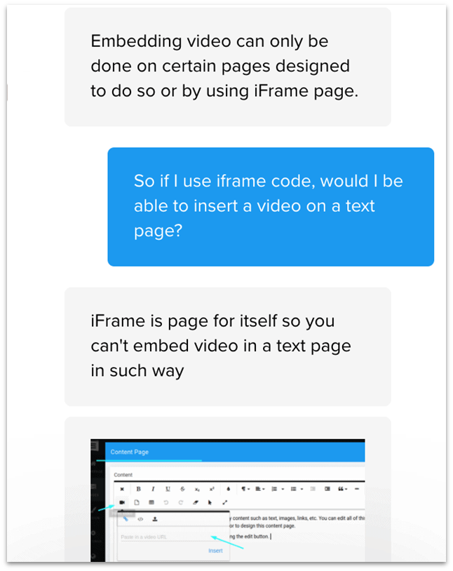
Pricing
SITE123 also has a fairly robust free plan, and the lowest-tier premium plan adds a lot more storage, a free domain name, and e-commerce capabilities. You’ll also find a lot more customization options if you want more design freedom. It’s a good value option for a lot of blogs and small businesses.Other Features
SITE123 doesn’t have a ton of extra features, but it does cover the basics that most site builders offer, and in a simpler manner than others. Here are some of those:- SEO: You can add your title tag, meta description, and image alt text, but that’s about it. There’s also a keyword meta tag field, but that’s pretty obsolete in SEO, so more of an unnecessary inclusion than a real feature.
- Online Store: The online store is pretty thorough in terms of adding product information, and felt very easy to move through as someone who has never set up e-commerce sites before. It comes as a built-in page type on the premium plan or higher, so you don’t have to add anything extra to get started.
- Single-page Website: Although this feature gave me the most trouble at first, SITE123 is certainly the easiest builder for making a single page site with distinct sections and automatic navigation links throughout the page. It’s a great option for portfolios and resumes or event websites that only require a single page.
#7 Webador – The Fastest Builder for Beginners
| Criteria | Score/Number |
|---|---|
| Ease of Use | 10/10 |
| Design Flexibility | 6/10 |
| Pricing | 10/10 |
| Templates Available | 50+ |
| Apps Available | None |
Ease of Use
Setting up a website with Webador is pretty straightforward. Even if you don’t have any previous experience with website builders, it won’t take you more than 10 minutes to figure out how to create a website in Webador. If you do have previous experience, a brief glance should be enough. The user interface (UI) is intuitive and clearly labeled to help you edit the different aspects of your site quickly. The Settings, Webshop, Pages, Design, and Editor tabs do exactly what you’d expect them to do. In particular, the design tab is great for making broad changes to the overall mood of your site quickly. There, you can change the color scheme and fonts of your site to suit your desired tone.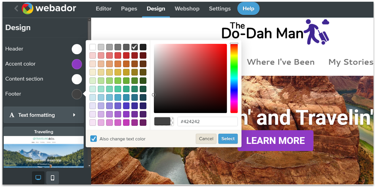
Design Flexibility
Though it can help you create a simple website in minutes, Webador might not be the ideal choice for anything more complex than a few static pages and a blog. That’s because other than a couple of surprising options for media sharing, the editor doesn’t offer that many customization tools. That’s not to say that it offers nothing of value. Webador lets you add headings, text, images, buttons, and every other essential element you need to create a working site. But you won’t find anything remarkable like animation options or layered editing features. If you want to add new elements to a page, Webador will automatically arrange them to a simple grid, which can prevent your site from looking disorganized, but it can also make it look rigid and a little outdated.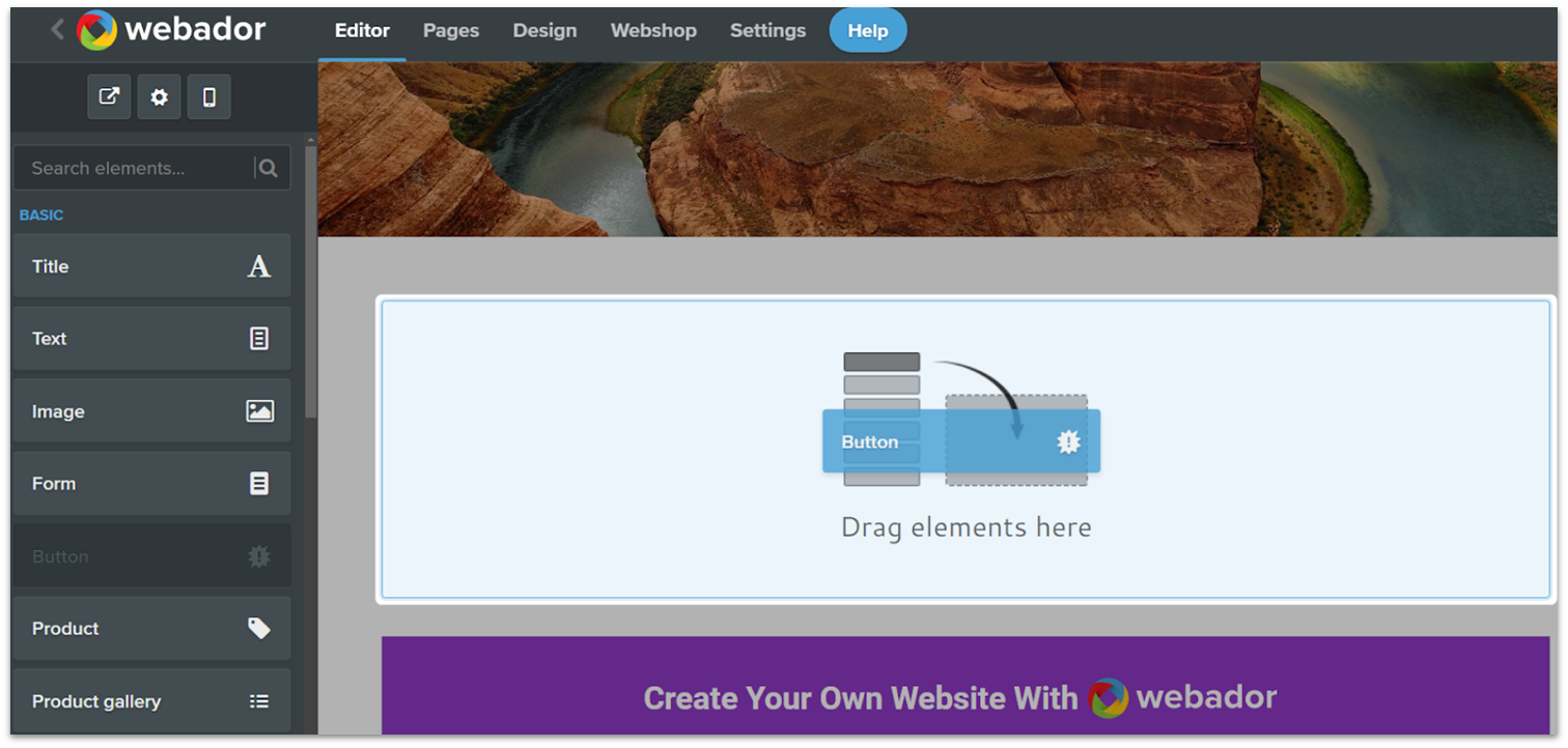
E-commerce Features
For a builder with simplicity as its main focus, Webador offers a surprisingly well-rounded set of e-commerce features to help you sell directly from your site. Webador offers options for special tags, discounts, SEO, and more. It’s also one of the few website builders that don’t charge any transaction fees. This means you get to keep everything you earn when you set up your online store. Webador is unlikely to help you build the next multinational e-commerce empire. But if you’re looking to set up a quality store quickly, it’s an excellent choice.Pricing
Webador is one of the cheapest builders on the market. In fact, regardless of which plan you choose, you get the first three months for a heavily discounted price. Even once the renewal fees start, Webador remains affordable.Other Features
Webador isn’t the most feature-packed builder out there, but it still manages to fit in a couple of surprises in its relatively limited offering, such as:- Unique file-sharing widgets: Webador includes options to let you turn your website into a file-sharing hub with a one-button downloader, audio playback, and a document viewer.
- Customizable forms: You can create and modify customized forms to ask visitors for their opinions on various topics. Webador also automatically organizes the results for you.
- Drag-and-drop rating system: If you want an even quicker way to know how your visitors feel about something, you can add responsive, five-star system ratings anywhere on your site.
- Easy SEO options: Webador allows you to customize your site’s SEO easily to help you get more traffic.
#8 BigCommerce [E-commerce] – The Best Website Builder for High-Volume Online Businesses
| Criteria | Score/Number |
|---|---|
| Ease of Use | 5/10 |
| Design Flexibility | 8/10 |
| Pricing | 8/10 |
| Number of Templates | 12 free/187 paid |
| Number of Apps | 1000+ |
Ease of Use
BigCommerce is a tool generally designed for teams and enterprises – people who are already versed in the world of e-commerce, or who have knowledgeable collaborators. So while it’s not hard to use, it isn’t very intuitive or beginner-friendly either. After signing up, you are taken straight to your dashboard, which is where you’ll manage every element of your site. With all the menus, pop-ups, and drop-downs, the initial setup can feel a little overwhelming. Personally, I would have liked a quick tutorial explaining the dashboard’s main functions. There is, however, a checklist to help you get started.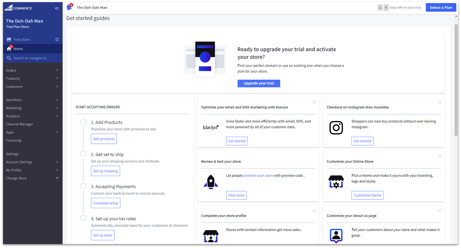
Design flexibility
BigCommerce offers a diverse selection of good-looking and mobile-responsive templates. Only 12 of them are free – but that’s normal for dedicated e-commerce platforms, even if it’s less than what generalist builders have. Most paid themes cost between $110 and $220 (some cost as much as $300), which is not cheap, but not a huge expense for a large e-commerce store, either. If you’d like, you can also purchase cheaper themes from third-party marketplaces, like ThemeForest. Plus, BigCommerce has plenty of customization options. Using a combination of the storefront editor and the page builder, you can customize the colors, fonts, typographies and layouts of all non-product or listing pages. Additionally, most templates come with 2-4 different color presets.
E-commerce features
I wasn’t exactly blown away by BigCommerce on the ease-of-use and design flexibility fronts, but this builder really comes into its own when it comes to e-commerce features – as you might expect. BigCommerce has a strong set of basic features: unlimited storage and bandwidth, Google AMP for speedy website loading, a mobile app, simple blogging tools, discounts and coupons, product ratings and reviews, abandoned cart reminders, and integrations with external payment providers (among other things). BigCommerce also has a few knock-out e-commerce features that, in my opinion, will make fiddling with its editor totally worth it for some online stores. For instance, BigCommerce lets you sell all over the world. We’re not only talking about multilingual sites, but also separate sites for different regions, with their own product lists. Even if you’re not a large corporation, there’s plenty to boost your business. BigCommerce’s multi-channel selling is a good example. You can list your products on Amazon, eBay, Walmart, Google Shopping, and social media marketplaces, and manage everything from your BigCommerce account. Your inventories are synced so you don’t oversell. In addition to robust SEO tools, BigCommerce offers strong marketing tools. You can sync store data with email marketing platforms like MailChimp, G Suite and Constant Contact, for example. And from the Plus plan upwards, you can segment your customers into different groups and market to them in different ways. If you want to combine online and offline shopping with ease, BigCommerce integrates with leading point-of-sale (POS) solutions, including Square, Vend, Clover, and more – allowing you to sync your inventories and let your customers pick up their orders in person. You can add further functionality via BigCommerce’s selection of nearly 1,000 apps (many of which are free). There are apps for everything, from shipping and order management, to marketing and analytics.Pricing
As you might have guessed from reading through all these features, BigCommerce is not exactly cheap. But considering what’s on offer, BigCommerce’s pricing is more than fair. Indeed, BigCommerce opts for a relatively standard pricing structure, with each plan costing virtually the same as comparable Shopify plans. There are some differences, however. Shopify includes abandoned cart recovery with its cheapest plan, while BigCommerce makes you upgrade to the mid-tier Plus plan to access this feature. On the other hand, BigCommerce gives you unlimited staff accounts from the start, whereas Shopify limits you to 2, 5, or 15 accounts, depending on your plan.#9 WordPress.com – The Best Website Builder for Blogging
| Criteria | Score/Number |
|---|---|
| Ease of Use | 6/10 |
| Design Flexibility | 8/10 |
| Pricing | 9/10 |
| Number of Templates | 140+ native/thousands of third-party templates available |
| Number of Plugins | ~50K (third-party) |
Ease of Use
WordPress.com’s block editor is somewhat easy to use if you understand the concept of using blocks to create layouts. You can start building a page from an existing template to streamline your design experience, and there are dozens of block types to choose from. These are helpfully categorized by their purpose, so you don’t have to spend a lot of time hunting for what you need.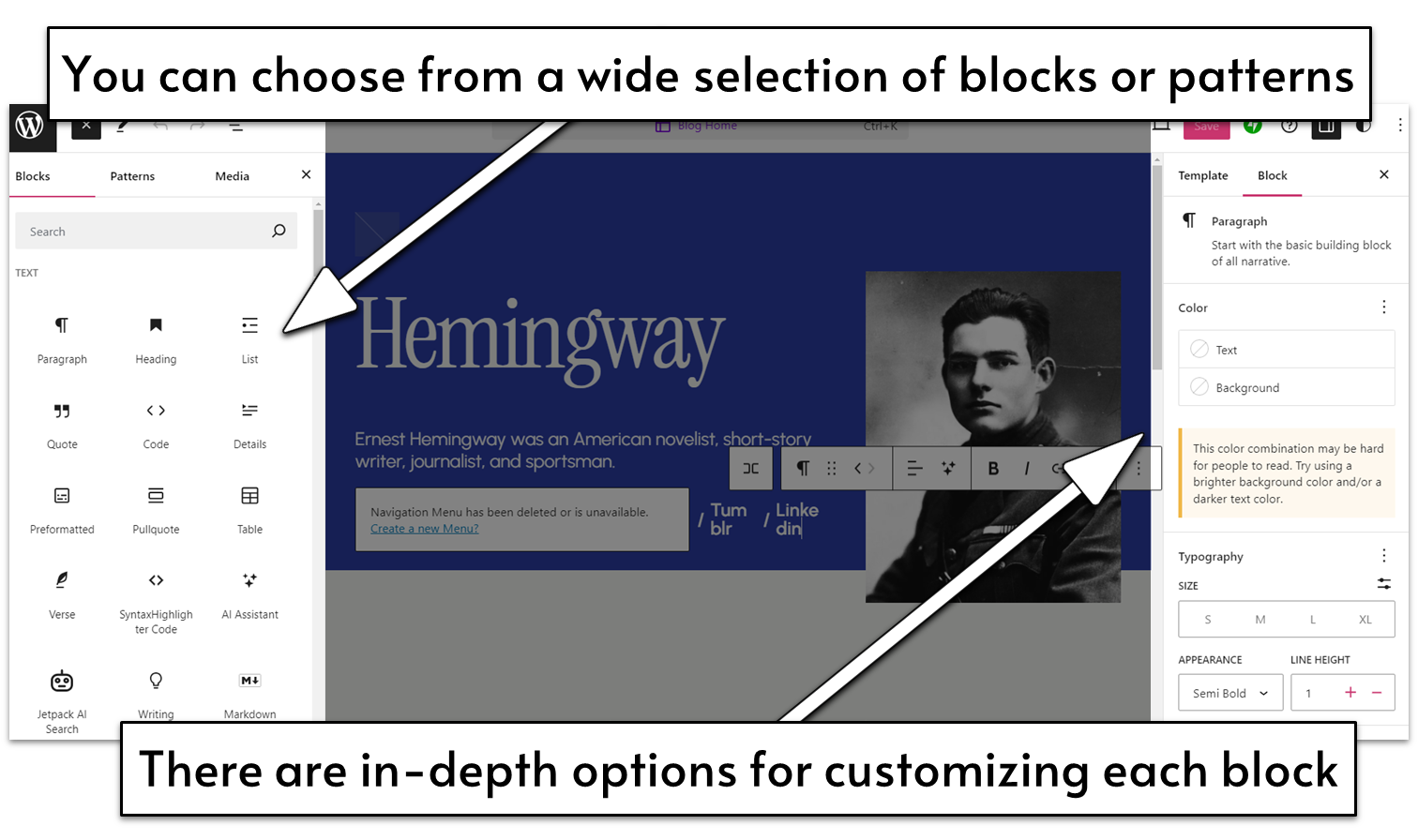
Design Flexibility
Customization options vary widely and are entirely dependent on the theme you choose. Though older themes usually offer very limited customization options, the newer themes (both by WordPress and third-party marketplaces) offer a lot more customization options.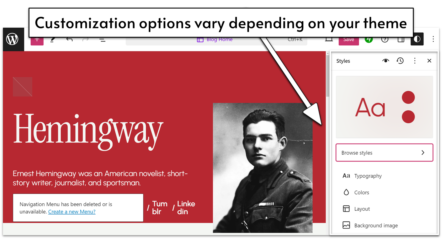
Pricing
WordPress.com has one of the widest ranges of prices (there’s also a free plan available), and there are significant distinctions between each plan. The lowest tiers are very affordable, and are sufficient for bloggers or freelancers who need a highly functional but low cost website. The Business plan is needed to access plugins, custom themes, and other advanced features, but with everything it offers, it is well worth the cost.Other Features
Plugins make up a lot of WordPress.com’s best features, but there were a few small built-in things that were convenient and I didn’t see in other site builders:- In-depth blogging features: WordPress offers perhaps the most advanced blog and page management system for a regularly updated blog.
- Direct video embedding: WordPress allows you to embed videos directly on your site, instead of through third-party video platform integrations.
- Platform movement options: WordPress offers the most import/export options between platforms.
- Efficient page loading: WordPress delivers impressive load speeds on desktop and mobile.
#10 Web.com – A Well-Rounded Option for Intermediate Users
| Criteria | Score/Number |
|---|---|
| Ease of Use | 6/10 |
| Design Flexibility | 8/10 |
| Pricing | 8/10 |
| Templates Available | 200+ |
| Apps Available | None |
Ease of Use
You don’t have to be a professional website designer to get the hang of Web.com. However, I wouldn’t recommend it as the most beginner-friendly option nor as a quick and easy tool for building a website in a couple of minutes. That’s not even due to a particularly steep learning curve. Theoretically, you could create a very simple site in a few steps, but the features that really make Web.com worth it require a little more technical expertise. Web.com places a lot of emphasis on tools for things like spacing, nested design, and responsiveness. All of these can make a big difference in creating the right design for your site but might seem unnecessary and overly technical if you’re not interested in the design details. This puts Web.com in a bit of an awkward position, as it’s a little too complex for complete beginners but lacks advanced features that professional designers and agencies would want. However, it implements its tools in an accessible and intuitive way, making it a great builder for getting started with design concepts.
Design Flexibility
If you’re willing to invest the proper amount of time into your site, Web.com can help you create any design you imagine. Thanks to its well-structured editor, you can start with the big picture and then focus on the details of each element. For starters, Web.com has a wide selection of over 200 professionally designed templates to fit a wide variety of needs. Once you’ve selected your ideal starting point, you can modify all the general aspects of your site’s look from the Theme tab. Its design options go beyond the usual color and font choices. Web.com allows you to fine-tune the style of your site’s buttons, headings, dividers, and even timelines and countdowns. If you want to make sure that your style is particularly on-brand, Web.com offers a color wizard tool. All you have to do is upload your logo to the color wizard, and it will automatically update all site colors to match your logo’s palette. But Web.com really shines when it comes to individual widgets or blocks. Not only is its widget selection considerably more diverse than the competition (with widgets for things like custom countdowns, progress bars, and interactive maps), but it also gives you an incredible amount of control over each element’s design.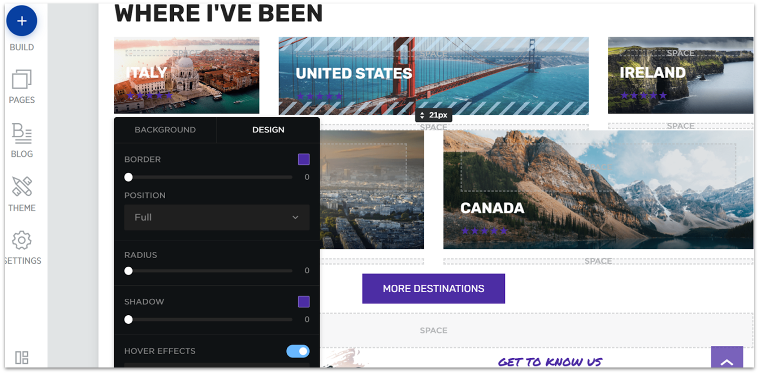
E-commerce Features
While sales aren’t its main focus, Web.com still offers a fairly complete set of e-commerce capabilities. Its e-commerce dashboard is user-friendly and fairly robust, and since it’s separate from the design dashboard, it helps you focus on running a functional online store. For each new product, you can add as many details and specifications as you want, both for your customers’ convenience and to help keep track of item performance. You can also input information about orders, shipments, and even tax rules to your dashboard. With all this data, you can use Web.com’s pre-made business reports to track your business’s health and pain spots. It’s worth mentioning that Web.com also offers a dedicated branding dashboard which offers impressive options for helping you set-up your brand identity, like logo creation features, merchandise mock-ups, and social media tools. The payment method selection is still somewhat limited, and there are no customized reports. Even then, Web.com’s offering for online businesses is impressive.Pricing
If all you want is to create a website tailor-made to your vision, Web.com’s Website Essentials offers a lot more in terms of features and customization than many other starting plans on the market. In fact, if you’re not interested in e-commerce capabilities, Website Essentials offers all you need – at an affordable rate. Beyond that, it’s all about e-commerce and growth. The Business Essentials plan adds powerful marketing and SEO features to help you get found online. The eCommerce Essentials and eCommerce Premium plans allow you to sell products online through multiple sales channels and give you access to branding features.Other Features
Web.com offers a pleasantly surprising toolbox filled with web-building goodies. All the extra features available outside of its website building plan only add to its value. Here are my favorites:- Quickstart: If you’d rather leave the heavy lifting to the professionals, you can. With Web.com’s Quickstart service, professional designers create your website for you based on your needs and vision. Once they’re done, you can use the classic editor to make changes.
- Template generation wizard: If you don’t feel like spending hours looking for the perfect template, you can instead answer a few questions about your website and let the template generation wizard create a customized starting point for you.
- Pre-made blocks: As you edit your site, you don’t have to add each element individually to get the ideal result. Web.com offers a wide selection of pre-generated widget blocks for things like contact forms, testimonials, and image galleries.
- Logo builder: As a side service, Web.com offers an easy-to-use logo builder which you can use to build a unique identity for your brand.
What I Learned and What Surprised Me
Before taking on this project, I hadn’t given much thought to just how different website builders can be. This testing process showed me just how much range there is, and how you truly do need the right website builder in order to have the best experience for both you as the person building the site and your visitors. What surprised me the most was seeing the trade-offs of design flexibility and other factors in action. In general, website builders that offer more flexibility, like Wix, took longer to build and have slower page load speeds, while those that limit your options make the site build go faster and are more guaranteed to have good design (because you can’t mess it up by deciding your DIY layout is better). After testing so many website builders and creating actual websites, here’s the main advice I’d give to those deciding on a website builder:- Know your site goals ahead of time. Do you want to sell products or run a blog? Both? This will help you pick the right website builder, as they all have different strengths. Opt for a more flexible one if you aren’t sure.
- Cheap (or free) isn’t always better. Some website builders have really great value plans, but overall, you get what you pay for. You and your visitors will have a better experience if you’re willing to pay for a plan.
- It’s okay to rely on pre-made designs. Lots of website builders want you to know you have a lot of flexibility, but doing a lot of DIY design has the potential to go poorly quickly. If you know you don’t have an eye for design, choosing a builder that has strong guidelines built-in, like Squarespace, can be really helpful.
FAQ
Is it better to build my own website, or should I hire a web designer?
As I learned through my website builder tests, it’s pretty simple to build a website yourself – even with no design experience! When you build your own website, you’ll save money on hiring a designer and can make as many changes as you like, without having to go back and forth with a designer for edits. However, building your own site may take a bit longer and be limited by the customization options of the builder you choose. If you hire a designer, you’ll find yourself paying more for their time and experience (although you can use Fiverr to find inexpensive options), but you’ll get a stunning professional design that is unique to you.What is the best free website builder?
Not all free website builder plans are created equal – some limit the number of pages you can build to the single digits, while others limit you only by the amount of storage space. Almost all place ads on your site. Check out our assessment of the best free website builders to see which one is best for your needs.How much does a website builder plan cost?
Paid website builder plans have a wide range, depending on the level of plan and the features it offers. During this test, prices ranged for $4 for a personal plan on one builder to over $50 for a premium business plan on another. (There are also enterprise level plans that cost in the hundreds.) On average, the most popular plans are between $12-$25 per month, if you purchase the annual plan. Paying for a year upfront will save you money overall, but will require a higher payment initially. Don’t miss our ultimate guide to Wix pricing.When should you upgrade to a paid website builder plan?
You should upgrade to a paid plan as soon as you need a custom domain to start building brand and SEO authority online. Every site builder on this list requires a paid plan to connect a custom domain. With a paid plan, you’ll also typically remove built-in ads, which can also help your brand image. If you don’t have a pressing need for a custom domain, upgrading to a paid plan will depend largely on your site needs and the builder you choose. As soon as your site needs to outgrow the free plan, you should upgrade – but that could be when you need more than 5 pages on Jimdo, or when you need more than 500 MB of storage on Wix.What is a drag-and-drop website builder?
A drag-and-drop website builder refers to the ability to add and move site elements anywhere on a web page, simply by clicking them with your mouse and moving them to your desired location. This is different from a block editor, which has more parameters around what you can put on your site and where. Drag-and-drop website builders like Wix make the customization process a lot smoother and overall easier.How and where should I get my domain name?
Most website builders will offer a free domain name with a yearlong subscription to a paid plan, which is typically the easiest option for obtaining your domain name. You can also find domain names from domain registrars or web hosting providers. Check out our guide to choosing a domain name if you need more help.
- Wix
- Squarespace
- Hostinger Website Builder
- Shopify
- IONOS Website Builder
- SITE123
- Webador
- BigCommerce
- WordPress
- Web.com Website Builder
- What I Looked For In The Best Website Builders
- E-Commerce Builder or Regular Builder with E-Commerce Features?
- Website Builders Compared: The Testing Process
- The Full Website Builder Comparison: How Each Builder Performed
- FAQ
So happy you liked it!

We check all comments within 48 hours to make sure they're from real users like you. In the meantime, you can share your comment with others to let more people know what you think.
Once a month you will receive interesting, insightful tips, tricks, and advice to improve your website performance and reach your digital marketing goals!