10 Best Website Builders: Tried & Tested [2026 Update]
Website Builders Compared by Building Real Websites

A website builder is a great way to get a site online, but not all of them will offer the quality you need. I tested the major builders on the market to see which ones provide the best templates, features, and the best overall experience.


These days every website builder promises to be the best: the easiest, the fastest, the most professional. It’s now easier than ever to get online, but for every great builder there are a dozen subpar ones bombarding you with marketing jargon and “limited time deals,” that seem a little too tempting.
It’s not a light choice to make. Over 80% of consumers worldwide consider a business’s website when deciding its trustworthiness, and similar numbers apply for professionals looking to get hired, local events, nonprofits, and more.
So, which ones actually deliver? Our international team of reviewers have tested hundreds of different builders to answer that question. We signed up for each builder and created a complete, professional site from scratch. Along the way, we tested usability, design tools, ease of use, performance, AI features, and final output – all from the perspective of a first-time user.
Below, you’ll find only the builders that met our strict standards. Whether you’re looking to build a personal site, a blog, a site for your business, or even an online store, you’re sure to find a solution that adapts to your needs on this list.
A Quick Look at Our Top Website Builders
- 2,500+ designer-made, fully customizable templates
- Intuitive drag-and-drop editor with AI assistance
- AI builder generates a custom site in minutes
- SEO Setup Checklist to boost your Google ranking
- Extensive app market with 800+ extensions
- Powerful mobile app to edit your site on any device
- Free plan offers complete access to AI tools
- Slight learning curve based on the sheer volume of features
- 180+ professionally designed, responsive templates
- User-friendly block editor for easy customization
- AI-powered design and content tools with Design Intelligence
- Social media integration and free marketing apps
- Robust e-commerce and branding features
- Design your brand's logo for free
- Unlimited storage for images
- Can be restrictive for designers
- 150 templates in 17 categories
- AI tools for creating logos, blog posts & images
- Powerful e-commerce tools
- Easy access to marketing tools like Google Ads and Meta Pixel
- Free custom domain for 1 year
- File-sharing & map integrations
- No free plan but offers a 7-day trial
- Limited third-party integrations
-


- 2500+ templates for any type of site
- Extensive customization options
- User-friendly drag-and-drop editor
Wix has one of the most flexible editors I’ve tested. You get hundreds of widgets that allow you to customize nearly every detail of your website. Its intuitive set of design tools also let you adjust colors, fonts, and the overall layout of a page.
If you have a specific idea in mind for your site, Wix offers 2500+ templates in 19 different categories and 70+ subcategories. This means there’s a template for just about any kind of website you could think of. However, you don’t have to use the designated template for your industry – I just chose my favorite design and adjusted it to meet my needs.
Wix also offers industry-leading AI tools for building your site. You can create a unique template using the Wix AI site builder, or you can complement your handmade site with AI generated blocks, images, and context-appropriate content. If you have more experience with web design, Wix also offers an advanced tool for professionals called Wix Studio.
Wix also offers a massive app market with over 800 native and third-party extensions. Many of the apps are free, and you can use them to add things as basic as simple contact forms to more advanced functionalities like full-blown e-commerce features.
Despite its depth, Wix is still beginner-friendly. You simply drag and drop elements onto your page to modify your site’s design, whether it’s a portfolio or an online store. Plus, its built-in tools for managing bookings, payments, and customer communication make running your business simple.
The one caveat is that it’s easy to get lost in all these features. I spent hours on my site, not because I had to, but because there was so much to explore and I was enjoying the process so much. There are simpler builders out there, but few match Wix’s balance of flexibility and power.
-
- Professionally designed templates
- A popular choice for artists and creatives
- Great e-commerce features
Squarespace focuses on design, which you can see in its sleek user interface and top-notch, mobile-responsive templates that look great on all devices. It has a block editor that lets you make both major layout changes and detailed tweaks to specific page elements. Thanks to Squarespace’s user-friendly interface, I could easily build a website tailored to my needs.
If you’re in a hurry but still want to ensure a polished look, you can have Squarespace Blueprint AI generate a website for you. Like with Wix, you answer a few questions about your industry and preferences. Then, Squarespace creates a website complete with text and images that suit your brand.
You’ll find Squarespace isn’t just about looks – it also includes strong business tools. You’ll get powerful e-commerce tools, free marketing apps, and a range of branding features. This makes Squarespace a great choice for professional websites, from fully online stores to brick-and-mortar businesses, and even portfolio sites.
While it doesn’t have a free plan, Squarespace offers a 14-day free trial. Still, you can access the majority of essential features on either of the lower tier plans, which are comparably priced to the other builders on this list.
-

- AI Tools to streamline website building
- Powerful features for e-commerce
- 150+ professionally-designed templates
Hostinger Website Builder’s AI tools help you through every part of the site building process. You get AI-generated templates, an AI writer to help you populate your site with original content, and an AI heatmap to track which spots of your page are most likely to attract visitors’ attention.
Hostinger Website Builder strikes a good balance between creative freedom and ease of use. While it’s not as advanced as Wix, its drag-and-drop editor is more flexible than those of most beginner-focused builders. And, since all sites are hosted on Hostinger’s fast servers, you’ll enjoy reliable performance, too.
If you want to create an e-commerce site, Hostinger has widgets for categories, bookings, custom discounts, and even marketing from the get-go. Hostinger has two affordable plans (from $2.99/month) and low renewal prices, making it one of the cheapest options for building your website.
Although there’s no app market, there are useful third-party integrations available. Some of these include Facebook Pixel (also known as Meta Pixel) for monitoring your ad performance and WhatsApp for easy communication with customers. Overall, it’s still a great choice if you want to build a cheap, secure, and good-looking site.
More on Hostinger Website Builder
Visit Hostinger Website Builder > Read our Hostinger Website Builder review -
- Everything you need to sell online
- Thousands of proprietary and third-party themes to choose from
- Advanced business features and tools for international shipping
Shopify is great if you’re looking for a central dashboard where you can handle all your sales. It offers integrations with a variety of site builders like Wix or WordPress and with social media platforms like Facebook and Instagram. This means you can sell from a variety of different channels while keeping track of all your products.
If you want a dedicated site just for your store, Shopify offers a fully-fledged website builder with plenty of customization features. There’s also a robust app market with thousands of options for extending your site’s functionality.
Shopify has powerful e-commerce features like abandoned cart recovery, detailed sales analytics, customer profiles, and real-time shipping rate calculations. It gives you all the tools you need to run and grow an online store.
While Shopify focuses more on selling than site design, its editor is still easy to use and gives you enough flexibility to build a store that matches your brand. Sure, you won’t get the same range of options as you would with some dedicated website builders. Still, Shopify’s editor uses prebuilt content sections (or “blocks”) that make it easy to customize your store without needing design skills.
-

- Affordable business tools
- Cheap online store packages
- Simple editor and AI tools, perfect for speedy site-building
IONOS Website Builder plans are quite affordable while providing strong business tools. All plans include an AI website builder and a free business email to maintain brand consistency. Also, the second cheapest plan offers an integrated booking tool, a range of AI content tools, and comprehensive site analytics to monitor your site’s performance and visitor behavior.
Instead of dedicated plans for e-commerce, IONOS offers online store packages that you can add to any plan. This option makes IONOS one of the cheapest e-commerce solutions available. It’s a good match if you want to build a simple online store with all the necessary features.
IONOS is a straightforward tool that helps you create a clean, no-fuss site by focusing on essential design elements. You won’t find a huge template library or advanced design tools. Instead, IONOS uses pre-built sections you can easily drag into place and customize to fit your needs.
Overall, IONOS is a good choice if you want to get online quickly without sacrificing a professional look. Just don’t expect the range of features you’ll find with more advanced builders like Wix and Shopify.
-
- Ultra-simple point-and-click editor
- Great gallery options for photographers
- Built-in form builder
SITE123 is one of the simplest builders I tested (hence the name – you should be able to build your site as quickly as one… two… you get the idea). This simplicity makes it ideal if you’re building your first website. This website builder has 80+ mobile-responsive templates and a strong selection of apps to expand your site’s functionality.
SITE123’s editor is point-and-click, meaning you click a series of buttons and prompts to design your site inside a given framework. Instead of adjusting each element to the pixel, you add and reorder sections for things like text, media galleries, and contact information.
Although there is a bit of a learning curve (especially if you’re used to drag-and-drop builders), once I figured out a few quirks, I was able to build my site in just a few minutes. There are also some time-saving automatic features like breadcrumbs navigation and auto-categorization of products in the online store, which made the process even quicker.
-
- Straightforward blogging and marketing integrations
- Generous storage and bandwidth
- Well-rounded set of tools for small online stores
Webador is not the first builder to promise you a complete website in 10 minutes. However, thanks to its responsive UI, site-wide customization tools, and well-categorized drag-and-drop widgets, it’s one of the few that delivers on that promise.
But Webador doesn’t just offer speed. If you’re a beginner, you won’t find a more straightforward dashboard for managing a small store or blog. Webador also provides many high-quality widgets for engaging your visitors, such as custom forms, five-star product/service feedback buttons, and digital maps.
That said, compared to my top picks, Webador has limited design flexibility and its feature set won’t meet the needs of growing businesses. But, as one of the most affordable builders on the market, Webador is a solid option if you’re looking to create a simple, good-looking website on a budget.
-

- Best for large online retailers or dropshippers
- Huge suite of built-in e-commerce features that reduce reliance on third-party tools
- Robust marketing tools for driving sales
BigCommerce is ideal for large or fast-scaling online stores that need deep customization and serious selling power. It offers one of the most comprehensive e-commerce feature sets on the market – even more granular than Shopify’s.
You get inventory management and payment integrations, as well as advanced features like multilingual sites, staff accounts, and flexible shipping options.
That said, BigCommerce isn’t beginner-friendly. Its interface can feel overwhelming, and getting everything set up takes time. But if you’re running a large operation or plan to grow fast, the learning curve is well worth the effort.
-

- The hassle-free way to use WordPress
- The best blogging platform
- Thousands of plugins to expand functionality
WordPress.com is the best choice for serious bloggers who want complete control over their content. It offers nearly all the power of WordPress.org, but without the hassle of self-hosting or coding.
The WordPress.com editor uses a block-based system that makes it easy to structure posts and pages with text, images, videos, and other media. You can also use prebuilt content sections (called “patterns”) to save time.
That said, WordPress.com has a steep learning curve, and many of its best features – like plugins and premium themes – are locked behind higher-tier plans. However, if blogging is your main focus and you’re willing to invest time upfront, WordPress.com gives you unmatched flexibility and room to grow.
-
- 10+ tools for small businesses
- 100+ templates to choose from
- Grid-based editor for maintaining a structured layout
While it’s best known for domains and hosting, Network Solutions also has a website builder that’s great for beginners and small businesses that want to get online quickly. Network Solutions simplifies website creation with an AI builder, 200+ modern templates, and a grid-based editor that keeps your site neat.
Network Solutions lets you run an online store, manage appointments, and promote your services with integrated tools for email marketing, ad management, and social media. There’s also a marketing calendar, branded link-in-bio pages, a logo generator, and QR code creation for offline promotion. This all-in-one setup helps streamline your workflow and save time.
However, the builder isn’t ideal if you want extensive customization, third-party app integrations, or SEO tools. Still, Network Solutions is a great choice for getting a polished site online quickly, especially one that supports appointments or e-commerce.
More on Network Solutions Website Builder
Visit Network Solutions Website Builder > Read our Network Solutions Website Builder review
What I Looked for in the Best Website Builders
I evaluated each website builder based on three key criteria: ease of use, design flexibility, and pricing. I also considered several secondary factors to help distinguish between builders with similar scores. Here are the factors I considered when comparing the different website builders:
Ease of Use
A good website builder is intuitive, clear, and enjoyable to use. The setup process must be simple, and once you’re in, all the essential tools should be clearly explained and easy to access – no digging through menus just to change a font or add a page.
Customizing your site’s core elements (like layouts, images, and text) should be straightforward. Additionally, strong help resources, like live chat, email, or tutorials, are a must.
Bonus points for features like autosave and proactive prompts that guide you through important steps, like publishing your site or connecting a domain.
Design Flexibility
To make sure your site stands out, you need more than a basic template that visitors have seen a hundred times before. The best website builders offer a wide variety of templates, plus the tools to customize them into something uniquely yours. Specifically, it should have:
- Plenty of initial templates to choose from
- Full control over color scheme
- A wide range of fonts
- Lots of options for page layouts and/or blocks
My test results show drag-and-drop editors tend to offer the most flexibility. However, other types of editors can offer plenty of design freedom as well.
Pricing
When it comes to pricing, it’s not really about the cheapest plan – it’s about getting the most features for your money. A good-value builder gives you strong functionality across all tiers, with flexible plans that match your needs.
Bonus Features
The criteria above is the foundation of any quality website builder. Simply put, without ease of use, design flexibility, and fair pricing, it doesn’t matter which other shiny jewels a builder dangled in front of my face, it didn’t earn a higher spot on the list.
That said, providing just the foundations also didn’t make any website builder shoot to the top of the list.
I looked at some additional features that I believe elevate some builders above the rest. It was very important that these additional considerations were also actually useful, not just a way to pad a builder’s credentials. Here are some of the things I looked at:
- SEO and marketing capabilities. There are very few examples in which a website wouldn’t benefit from increased traffic. I looked at features that helped put more attention on your site, both by elevating your search engine rankings, and by directly reaching out to visitors.
- AI tools. AI is a big consideration for potential users in 2026, and while it seems like every builder these days promises the latest and the greatest, you can do a lot better than basic text generation. I looked at AI features that actually help you when it comes to design, content, and promotion.
- Plenty of apps and integrations. There might come a point where a builder’s built-in capabilities simply aren’t enough to cover what you want to do, and that’s where a strong app market comes in. I considered builders that offered easy integrations with tools you already use – like Mailchimp for email or Calendly for bookings – to streamline your workflow.
- A truly unique feature. Some builders come with a unique offering that sets them apart, like a quality logo maker, tailored onboarding experiences, or a personalized marketing assistant. These aren’t always essential, but if a builder delivers on every other criteria, these tools can offer extra value if you have specific goals in mind.
E-Commerce Builder or Regular Builder with E-Commerce Features?
Every builder on this list offers some e-commerce capabilities, so you might wonder why you’d go with a specialized e-commerce platform like Shopify or BigCommerce instead of just a regular builder with an e-commerce plan.
E-commerce platforms focus almost exclusively on online store capabilities, instead of design or content like others on the list. The tradeoff is that while they might be limited on other aspects, e-commerce platforms offer more advanced online store capabilities.
Some (though not all) of these advantages include: advanced shipping and storage options, integration with a lot more payment processors worldwide, advanced sales analytics, tools for custom discounts, subscription options, and more. They also have the specific infrastructure that helps them better process large orders or high sales volumes.
If your main goal is to sell products or services, an e-commerce platform will be the better choice. On the other hand, regular builders with e-commerce are a better option if you consider online sales more of an “extra,” for example, if you’re a creator who wants to offer fans the option to get merch.
Many e-commerce platforms offer integrations with other website builders. So you can get the best of both worlds, but consider that it will involve managing two websites at the same time, and come with added costs too.
Website Builders Compared: The Testing Process
For a fair comparison, I used the same basic framework with essential features most websites need. Every site I built included:
- A static text page (About page)
- A blog post
- A photo gallery
- A contact page
- An online store
With those, I tested the following:
- “Broad” site style changes. Changing the colors and font schemes across universal site elements.
- “Minute” changes. How much I could customize specific elements or blocks.
- Image and video features. Storage, gallery options, unique display features, and everything that might be relevant for adding multimedia content to a site.
- Visitor interaction tools. These were mostly contact forms, how much I could edit them and how well each builder stored and organized the information.
- Buttons, links, and menus. How easy it was to add and customize interactive navigation elements.
- SEO tools. How much I could tweak the site’s SEO, and whether there were any additional features.
While this general approach let me evaluate each builder’s core functionality under the same conditions, I did adapt each site to the builder’s ideal use-case. So, instead of stubbornly trying to make the same site on Squarespace as I did on Shopify, I did try to make a more content-centric version with the former and I focused on a full online store with the latter.
While I had used most of these platforms before, I approached them all from a beginner’s perspective. I paid close attention to how intuitive each one felt, then drew on my background to spot where things would get tricky for new users. For advanced features, I also referenced help articles and tutorials to see how far I could take each builder.
This approach gave me a general framework so I could judge each builder fairly, while giving me some flexibility to score each on their own merits.
The Full Website Builder Comparison: How Each Builder Performed
This chart highlights the essentials – free plan availability, template variety, AI tools, and who each builder is best suited for. Use it to compare top options before jumping into my in-depth reviews below.
| Free Plan | Templates | AI Features | Integrations | Best For | |
|---|---|---|---|---|---|
| Wix | ✔ | 2500+ | Website builder, text generator, image creator, logo maker | 800+ | Creative freedom and flexibility |
| Squarespace | ✘ | 180+ | Website builder, content tools | 130+ | Design-focused professionals |
| Hostinger Website Builder | ✘ | 180 | Website builder, writer, image generator, SEO tools | 10+ | Fast, multilingual site setup |
| Shopify | ✘ | 900+ | AI image editor, copywriter (product descriptions and emails) | 13,000+ | Growing online stores |
| IONOS Website Builder | ✘ | 40+ | Website builder, image generator, writer | 10+ | Startups on a budget |
| SITE123 | ✔ | 80+ | AI text generator | 100+ | Simple 1-page websites |
| Webador | ✔ | 50+ | AI setup wizard | 30 | Basic business sites |
| BigCommerce | ✘ | 200+ | Content tools, e-commerce tools | 1,200+ | Large online retailers |
| WordPress.com | ✔ | 300+ | Website builder, content tools, plugins | 59,000+ | Bloggers and content-heavy sites |
| Network Solutions Website Builder | ✘ | 200+ | Website builder, writer, logo generator | None | Low-effort website setup |
My Experience With the Website Builders
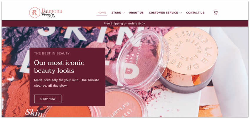
I used all the builders to create a test website for Korean cosmetics and makeup products. I detailed the onboarding process for each platform. I also discussed the builders’ ease of use, design flexibility, the most outstanding features, and pricing information.
I selected Korean cosmetics since it’s a broad enough industry and topic to let me test different aspects of each builder. I could adapt it to different use cases, focusing on high-quality image displays on some builders, blogging capabilities on others, e-commerce tools on others, and so on.
#1 Wix – Best Website Builder Overall

| Criteria | Score/Number |
|---|---|
| Ease of use | 10/10 |
| Design flexibility | 10/10 |
| Pricing | 9/10 |
| Templates available | 2500+ |
| Apps available | 800+ |
Ease of Use
The Wix website builder is the most intuitive site editor I tested. Everything I needed was in the first place I looked, and at no point did I feel frustrated or even need to check the support center for help. I was able to build about half of the site in just 30 minutes, and it took around 75 minutes to build my full Wix site.
While I started with a template, you can use Wix’s AI builder to help you create a website from scratch. You’ll be asked a few questions about your site and the AI will build you a custom site in minutes.
You can also use Wix’s AI tools to help you write your website’s content, touch up images, and analyze how your site is doing. And you can always revert back to an earlier version of your site whenever you want, as Wix saves everything.
On the SEO front, Wix offers more advanced options than almost any other builder I tested. It automatically generates a sitemap for search engines to “understand” the structure of your site, allows you to manually optimize pages, and even provides an SEO checklist that goes through all the steps you need to complete.

More and more, people are also using AI tools like Gemini or ChatGPT to find pages online, not just Google. Wix offers a proprietary AI visibility tool to show where your site is mentioned by AI engines, which in my opinion, is incredibly valuable.
One potential drawback is that templates aren’t completely mobile responsive. While some of your website’s design gets automatically re-formatted for mobile view there’s a separate editing process for the mobile and desktop versions.
This is only half a bad thing though. It might involve more work, but it also means that you have more creative control over the mobile version of your site. That said, it’s worth noting that my Wix site loaded quite slowly during my page speed tests.
Design Flexibility
Wix lives up to its promise of letting you edit every element of your site to customize it exactly how you want it. There are plenty of options for colors, font, blocks, and layouts, and you can save color palettes and font schemes easily for sitewide application.

Guidelines help you ensure page elements are aligned with each other. I sometimes had difficulty getting the drag-and-drop editor to do my bidding when fiddling with page height or other adjustments. However, those are nearly at the pixel-level of adjustment and aren’t a big deal when considering the site design as a whole.
Wix’s huge number of templates means you’re likely to find a pre-made template close to what you envision for your site. You also have the option to start with a completely blank template and design the whole site from scratch.
Once you start editing a template, you can’t switch to a different one without starting over, so be sure of your choice before getting too far in designing. That said, you should be able to create anything you want within your chosen template, or reproduce a layout from a different template that catches your eye later on.
E-Commerce Features
Just like the standard website editor, the Wix Store interface is easy to navigate. It walks you through every step of building your store. You can easily add product galleries, manage inventory, and set up a variety of payment options for a seamless customer experience.
You get plenty of built-in functionality, such as the ability to accept pre-orders and offer a loyalty program for returning customers. If you need more, you can add apps to expand what your store can do. For instance, you can add Laybuy for flexible payments and Gifted for selling gift cards.
Pricing
Wix’s free plan gives you a lot of customization options, with access to all 2500+ templates and a wide selection of apps. That said, you only get 500 MB of storage and 1GB of bandwidth. If you want to connect a custom domain, add storage space, and remove Wix’s advertising, you’ll need to go for one of the four paid plans.
With each upgrade, you get access to more storage space, video hours, and collaborator accounts. The entry level plan provides basic marketing tools, while higher-tiered options offer standard e-commerce functionalities.
Other Features
There are a few other notable things about Wix that I loved:
- Advanced SEO options: These include options for structured data, canonical URLs, and custom meta tags to help Google better understand your site on a technical level, without you having to take on any complex technical work. You can also set up AMP pages for a faster mobile experience.
- AI Website Builder: Even if you don’t find anything you like in Wix’s 2500+ template selection, you can also use Wix’s AI questionnaire to help you create a custom template specifically catered to your needs.
- AI Marketing Agent: This tool helps you plan and schedule social posts, write captions, and automate posting. It can also optimize your main site pages for SEO and create email campaigns, reducing manual work.
- Customer support: On top of an extensive knowledge base, Wix offers callbacks, email, and live chat support in various languages. You can also use “@WixHelp” on Twitter and Reddit to get support through its social media channels.
#2 Squarespace – Best Website Builder for Artists

| Criteria | Score/Number |
|---|---|
| Ease of use | 8/10 |
| Design flexibility | 8/10 |
| Pricing | 6/10 |
| Templates available | 180+ |
| Apps available | 40+ |
Ease of Use
When you sign up for Squarespace, you can choose to start with Blueprint AI, Squarespace’s AI website builder. It asks you about your site’s purpose, desired features, and brand personality. Based on your answers, it creates a fully customizable website complete with on-brand content, color schemes, and fonts.

I particularly like the color palette picker, where you choose 3 basic colors to match your site and Squarespace generates 10 color themes to be used throughout. You can edit these color themes more heavily, but sticking to them ensures that you have a designer’s eye on your color palette, even if you’re not a designer yourself.
There’s also the “Setup Guide” feature that gives you a checklist of everything you need to get your site started, and can be called upon or hidden as you need it. It walks you through basic steps for website setup and links you to relevant guides for the information you need.
One small but nice perk is the ability to bounce back and forth between the live site preview and editor in a single window. Though it doesn’t sound earth-shattering, it can help you create an efficient and streamlined design experience.
Design Flexibility
Squarespace has some of the best-designed templates and they offer impressive flexibility. There are some natural limitations to the editor, but overall you can do a ton of customization, and it’s built so that anything you do looks pretty spectacular.

Squarespace’s Fluid Engine lets you customize your site layout for desktop and mobile using drag-and-drop blocks. Start by adding premade sections with specific purposes, like introducing your services or your team. Then, fine-tune your layout by adjusting each block’s style, size, and placement.
You can also preview and edit the mobile view separately by clicking the mobile icon in the top right corner of the editor.
E-Commerce Features
Squarespace offers a comprehensive set of e-commerce tools for small and medium-sized stores. Adding products is less intuitive than the setups on other regular site builders, but you can customize quite a lot. For instance, you can add hover effects to your product images and add a newsletter subscribe option to your checkout.
Even on the cheapest e-commerce plan, you get advanced features like the ability to sell unlimited products and get real-time shipping rates. Compared to Wix, there are fewer payment providers available – PayPal and Stripe. But, if you also run a physical store, the Square Point-of-Sale (POS) integration lets you manage online and in-person sales from one place.
Pricing
There is no free plan, but you get a lot of features on the lower tiers. You can test Squarespace with a free 14-day trial before committing to the paid plan. As you move up in price point, you’ll get more advanced e-commerce features, which makes Squarespace an affordable option for smaller online stores.
Other Features
Squarespace’s strongest point is its designs, but there are a few other points worth noting:
- Free marketing tools: With the Unfold app, create eye-catching Instagram posts using prebuilt templates and custom graphics. Also, the “Link in Bio” feature allows you to build a one-page website that contains links to all your content, from blogs to videos.
- AI-powered SEO assistance. Squarespace recently introduced an AI-powered SEO analyzer that automatically creates metadata and alt text based on your content and brand voice. That can save you a huge amount of time.
- Built-in email campaigns: You can start building an email campaign directly from published posts without having to add any integrations or extensions – something you won’t find with other website builders.
- Invoicing tools: On all plans, Squarespace lets you create and send invoices with templates that match your website style to ensure a consistent brand image.
#3 Hostinger Website Builder – The Most Flexible AI Website Builder

| Criteria | Score/Number |
|---|---|
| Ease of use | 6/10 |
| Design flexibility | 4/10 |
| Pricing | 4/10 |
| Templates available | 180 |
| Apps available | 10+ |
Ease of Use
It took me under five minutes to become familiarized with Hostinger’s Website Builder editor. Besides just good UI design that makes navigation easy, Hostinger includes a complete site setup checklist to help you get started as you get to grips with the essentials.
Hostinger does things a little differently from other website builders. Things like buttons and sections are arranged differently than with other builders but that is in no way an issue, just something to get used to if you’ve worked on other builders before.
Hostinger also offers an impressive set of AI tools, like a business name generator, a slogan generator, AI tools for writing blogs, and SEO-friendly content generator tools.

The text it generated for me was definitely on the bland side, so I think I’d prefer to write my own copy. But it could definitely help get the creative juices flowing if you’re suffering from blank page syndrome and don’t know where to start.
Overall, Hostinger’s set of features is relatively minimalist, which helps on the ease-of-use front since there isn’t a huge amount to learn. The downside is that Hostinger might be lacking a certain feature you’re looking for.
For instance, I wasn’t able to add a calendar or an event page. I asked the live chat support about this problem and was told I had to create a calendar with an external provider and then embed the code on my website. Not ideal.
Design Flexibility
For a simple website builder, Hostinger actually offers a pretty decent amount of design flexibility. The templates are all nicely put-together, but you’re by no means locked into the way they are designed or laid out.

For example, you can choose an overall color scheme for your site, but that doesn’t mean you’re then restricted to those colors. In fact, you can edit the color of every individual element as you see fit.
In terms of fonts, you have to set text styles for headings and paragraphs across your entire website – but that’s just good design practice.It’s also easy to edit the size, placement, and order of individual elements using the drag-and-drop editor. Hostinger uses a grid-based layout, so elements snap into place on a grid as you drag and drop them around the page.
This can take some getting used to – a couple of times, my button or block of text suddenly flew away from where I’d placed it – but overall, I liked this feature. You can’t put things wherever you like (this isn’t Wix), but it’s a great way of making sure that your site stays neat and well-spaced.
It’s worth mentioning that, thanks to its advanced optimization tools, Hostinger delivers some of the best loading speeds amongst highly-customizable builders. This is particularly important since loading speeds can have an important effect on SEO performance, visitor retention, and more. No one wants users to click away just because the page doesn’t load on time.
E-Commerce Features
Hostinger’s e-commerce features are robust and easy to use. You have to exit the website editor and enter the Store Manager to start building your website store, but navigating between the two is very simple.
Hostinger also gives you a helpful step-by-step list of tasks to complete to get your online store up and running. It guides you through the basic process of adding products, specifying delivery options, and setting up payments.
It got a little trickier when it came to categorizing my products, tracking my inventory, and creating product variants (this last part in particular had me lost in a sea of error messages for a few minutes). Of course, tricky doesn’t mean impossible, and I was able to figure it out in the end.
Pricing
You can use Hostinger’s 14-day free trial to test its core features, including the AI website builder, mobile editing, and e-commerce tools. Alternatively, you can sign up for a paid plan and make use of its 30-day money-back guarantee – a free trial of sorts.
There are two premium plans available: “Premium Website Builder” and “Business Website Builder.” You can use the website builder to create your site with any of its hosting plans. Overall, Hostinger is very affordable, with incredibly low per-month pricing.
However, it’s not unfair to say that Hostinger is a little sneaky. For instance, the advertised price assumes you’ll pay upfront for a four-year contract. That’s one heck of a commitment. If you factor in the extra cost of paying monthly, you might find you get more for your money elsewhere.
Other Features
Hostinger isn’t as feature-packed as other builders, but it still offers solid tools to help you build a fully functional and visually attractive site.
- Marketing integrations: Though Hostinger doesn’t have an app marketplace, you can add useful marketing tools to your site, such as Facebook Live Chat, Google Analytics, and Google Ads to grow your audience.
- Dedicated mobile editor: Use Hostinger’s mobile editor to fine-tune the mobile version of your site to your exact requirements.
- iOS and Android mobile app: With the app, you can manage your mobile store on-the-go.
- Website importer tool: This tool can help you import text and images from your existing website, if you have one.
#4 Shopify (E-Commerce) – Best Value Website Builder for Online Stores

| Criteria | Score/Number |
|---|---|
| Ease of use | 7/10 |
| Design flexibility | 7/10 |
| Pricing | 7/10 |
| Templates available | 900+ |
| Apps available | 13,000+ |
Ease of Use
Shopify has 900+ themes (24 are free) and thousands of third-party design options. You can also have Shopify’s AI generate custom themes based on the keywords you provide.

However, my favorite AI feature is Shopify Magic, which generates product descriptions and email subject lines for you. If you’re not skilled with product copy (or writing emails), Shopify provides a good foundation – I was happy with the description of my made-up cleansing toner.
Shopify has many features that are easy to use, but its page editor isn’t the most intuitive. Sometimes you have to hop back-and-forth between several menus to edit a page’s format, and it’s not always clear how to edit a page’s design. Rather than editing text directly on the page, you have to edit it in the sidebar to see the page changes, which can be a bit confusing.
Despite the older feel of some of the editing options, it’s still fairly simple to navigate and find what you need. Blocks and apps are well-categorized and clearly labeled, and you can sort and filter your products by a lot of different criteria.
If you get stuck, you can consult the Sidekick, Shopify’s AI chatbot. It answers your questions and it provides you with a 13-step guide to set up your store.
Design Flexibility
Shopify has lots of color and font options to customize your theme, as well as a strong selection of blocks from which you can build your homepage. The layout flexibility for other pages is more limited, but you’ll find page builders in Shopify’s app store – these may provide additional design options to some of your store/site pages.

That said, if you need a lot of site content and a lot of online store capability, you likely need a different website builder anyway.
E-Commerce Features
Shopify’s e-commerce features are intended to benefit brick-and-mortar retailers as well as online stores. As such, they have some cool features for adding locations and tracking inventory at each store, as well as transfers to and from locations.
For brick and mortar stores, Shopify also offers complete integrations to its point-of-sale systems. This allows you to manage physical and digital transactions from a single platform.
If you’re outside of the US, Shopify also offers some of the largest selection of integrations with payment processors worldwide, allowing your customers to pay in the way that’s most convenient for them.
Honestly, Shopify’s selection of e-commerce features is way too big to list here. Just know that you have options for a wide variety of business models, like B2B, subscription-based, digital products, and more.
Pricing
All of the e-commerce builders have similar pricing structures, but Shopify gives you slightly better value for money (there’s also a free trial, though it’s only 3 days long). You can get massive shipping discounts, the ability to add store locations, and a few other goodies for essentially the same price as BigCommerce.
Other Features
Shopify is packed with built-in features that simplify the process of marketing, selling, and communicating with customers. Here are my favorites:
- Starter plan for beginners: Shopify offers a lightweight version of its platform that lets you build a simple store on your phone. You can sell on social media and chat apps – it’s a good way to test your business idea before committing.
- Shopify Email: You create branded emails from prebuilt templates, such as for sales and newsletters. Also, you can send up to 10,000 monthly emails for free.
- Shopify Inbox: This is a free messaging app to help you strengthen customer relationships. You can set up personalized responses with AI and offer custom discount codes over chat.
- Shopify Shipping: If you’re handling order fulfillment by yourself, this tool lets you buy and print shipping labels directly from your dashboard. Also, you get discounted rates for your labels, so you can save up to 88% on shipping.
#5 IONOS – Best Website Builder for Startups

| Criteria | Score/Number |
|---|---|
| Ease of use | 9/10 |
| Design flexibility | 8/10 |
| Pricing | 8/10 |
| Templates available | 40+ |
| Apps available | 10+ |
Ease of Use
Though it’s primarily a web hosting company, IONOS offers a simple website builder catered towards business websites called MyWebsite Now.
Set-up is super simple. You just need to select a template and start clicking. Alternatively, you can have the AI website builder create a site for you based on your business information. IONOS’s AI generates 8 designs for you – you can pick the one you like and customize it, or start again.

When you land on your dashboard, you get recommended actions to help you get started. There’s a tour of the editor and information on how to add an online store, among other things.
MyWebsite Now is easy to navigate, especially if you’ve used a site builder before. It lets you assemble your site using pre-made content blocks. You can add a section like a gallery, a grid, or a contact form, choose the layout you prefer, and then edit the text and images.
You won’t have to endlessly tweak your site to make things look right. I was happy at how quickly I could put my site together in this way. If you run into issues, there’s a big knowledge base with lots of tutorials, tips, and tricks, plus customer support on the phone.
Design Flexibility
The MyWebsite Now builder has a selection of well-designed templates that are clean, modern, and mobile-friendly – there just aren’t many of them. Only 40+ designs are available, a few per industry. It’s not a lot of options, but it’s possible to make each your own. Plus, you get AI-generated designs you can tweak to your heart’s content.
For a simple website builder, IONOS gives you a pretty good range of personalization options. You can set colors and fonts to apply across your entire website – there’s also an option to create your own custom color palette – as well as customize each element individually in terms of colors, size, fonts, and spacing.

I’ll be perfectly honest, I did find IONOS’ design flexibility lacking at times. There aren’t that many premade section layout options or elements to choose from. Since the pre-made content looks very professional and sleek, it’s not a deal breaker – but I couldn’t get my website to look exactly how I wanted.
E-Commerce Features
IONOS gives you the option to upgrade for e-commerce features – and it’s one of the cheapest e-commerce plans out there. If you want a simple online store, this is good value for money.
As you’d expect from the price, the e-commerce tools aren’t as robust as what you’d get with a dedicated e-commerce builder like Shopify or BigCommerce. But you do get light inventory management, product options, tax and shipping settings, and a content block for adding related products to your product pages. You can also sell both digital and physical goods.
IONOS also lets you create discounts and coupons, set up abandoned cart emails, and use integrations to sell directly from your site via Facebook, Instagram, Google Shopping, eBay, and Amazon. Some builders on this list reserve these features for premium e-commerce plans, but IONOS includes them as standard.
Pricing
If you’re opting for MyWebsite Now (which is my recommendation for a beginner), there are two plans: Starter and Online Store Starter. The right one for you simply depends on whether you want to sell online.
Starter comes with all the templates, design options, color schemes, a free domain for one year, and a professional email. The Online Store Starter plan throws in online store tools like product listings, payment options, shipping and collection options, marketing tools, and integrations for selling your products via social media.
Though IONOS is quite affordable, it’s worth noting that its budget pricing is only for the first year. If you want to use the builder after that, renewal prices are pretty steep.
You can try the builder at no cost – kind of. If you sign up for a monthly plan, you can use IONOS for free for one month. If you opt for a yearly plan (which ends up being much less expensive), you don’t receive the free month but rather a reduced price for your initial 12 months.
You do, however, get a 30-day money-back guarantee, so either way, you can cancel within 30 days for a full refund. But it would be nice not to have to get out your credit card to sign up. Just saying.
Other Features
IONOS isn’t exactly flush with extra features. There’s no app market for adding functionality, for example – but it does have most of the basics, including:
- SEO tools: IONOS comes with some basic SEO capabilities, including setting page names, descriptions, and images for social media sharing. You can also integrate rankingCoach, a paid add-on that creates an individual plan for you to help you rank higher on Google.
- Analytics: You can keep track of visitors to your site with IONOS’ simple inbuilt analytics tool.
- GDPR: The pre-built cookie banner is a super simple way to make sure your website is GDPR-compliant.
- Image library: You can access a library of more than 17,000 royalty-free images, to help make your site visual even if you don’t have top photography skills.
#6 SITE123 – Best Website Builder for Beginners

| Criteria | Score/Number |
|---|---|
| Ease of use | 8/10 |
| Design flexibility | 7/10 |
| Pricing | 8/10 |
| Templates available | 80+ |
| Apps available | 100+ |
Ease of Use
SITE123 really does create your site in 3 steps – it asks you about your site’s title, the type of website you want, your email, and that’s it! When you sign up, you land on SITE123’s editor, and you can access all customization options from the sidebar on the left. Thanks to the clutter-free design, I was able to build my demo site in under an hour.

The interfaces for each feature, like the blog and online store, are pretty straightforward to use. They don’t feel quite as modern as Squarespace, but that’s not a reflection on the look of the site this builder can produce.
Design Flexibility
You can’t customize your site as liberally on SITE123 as you can on Wix, but you still get plenty of variety. There are over 20 categories of page layouts, including text, photo galleries, events, and even restaurant reservations.

These page types can be further customized by adding blocks, but there are some design limitations based on the layout you choose. For instance, you can only add Call-to-Action (CTA) buttons to the Homepage and Promo layouts. Also, there’s no dedicated newsletter layout, but you can easily create one by choosing one of the Promo layouts and adding a newsletter signup field as a button.
What SITE123 lacks in design freedom is made up for in a few other significant benefits. The predetermined layouts ensure that your site is aesthetically pleasing, no matter what – you won’t mess up the feel of your whole site because something is misaligned by a fraction of an inch.
In addition, fewer places to change colors and fonts means you spend more time on your site content and less time wondering if this shade or that other one is closer to what you want. This simplicity also leads to faster load speeds on both desktop and mobile, which is critical for a good site experience.
E-Commerce Features
The online store is pretty thorough in terms of adding product information, and felt very easy to move through as someone who has never set up e-commerce sites before. It comes as a built-in page type on the premium plan or higher, so you don’t have to add anything extra to get started.
The Advanced plan will likely be enough for small online stores with basic needs. You can process up to 1,000 orders per month and offer payment providers like PayPal and Stripe.
If you want more advanced tools like abandoned cart reminders and the ability to sell digital products, you’ll need to upgrade.
Pricing
SITE123 has a free plan, but it’s limited in terms of design options and functionality. The lowest-tier premium plan adds a lot more storage, a free domain name, and e-commerce capabilities. You’ll also find a lot more customization options if you want more design freedom. It’s a good value option for a lot of blogs and small businesses.
Other Features
SITE123 doesn’t have a ton of extra features, but it does cover the basics that most site builders offer, and in a simpler manner than others. Here are some of those:
- Gallery options: SITE123 offers several gallery layouts to help you showcase your images or videos effectively. In addition to Carousel and Portfolio layouts, I particularly like the Rounded Images gallery – it adds a new twist to your images.
- Built-in reservations tool: If you run a restaurant, this feature lets you accept reservations automatically or manually and manage orders. It also lets your guests choose a table size while making a reservation.
- Single-page website: SITE123 is certainly the easiest builder for making a single page site with distinct sections and automatic navigation links throughout the page. It’s a great option for portfolios and resumes or event websites that only require a single page.
- Built-in form builder: This lets you create tailored forms, such as contact forms, surveys, and registrations. It’s easy to edit form fields, and you can set up automated confirmation emails, restrict users to a single submission, and get notified via email when you receive a form submission.
#7 Webador – Flexible Blogging and E-Commerce Tools for Cheap

| Criteria | Score/Number |
|---|---|
| Ease of use | 10/10 |
| Design flexibility | 6/10 |
| Pricing | 10/10 |
| Templates available | 50+ |
| Apps available | 40+ |
Ease of Use
Even if you don’t have any previous experience with website builders, it won’t take you more than 10 minutes to figure out how to create a website in Webador. If you do have previous experience, a brief glance should be enough. You can choose one of Webador’s templates or have the AI generate a fully customizable site for you.

Webador’s user interface (UI) is intuitive and clearly labeled to help you edit the different aspects of your site quickly. The Settings, Store, Pages, Design, and Editor tabs do exactly what you’d expect them to do. I also like that you can drag and drop third-party apps like Google Calendar, Spotify, and Telegram to add them to your site. It’s an incredibly fast way to extend your site’s functionality.
Design Flexibility
Even though it doesn’t offer many flashy features, you can build a simple, good-looking website with Webador. If you want to add new elements to a page, Webador will automatically arrange them to a simple grid, which prevents your site from looking disorganized.
Also, you can drag-and-drop a blog to your site and customize individual posts. For instance, you can schedule blog posts for publication and make them visible in Google Search. You can also optimize the post’s title and meta description to improve its Google rankings.

The selection of prebuilt sections is quite basic, but there are some handy widgets that I didn’t expect to see. For instance, you can add media-streaming elements like video and audio files. Also, you can add a comment section anywhere on your site (not just under blog posts) to encourage discussions.
E-Commerce Features
For a builder with simplicity as its main focus, Webador offers a surprisingly well-rounded set of e-commerce features to help you sell directly from your site. Webador offers options for special tags, discounts, SEO, and more. It’s also one of the few website builders that don’t charge additional transaction fees. This means you get to keep everything you earn when you set up your online store.
Webador is unlikely to help you build the next multinational e-commerce empire. But if you’re looking to set up a small store quickly, it’s a strong contender.
Pricing
Webador is one of the cheapest builders on the market. In fact, regardless of which plan you choose, you get the first three months for a heavily discounted price. Even once the renewal fees start, Webador remains affordable.
The free plan is great for testing out the editor and deciding if it’s right for you. However, if you’re ready to make the commitment, you should opt for Pro, since it allows you to access Webador’s full suite of features and removes advertisements from your site.
You can sell up to 10 products on your site with the Pro plan. If you want more, the Business plan offers everything the Pro plan does, but it allows you to sell an unlimited number of products.
Other Features
Webador isn’t the most feature-packed builder out there, but it still manages to fit in a couple of surprises in its relatively limited offering, such as:
- Unique file-sharing widgets: Webador includes options to let you turn your website into a file-sharing hub with a one-button downloader, audio playback, and a document viewer.
- Customizable forms: You can create and modify customized forms to ask visitors for their opinions on various topics. Webador also automatically organizes the results for you.
- Drag-and-drop rating system: If you want an even quicker way to know how your visitors feel about something, you can add responsive, five-star system ratings anywhere on your site.
- Personal mailbox: On the Pro and Business plans, you can set up a custom email address and get 1GB and 10 GB of mailbox storage respectively.
#8 BigCommerce (E-Commerce) – The Best Website Builder for Large Online Businesses

| Criteria | Score/Number |
|---|---|
| Ease of use | 5/10 |
| Design flexibility | 8/10 |
| Pricing | 8/10 |
| Templates available | 200+ |
| Apps available | 1,200 |
Ease of Use
BigCommerce is a tool generally designed for teams and enterprises – people who are already versed in the world of e-commerce, or who have knowledgeable collaborators. So while it’s not hard to use, it isn’t very intuitive or beginner-friendly either.

After signing up, you are taken straight to your dashboard, which is where you’ll manage every element of your site. With all the menus, pop-ups, and drop-downs, the initial setup can feel a little overwhelming. Personally, I would have liked a quick tutorial explaining the dashboard’s main functions. There is, however, a checklist to help you get started.
If you’re used to “regular” site builders, BigCommerce’s separation of product management tools, site design tools, and page builder tools can be confusing at first. For example, I spent a while trying to work out how to edit my site menu in the page builder, before I realized I had been looking in the wrong place. I had to exit and edit my product categories in the product manager to get the menu to update.
Thankfully, BigCommerce does offer a robust knowledge base and plenty of tutorial videos. Plus, all plans grant 24/7 access to customer support via phone, live chat, and email. After a few hiccups, I did get the hang of things, it just took me quite a while to get there.
Design flexibility
BigCommerce offers a diverse selection of good-looking and mobile-responsive templates. Only 12 of them are free – but that’s normal for dedicated e-commerce platforms, even if it’s less than what generalist builders have.
Most paid themes cost between $135 and $400, which is not cheap, but not a huge expense for a large e-commerce store, either. If you’d like, you can also purchase cheaper themes from third-party marketplaces, like ThemeForest.

The page builder isn’t the most advanced, but fewer features also means you can adjust your pages quickly. When you combine the page builder with the storefront editor, you get more options to customize the colors, fonts, and layouts of non-product or listing pages.
You can also make small changes to your product pages, for instance by editing the image sizes, number of products per page, or how the product names display.
E-Commerce features
I wasn’t exactly blown away by BigCommerce on the ease-of-use and design flexibility fronts. However, this builder really comes into its own when it comes to e-commerce features – as you might expect. BigCommerce has a strong set of basic features, such as discounts and coupons, abandoned cart reminders, and integrations with payment providers.
It also has a few advanced features that, in my opinion, will make fiddling with its editor totally worth it for some online stores. For instance, BigCommerce lets you sell all over the world – and create separate sites for different regions, with their own product lists.
Even if you’re not a large corporation, there’s plenty to boost your business. BigCommerce’s multi-channel selling is a good example. You can list your products on Amazon, eBay, Walmart, and social media marketplaces, and manage everything from your BigCommerce account. Your inventories are synced so you don’t oversell.
Marketing-wise, you can sync store data with email marketing platforms like MailChimp and Constant Contact. From the Plus plan upwards, you can segment your customers into different groups and market to them in different ways.
If you want to combine online and offline shopping with ease, BigCommerce integrates with leading point-of-sale (POS) solutions, including Square, Vend, and Clover. This allows you to sync your inventories and let your customers pick up their orders in person.
You can add further functionality via BigCommerce’s selection of over 1,200 apps (many of which are free). There are apps for everything, from shipping and order management, to marketing and analytics.
Pricing
As you might have guessed from reading through all these features, BigCommerce is not exactly cheap. But considering what’s on offer, BigCommerce’s pricing is more than fair. Each BigCommerce’s plan costs virtually the same as comparable Shopify plans.
There are some differences, however. Shopify includes abandoned cart recovery with its cheapest plan, while BigCommerce makes you upgrade to the mid-tier Plus plan to access this feature. On the other hand, BigCommerce gives you unlimited staff accounts from the start, whereas Shopify has different account limitations, depending on your plan.
Another big plus is that BigCommerce doesn’t charge additional transaction fees. This makes it a logical choice if you’re going to be shifting a lot of sales volumes – as those charges sure do add up.
Other Features
BigCommerce has a few other features to make your life easier:
- Multi-storefront management: This feature allows you to manage multiple storefronts from a single BigCommerce account. It helps streamline operations if you’re running several brands or regional sites.
- User roles and permissions: You can assign custom roles and permissions to team members. This is especially useful for maintaining security and delegating responsibilities in larger companies.
- Analytics and reporting: BigCommerce includes built-in analytics dashboards and customizable reports to track your site’s performance. You’ll get insights into your sales, marketing efforts, customer behavior, and more.
- 24/7 tech support: On all plans, there are 24/7 email, live chat, and US-based phone support for any technical issues you might have.
#9 WordPress.com – Best Website Builder for Authors

| Criteria | Score/Number |
|---|---|
| Ease of use | 6/10 |
| Design flexibility | 8/10 |
| Pricing | 9/10 |
| Templates available | 300+ |
| Apps available | 59,000+ |
Ease of Use
WordPress.com’s block editor is somewhat easy to use if you understand the concept of using blocks to create layouts. You can start building a page from an existing template to streamline your design experience, and there are dozens of block types to choose from. These are helpfully categorized by purpose, so you don’t have to spend time hunting for what you need.

If you want to get online quickly, you can write and translate text and generate images with WordPress.com’s AI Assistant. Plus, with the Jetpack AI search content block, you can ensure a smooth visitor experience as well. This tool answers questions based on your site’s content, so your site’s visitors can quickly find the information they’re looking for.
Design Flexibility
Customization options vary widely and are entirely dependent on the theme you choose. There are page templates available to jumpstart your design, but you can also start with a completely blank page and add blocks in whatever arrangement you like.

Another thing to bear in mind: some themes (like mine – Attar) allow you to customize colors, fonts, and pages in the same editor. However, depending on the theme you choose, you may have to go back and forth between the site editor and the customizer (for colors and fonts) to edit specific site elements.
WordPress.com’s flexibility extends to functionality as well, with thousands of plugins available to add analytics, contact forms, SEO, and almost anything you can think of. That said, you can only install third-party themes and plugins on the more expensive WordPress.com plans.
E-Commerce Features
If you want to sell on WordPress.com, you’ll need a third-party plugin like WooCommerce (available on the Business plan and above). WooCommerce was specifically designed for WordPress and it includes all the essentials, such as the ability to sell physical and digital products, manage inventory, and automate shipping.
It’s worth noting that, if you plan to sell content, you can do it for free – WordPress.com’s free plan lets you offer gated content and subscriptions. This is something that requires signing up for higher-tiered plans with most other website builders.
Pricing
WordPress.com’s free plan is a good way to test the platform. The lowest tiers are affordable and sufficient for bloggers or freelancers who need a highly functional but low-cost website. The Business plan is needed to access plugins, custom themes, and advanced features, but with everything it offers, it is well worth the cost.
Other Features
Plugins make up a lot of WordPress.com’s best features, but there were a few small built-in options that were convenient and I didn’t see in other site builders:
- In-depth blogging features: WordPress offers perhaps the most advanced blog and page management system for a regularly updated blog.
- Direct video embedding: You can embed videos directly on your site, instead of through third-party video platform integrations.
- Platform movement options: There are plenty of import/export options between platforms, so you can easily migrate if you feel the current solution doesn’t meet your needs.
- Efficient page loading: WordPress delivers impressive load speeds on desktop and mobile.
#10 Network Solutions (formerly Web.com) – Best Website Builder for Small Businesses

| Criteria | Score/Number |
|---|---|
| Ease of use | 7/10 |
| Design flexibility | 7/10 |
| Pricing | 7/10 |
| Templates available | 200+ |
| Apps available | None |
Ease of Use
Network Solutions is beginner-friendly with a guided, simple, and fast setup process. I started by answering a few questions and its Site Wizard generated layouts tailored to my sample business. These included website styles, color schemes, font choices, and the tone of voice for my site content.

Network Solutions’ editor features a left-hand menu with clear labels for adding elements like text boxes, setting up appointments, and integrating an online store. I had no issues creating new pages, sections, or blog posts.
The editor also comes with an AI text generator, stock photo libraries, and a Color Wizard tool that automatically matches your site’s color theme with your logo. These tools made it easy for me to create a professional, visually cohesive website without a steep learning curve.
That said, Network Solutions’ templates are fairly packed with content blocks, so it may feel a bit overwhelming to edit them. Also, there are no app integrations, but this exclusion actually keeps things simple and uncluttered, especially if you prefer not to manage plugins or third-party tools.
Design Flexibility
Network Solutions’ templates are modern, and each one has both single- and multi-page options. They’re mobile-responsive and sorted into categories including Business, Services, and Portfolio. You can customize colors, fonts, and layout elements easily, even before entering the editor.

Network Solutions’ editor uses a grid-based structure that snaps each added element into place. While it doesn’t offer the same creative freedom as Wix’s free-form editor, it helps you maintain a clean layout.
One minor issue with Network Solutions is its lack of minimalist templates, which can make editing take longer initially. However, as you spend more time with Network Solutions, you’ll quickly adapt to its interface and find the design process much more straightforward than when you first started.
E-Commerce Features
Network Solutions comes with product categorization, subscription management, and detailed reporting and analytics for tracking your store’s performance. You get an e-commerce dashboard for insights into orders, abandoned carts, low inventory, and top-selling products, giving you full visibility into how your store is doing.
You can also expand your sales channels by connecting your store to Amazon, eBay, and Etsy. It’s easy to manage inventory with purchase order tools, and you can streamline your workflow with bulk product editing, automated tax calculations, and fulfillment automation.
Pricing
Network Solutions has three plans: Website, Website + Marketing, and Ecommerce. The initial pricing is very affordable, with intro rates as low as $1.99/month. However, renewal fees increase by nearly 10x, so you’ll want to factor that in long-term.
The Website plan is best for simple sites, but the Website + Marketing tier unlocks appointment scheduling, email marketing, and social media integration. Ecommerce adds the full online store suite.
While there’s no free plan or trial, and the refund policy is limited to just 3 days, Network Solutions’ low upfront cost gives you a budget-friendly way to test the platform before committing.
Other Features
Network Solutions has a solid list of extras that make building and running a business website easier:
- SocialBooster: You can schedule and publish content across Google, Facebook, Instagram, X (formerly Twitter), and LinkedIn to engage your audience and make your brand more visible.
- AdSpend: Network Solutions lets you launch and manage ad campaigns directly on Google, Facebook, and Microsoft Ads without leaving your dashboard.
- MyLinks: With this tool, you can create a custom link-in-bio page to consolidate your blog, store, booking tools, and social media profiles in one shareable location.
- Design Studio: This is an image editor with built-in tools for brightness, contrast, cropping, and filters. You can also use it to design custom-branded merchandise.
- LogoBuilder: Network Solutions’ AI can generate a personalized logo that fits your business’s identity.
What I Learned and What Surprised Me
This testing process showed me just how much range there is between different website builders. It may seem obvious, but I realized that you really do need the right mix of tools to create the best experience – both for you as the person building the site and for your visitors.
What surprised me the most was seeing the trade-offs of design flexibility and other factors in action. In general, website builders that offer more flexibility, like Wix, take longer to build and have slower page load speeds. In contrast, those that limit your options make the site build go faster and are more guaranteed to have good design. This is because you can’t mess it up by deciding your DIY layout is better.
After testing so many website builders and creating actual websites, here’s the main advice I’d give to those deciding on a website builder:
- Know your site goals ahead of time. Do you want to sell products or run a blog? Both? This will help you pick the right website builder, as they all have different strengths. Opt for a more flexible one if you aren’t sure.
- Cheap (or free) isn’t always better. Some website builders have really great value plans, but overall, you get what you pay for. You and your visitors will have a better experience if you’re willing to pay for a plan.
- It’s okay to rely on pre-made designs. Lots of website builders want you to know you have a lot of flexibility, but doing a lot of DIY design has the potential to go poorly quickly. If you know you don’t have an eye for design, choosing a builder that has strong guidelines built-in, like Squarespace, can be really helpful.
There’s a lot of personal preference that goes into choosing a website builder, so think carefully about what you need from one before committing. If you need more help in making your decision, read through our extensive reviews on each website builder for more information.
FAQ
Is it better to build my own website, or should I hire a web designer?
How much does a website builder plan cost?
When should you upgrade to a paid website builder plan?
What is a drag-and-drop website builder?
How and where should I get my domain name?
What is the best website builder for small businesses?


- Wix
- Squarespace
- Hostinger Website Builder
- Shopify
- IONOS Website Builder
- SITE123
- Webador
- BigCommerce
- WordPress
- Network Solutions Website Builder
- What I Looked for in the Best Website Builders
- E-Commerce Builder or Regular Builder with E-Commerce Features?
- Website Builders Compared: The Testing Process
- The Full Website Builder Comparison: How Each Builder Performed
- My Experience With the Website Builders
- What I Learned and What Surprised Me
- FAQ
So happy you liked it!