Just how much do you know about logos?
There are so many “best practices” in logo design that it’s easy to get lost in all that knowledge. But even the most experienced designers and biggest brand enthusiasts among us can always learn something new.
That’s why we’ve done the research and are here to shake things up with the most up-to-date logo statistics from the Fortune 500 list.
Along with insights from our own data analysis, we’ll be sharing statistics, interesting trends, and fun facts about logos and branding. Busy CEO, in-house marketer, or even freelancer, you’re sure to find something that will help you grow your brand and boost your business.
Current Logo Design Trends from Top Companies
Successful logo design is a balance between fitting in and standing out, adhering to best practices without getting too generic. So how do the most successful companies in the world achieve this tricky design balance? Let’s look at the numbers to find out.
By analyzing data from Fortune 500 companies, we compiled the following logo statistics.
1. Combination Logos Rule the Field
We divided the Fortune 500 logos into seven distinct types to see which logo style is most popular.
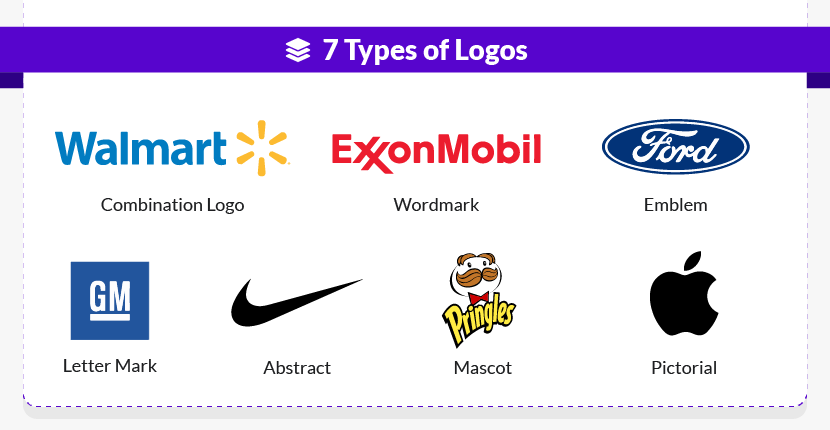
And the findings are pretty clear: combination logos rule! Of these top 500 companies, over 60% use combination logos.
The full breakdown is as follows:
- Combination logos – 307
- Wordmarks – 155
- Lettermarks – 24
- Emblems – 12
- Abstract icons – 1
- Pictorial icons – 1
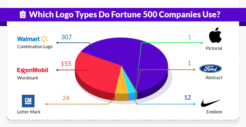
It’s no surprise that combination logos are so popular. By including both a wordmark and an icon, combination logos are incredibly versatile – allowing companies to use the icon, the text, or the full combination depending on the context of the logo.
In case you’re curious, the two companies that generally use stand-alone icons? They’re none other than Nike (abstract icon) and Apple (pictorial icon). No wordmark needed here!
 |
 |
2. The Most Popular Color Is Blue
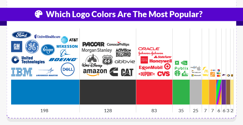
Among Fortune 500 companies, blue is the top logo color by far, accounting for nearly 40% of the entire list.
 |
 |
Want more detail? Here’s a look into the full logo breakdown by color, sorted from most popular color to least popular color:
- Blue – 198
- Black – 128
- Red – 83
- Green – 35
- Gray – 25
- Yellow – 7
- Orange – 7
- Multicolor – 6
- Purple – 6
- Brown – 3
- Metallic gold – 2
It may be the least popular logo color in terms of numbers, but gold definitely makes a statement! The two companies that use gold, Markel and MGM Resorts International, rely on this unique color choice to position themselves as high-end, luxury brands.
 |
 |
Since color alone accounts for up to 90% of a person’s first impression, it’s no wonder that color matters so much to logo design! (For a more in-depth look into the color psychology of logos, jump down to some stats about consumer perceptions.)
3. When Combining Colors, Two Is Standard
The color breakdown above is based on each logo’s main color. Of course, many logos utilize two, three, or even four colors at once – also shown in the blue logos from McKesson and Walmart above.
So what’s the most common number of colors within a single logo design? According to our research, two-color combinations are the most popular:
- 217 logos use two colors (43%)
- 186 logos use one color (37%)
- 68 logos use three colors (14%)
- 23 logos use four colors (5%)
And the final six logos (comprising less than 1%)? They’re multicolored, incorporating five colors or more.
 |
 |
 |
 |
4. Black and Red Is the Top Combination
So which two colors work best together? Of the 217 logos that use two colors, the three most popular color combinations are:
- Black and red – 39
- Black and blue – 22
- Black and white – 21
By choosing one of these two-color combinations for your logo, you’ll place your company (or your client’s company) on the same footing as household names like these:
 |
 |
 |
 |
 |
 |
5. Other Color Combinations Are More Unique
If you’d rather stand out than fit in, consider one of these two-color combinations for your logo – used by just one or two companies on the entire Fortune 500 list!
- Black and pink – AutoNation*
- Purple and orange – FedExᐩ
- Green and red – US Foods Holdings
- Orange and white – The Home Depot
- Purple and red – Mondelēz International
 |
 |
 |
 |
 |
*Pink is a very uncommon choice for logos, especially within the traditionally masculine automotive industry. However, AutoNation has used pale pink to create a brand identity built around its breast cancer charity work. Pretty remarkable!
ᐩCan you spot the hidden image in the FedEx logo? (Hint: Look between the “E” and the “x.”) Once you’ve seen the arrow pointing forward, you’ll never forget it! For a brand that’s always moving things forward, this clever design is exactly on-point – showing how white space can matter just as much as color!
6. What About Gradients?
Across the web and in print, gradients are super on-trend… but they haven’t caught on for too many of these Fortune 500 logos. Of these 500 global companies, just 34 logos incorporate gradients.
The five top-ranking companies with gradients in their logos are:
- Chevron (#11)
- Ford Motor Company (#12)
- General Motors (#13)
- United Parcel Service (#41)
- Procter & Gamble (#45)
 |
 |
 |
 |
 |
Gradients are also what transforms a normal beige-y brown into a shiny metallic gold, demonstrated in the Markel and MGM logos above.
7. Sans Serif Fonts Are In
Among these 500 logos, the most popular font style is sans serif. And we really mean popular! Take a look for yourself at just how common sans serif fonts are:
- 367 logos use sans serif fonts only (73%)
- 90 logos use serif fonts only (18%)
- 32 logos use some combination of sans serif and serif fonts (6%)
- 11 logos use some other font style, such as handwritten or script (2%)
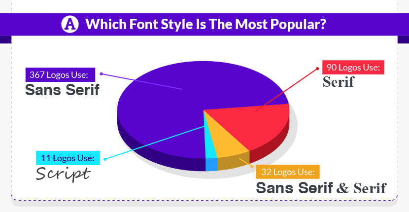
That means that three-quarters of all Fortune 500 logos use sans serif fonts! A few of the biggest names include:
 |
 |
 |
 |
 |
Although sans serif fonts have been around for centuries, they’ve exploded with the advent of computer technology.
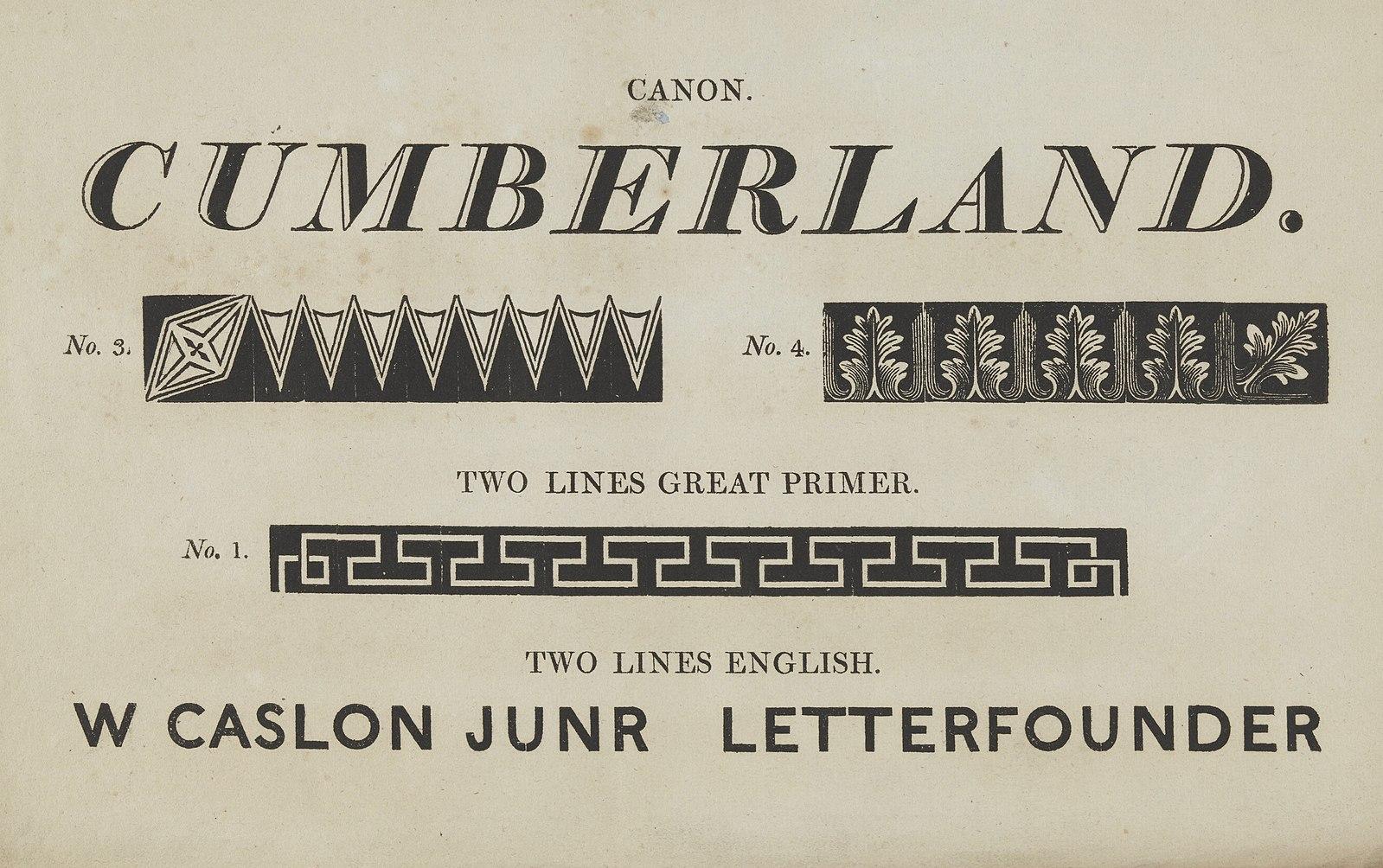
Fun fact: the first documented sans serif font was published by William Caslon IV in 1816.
Why? Because sans serif fonts are historically easier to read on screens. Better screen resolutions are making this “fact” less true by the year, but many companies are still rebranding away from serif fonts and toward sans serif fonts just to stay current.
8. To Capitalize or Not to Capitalize?
Some companies stylize their names differently in logos than they do in normal text. For instance, big-name companies such as Mastercard, eBay, and Intel have all chosen lowercase letters for their logos:
 |
 |
 |
These lowercase logos are definitely notable, but they’re actually the least popular text style of all Fortune 500 logos. Here’s the breakdown of capital vs lowercase letters in logos:
- All caps – 233 logos (47%)
- Title case – 167 logos (33%)
- Combination – 62 logos (12%)
- All lowercase – 38 logos (7%)
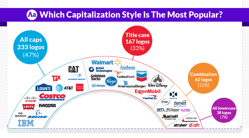
The choice to use lowercase, all-caps, or traditional title case depends on several factors, including brand identity, font choice, and even the length of the company name. If you’re trying to choose the best font and text style for a new logo, get more tips on wordmark logo design here.
A Look at Rebranding and Logo Redesign
One fascinating aspect of logo design isn’t necessarily the first iteration, but rather the inevitable redesign. Below are some interesting facts about rebranding and logo redesign – including when they work and when they don’t.
1. Why Companies Rebrand
Companies often rebrand as part of a merger or acquisition. A Landor Associates study found that 74% of S&P 100 companies rebranded an acquired asset within the first seven years.
But mergers and acquisitions aren’t the only reason for rebranding. Many companies also rebrand to try to turn around a failing business.
Take Apple, for instance.
When Steve Jobs returned to Apple in 1997, the company was on the verge of failure. But Apple’s logo redesign has been credited for at least part of its successful brand revival. That logo (1998) turned into a sleeker, single-color silhouette that looks just like the logo we all know today.

Other common reasons for corporate rebranding include:
- Change in leadership
- Outdated design trends that need to be modernized
- Growing portfolio of products and services
- Need to accommodate new platforms, such as digital spaces
- International expansion
- Attempted recovery from a scandal
2. Famous Logo Rebrands
Apple isn’t the only world-renowned company to have redesigned its logo as part of a shift in brand identity. Just in the past decade or so, other famous logo rebrands have included:
- Starbucks
- Microsoft
- eBay
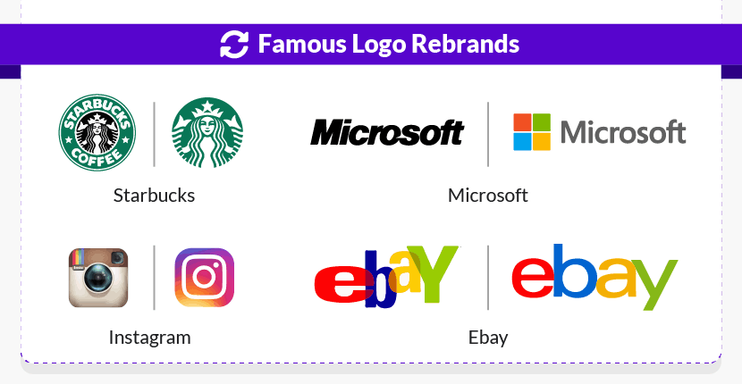
Not everyone was crazy about these new logos (especially when they first came out), but they weren’t a major PR disaster, either. Not like these next ones at least!
3. Infamous Logo Rebrands
A poorly executed rebrand can generate negative publicity and make customers question their trust in the company. Perhaps the best example is Gap’s logo redesign in 2010.
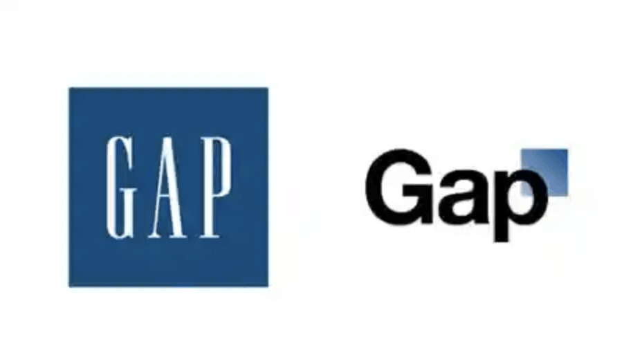
When Gap’s new logo was released (shown at right), there were 2,000+ comments on Facebook and 5,000+ followers on Twitter protesting almost immediately. Within days, Gap decided to revert to the old logo – losing an estimated $100 million in the process!
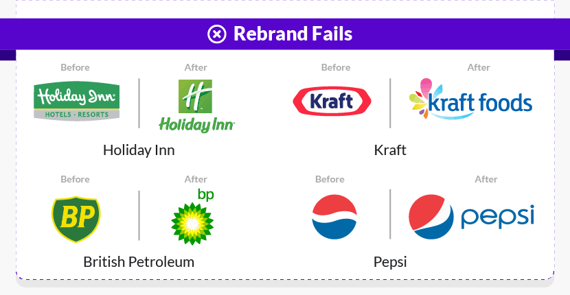
Other companies have become infamous for their rebranding attempts, too:
- New Coke (a failed drink recipe as well as failed branding)
- Kraft Foods
- British Petroleum (BP)
- The Metropolitan Museum of Art (the Met)
While Coke and Kraft eventually ditched their new logos, BP and the Met have stuck with them, for better or worse.
4. How Consumers React to Logo Redesigns
As those last two points demonstrate, rebranding can help cement a popular brand…or it can become a serious PR nightmare. And a University of Pittsburgh researcher may have found the difference!
According to this study, it is a consumer’s level of brand commitment that determines their reaction to redesigned logo shapes:
- Consumers who are strongly committed to a brand tend to react more negatively to a redesigned logo.
- Consumers who are not strongly committed to a brand tend to react more positively to the same rebrand.
The big takeaway? If you have raving fans already, you might want to reconsider that total logo makeover.
5. No Redesign Here: Tried-and-True Logos
An adage for engineering and marketing alike: why fix something that isn’t broken? Sometimes the best move for a brand isn’t to rebrand at all.
Here are some of the oldest logos still in use today:
- Stella Artois: Logo first used in 1366
- Bass Ale: Logo first used in 1876
- Levi Strauss: Logo first used in1886
- Twinings Tea: Logo first used in 1887
- Sherwin-Williams: Logo first used in 1905
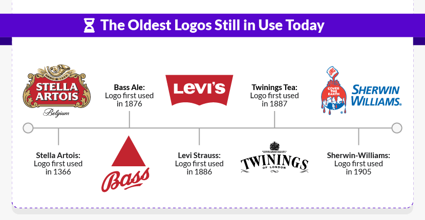
Although these logos have certainly evolved with the times, they’ve retained their primary design components and have largely resisted over-modernization.
The Logo Design Industry
Many best practices of logo design (e.g., simplicity and legibility) haven’t changed over the years, but the industry definitely has. The facts below cover more about where and how logos are designed today.
1. Agencies Are Still a Big Player
The days of Mad Men might be over, but many enterprise companies still rely on creative agencies. World-famous brands like L’Oréal, Unilever, FedEx, Nike, and Coca-Cola all turn to agencies for their branding and rebranding efforts.
One design agency in particular, Huge, is responsible for branding nearly 20% of the entire Fortune 100 list. Pretty impressive clientele, right?
2. But Big Agencies Are Too Costly for Most Small Businesses
Curious about how much these big-name companies pay their creative agencies? Specific prices and packages vary so much that it’s hard to nail down a specific price. However, price ranges of $25,000 to $100,000+ aren’t out of the question for logo design and brand strategy from a large, well-known agency.
Needless to say, these costs are far greater than what most businesses would be able or willing to pay. A survey of 1,500 small business owners by 99designs found that just 14% would spend more than $1,000 on a new logo (57% would pay $500 and 18% would pay up to $1,000).
3. In-House Design Happens, Too
Just because enterprise companies often work with dedicated creative agencies doesn’t mean that all of their branding is outsourced. Google’s latest logo (2015) was designed in-house, with input from logo designers across the country.
4. Freelancing Platforms Are Growing
It’s clear that creative agencies are still around…but thanks to the internet, they are no longer the only way to get professional branding. Online freelancing platforms have become a key tool for more affordable logo design services.
Calculated by the total number of users, the largest online freelancing platforms today are:
- Freelancer.com: More than 31 million users
- Upwork: More than 17 million users
- Fiverr: More than 7 million users
In terms of logo design specifically, here’s how these platforms stack up*:
- Freelancer.com: Over 118,000 logo designers
- Upwork: Over 300,000 logo designers
- Fiverr: Over 134,000 logo designers
*Based on a January 2021 search for logo design services
For more about freelancing in general, hop on over to our 45+ stats on freelancing.
5. Crowdsourcing: Not New but Popular
Crowdsourcing is another avenue for logo design today. If you aren’t familiar with the term, “crowdsourcing” allows you to harness the creativity of multiple designers within the same project. You have many designers design logos for you and then choose the best one from the crowd.
Although crowdsourced graphic design has exploded along with online freelancing platforms, it’s not a new concept. In fact, famous vehicle manufacturer Toyota crowdsourced its very first company logo back in 1936.
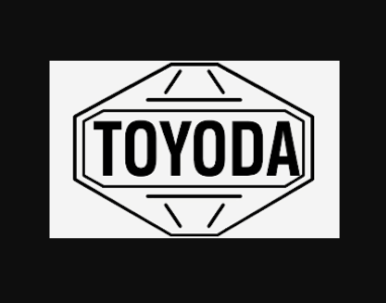
Toyota’s original logo was chosen from around 27,000 entries to a public logo design contest. It was made before the company changed its name from Toyoda (the founder’s last name) to Toyota, a word that sounds more catchy and uses a lucky number of strokes in Japanese.
6. Vector Graphics Software
Free and paid software like Adobe Illustrator, Adobe Photoshop, GIMP, Inkscape, and Sketch are the tools of choice for professional logo designers.
Technically, though, anyone can dive in and give the tools a try, even without any previous design background. For instance, Google’s first logo (1998) was made by its co-founder in GIMP, a free open-source program.
7. DIY Logo Makers Are Getting Better
Whereas vector graphics software can be expensive and difficult to master (even for professional designers), online logo makers are specifically designed to be affordable and beginner-friendly. On these websites, anyone can choose a logo template and then customize it through an in-browser editor.
The quality of logo templates, the number of customization options, and the price all vary a lot between these DIY logo makers. Some use artificial intelligence (AI) to generate unique logo designs based on user input as well.
While there aren’t public stats on how many companies use these programs, the logo makers themselves advertise a large user base:
- Canva claims to have 200,000+ business users on its logo maker program.
- Another DIY logo maker, Looka, advertises more than 3,241,627 business users.
These programs are pretty decent, but you should probably take those self-reported numbers with a grain of salt.
8. What About Stock Photos?
Okay, first of all, don’t use stock photos in your logo. But funny enough, now-famous social media giant Twitter did just that! Twitter paid $15 for its first bird logo, an image that was also available on iStockPhoto.
The company kept this stock photo bird as part of its brand until 2009.
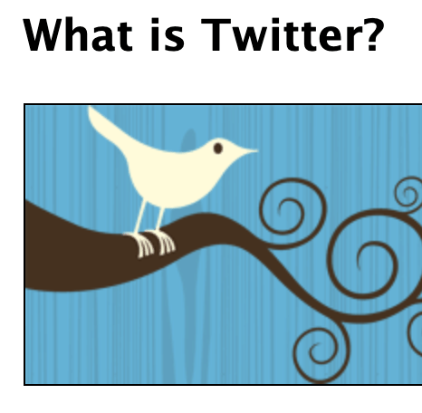
Free stock photos can certainly have some great uses…but logo design isn’t one of them! After all, your business logo can hardly be unique if literally anyone in the world could buy the exact same image.
The Logo/Graphic Design Industry
Who are logo designers today? And what’s the future of the design industry? Those are the questions that this next section sets out to answer. Because most graphic designers work in many different areas (not only logo design), we focused on the industry as a whole.
1. Self-Employment Is King
An analysis of market trends shows there were an estimated 273,000 graphic designers working in the United States in 2020. Here are the top five sources of employment for those designers:
- Self-employed – 20%
- Specialized design services – 10%
- Advertising, public relations, and related services – 8%
- Printing and related support activities – 7%
- Newspaper, periodical, book, and directory publishers – 5%
Nike’s logo was actually a freelance project, as Professor Phil Knight hired student Carolyn Davidson to create the now-iconic Nike swoosh. She spent a single day on the logo and was paid only $35! (Although she did later get 500 shares of Nike, which are now worth millions.)
2. Agencies Are Going Flexible, Too
According to research from The Creative Group, 76% of creative executives surveyed said that their companies offer some kind of flexible work program, such as:
- Part-time working
- Flex scheduling
- Telecommuting
- Remote work
Such growing flexibility may be necessary to retain creatives who would otherwise join the growing freelance workforce.
3. Job Growth Will Be Digital
Between 2021 and 2028, it is estimated that the field of graphic design will grow 13%. This increase is largely due to a projected recovery following the COVID-19 pandemic, during which graphic design employment declined. Digging a little deeper, we find an interesting pair of projections:
- Graphic design jobs in newspapers, periodicals, and books are expected to decline by 22%.
- Graphic design jobs in computer systems and related services are expected to grow by 24%.
The lesson here? Print may not quite be dead…but it doesn’t hold much market potential, either.
4. Formal Education vs. Skill-Based Training
Graphic designers are expected to face “strong competition” for jobs in the next ten years, which makes education and training even more important:
- Formal education: Graphic design jobs do not require a four-year degree, but many designers do have one. In the United States, there are around 350 degree programs accredited by the National Association of Schools of Art and Design (NASAD).
- Skill-based training: Since the highest percentage of designers are self-employed, it makes sense to look at freelancers’ opinions here, too. Of freelancers with a four-year degree, 93% say that skill training is useful, compared to only 79% who say their college education is useful.
- Self-taught: Around 17% of graphic designers surveyed in the most recent Design Census named “online learning” as part of their education. (Respondents could select more than one answer, though, so this does not necessarily preclude formal education, of which 32% selected “bachelor’s degree.”)
Skill training appears to be more important to employers, too. Around 45% of creative executives have said that it’s difficult to find highly skilled designers with diverse skill sets. Investing in new skills (e.g., copywriting, videography, UI/UX) can make logo designers much more hireable.
The Target Audience
Ultimately, logos aren’t about the creative agencies or individual designers behind them; they’re all about the customers! So let’s dive deeper into the target audience and their perception of logo design and branding in general.
1. First Impressions Happen Faster Than You Think
There are tons of numbers floating around the internet about how quickly first impressions are formed. While few of these studies have focused on logos alone, key findings point to the same fact: first impressions form in the blink of an eye.
- Psychologists have demonstrated that it takes just one-tenth of a second to form a first impression of a new person.
- A Google study has shown that visitors need just 50 milliseconds – or one-twentieth of a second – to form an opinion about a website.
So that age-old advice you’ve heard about having “10 seconds” or “20 seconds” to make a good impression with your logo? That’s probably way too generous.
2. Consistent Branding Matters
Sixty percent of millennials expect a consistent brand experience across all interactions with a company.
That means logos are now an even more prominent part of brand identity – in print, online, and especially on social media. (The small size of many social media profile images often makes logos the best, if not only, way to identify a company.)
A logo that looks poorly pasted onto a web page or thrown haphazardly onto ads won’t give that polished, consistent experience that customers expect today.
3. Color, Color, Color!
You may have heard the famous fact that “a signature color increases brand recognition by 80%.” As far as internet digging has shown, though, this figure has been taken out of context and is not really true.
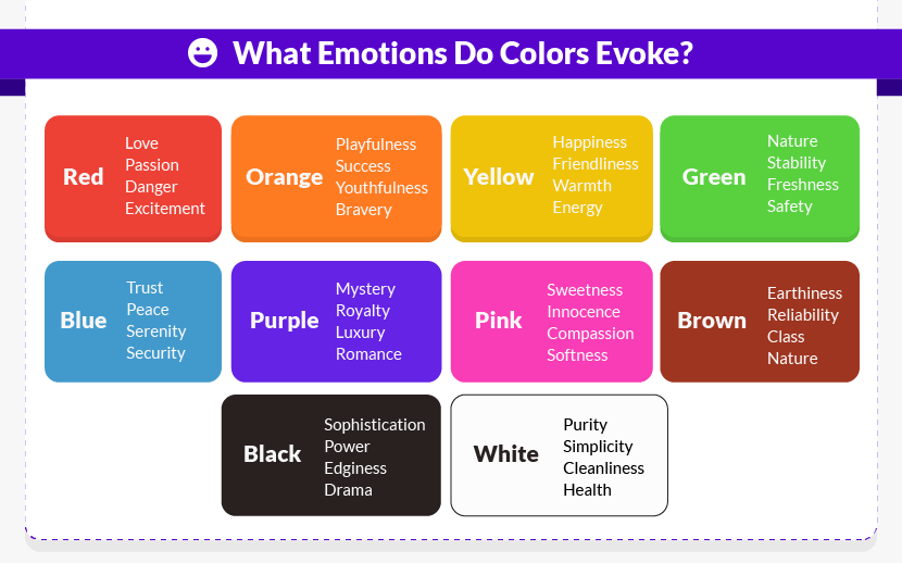
Nonetheless, there are reliable stats about color psychology out there. Academic researchers divide brand personality into five dimensions, each represented by certain colors:
- Competence: blue, black
- Excitement: red, orange, yellow
- Ruggedness: green, brown
- Sincerity: yellow, pink, white
- Sophistication: purple, white
If you think back to our own Fortune 500 research at the top of this article, this insight into color psychology probably won’t surprise you. It makes sense that nearly 40% of the world’s most successful businesses have chosen to brand themselves with blue – the color of competence.
Here’s another quick example of color psychology in action, from two of our Fortune 500 companies. Exciting red is the perfect choice for vibrant fast-food chain Yum China Holdings, whereas soothing blue is more fitting for investment management firm Prudential Financial.
 |
 |
Other color psychology studies have taken these general dimensions even further, adding more detailed descriptors and personality traits to each color.
4. Shape Matters, Too
A team of international researchers has found that consumers judge a brand based solely on the shape of its logo:
- An angular logo led viewers to rate a hypothetical pair of shoes as more durable.
- A circular logo for the same hypothetical pair of shoes led viewers to rate the product as more comfortable.
The idea of comfort extends far beyond physical hardness or softness, too. Round logos may suggest “softness” in terms of a company’s care, warmth, sensitivity, or friendliness.
5. Symmetrical vs. Asymmetrical Logos
Studies have shown that symmetry makes a difference in how consumers perceive logos, too. Several studies out of Carey Business School have found one significant trend: asymmetrical logos are perceived to be more exciting.
Burger King’s rebrand from the 1990s demonstrates this principle pretty clearly, moving away from its front-view, symmetrical logo to one that’s rotated off-center with upward-tilting text (adding extra highlights and a deep blue border, too).
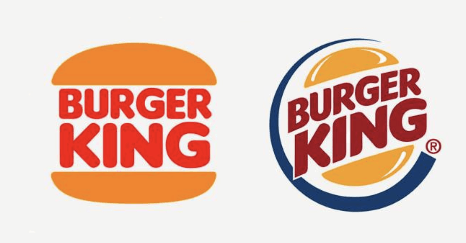
If your brand wants to be seen as serious and formal, then symmetrical may be the way to go – for something more exciting, try tilting your logo’s text or shape.
6. How Memorable Are Famous Logos?
One of the most important logo design principles is simplicity. In almost all cases, the simpler the logo design, the more memorable it will be – but just how memorable?
One unique study, Branded in Memory, tried to answer this question by asking 150 Americans to draw 10 famous logos from memory. The table below shows their results.
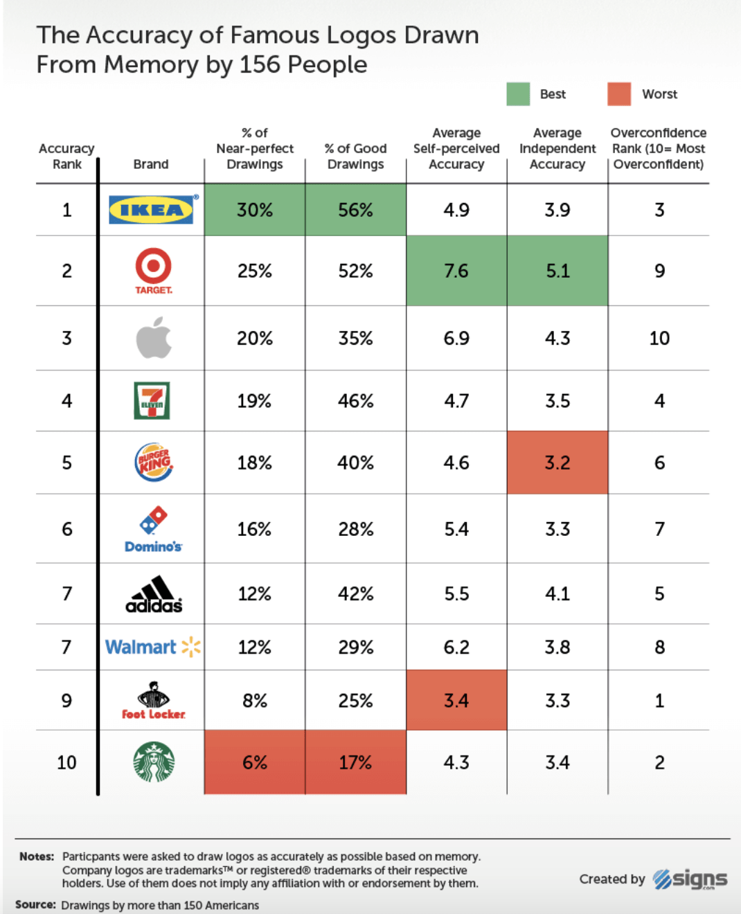
The takeaway from these hand-drawn results (which were often hilarious and can be viewed in their entirety here) is pretty clear: the simpler the logo, the easier to remember. Bold wordmarks like IKEA and simple pictorial marks like Target ranked at the very top.
A pretty neat way to validate one of the most important logo design conventions!
7. Consumers’ Memory of Color
It’s not too surprising that most people cannot accurately draw a logo from memory. What is surprising, though, is the fact that many people cannot accurately remember colors, either.
In a study where people were shown one color and then asked to correctly identify it from a selection of similar colors just five seconds later, they were correct only 40% of the time. By color, here’s how many participants got the color identification right:
- Yellow – 73%
- Orange – 35%
- Green – 13%
- Purple – 40%
That’s not to say that color doesn’t matter to your logo, as it clearly does (demonstrated by the color psychology facts above). It just means that very minor color variations may not be noticeable, and thus not worth stressing over.
Future Projections: Logo Design Moving Forward
So far, we’ve explored a ton of facts about logo trends, the graphic design industry, and even the consumers themselves. Now we’ll be diving into what’s next for logo design.
1. Technology Will Drive Changes
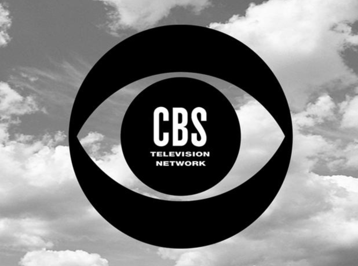
Every step forward in technology has led to changes in logo design. For instance, the advent of color TV in the 1960s led news channel CBS to create a brand-new full-color version of its famous eye logo.
 |
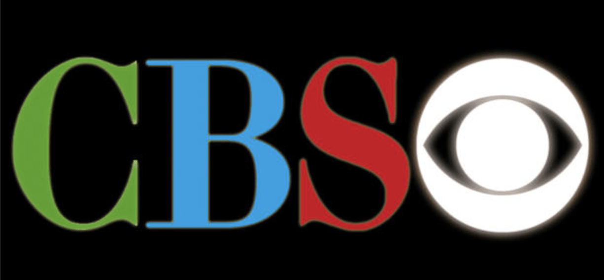 |
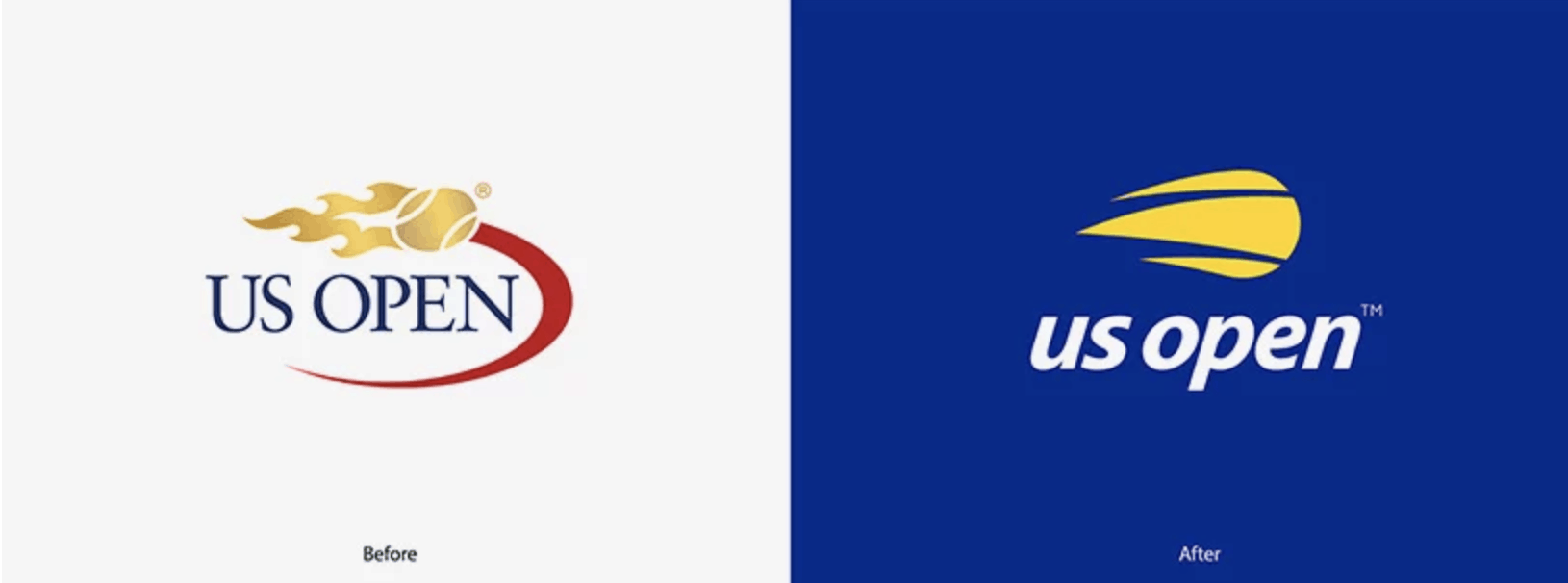
We’ve come a long way since 1965 and have now seen major logo design changes based on mobile technology. The US Open logo redesign (2019) is a good example of the shift toward minimal design and screen-friendly sans serif fonts.
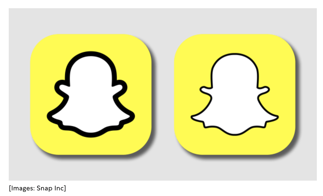
Another recent example is Snapchat’s bolded outline on its “Ghostface Chillah” logo (2019). Many users have expressed hatred for the new design, but others note that the bolded line is designed to be higher-contrast – a change made based on the limitations of those tiny smartphone app badges.
As touch technology, virtual reality (VR), and augmented reality (AR) become more prevalent in the future, logos will certainly reach new frontiers – many of which we can’t even guess at now.
2. Rise of Animation
We’ve seen a shift toward more interactive logos already, as faster internet connections have allowed for more complex web animations. Companies like Google, Netflix, and Skype have led the way with creative animated logo design.
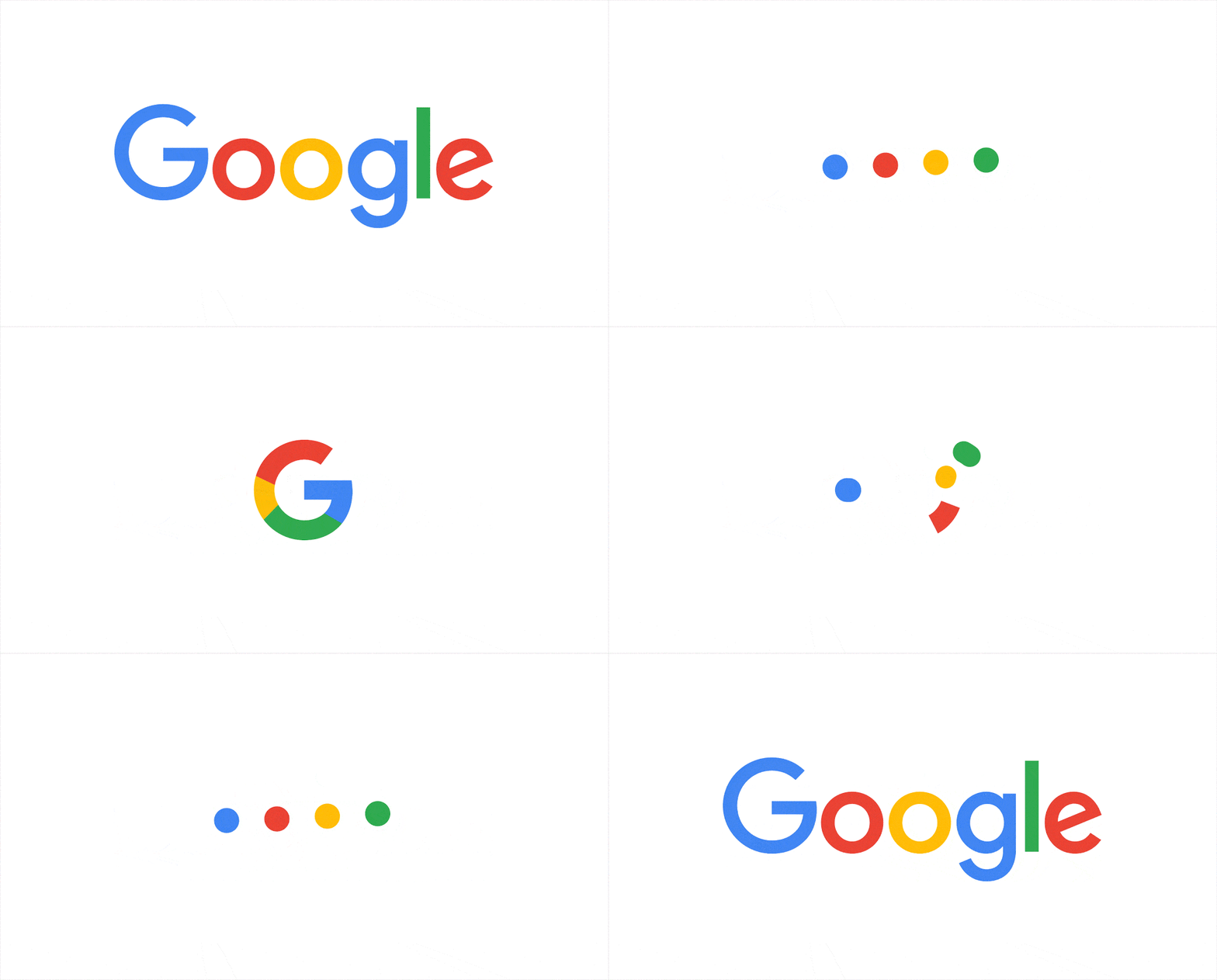
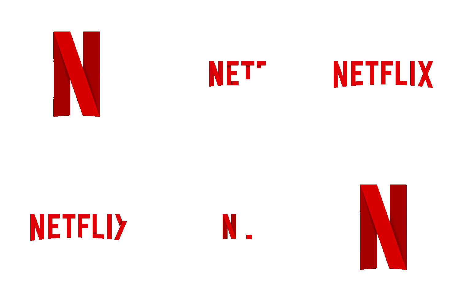
Here’s why animated logos are trending. Unlike a static logo design, they:
- Catch and hold viewers’ attention
- Can be incorporated into the overall user experience (e.g., used as loading screens)
- Position companies as technologically savvy, thus more trustworthy for the modern consumer
Animated logos are definitely on the rise, but they’re not new, either! As early as 1928, MGM Studios pioneered the animated logo with their first real lion mascot, Jackie, roaring at the start of every movie.

3. Importance of Dynamic Logos
A similar concept is the rise of dynamic logos, or logo designs that can be easily adapted for different contexts and devices without losing the brand’s core identity.
We’ve mentioned Google a bunch already, but it’s worth noting that Google used a dynamic logo back in 1998, altering its homepage logo with a stick figure representing the iconic Burning Man festival.
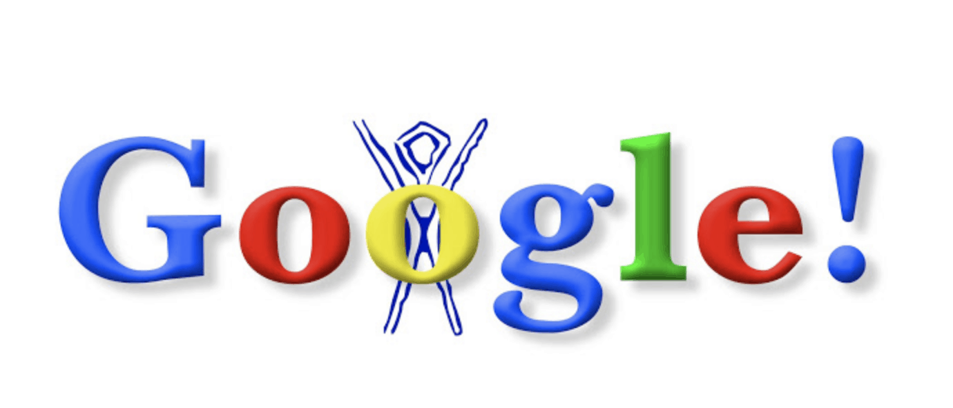
The original (1998) Google Doodle that started it all, showing a rough sketch of the famous Burning Man
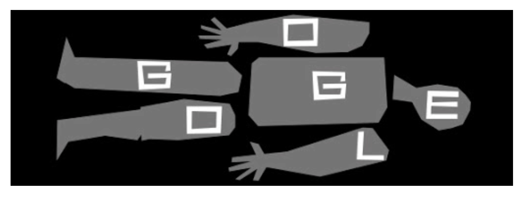
This Doodle from May 2013 celebrates the 93rd birthday of Saul Bass, one of the world’s most famous graphic designers (who we highlight more below!)
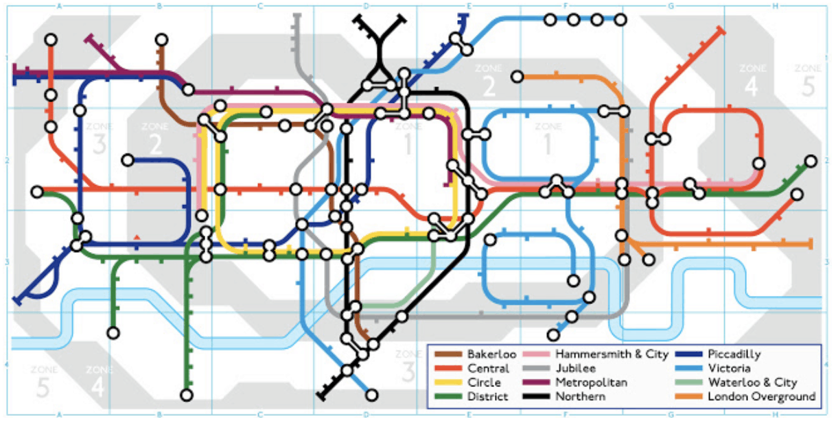
This super-complex Doodle celebrates the 150th anniversary of London’s Tube in 2013.
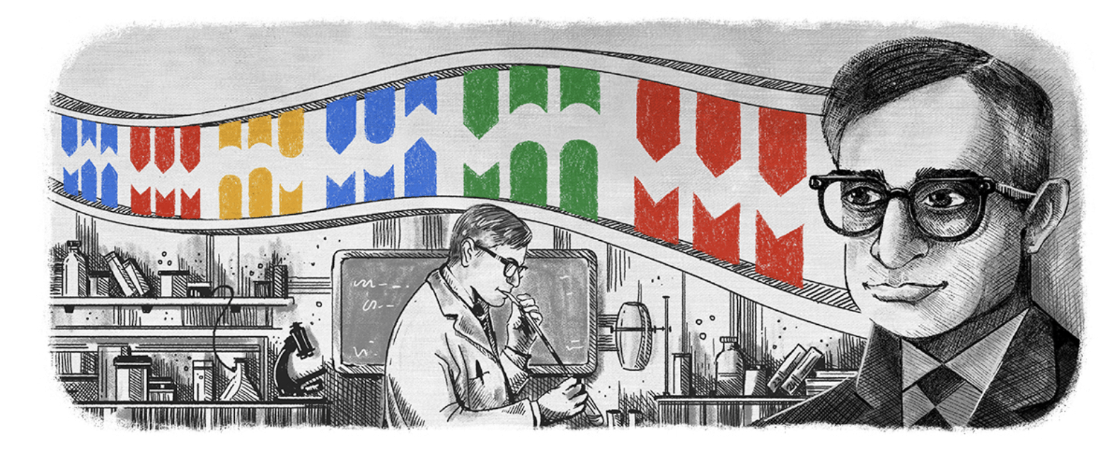
Eliminating text altogether, this Doodle celebrates the 96th birthday of Har Gobind Khorana, a pioneer in DNA research.
Fortunately, dynamic logos today look far less homemade than the first Burning Man doodle (sorry, Google). In recent years, three big brands stand out for their skillful execution of a dynamic logo:
- Ikea – a new white logo (2019) with a transparent background that can be placed over virtually any GIF or still image
- Spotify – a global rebrand (2015) that expanded the brand colors from two to 31 and introduced trend-setting duotone effects
- City of Melbourne – dynamic letter forms created in different geometric styles and vibrant color palettes
More Fun Facts About Logos
Last but not least, let’s talk about some random fun facts and interesting trivia about logos and branding throughout history. Just had to share some fun before you go!
1. Oldest Trademarked Logos
Curious about some of the oldest logos in the world? It’s hard to track exactly when famous logos first appeared, but a look at registered trademark records can give some insight:
- 1874 – Nestle’s Eagle Brand (first registered trademark in Hong Kong)
- 1875 – Bass Ale (first registered trademark in the UK)
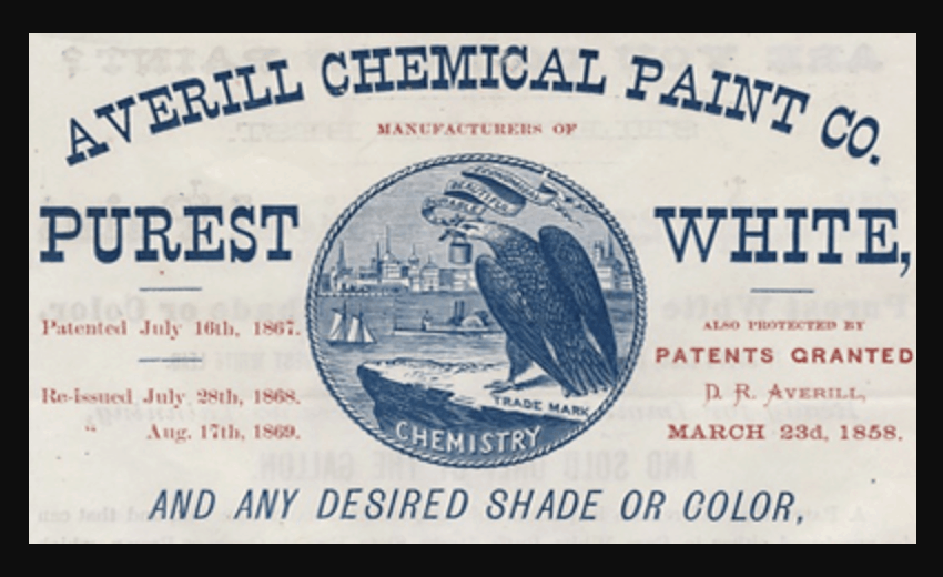
- 1870 – Averill Chemical Paint Company (first registered trademark in the US)
Read more about how and why to trademark a logo.
2. Can You Trademark a Color?
You can unmistakably trademark the distinct blend of shape, text, layout, and color that constitutes a logo. However, what happens when considering the sole trademarking of a signature color?
That’s what high-end shoe designer Christian Louboutin tried to do. Instead of his logo alone, he sought to protect his famous red-soled stilettos by filing a trademark for exclusive use of Pantone color 18 1663TP.
The case will likely be appealed, but Louboutin’s request to trademark a color was denied in 2018 under EU trademark law.
3. Most Expensive Logos in the World
Let’s start by saying that it’s impossible to name the most expensive logo ever, since 1) most companies don’t publicly announce their branding costs and 2) most logo designs for enterprise companies come with a complete brand strategy and/or acquisition package.
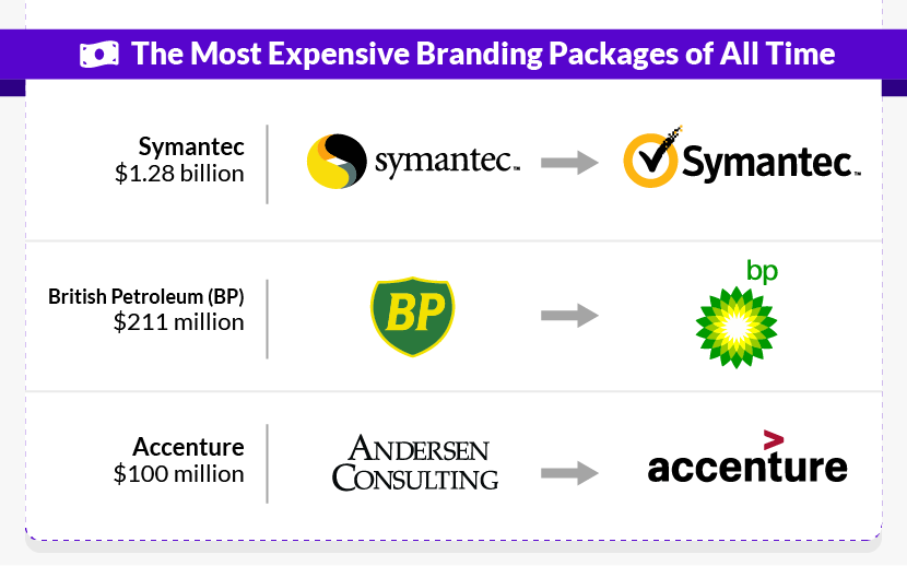
With that in mind, though, here are some figures for some of the most expensive branding packages of all time:
- Symantec – paid $1.28 billion to acquire VeriSign, including the rights to VeriSign’s famous checkbox logo
- British Petroleum (BP) – paid $211 million for rebranding, including a controversial logo redesign by agency Landor Associates (named as a rebrand failure above)
- Accenture – paid $100 million to rebrand from Andersen Consulting to Accenture, including a brand-new logo design
4. Salvador Dali, Logo Designer?
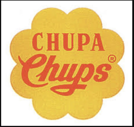
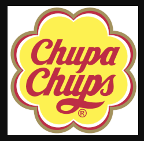
He may be known for his surrealist paintings and wacky mustache, but Salvador Dali also designed one of the most well-known logos in the candy industry! In 1969, he created the logo for Spanish lollipop maker Chupa Chups, and a similar design is still in use today.
 |
 |
5. Most Prolific Logo Designer
Salvador Dali could be considered a one-hit-wonder in terms of logo design, but Saul Bass is anything but. Probably the most influential graphic designer of the 20th century, Bass is known for both the quantity and quality of logos he created.
Across tons of industries, Saul Bass designed some of the most recognizable logos of all time:
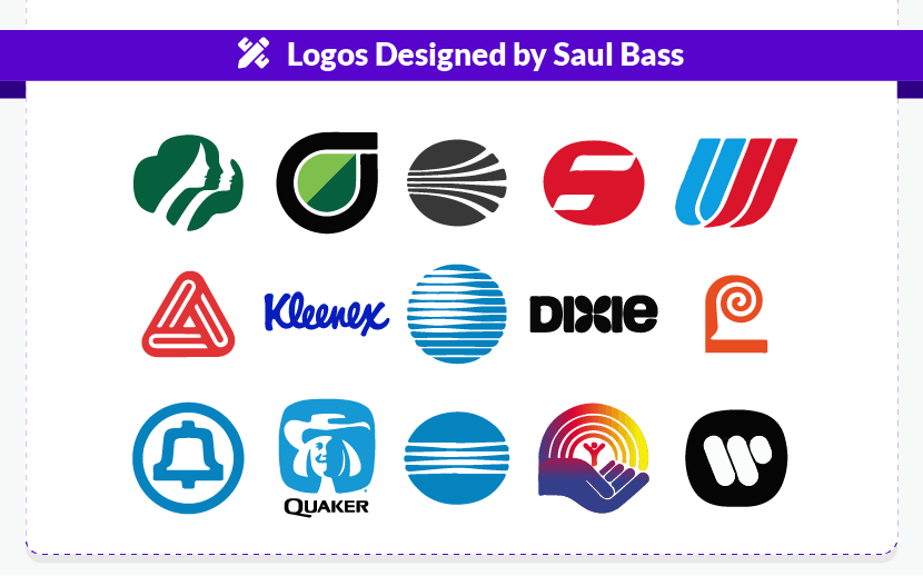
30 More Stats
- A colored logo design increases brand recognition by up to 80%
- 84% of B2B marketers believe brand awareness is a major objective for their business
- Companies with poor branding and logo design pay 10% more on salaries
- 59% of shoppers prefer to buy from recognizable brands
- Due to COVID-19, it’s estimated that the graphic design market shrunk by 14.8% in 2020
- In 2021, the graphic design market was worth $12.7 billion in the US
- There were over 400,000 US businesses working with graphic designers in 2020
- The trademark for a logo lasts 10 years
- It costs $325 to submit a basic logo trademark application
- It takes an average of 5-7 impressions before someone recognizes a brand
- The consistent presentation of a brand can increase sales by 23%
- The Coca-Cola logo is recognizable by 94% of the world’s population
- It takes 10 seconds for customers to form an opinion of a brand
- 600 design logos have been won by identity designer Jeff Fisher
- The 5 most successful logos of 2020 are Amazon, Google, Apple, Microsoft, and Samsung
- The majority of Millennials expect a consistent branding experience (60%)
- A lawsuit was filed against Nike in 2010 for their logo, and its similarities with cigarette brand Newport
- The 2016 Uber logo became the most hated logo of the decade
- Female graphic designers earn 6% less than male graphic designers
- On average, creative design-led companies obtain 1.5X greater market share
- The Johnson & Johnson logo was first used in 1987
- It takes an average of just 15 minutes to create a logo on a free-to-use platform
- More than half of small businesses take logo design into their own hands
- Over the last 100 years, MGM has changed its logo 12 times
- Paul Rand’s IBM logo, created in 1972, hasn’t been changed to this date
- Two most famed logo fonts, Helvetica and Univers, were created in 1957
- 400 milliseconds is all it takes for your brain to process a logo
- SMBs account for 80% of all design crowdsourcing
- The first apple logo was multicolored so as to advertise the Mac’s colored screen
- Saul Bass logos last an average of 34 years
The Takeaway
Whether you’re a data geek with an eye for design or a new designer looking to expand your knowledge base, you’re hopefully more familiar with where the industry has been, where it is now, and where it’s headed in the future. Who knows? With this new knowledge and a little creativity, you may just be the highlight of our next logo design service list!
FAQ
What is the most popular logo type?
How are logos designed today?
Why do companies rebrand?
How do I create a professional logo?
Sources
https:// www.colorcom.com/research/why-color-matters
https:// landor.com/news/landor-ma-brand-study-first-quantitative-ma-brand-benchmark
https:// www.brandingstrategyinsider.com/2018/06/10-reasons-for-corporate-rebranding.html
https:// www.theguardian.com/media/2010/oct/12/gap-logo-redesign
https:// www.canny-creative.com/10-rebranding-failures-how-much-they-cost/
https:// www.nytimes.com/2016/02/19/arts/the-met-and-a-new-logo.html
http:// d-scholarship.pitt.edu/9746/1/mfwalsh_dissertation.pdf
https:// www.msn.com/en-us/money/companies/the-oldest-corporate-logos-in-the-world/ar-BBVxDcH
https:// penji.co/best-design-agencies/
https:// designshack.net/articles/business-articles/how-much-does-logo-design-cost/
https:// justcreative.com/2018/11/26/logo-design-cost/
https:// visual.ly/community/infographic/business/does-design-matter-99designs-survey-1500-small-businesses-and
https:// fci.nl/about-factoring/crowdsourcing_mikhail-treyvish.pdf
https:// gizmodo.com/the-evolution-of-googles-iconic-logo-1582297667
https:// www.entrepreneur.com/article/217730
https:// web.archive.org/web/20071129012347/http://twitter.com/
https:// www.bls.gov/ooh/arts-and-design/graphic-designers.htm
https:// blog.designbro.com/ten-most-expensive-logos/
https:// nasad.arts-accredit.org/directory-lists/accredited-institutions/search/?institutionname=&city=&state=&country=&search=true
http:// gdusa.com/career/get-a-peek-into-the-job-market-for-designers-in-2018
https:// conversionxl.com/blog/first-impressions-matter-the-importance-of-great-visual-design/
https:// visual.ly/community/infographic/technology/branding-across-new-digital-environments
https:// www.nickkolenda.com/color-psychology/#color-brand-personality
https:// www.psychologicalscience.org/news/minds-business/the-shape-of-a-logo-has-a-powerful-impact-on-consumers120911.html
https:// hub.jhu.edu/magazine/2019/spring/tilted-logos-consumer-psychology/
https:// www.signs.com/branded-in-memory/
https:// www.cbsnews.com/pictures/the-evolution-of-the-cbs-eye/5/
https:// www.designboom.com/design/us-open-rebrand-tennis-chermayeff-geismar-haviv-03-20-2018/
https:// www.fastcompany.com/90389667/the-real-reason-snap-changed-its-logo
https:// www.logodesignlove.com
https:// www.blog.google/inside-google/doodles/doodle-me-20-notable-doodles-google-history/
https:// www.dossey.com/blog/2015/march/oldest-trademarks-in-the-world/
http:// respectfortrademarks.org/wp/timeline/13.jpg
https:// knowledge.wharton.upenn.edu/article/louboutin-red-soles/
https:// www.brandsdesign.com/blog/most-expensive-logos/
https:// designcensus.org/





![13 Best Logo Makers That Are Free To Try (& Good) [2026]](https://dt2sdf0db8zob.cloudfront.net/wp-content/uploads/2018/08/LD-best-free-cheap-850x446.jpg)
![13 Best Logo Makers That Are Free To Try (& Good) [2026]](https://dt2sdf0db8zob.cloudfront.net/wp-content/uploads/2020/09/1.jpg)
