Inside this Article
Branded: The Purpose of a Logo
A logo is intended to embody the essence of your business and create a means by which potential customers can instantly recognize your brand. It should be versatile enough that it can be applied to various platforms, giving your business a consistent image on everything from your website to your mobile app. While you want it to be current, you also want it to be timeless so it’s important to consider if the latest trends really embody your product or just boost your ego, after all, you don’t want it to be so trendy that, by next year, it already looks out of date. Clear lines and simple forms are at the center of any good logo design, especially in 2018 which sees form simplification continuing its former popularity and going one step further in terms of minimalistic design.Rainbows Reign: Shades of 2018
The past few years have seen an upsurge of white space and negative color usage, but designers are finally ditching the minimalist approach. With a mobile website, essential features, including large images and complex details, are giving way to bright, brash colors. Using too many different colors in a logo design can be counterproductive, however, and it is often those with a limited color scheme that prove the most memorable. Given that a logo will usually appear on a range of different platforms and products, by associating a business with a single color, it becomes easier to maintain consistency.Form Simplification
In 2018, numerous graphic designers are shifting their focus from the clean, minimalist lines that characterized logo design in the previous year. However, the yearning for simplicity continues to hold a significant influence. Employing words to generate distinct silhouettes or outlines enables the crafting of a captivating and versatile logo. This logo remains adaptable to various platforms without any compromise on quality. Achieving an edgy aesthetic becomes feasible through the utilization of a straightforward font, making slight spacing adjustments, and employing clever letter stacking techniques.Figure it out with Simple Shapes
Simple shapes, like circles, rectangles, and lines, can add consistency to your logo. By creating balance, the logo is easier on the eye and encourages brand recall – the audience is drawn in and retains that image, making an automatic connection between image and product. The increasing popularity of smartphones has had a marked effect on all aspects of website design, including logos. With large images falling by the wayside, designers are focussing increasingly on illustrations and icons that are quirky, quicker to upload and easier to understand. As a part of the website, the logo needs to fit seamlessly into the whole design, which is why many companies choose to outsource their logo creation to a professional graphic designer.Slices of Space
Simple concepts can have dramatic results, and utilizing effects such as logotypes, letter stacking, and negative space are great ways to achieve brand retention. Elegant shapes have been used to great effect by the likes of Samsung and Google, whose logos are known and remembered globally. Nike’s timeless logo epitomizes the use of graphic elements to create balance within the design and the company’s success speaks for itself. Another great way to add a more striking visual is through the use of overlapping shapes and bold colors, like those applied in the Mastercard logo design. Overlapping elements can produce a sense of movement as well as adding depth to a design without over-complicating it.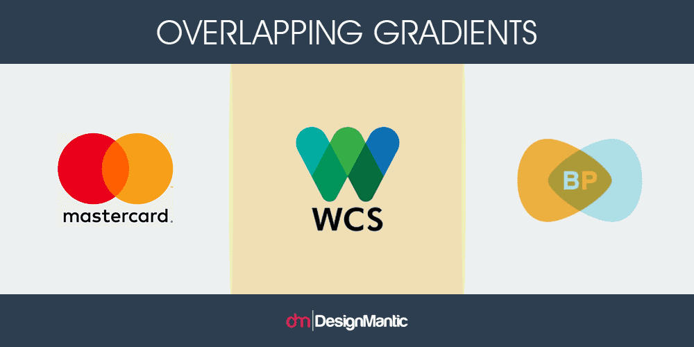
Hell-vetica: Fonts that Fail
As with any design, there are as many counter-trends as there are trends and designers are currently steering clear of certain elements that, through overuse, have become trivial to the point of being banal. For a while, Comic Sans was the typeface of the moment, and then Helvetica took over as a symbol of the minimalist aesthetic. Described by some as being a “neo-grotesque” font, Helvetica has had its day in the sun and designers are deviating into some of the less explored typefaces available. Emerging typefaces include the hugely versatile Opposit from the Good Type Foundry; the colorful and charming Trade Gothic Display from Monotype; and the ultimately logo-friendly Mont from Fontfabric with its distinctive look and wide weight variation.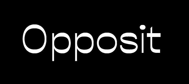
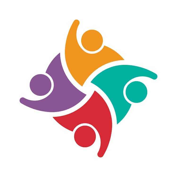
Why Swooshing is Off the Cards
That standard swoosh figure looked good for years and did exactly what it was designed to do, bringing humanity to the heart of many logo designs. The swoosh humanoid, with its gender-neutrality and flowing movement, gave many of companies a clear figurehead, but the stylized look is losing its momentum. The swoosh figure is now indicative of a lackluster design and a company that sees its customers as a bland collective rather than a group of creative, imaginative individuals. The precise styling inspired by technological advances of previous years looks set to give way to a more humanized approach where artful imperfection engages the audience with humanity and warmth.