Inside this Article
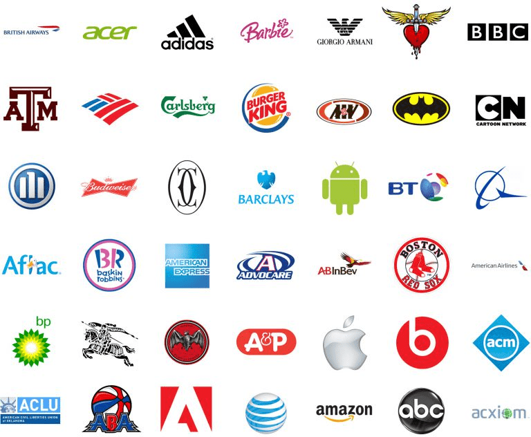
Considering this, it’s massively important to create a workable logo! However, most companies believe they’d need a huge budget. But in reality, the cost of your logo doesn’t determine your success. Twitter paid only $15 for their design, the Nike tick cost just $35, and Microsoft designed their logo internally for free! If your business doesn’t have the revenue to employ a fancy design company, don’t worry! This guide will help you create a functional, memorable logo for little-to-no cost.
#1: Choose Your Logotype
 The first step is to decide on the type of logo you want. All options can be broken down into four categories, although you can combine two or more of them. To determine the ideal kind for your business, carefully consider its aim and confirm which style would best achieve its goals.
- Wordmarks. These logos are comprised of a full word or abbreviation of the company name. Coca-Cola and CNN are good examples. Wordmarks usually use creative fonts to help them stand out and give an extra pinch of uniqueness. The benefit of these logos is that your business name is communicated directly to anyone who sees them.
- Letterform. Unlike wordmarks, some companies opt to shorten their name to the first letter and use this to create an aesthetically pleasing logo. Some common examples include the golden arches of McDonald’s or the stylized “B” of Beats by Dr. Dre. These logos are useful, as they can be scaled easily for different purposes.
- Pictorial. Any logo that uses a picture is categorized as a pictorial. The image usually relates to the name or purpose of the business, so it’s able to communicate the company message. These logos are often the most memorable and recognizable, as humans process images 60,000 times faster than we process words. Consider how easy it is to remember the logo for Twitter or Target, for example.
- Abstract. If a company uses an image or shape that doesn’t immediately relate to their goals, then it’s an abstract logo. While this type is often the hardest to pull off — as it doesn’t naturally communicate your brand ethos — they are also known to become classics. The Nike tick and the new Pepsi logo are good examples.
#2: Hire Help
Just because your company doesn’t have a considerable budget to hire a design firm doesn’t mean you can’t get input for your design. Freelance designers can be employed for a significantly lower price. Similarly, many AI bots exist that will create logos automatically, based on your company aims.- Work with a Freelance Designer. Branding expert Alina Wheeler commented on the benefits of hiring professional help: “Working with a skilled graphic designer is really critical. They understand what a good logo is and how it needs to scale and function across different media and marketing channels.”
- Use a Logo Maker. If you don’t have the time or money for professional help, you can use an automated logo maker such as Tailor Brands. Visit the website, and you’ll be asked to input your company name and answer questions about your industry, logotype, and font preferences. Once completed, you’ll get a unique image specifically for your business — plus, it’s free!
#3: Appeal to Your Target Audience
Knowing your target market is vital for successful marketing. In a recent survey commissioned by the Digital Advertising Alliance, 40.5% of respondents said they preferred ads that were specifically aimed at them. If you can communicate with customers via you branding, then you’ve already done a significant amount of the work. When building a company logo that’s directed at your audience, you need to consider your brand personality.- Youthful. Bold, exciting designs appeal to younger customers or those who’ve retained a youthful mindset.
- Sentimental. Some brands capitalize on their thoughtfulness and kindness. Curves, soft colors, and cute images convey a comforting vibe that’s ideal for sentimental companies like wellbeing brands, vintage shops, etc.
- Rugged. Brands with strong shapes, angles, and colors appeal to the rough and outdoorsy types. These brands generally have a masculine tone.
- Influential. Brands that aim to be an authority in their industry have to communicate a sense of leadership. Aim to be strong and bold, without being too bright or flashy.
- Luxurious. Elegance is a key feature for luxury brands. That’s best achieved through deep, rich colors. Also, try to stick to a simple design, as too many elements can quickly look cheap and tacky.
- Alluring. Some exclusive businesses communicate their alluring nature by creating a sensual mood in their branding. Passionate colors, such a red and pink, are ideal for this company type.
- Color
- Shape
- Icon
- Image
- Font
#4: Consider Your Competition
Creating a logo based on your target audience is a good step, but it does have a potential pitfall. Your competitors will be working in the same market and might end up producing similar branding. This could jeopardize your marketing, as being confused for your competitor may drive sales away.To avoid this problem, research your competitors. You can use the following methods:
- Google Search. A quick search for your specific niche keywords should bring up a list of similar businesses. Make notes establishing how closely you are competing with each.
- SpyFu. Once you know the competing brands, SpyFu is an excellent resource for finding more information. You can search any domain, and it will provide results about their keywords, AdWords purchases, organic ranking and ad variations.
- Google Trends. Searching trends can also be useful for finding similar brands. You can explore any search term, and you’ll receive analytics on that keyword, including companies already ranking well.
- Your Customers. Asking consumers provides primary data on your industry. Try sending your subscriber list a survey and use social media to gain responses.
- Different Color Pallet
- Different Icons/Images
- Different Font
#5: Understand Basic Design Elements
Once you’ve created a concept for your design, it’s time to tackle the smaller details. While hiring a designer is always preferable, it’s possible to create a versatile and appropriate logo just by understanding the basic concepts of design.White Space
White space (or negative space) refers to the parts of your logo that make up the background. Most successful logos are perfectly balanced, so there’s an equal distance between the icon and the edge of the images on every side. It can be varied, such as by having more space in the horizontal edges and less in the vertical, but being off-center on either axis is not a good look! Also, many companies choose to utilize the white space to portray their message further. For example, the FedEx logo has a gap between the “E” and “x” that makes the shape of an arrow – a symbol which is synonymous with transporting or moving: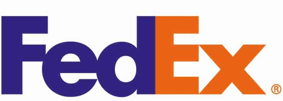
Color Choices
Of the world’s most famous logos, 95% use one or two colors. The reason for this is that colors have an incredible emotion connection and can inspire mood unlike anything else. Look at the following and decide which color scheme best suits your brand. And remember, you don’t have to stick to just one!- Red – excitement, passion, anger
- Orange –invigorating, playful
- Green – ecological, nature; OR finance, prosperity
- Yellow – friendliness, accessibility
- Purple – elegant, luxurious
- Blue – trustworthy, secure, mature
- Pink – flirty, girly, fun
- Brown – rugged, masculine, outdoorsy
- Black – sleek, modern
Shape Psychology
Like color, shapes also communicate specific meanings and feelings. Utilizing shape psychology is a much subtler way to express your brand personality. Often, you have to really look at logos to see their use of shape.- Circles represent unity and community, presenting a united front.
- Squares denote balance, trust, professionalism, and security.
- Triangles symbolize power, masculinity, and stability.
Scaling
Scaling is an essential factor when it comes to logo design. You need to know what platforms the image will be hosted on to get an idea of how best to scale it. For example, your logo could be on a social media picture, a shop front, your website, and — as it’s the most common way to access the internet — on mobile screens. Of the world’s most popular logos, 93% are simple enough to be viewable in smaller sizes, which emphasizes how important this element is to success. Of course, the best way to achieve this is through minimalism, as simple icons will look good at any size. You could also develop slight variations for different platforms, as Disney has. Disney’s full logo includes their brand name, in front of the Disney Castle surrounded by a rainbow; when scaled they use only the stylized D.Fonts
Effective communication of meaning relies on fonts. Although a naturally gifted calligraphy artist might favor a personalized font, not everyone possesses this skill. If you encounter difficulty in discovering distinct lettering, remember that Google fonts offer a selection of more than 800 free typography styles for you to choose from. It’s critical that your font choice parallel your branding and personality. Similar rules apply to those in shape psychology:- Bold, angular fonts convey strength and reliability.
- Whimsical fonts are youthful and fun.
- Script fonts can give the impression of elegance and luxury.
- Bold, bubble fonts are exciting and inclusive.
Images
Images are a key part of many successful logos. However, you can’t just use a piece of clip art and expect it to work. Much effort goes into creating the perfect image for a logo. If you want to take this avenue, consider these three elements:- Symmetry & Proportion. Most designers use basic shapes to create the size and structure of the logo. Using these templates helps create aesthetically pleasing designs with the right angles and proportions.
- Deeper Meaning. Adding a visual meaning that goes deeper than just using a relevant image will make your logo memorable and impactful. Consider the Apple logo: While the outline of an apple is not particularly impressive, the bite taken out of it represents a computer byte and gives it more context.
- Clichés. Using clichéd images is never a winning formula. For example, an airline company should never use just a picture of an airplane. Using stereotypes is okay if you can cleverly incorporate them into the design. For example, the Burger King logo is the brand name inside a burger.