9 Best Logo Design Services & Online Logo Makers [2026]
The biggest logo design service comparison ever performed
We tested all the major online logo makers and logo design platforms in search of the best new logo for Website Planet. We found a winner, and it is now the official logo for our site!


Your logo is the face of your brand, and it deserves love and attention. While you could hire a professional agency to design yours for thousands of dollars, there’s no guarantee you’ll be satisfied with the result.
Traditional design agencies are a relic of the past. By using an online logo design platform, you can receive equally good designs – if not better – much quicker and for a fraction of the cost. But with so many options, how will you know which platform’s right for you?
That’s where I come in. As a long-time graphic designer and part of the Website Planet team, I set out on a quest to find the best new logo for our site. I spent months testing all the major logo design platforms to see where I could get the highest quality for the best price. Services with intuitive interfaces, easy hiring processes, and excellent customer support earned extra points.
Only the best logo design services that met my strict standards made the shortlist. Look at the final designs below, consider each platform’s strengths, and pick one that ticks all the right boxes for you. You can also jump down to learn more about how I evaluated these logo design services and my design process. I’ll also share some advice on what makes a good logo design.
-

- The lowest prices for professional design
- Thousands of gigs and design styles available
- Best way to get high-quality logos fast
- Starting price: $5
I tested several different designers on Fiverr to see the quality I could get at different price points. In general, I like how the platform works. There’s a handy logo design search wizard that helps you find the perfect designer for your project. You can browse designers’ profiles to see their past work and feedback from other clients, and the messaging system is quick and easy.
But what’s really interesting about Fiverr is the quality of work you can get for such low prices. I’ll admit I was a bit skeptical about having a logo designed for only $5. But I was pleasantly surprised with what I got, both from the inexpensive designers and the pricier “Fiverr Pro” I hired – and I’d definitely feel comfortable using Fiverr for future projects.
While you may still want to mess around with a DIY logo maker to create something for yourself, I have to admit that hiring a freelancer on Fiverr to do the work for you is a hard deal to beat. Plus, Fiverr is generally cheaper than the leading logo services and you’ll get a custom-made logo that you know no one else is going to have. You could even hire several different designers and run a little “design contest” of your own.
More on Fiverr Logo Design
Visit Fiverr Logo Design > -
- Powerful wizard can generate 100s of logo options
- Inspiration and logo ideas from thousands of curated designs
- Free to try; pay only if you like the logo
- Starting price: $20
Looka’s user-friendly AI logo tool quickly generates high-quality logos by asking for basic inputs like your company name and industry. I was impressed by Looka’s ability to generate modern, well-designed logos. You get numerous design options that can be customized to match your brand’s identity.
One of Looka’s strengths is its comprehensive Brand Kit, which includes over 300 branded templates. These templates cover a wide range of uses, such as social media posts, business cards, email signatures, and more. This helps maintain consistency across all your marketing materials, making your brand look cohesive and professional from the start.
While I like Looka’s logo maker, I found its logo editor quite limited – you can’t drag and drop elements and place them wherever you want. As a designer, I understand why it works this way: the layout and spacing have been carefully calculated, and the system prevents users from accidentally messing things up. Still, I would have appreciated the option to remove these guardrails and customize my logo even more.
Looka provides crisp, high-resolution PNG and JPG files for online and offline use, as well as scalable SVG and EPS files, ideal for printing at any size. It also offers additional features like a drag-and-drop website builder and a print shop for merchandise like T-shirts and mugs.
More on Looka
Visit Looka > -
- Run contests and receive 30+ designs with each request
- Full refund within 60 days if you don’t like any of the logos
- Option to work with a designer one-on-one
- Starting price: $109
DesignCrowd connects you with a global network of professional designers through its crowdsourcing model. You start by submitting a detailed brief, and designers from around the world submit their design proposals.
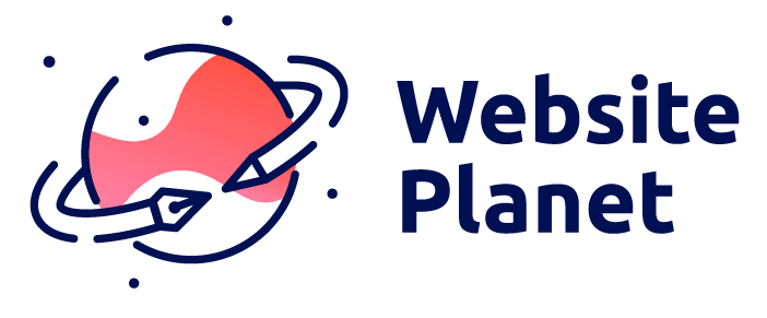
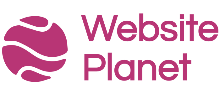
The logo we got from DesignCrowd won the office vote, and it is now our new logo for Website Planet! That is definitely an impressive achievement, and you might be wondering why DesignCrowd isn’t ranked #1 on my list.
Well, we all like the logo I got from DesignCrowd, but I still had a couple of issues with the platform. First, there was the price. When you can hire a designer on Fiverr for as little as $5, paying over $100 for DesignCrowd is comparatively expensive. My second issue was the user interface – I didn’t like all the calls to action and other distractions on the site.
You can run logo design contests on DesignCrowd and receive multiple proposals and ideas from professional designers. That said, I chose to work one-on-one with a designer instead. With DesignCrowd’s cheapest package, I couldn’t choose my own designer, but I did pay a little extra to hire one of the top designers – a wise investment. There’s also a 60-day money-back guarantee, so you don’t have to worry about being stuck with a design you don’t like.
More on DesignCrowd
Visit DesignCrowd > -
- Quick turnaround time for contest submissions
- Option to work directly with a designer
- 100% money-back guarantee within 60 days of payment
- Starting price: $299
99designs can be a bit pricey compared to the other services on this list, but it offers excellent value for your money, especially if you have long-term design work. You can run a contest for just about any design project, from logos to product packaging to book covers.
I decided to run a logo design contest to see what I would get. I received about 40 different submissions of varying quality; as you’d expect, some weren’t usable. Still, I was able to narrow them down to a few options that I really liked. Then we had an office vote, and the chosen winner was my favorite as well. Communicating with the designer to ask for revisions was easy and I had no problem getting exactly what I wanted.
If you don’t want your competitors to know what you’re up to, you can run a private design contest with 99designs for an extra fee. Agencies can sign up for 99designs Pro, which includes expedited service and a dedicated account manager.
If design contests aren’t your thing, you can browse through individual designers’ profiles and portfolios, choose your favorite, and work with them directly.
More on 99designs
Visit 99designs > -
- Simple logo maker for easy branding
- Plenty of downloadable file options
- On-the-go logo editing with the mobile app
- Starting price: $9.99
Out of all the logo makers I’ve tried, Tailor Brands is among my personal favorites. The editor is easy to use, and the logo generation process feels intuitive. You only need to enter your company name, give a short description of what you do, and choose up to 3 fonts. You’ll get an AI-generated logo less than a minute later.
I was a bit disappointed that the Tailor Brands logo editor doesn’t have all the advanced customization features that some of its competitors offer. However, there’s a massive library of icons to choose from, and you can customize what matters most: the text, fonts, and colors.
The logo maker is 100% free to try. You can design as many logos as you like – you pay only if you’re satisfied with the results. You can even download a free sample, but keep in mind that it will be low-quality.
Tailor Brands isn’t just about logos, either. The platform offers complete branding solutions, from printed merchandise to branded business presentations.
More on Tailor Brands
Visit Tailor Brands > -
- The best logo editor for design flexibility
- Choose from 10,000+ fully-customizable logo templates
- Free logos available (if you credit DesignEvo on your website or social media)
- Starting price: $1
I don’t usually get excited about this kind of thing, but working with the DesignEvo logo editor was one of the best experiences I’ve had throughout this entire process. Unlike similar tools, DesignEvo gives you true freedom: You can start with a blank canvas or customize an existing template. The drag-and-drop interface allows you to easily adjust icons, fonts, shapes, and colors to your liking.
DesignEvo has a wide range of templates and customization options, making it a powerful tool for beginners and non-designers alike. With over 10,000 templates and millions of icons to choose from, I had no trouble creating a logo that fit the WebsitePlanet brand.
But don’t worry if you don’t have any design experience because DesignEvo is very easy to use. Instead of a wizard that asks you questions, you simply browse through a searchable library of logo templates and choose your favorite. Then, you can customize it however you like.
What’s even more exciting is that you can download a PNG file of your design for free. The only issue is that you’re restricted to a 300px by 300px size. Still, you can do whatever you like with your free logo – even use it commercially, as long as you link to DesignEvo from your website.
More on DesignEvo
Visit DesignEvo > -
- You get 5 logos by different designers
- Logo delivery time is only 3 days
- Unlimited changes and revisions
- Starting price: $199
The Logo Company is a bit different from the other services on this list. Once you sign up, you fill out a very detailed design brief. Then five experienced designers work on your logo, and it’s up to you to pick the concept that best represents your brand.
I wasn’t crazy about all the logos I received, but there was one I liked a lot. I was happy to learn I could get unlimited redraws and revisions which proves that the company cares about its customers and wants them to walk away with a logo they love.
While you can undoubtedly find lower prices on Fiverr and other platforms, I felt that the quality and service I got from The Logo Company were worth the price. It felt more like hiring a classic design agency, but paying quite a bit less for similar, high-quality work.
More on The Logo Company
Visit The Logo Company > -
- 100% free DIY logo maker
- A large icon library with many styles
- Simple, easy-to-use interface
- Starting price: $0
The Squarespace website builder is one of the best ways to get a professional-looking website online fast, but what does that say about Squarespace Logo Maker? I was definitely curious to find out.
First of all, it’s incredibly easy to use. There aren’t a lot of settings and features to figure out, and the whole process is very straightforward. Not only that, but you can download and use your logo for free, no strings attached.
That could make Squarespace Logo Maker a good solution if you just need a quick logo for personal use. However, if you need a logo for your business or are looking for a more professional design that really stands out, this probably isn’t the way to go. The platform doesn’t offer many options, and the logos usually end up looking very generic.
You don’t need a Squarespace account to use the logo maker, but if you are a Squarespace user, you can easily integrate your new logo into your Squarespace site.
More on Squarespace Logo Maker
Visit Squarespace Logo Maker > -

- Free sample logo for non-commercial use
- Beginner-friendly drag-and-drop logo editor
- Many icons, fonts, and colors to choose from
- Starting price: $20
Wix Logo Maker is a decent DIY design tool that offers a user-friendly experience, ideal for those without previous design knowledge. Upon signing up, you answer a few basic questions, and the service generates a variety of logos tailored to your preferences. The logo editor also provides significant creative freedom – letting you choose colors and fonts, and arrange elements as desired.
However, the initial generated designs aren’t very inspiring, and you might need to invest extra time to achieve a logo you’re fully satisfied with. Additionally, the free plan doesn’t offer scalable vector graphics. SVG files are only included in the Advanced plan and the Brand Plus plan, which also comes with unlimited logo changes, printable business card designs, and additional assets.
Despite these drawbacks, Wix Logo Maker is a practical solution if you need a simple logo for personal use or small-scale online projects. It allows you to download a PNG file for free, but you’ll need to pay to use it for more professional purposes.
More on Wix Logo Maker
Visit Wix Logo Maker >
How I Compared The Best and Worst Logo Maker Services
What Makes a Good Logo Design?
No matter how you create your logo – whether you design it yourself, run a design contest, or hire a freelance professional – the approach alone won’t guarantee a good result. Just as owning the best saw won’t make me a skilled carpenter, a logo still needs to follow strong design principles to be effective. The following are a must when it comes to creating a memorable logo that reflects your brand properly.
- Keep it simple. The best logos are clean and uncluttered. A simple design is more recognizable and more likely to leave a lasting impression.
- Stick to clear, crisp fonts. The font is one of the most important elements of your logo. A serif font can give your logo a classic, trustworthy look, while sleek sans-serif fonts can look more contemporary. Avoid overly decorative fonts, which can come across as tacky and are less readable at smaller sizes.
- Choose colors strategically. Color psychology plays a vital role in logo design. Dark blues and grays, for instance, evoke a feeling of security, so they’re a good choice for logos with a corporate feel. Bright reds and yellows can make your logo stand out but may feel less professional.
- Prioritize versatility. Your logo needs to be versatile so it reads well across different media and business assets. Vector files are best because they can be sized up or down without image distortion.
- Make it relevant. Your logo should reflect your audience’s identity and values and those of your brand. Whether minimalist, playful, vintage, or modern, the design should be appropriate for your industry.
My final advice is to avoid making any choices about your logo based on what’s in vogue. Neglecting a design that conveys your message and brand values in favor of something “trendy” will quickly make your logo feel outdated and reflect poorly on your brand.
In my many years as a web designer, I’ve spent more time than I care to recall thinking about whether a logo is the right shade of green, or if the typography looks just right for a certain brand. This is the first time I got to properly test all possible avenues for a logo.
The project involved months of careful testing. In this time, I pushed the limits of what you can get with a variety of tools. I pushed the limits of AI-based logo design and gave various designers more creative freedom than they knew what to do with.
This wasn’t just a creative experiment. At the end of this process, we found what ended up as the official logo for Website Planet.
All the services on this list offer speed and affordability. There’s no point recommending a high-end designer agency if most people won’t be able