We rank vendors based on rigorous testing and research, but also take into account your feedback and our commercial agreements with providers. This page contains affiliate links. Advertising Disclosure
Right now, the WCAG 2.1 guidelines are your best guide to making sure people can actually read what’s on your websites, especially people with low vision or similar visual disabilities. But WCAG 2.1 compliance can be a little tricky. For example, you need to reach a minimum text to background contrast ratio of 4.5 to 1*, and that’s to say nothing of Level AA and Level AAA compliance.You should not try to eyeball this. Don’t worry, we’re going to make it easy for you to check and fix this sort of thing with a step-by step guide and a great color checking tool linked below.However, if you’d like to save yourself a lot of work and time, you should try accessWidget by accessiBe1. This is a plugin that can be used with WordPress, Wix, Squarespace, and manually-coded websites to help you reach WCAG 2.1, ADA, AODA, Section 508, and EAA/EN301549 compliance with minimal effort.* Note for the newbies: the contrast ratio is a measurement of the comparative luminance (or “brightness”) between two colors.
How Do I Use a Color Checker To Improve My Site’s Accessibility?
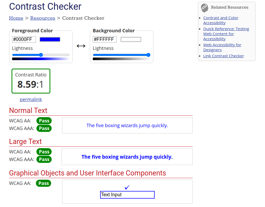
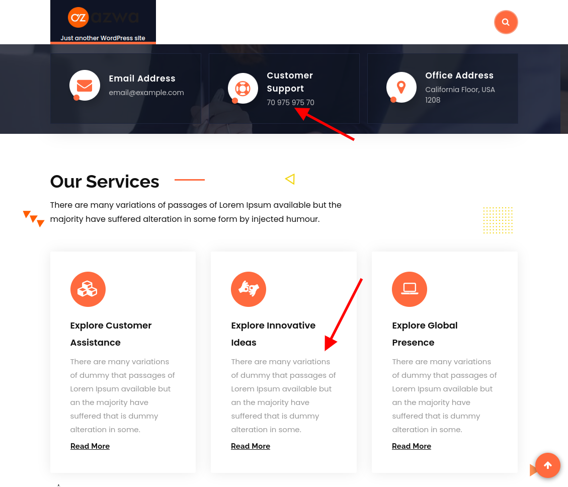
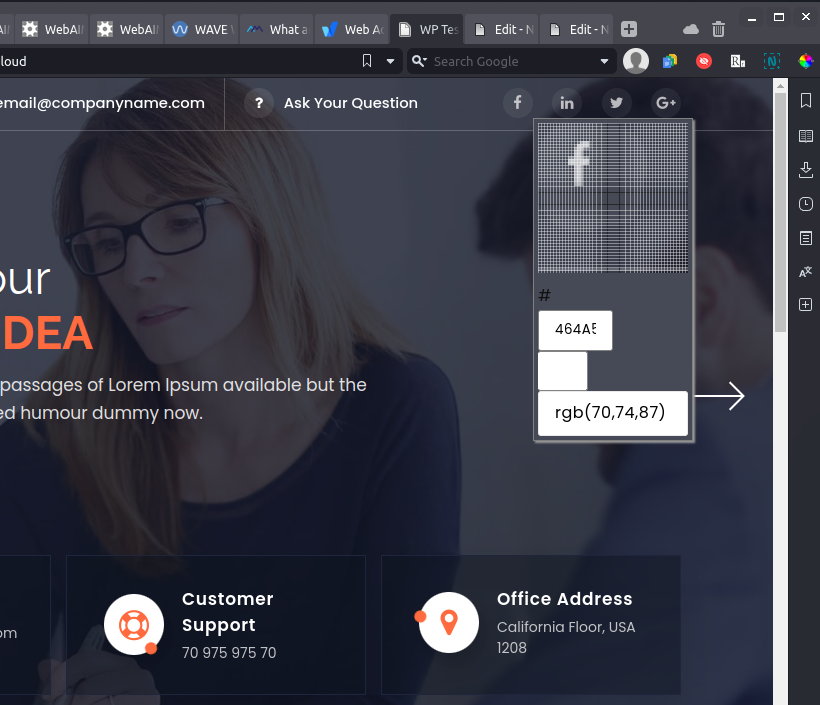
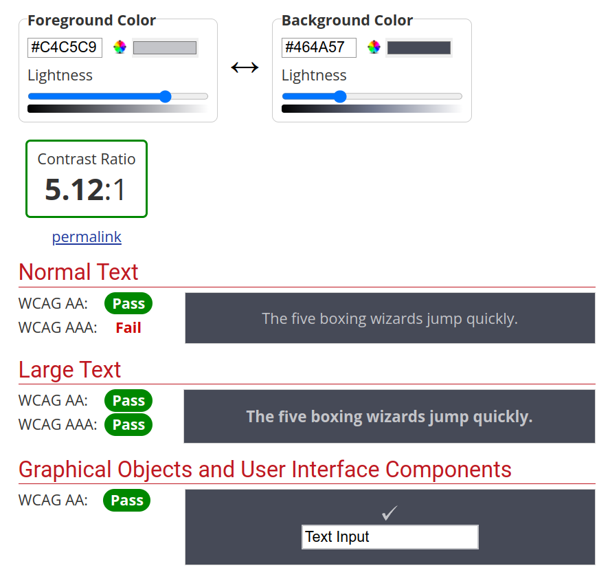
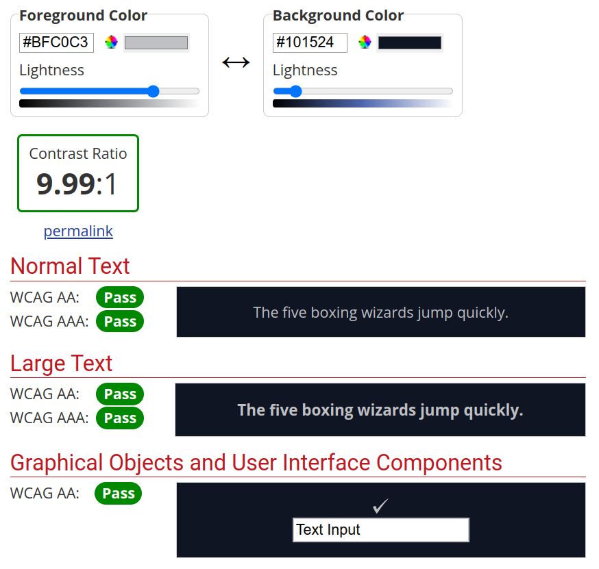
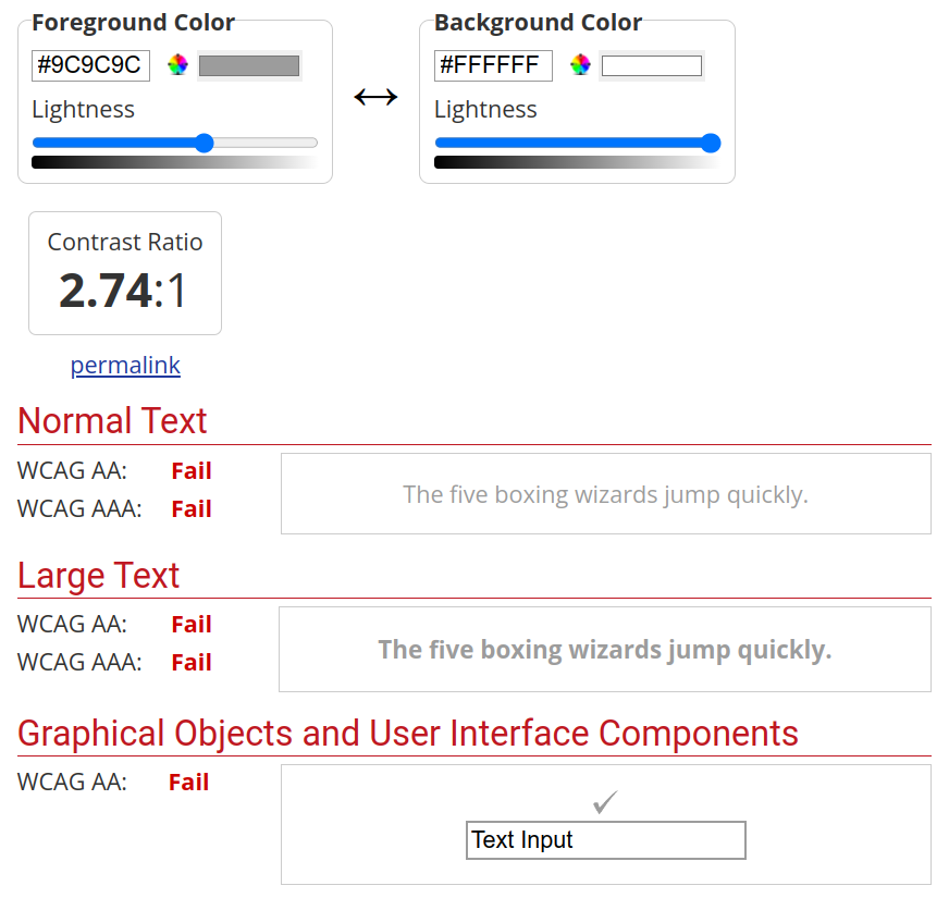
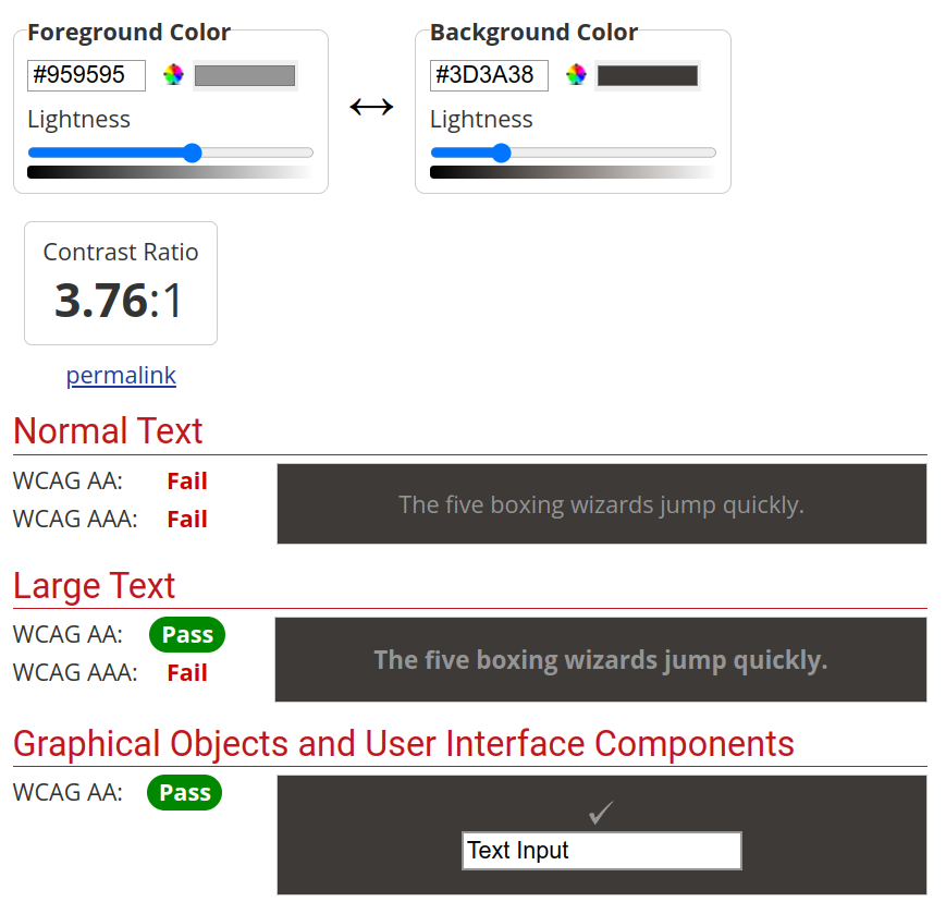
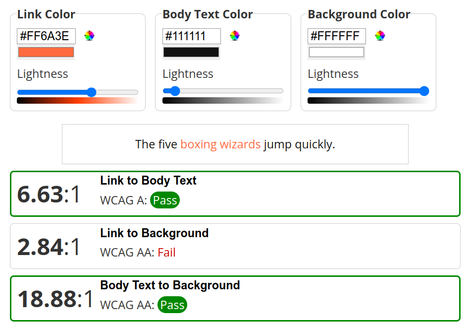
This part is actually really simple, though it takes a little bit of work. You’re going to need to use the online Contrast Checker tool from WebAIM. WebAIM is a non-profit organization based at Utah State University dedicated to improving accessibility all over the web.The actual checker looks like this: WebAIM’s contrast checker keeps things simple1You just have to grab your foreground color (e.g. the color of your text or icons) and background color as hexadecimal values (also called hex values, as specified in the HTML or CSS), and the checker will tell you if there’s enough of a contrast ratio between the two. Remember, the minimum contrast ratio that you’re looking for is 4.5 to 1. Black text on a white background has a ratio of 21 to 1, so you actually have a lot of wiggle room.The minimum can still be hard to read for some people1Above is an example of the minimum contrast you need, as screenshotted on WebAIM’s website.For this tutorial, I’m going to grab some colors from different elements on my personal WordPress test site, using my favorite slightly-flawed test theme: Ameya. Here’s what that looks like:This is my usual test website1Now mostly the contrast looks okay, right? Well, there are a few bits and pieces that concern me. I’d specifically like to check these icons in the header:Those icons look a bit low-contrast1And these two (repeated) text elements from further down on the page:The text in the “Our Services” section particularly worries me1You might be thinking, “Wow, that logo sure has terrible contrast!” And you’re right. This is a lesson in what happens to logos in WordPress child themes if you’re not careful. The funny thing is that although icons must have a basic amount of contrast, logos themselves don’t count towards the contrast/usability score in WCAG 2.1.This is, I’d imagine, a concession to the needs of company branding.I’d still change it though.Grabbing the HEX values is easy enough with an eyedropper tool1Now, I’m just going to grab the foreground and background colors of each, and show you the results. If you don’t feel like digging into your site’s code for the hex values, I recommend using an “eyedropper” tool like the ColorPick Eyedropper extension for Chrome and Chrome-based browsers, shown above.The icons pass Level AA, but not Level AAA1The results for the icons are interesting. With a contrast ratio of 5.12 to 1, it just barely beats the minimum requirements for normal-sized text, but does not meet Level AAA compliance. (Level AAA would require a 7 to 1 ratio.) However, since these are logos, they can technically pass.Note: if the social media icons didn’t pass the test, but had associated text labels that did, it would still count.This text/background combo can look kind of “dim”, but passes all tests1The light gray text on the dark blue background did even better, passing all tests with a ratio of 9.99 to 1.CAPTION: I blame this failed test on people badly copying early 2000s Apple adsThe text in the “Our Services” section failed across the board, as I suspected it would. That light-ish gray on white has a contrast ratio of 2.74 to 1, which is just not enough.Testing hover states is required by WCAG.1Incidentally, you also need to test what the contrast is like for elements in their “hover states” like the box with the background image above.Turns out that medium-gray on dark grey (or an equivalent hue) won’t pass the test1That text also failed all the tests that mattered. 3.76 to 1 just isn’t enough for anything but large text and graphical elements.Lastly, make sure to check your text link color contrast. This can be accomplished with the Link Contrast Checker from WebAIM. This tool will measure the regular body text to background ratio, but also the contrast ratio between hyperlink text and regular text… and the background again. You want them all to look sufficiently distinct.Hyperlinks (especially in body text) should be underlined, or at least underlined in a hover state1Above are some examples of hyperlink text on my test site.This is not a situation where “2 out of 3” counts1The test results show that the contrast between the link text and body text is fine, as is the ratio of body text to background. But, at a ratio of 2.84 to 1, the hyperlink text is just a bit too light against the white background to pass.And that’s that. You now know how to manually check your website’s colors to make sure that all people can read and use your website, as well as to conform to the WCAG 2.1 accessibility standard. Now you just have to go into your website’s code and use more appropriate colors, or…
Quick Solution To Make Your Website’s Color Scheme Accessible
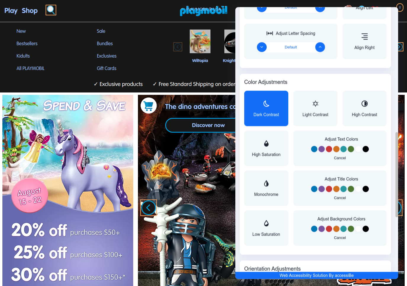
Remember how I recommended accessWidget by accessiBe before? Well, again, it’s a great option. For example, if you’re not very technical but you’ve got a WordPress site with a premade theme, and you don’t know (or have time to figure out) how to get into all the various CSS files to make manual changes, accessWidget will do everything for you1.Here’s the Dark Contrast mode in action on the Playmobil website.1In addition, visitors to your site with visual disabilities can use the accessWidget front-end features to adjust your site to their needs, and that includes the ability to choose one of several color contrast options.accessWidget also offers tweaks for type styling, focusing on the important bits of a page, increasing compatibility with screen readers, and more. You can, again, install it on just about any kind of website (including Wix, Squarespace, WordPress, and custom-coded sites).
How to Check Your Website’s Overall Accessibility
If the tutorial above seemed like it would be a lot of work, what with copying and pasting colors for all sorts of different website elements, I don’t blame you. You can get results a bit faster with WebAIM’s WAVE tool, which will check your site’s color contrast, as well as let you know about any usability issues in the structure of your site, and other WCAG guideline errors.The Web Accessibility Evaluation Tool (WAVE) by WebAIM in action1
However, it’s not flawless and may occasionally present errors even when they might not be entirely relevant. That’s why I provided you with the manual methods above; they are there for those instances when you want to ensure accuracy.
Or, you may want to try accessWidget’s free trial1 to resolve these issues quickly and automatically.
Meeting the WCAG 2.1 guidelines for color contrast doesn’t have to be overly complicated. Developing an inclusive, accessible design and sticking to it in the first place will save you a lot of trouble, and WebAIM’s tools can help you find potential problems on existing sites. It takes some work, but it’s worth it.However, if you’re looking for an easier solution to help your website reach WCAG compliance, accessWidget by accessiBe can implement a lot of handy accessibility features with minimal fuss. (On WordPress, it’s just a couple of clicks to install the plugin.)
FAQ
How do I make my WordPress site accessible?
By building your own theme from scratch and doing it right. Okay, that’s not feasible for everybody, but you can do a lot to make free and premium themes more accessible with the right tools.We have a whole guide to the best accessibility plugins for WordPress. Start there, and do a little reading on accessibility in general while you’re at it.
Can I make my Wix or Squarespace websites ADA compliant?
Websites built with the two most popular website builders aren’t, unfortunately, always ADA compliant right out of the box. But both Wix and Squarespace sites can be made compliant by applying a few useful tricks.Here’s our guide to Wix accessibility, andour guide to Squarespace accessibility to get you started.
Can accessWidget fix the contrast on my website?
accessWidget by accessiBe does have quite a few tools for helping to deal with color contrast issues, including the ability to: change colors sitewide, apply a high contrast mode, apply a dark contrast mode, reduce or add color saturation, and a whole lot more. We tested this plugin – read about everything that accessWidget can do in our review.
Where can I start learning to build accessible websites?
There are a number of fantastic resources for this, including the W3C, WebAIM, Mozilla’s MDN Web Docs, and more. Building accessible websites mostly involves keeping accessibility in mind from the moment you start building your website.However – if you don’t know much about building websites at all yet, check out our guide to building your first website.
Ezequiel Bruni is biologically Canadian, legally Mexican, and self identifies as a total nerd. He’s been a web and experience designer off and on since he was a teenager, and loves sharing the kind of beginner’s advice he really wishes he’d had when he first started. He also loves video games, tacos, open source software, video games, sci-fi and fantasy in all their forms, and video games. He does not love writing in the third person.
Thank you, - your comment was submitted successfully!
We check all user comments within 48 hours to make sure they are from real people like you. We're glad you found this article useful - we would appreciate it if you let more people know about it.
Share this blog post with friends and co-workers right now:
Thank you, , your comment was submitted successfully!
We check all comments within 48 hours to make sure they're from real users like you. In the meantime, you can share your comment with others to let more people know what you think.
Thank you for signing up!
Once a month you will receive interesting, insightful tips, tricks, and advice to improve your website performance and reach your digital marketing goals!