If you had listened to the likes of David Platt, Seth Porges, Steve Ballmer, and so many other doubters from ten years ago, you would never have believed that the smartphone would take off. But take off it did!
As reported by TIME, Americans as a collective whole check their smartphones a staggering 8 BILLION times a day. If you want to break that down, the average consumer checks their phone roughly once every 12 minutes, or approximately 80 times throughout the course of a regular day.
That’s not only astounding, it’s outright ridiculous. But as a business owner, it’s also a valuable insight into your prospective customer base — not to mention an ingenious way for you to optimize your website to better cater to your audience. That’s right; we’re talking about making mobile-friendly websites so that when your consumers are surfing the web from their handy mobile devices, your website will be at the top of their to-do list.
Here are some ways that you can make your website more mobile-friendly so your customers will keep returning again and again.
A Quick Look at the Numbers
But first, you need to understand how important having a mobile-friendly website is to your business. A little peek at recent statistics (as reported by OuterBox) ought to do the trick:
- 62% of smartphone users used their phones to shop within the last six months.
- 80% of consumers used their mobile devices to do comparison shopping, find other store locations, or learn more about a product.
- More than 33% of all eCommerce shopping was done using a smartphone during 2015’s holiday season.
- 57% of users would not recommend a business if it has a bad mobile website.
- 61% of users would not go back to a website if they had a hard time using it on a mobile device.
I could keep going, but you probably have the idea by now. Mobile eCommerce is the wave of the future, and if you don’t get on board, you will likely get left behind. Lucky for you, below are some pro pointers to help you get on the mobile bandwagon fast.
Be Responsive
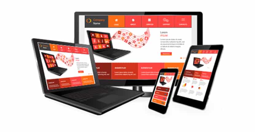
Just as friends, family members, and co-workers want us to be responsive, website viewers want the websites they’re visiting to be responsive, too. If you’re confused, let me explain. A responsive website is one that takes into consideration the type of device you’re using; it will automatically change your website’s size, formatting, and content layout to fit the screen that you’re looking at. Nice! Responsive design ensures that important marketing features, eye-catching icons, and the carefully placed elements of your website design aren’t lost to the screen size parameters.
Think Big Picture
We are visual creatures, which is why images play such an important role in website design. In fact, according to Hubspot, 37% of marketers quoted visual marketing as the most important form of content for businesses, and 74% said they put images ahead of blog posts and video content. In other words, pictures are a big deal, so make sure your pictures are selling your products for you. Use only high-resolution images to avoid that ugly pixel-popping effect.

Avoid the Zoom
How much do you hate landing on a webpage only to find a blur of text that you can’t read even if you squinted like your grandmother? Most people would be frustrated, and that’s why you need to avoid it at all costs when designing your mobile-friendly website. Instead, choose a font size and style that is easily legible on these devices. Experts recommend around 14px for text, and 44px by 44px for buttons.

Find a Website Builder that Offers Mobile-friendly Options
Trying to wear too many hats? If the idea of juggling marketing, inventory, CRM, website design, PR, and mobile optimization is a bit too much for you, it’s time to get help. Find a great website builder that also offers mobile-friendly options in their packages. This isn’t hard; in fact, the best website builder services give you mobile optimization in the same bundle. Here are some website builders you can turn to:
- Wix: Wix has an awesome mobile editor that lets you change design elements instantly for mobile devices.
- SimpleSite: This website builder lets you build responsive blog websites, so they’re mobile-ready.
- SITE123: Site123 has completely responsive templates, a mobile preview mode, and the ability to change your text, images, or content without a separate editor.
- WordPress: There’s no end to the apps and plugins you can use via WordPress to make a killer mobile-friendly website.
- Weebly: Weebly features a full mobile website builder, responsive templates, and a simple drag-and-drop designer for beautiful mobile designs in mere minutes.
Offer Options
While you need to optimize for mobile, you don’t want to eliminate the option for desktop view altogether. Because while most people prefer the updated, mobile-friendly website, there is still a big-enough group of consumers who prefer to see the old, familiar desktop version. For those folks, just include a simple link that directs them to go to the full website, or to view the desktop version. That way, people can choose to go mobile, or stick with desktop. And, everyone loves to be given a choice.
Skip Flash
In a word, Flash is old-school. It’s slow to load, isn’t supported by Android or iOS devices, and many browsers just don’t play well with Flash. Bottom line, skip it.
Test, Test, Test
The most effective approach to understanding your viewer’s perspective is through testing. Therefore, from time to time, take the initiative to access your website on different mobile devices. This will allow you to observe exactly what your consumers are experiencing. If the presentation is not optimal, proceed to make necessary improvements.
Time to Mobilize Your Forces With Mobile-Friendly Designs
Ecommerce has gone mobile, and it’s not turning back. That’s why you need to join the crowd if you want your business to still be here in a few years. The good news is that it’s relatively simple to create a beautifully responsive website design that takes mobile visitors into consideration, as well.
– – –
TIME: http://time.com/4147614/smartphone-usage-us-2015/
OuterBox: https://www.outerboxdesign.com/web-design-articles/mobile-ecommerce-statistics
Hubspot: https://blog.hubspot.com/marketing/visual-content-marketing-strategy
– – –
IMAGES
Responsive Website: https://clicktecs.com/responsive-website-design/
Mobile Friendly Website: https://www.wix.com/blog/photography/2017/03/20/how-to-make-your-photography-website-mobile-friendly/
