7 Best Landing Page Builders for Small Businesses in 2024
The most comprehensive list of the best landing page builders on the internet

We’ve tested numerous landing page builders that can help you convert visitors into valuable leads and sales. See which free and paid landing page builders we recommend to help your business grow and thrive, including options for WordPress and Shopify.
Every landing page builder claims it can help you maximize conversions, but not every platform is flexible enough to really give you what your specific business needs. Not only that, but some landing page builders are ridiculously overpriced.
I’ve tested all the major landing page builders out there to see which ones offer the best features – from attractive templates to advanced A/B testing – and for the right price.
I was surprised to find that dedicated landing page builders aren’t always the best solution for a landing page that really works. I also checked regular website builders that offer landing page capabilities, and other digital marketing platforms that let you create landing pages.
Read on to find out which landing page tools made my list of the very best, and why I think you’ll like them.
-
![Wix - Landing Page Website Templates]()
- 30+ professional landing page templates
- Simple editor gives you creative freedom
- Apps for marketing, social media, and more
- Fully customizable contact forms
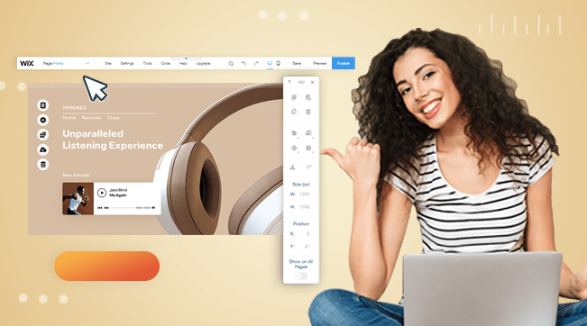
Although Wix is primarily known as a website builder, you can easily use it as a landing page builder. You’ll find over 30 templates in the Landing Page category, and these can be easily customized to match your branding and suit your needs.
There are plenty of reasons to choose Wix instead of a landing page builder. Wix App Market is definitely one of them, offering a wide selection of free and paid apps you can easily integrate into your page to maximize conversions. You can embed live chat or social sharing buttons, add a countdown timer for time-sensitive offers, include a video player, and much more.
Wix offers a free plan that gives you access to most features, but it does have some limitations. One major downside is that your free landing page will include Wix branding, which could make it look unprofessional. The good news is that the paid plans are quite affordable, and give you access to some interesting perks, like in-depth visitor stats and e-commerce on the Business plans.
-
![Squarespace - Launch Page Templates]()
- 20+ premium-quality launch page templates
- Streamlined email marketing management
- Advanced e-commerce to sell from your page
- Powerful contact form features
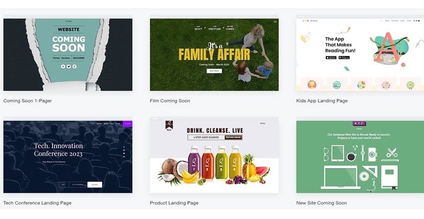
Squarespace is another website builder you can use to create beautiful landing pages. Its templates are all professionally designed, with high-quality graphics and mobile-responsive layouts. There are 20+ designated launch page templates, but you can also choose a template from any other category and use the easy drag-and-drop editor to customize it however you like.
Since Squarespace offers some strong ecommerce features, it could be a great solution if you’d like to sell physical or digital products directly from your landing page. If you’re from a nonprofit organization, you can easily set up a donation page.
With Squarespace, you can create well designed, intuitive contact forms to capture leads. Another thing I like is how it integrates with MailChimp to help you grow your mailing list. You’ll also have access to in-depth analytics to help you gauge visitor behavior and conversion rates.
One thing that’s a bit disappointing is that Squarespace doesn’t offer a free plan, but it does have a 14-day free trial with no credit card required. Just keep in mind that to publish your page, you’ll have to pay for a plan.
-
![Sendinblue - Landing Page Builder Features]()
- Email marketing with custom landing pages
- Targeted CTAs and form fields
- Simple drag-and-drop landing page editor
- Easily add “thank you” and follow-up pages
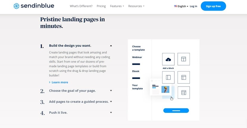
Sendinblue is a digital marketing platform that lets you easily create landing pages. Its main specialty is email marketing, which you can use to drive traffic to your page. It’s also a great way to keep in touch with prospects at every stage of the customer journey.
Sendinblue’s landing page builder offers a nice variety of customizable templates, along with an immensely useful step-by-step page building tutorial.
Sendinblue does offer a free plan, but it only gives you access to email marketing. To use the landing page builder, you’ll need to upgrade to the Premium or Enterprise plan, both of which are a bit pricey. However, if you’re looking to develop long-term customer relationships, Sendinblue’s scalability could make it a worthwhile investment.
More on Brevo (formerly Sendinblue)
Visit Brevo (formerly Sendinblue) > Read our Brevo (formerly Sendinblue) review -
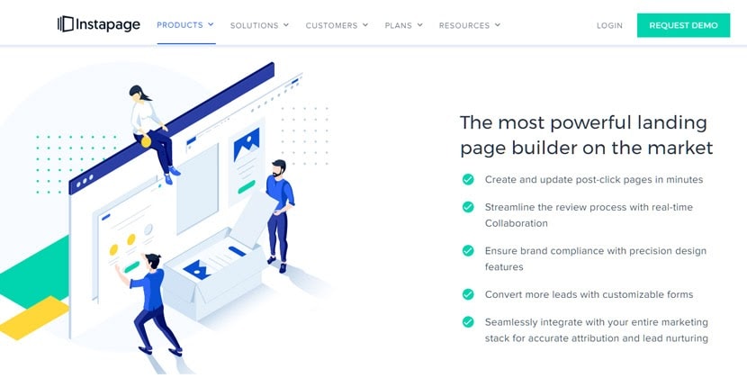
![Instapage - Landing Page Builder Features]()
- The best for fast loading speeds
- Heatmaps let you analyze visitor behavior
- Fully customizable forms
- 99.9% guaranteed landing page uptime
Instapage is another dedicated landing page builder that offers some powerful marketing tools. It’s not the cheapest option out there, but it’s easy to use. It offers 200+ customizable templates sorted by industry and use case, so you can find the best design for your needs and have it launch-ready in minutes.
One feature of Instapage that I particularly liked was the heatmap. It provides a color-coded map of your page, displaying the areas where the majority of your visitors click, hover, and scroll. Another feature I found useful was the ability to enable reCAPTCHAs on form-based pages to prevent spam and fraudulent submissions.
Instapage boasts the fastest loading pages in the industry, and there’s a 99.9% uptime guarantee, too. If you’re expecting a large number of visitors to your page, this kind of reliability could prove to be very valuable.
Instapage integrates with many of the most popular email and marketing platforms, including MailChimp, AWeber, Zapier, GetResponse, and HubSpot. Although it doesn’t offer a free plan, you can try it free for 14 days (or until you reach 2,500 unique visitors).
-
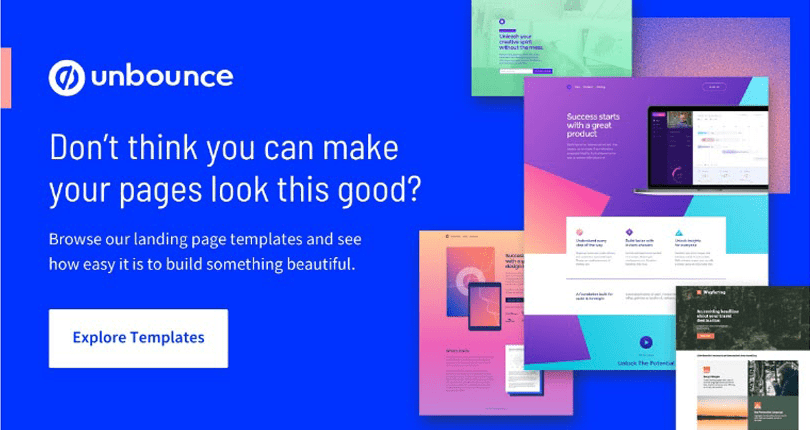
![Unbounce - Landing Page Builder Templates]()
- 100+ customizable landing page templates
- Access to 850,000+ copyright-free images
- Sub-accounts for marketing agencies
- Integration with 1000+ marketing tools
Unbounce is one of the most popular dedicated landing page builders available, and with good reason. It provides a user-friendly drag-and-drop interface to get your page up and running in minutes. There are over 100 conversion-focused templates in different categories, such as Webinars, Ebooks, and E-commerce.
I liked how customizing a template was easy and straightforward, especially with the built-in access to Unsplash’s massive library of 850,000+ professional, copyright-free images. You can use the A/B testing tools to experiment with different page elements (e.g., changing a header, image, or call to action) and analyze the results, to see which design produces the most conversions.
Unbounce integrates with popular tools like WordPress, Slack, Salesforce, and Zapier, along with 1000+ Customer Relationship Management (CRM) platforms, analytics tools, and email marketing platforms.
Unbounce is targeted more toward marketing agencies and large enterprises, and therefore is a bit pricier compared to other landing page builders. While it doesn’t have a free version, it does offer a 14-day free trial so you can test its full range of marketing tools.
-
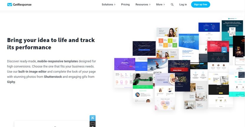
![GetResponse - Landing Page Builder Templates]()
- An all-in-one marketing solution
- Optimized landing pages for mobile & desktop
- Attract leads via Facebook and Instagram
- SEO tools to rank high in search results
GetResponse offers a complete suite of marketing tools, including landing pages, email marketing, webinar software, automated sales funnel generators, and A/B testing.
The drag-and-drop editor lets you build separate pages for desktop and mobile, to make sure your pages look good on any device. You can incorporate carefully-timed pop-ups to grab your visitors’ attention, keep them on the page, and encourage conversions. Another nice feature is the countdown timer – perfect for limited-time offers.GetResponse has an ad creator that helps you start and run Facebook and Instagram campaigns leading to your landing page. This can help you quickly generate a list of leads you can convert or nurture over time. GetResponse also integrates with popular platforms like Etsy, Shopify, WooCommerce, WordPress, and more.
GetResponse doesn’t offer a free plan, but it offers a 30-day free trial along with affordable packages for small and large businesses alike.
-
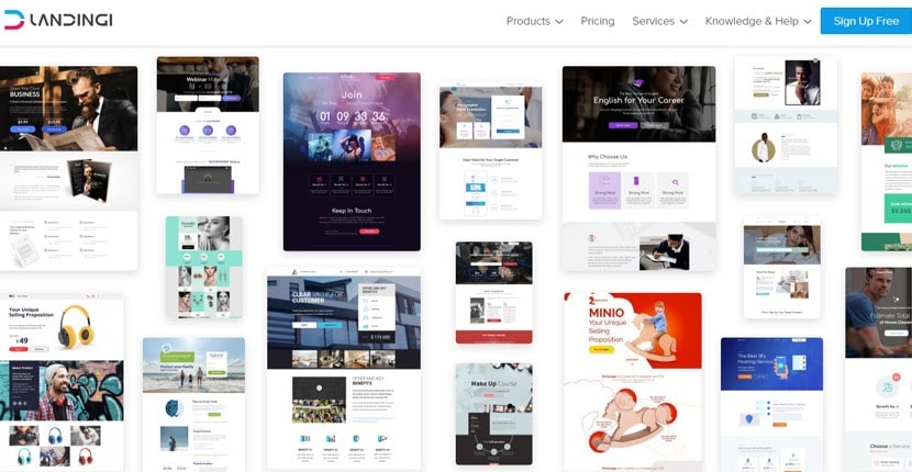
![Landingi - Landing Page Builder Templates]()
- Supports unlimited active landing pages
- Offers 150+ landing page templates
- Integrates with numerous email services
- Includes simple lead generation software
Landingi is a dedicated landing page builder with 150+ templates on its Core plan, and another 50+ premium templates available on the Create plan. If you don’t want to use a template and you already have a design that was created for you, the Landingi team can implement it into your account for an added fee.
I really appreciated how Landingi lets you keep unlimited landing pages active on any plan, so you can create and publish as many landing pages as you’d like for your own business or for your customers.
Landingi integrates with popular email services like MailChimp, AWeber, and GetResponse. You can also track performance with its built-in A/B testing and analytics tools, and via third-party analytics platforms like Google Analytics, Kissmetrics, and Yandex Metrica. Plus, it supports live chat and callback features so you can offer top-notch support to your prospective customers.
In addition to its business plans, which are quite affordable for what you get, Landingi has agency-tier plans for marketing companies and consultants who want to offer unbranded landing page services to their clients.
While Landingi doesn’t offer a free plan, there is a 14-day free trial period with no credit card required.
FAQ
What is the best free landing page builder?
I’d have to say Wix. Not only does it offer a forever-free plan that lets you create and publish fully functional landing pages, but it offers 30+ landing page templates that you can customize as much (or as little) as you’d like, so it’s a good choice if you want full control over the design of your page. SITE123 is another interesting option – while its templates aren’t as nice as what Wix has to offer, you can use the free plan to build a landing page. Unbounce is a more professional tool, geared towards larger businesses. It doesn’t have a free plan, but I definitely recommend taking it for a test drive with the 14-day free trial. For more information, check out our list of the best free landing page builders.Should you choose a dedicated landing page builder, or just use a website builder to create your page?
Since a landing page, by definition, is a single-page website, there’s no reason why you can’t build a landing page with a website builder. That’s why we didn’t limit this list to only include dedicated landing page builders. That said, you might have some specific needs for your landing page (e.g. A/B testing, heatmaps, email marketing integration, custom forms), so if you’re considering using a website builder, make sure it offers the features you need to create a high-converting landing page. The website builders we list on this page have a number of features that can help you build an effective landing page, but only you know your exact requirements, so choose carefully.What is a landing page builder?
A landing page builder is a specialized website builder designed specifically for creating landing pages. Since landing pages generally serve a different purpose than full websites, such as gathering leads or selling a single product, the best landing page builders include features that help you achieve those goals (e.g. landing page templates, A/B testing tools, email campaign integration). Of course, many website builders provide features that work for both full websites and landing pages, so I’ve included some of those in this list.Can you create a landing page without a website?
Landing pages and websites generally serve different purposes. While websites exist to provide information about your business or sell multiple products or services, companies typically use landing pages to serve a single purpose – such as capturing leads or selling a specific product. Nevertheless, some businesses do just fine with a single landing page for their entire company. For example, a company whose sole product is an app could get away with creating a landing page that contains all the information prospective users need to understand the app features, download it, and become paying customers.What features should a good landing page have?
Since the goal of a landing page is conversions (e.g. lead generation, sales), every page element should align to serve that purpose. A good landing page is visually engaging, with quality images and content that draws prospective customers in and encourages them to scroll, read, and convert. Break your content into small paragraphs and include bold, catchy headlines and bullet points, making it easy to scan and spot the features and benefits that sell your product or service. If it makes sense, consider including client testimonials to build trust. If you’re selling a physical product, include clear images so people know what they’re buying. Most importantly, you’ll want to include CTAs throughout the page (e.g. “Sign up today!” alongside a colorful “Sign Up” button). For whatever reason, people are more likely to do something if you directly tell them to do it, so think carefully about each CTA and the copy that surrounds it. This is just a starting point, of course – check out our in-depth guide to learn how to build a landing page.Why should you use a landing page builder?
A landing page builder can save you a lot of time (and money) compared to paying designers and developers to build something from scratch. In fact, if you use premade templates that are already optimized for your needs, you can get your landing page up and running in no time. This lets you quickly build and deploy marketing campaigns so you can start converting new customers immediately. Plus, many builders come with marketing tools and analytics that can help you optimize your landing page’s performance.What is the best landing page builder for WordPress?
Several landing page builders integrate with WordPress, but here are two I highly recommend. Landingi has a WordPress plugin lets you quickly set up landing pages, no coding necessary. It offers over 150 premade templates with a large free image library, and you can build unlimited landing pages without breaking the bank. Unbounce isn’t the cheapest option, but its drag-and-drop builder is easy to use and the entry level plan allows for half a million unique visitors per month (Landingi’s traffic limits range from 100,000 to 200,000 unique visitors, depending on the plan). This makes Unbounce an ideal choice for larger businesses and high-traffic marketing campaigns.What is the best landing page builder for Shopify?
Here are two Shopify-friendly options that can help you maximize your sales potential. GetResponse is ideal for small businesses that are building their first marketing campaigns. You can easily build and manage mailing lists and create mobile-friendly landing pages. As your business grows, it offers multiple plans so you can scale up when the time is right. Unbounce is not only great for WordPress, but also a solid choice for Shopify users. You can set up A/B testing to see which page elements convert, and its pop-ups and sticky bars make it easy to entice customers with special sales and personalized offers.
So happy you liked it!

We check all comments within 48 hours to make sure they're from real users like you. In the meantime, you can share your comment with others to let more people know what you think.
Once a month you will receive interesting, insightful tips, tricks, and advice to improve your website performance and reach your digital marketing goals!