
Inside this Article
What We Look For in the Best Responsive Website BuildersWhat Makes a Site Mobile Responsive?1. Wix: Best Responsive Website Builder for Design Freedom2. Squarespace: Best for Visually-Striking Responsive Websites3. Hostinger: Affordable, AI-Powered Mobile Optimization Tools4. IONOS: Responsive Builder With Personalized Help5. SITE123: Best Free Builder for Simple Responsive Websites6. Webador: Affordable Responsive Site Builder for BeginnersOther Notable Responsive Website BuildersMobile-Specific SEO Optimization TechniquesChoose the Best Responsive Website Builder for Your SiteFAQ
Short on Time? These Are the Best Responsive Website Builders in 2025
- Wix – Large library of mobile-responsive templates, with full creative control over all versions of your site.
- Squarespace – Striking designer templates that look polished on any screen.
- Hostinger Website Builder – AI tools for creating mobile-responsive websites fast.
What We Look For in the Best Responsive Website Builders
The builders on this list are some of the best in their own right. That being said, I also made sure they come with features that make them ideal for responsive editing. The features I paid most attention to were:- Mobile responsive templates. All my recommendations include professionally designed templates that automatically adjust to different screen sizes.
- Mobile editor. Templates are a great start, but I also included builders that let you tweak layouts, spacing, and content for different screen sizes. This makes sure you can make a great impression regardless of the device your customers are using.
- Preview modes. I only included builders that give you accurate previews of what your final site will look like on different devices.
- Ease of use. Though some are easier to use than others, all the builders on my list are beginner-friendly. Each one offers great customer support channels and knowledge bases so you can get the most out of the platform.
- Value for money. These builders offer premium features without eating up your budget. You’ll also get plenty of hosting resources so that your site loads as quickly as possible, even if your customers are using mobile data.
What Makes a Site Mobile Responsive?
A mobile-responsive site automatically changes its layout, content, and functionality to fit different screen sizes. This means it resizes images appropriately, maintains readable text without requiring zooming, and optimizes navigation for touch interactions. Behind the scenes, responsive websites use flexible grid layouts, CSS media queries, and scalable assets to adjust content dynamically. Instead of creating separate versions for mobile and desktop, a single responsive design keeps everything consistent across devices. This helps it to load faster, which ensures your site performs well in search results.
Short on time?
Take this one-minute quiz to learn which website builders are best for your project.

. 
Save up to 50 % on your Wix plan!
Sign up for an annual plan and enjoy the savings.
Plus get a free custom domain for 1 year!
25044 users used this coupon!
Features
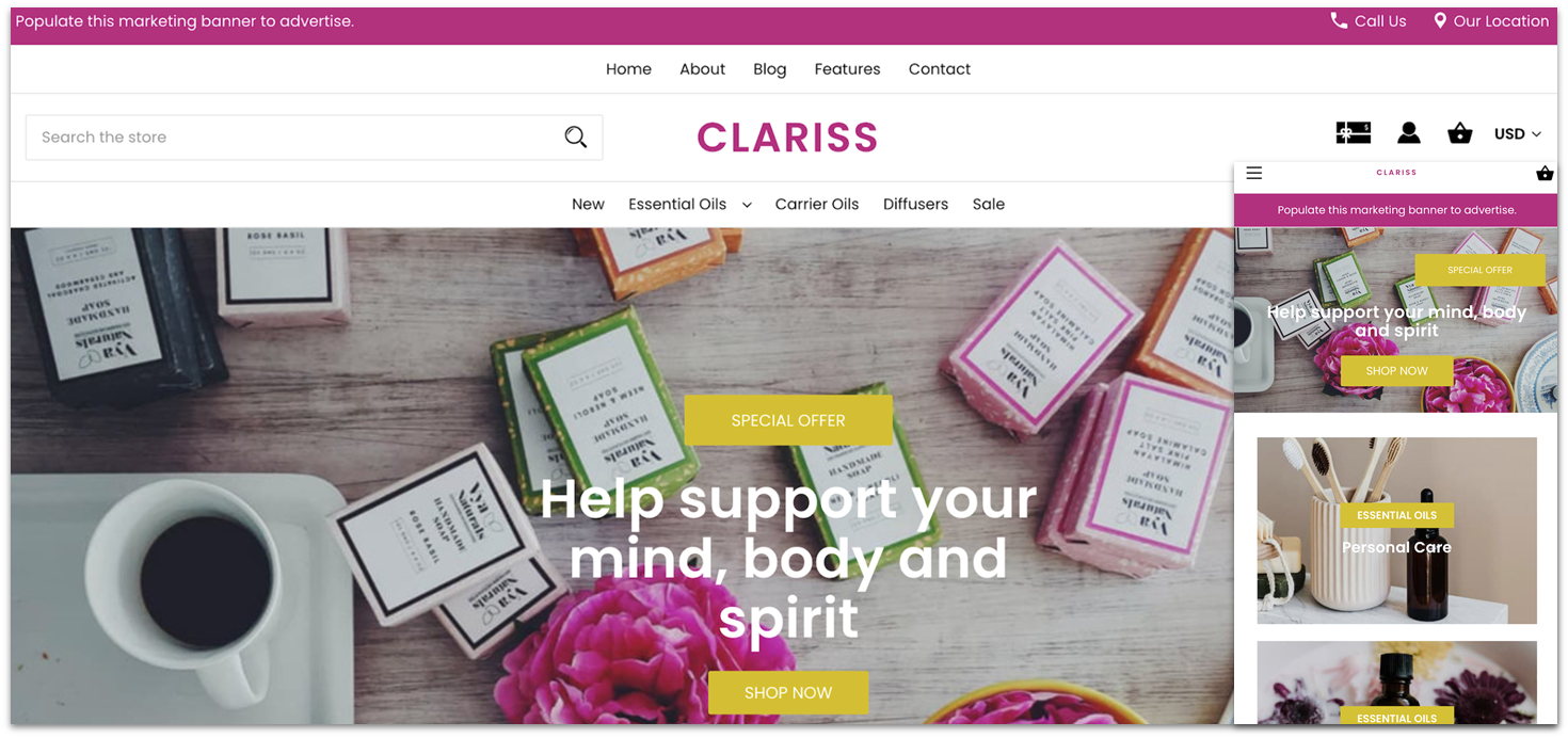
- Extensive e-commerce functionality. Wix lets you build and customize online stores that look great and function smoothly across all devices. You get features like multichannel selling, inventory management, and integrated shipping tools.
- Scheduling tool. You can use Wix Bookings to schedule appointments, send automated reminders, and collect payments on your website. While you can’t customize all Wix Bookings elements for mobile, you can change the layout of your service list to make it easier to scroll.
- Wix Pro Gallery. This tool is great for creatives, photographers, and designers who need a mobile-friendly way to present their work. The gallery automatically adjusts to different screen sizes, so your images look good on both desktop and mobile devices.
- Wix SEO Setup Checklist. This step-by-step guide walks users through critical SEO tasks, including optimizing your site for mobile devices, adding homepage titles and descriptions, integrating keywords, and connecting social networks.
| Free Plan | ✔ |
|---|---|
| Previews Available | Desktop, mobile |
| Mobile Image Optimization | Automatic resizing, mobile image editing |
| Starting Price | $17.00 |

. 

Save up to 36 % on your Squarespace plan today!
Plus get a free domain for one year!
1714 users used this coupon!
Features
- Comprehensive mobile app. Squarespace has a free app for iOS and Android that lets you manage your site on the go. You can update content, monitor analytics, and view sales directly from your phone.
- E-commerce features. Squarespace’s built-in online store supports unlimited products, integrated payment gateways (Stripe, PayPal, Square), subscriptions, digital downloads, and solid commerce analytics.
- Squarespace Extensions. These connect third-party services directly into your Squarespace dashboard. For example, you can add tools for print-on-demand, advanced shipping calculations, or marketing integrations – all without coding.
- Squarespace Blueprint. This AI tool can generate a responsive website design based on your brand preferences, like color palette, fonts, or layout style. If you don’t have much time to get your mobile site live, this is a great option.
| Free Plan | ✘ |
|---|---|
| Previews Available | Desktop, mobile |
| Mobile Image Optimization | Automatic resizing, separate editing for mobile galleries |
| Starting Price | $16.00 |
3. Hostinger: Affordable, AI-Powered Mobile Optimization Tools
. 

Save up to 75 % on your Hostinger Website Builder plan!
Website Planet readers get an additional 10% off!
110 users used this coupon!
Features
- Mobile app. Hostinger lets you create and modify your website directly from your smartphone. Your edits sync across devices in real time, so you can start working on a desktop and make quick updates later from your phone without losing progress.
- AI SEO Assistant. You get an AI-powered SEO tool to generate keyword suggestions, write SEO-friendly metadata, and improve your overall site structure so you perform well in mobile search results.
- AI logo maker. Brand consistency matters, especially on small screens. Hostinger’s AI can generate professional logos that scale and display well across all screen sizes.
- Powerful marketing integrations. Hostinger lets you connect tools like Google Analytics, Facebook Pixel, and Google Ads to understand visitor behavior and track performance across all devices.
| Free Plan | ✘ |
|---|---|
| Previews Available | Desktop, mobile |
| Mobile Image Optimization | Automatic resizing |
| Starting Price | $2.99 |

Features
- Automatic image optimization. IONOS automatically resizes and compresses images to load beautifully and quickly across all devices – no manual tweaking needed.
- Competitor tracking tools. Receive alerts about rival sites’ search rankings and social media engagement, to help you benchmark your site’s performance in mobile and desktop search contexts.
- AI-powered website building. If you give IONOS your business details, its AI will generate a ready‑to‑customize responsive site. It also has AI tools to help with color palettes, image generation, and SEO‑optimized text.
- RankingCoach SEO tool. This tool guides you on how to optimize text, improve snippets, build backlinks, and integrate CMS for the best SEO results in both mobile and desktop search.
| Free Plan | ✘ |
|---|---|
| Previews Available | Desktop, tablet, mobile |
| Mobile Image Optimization | Automatic resizing |
| Starting Price | $1.00 |
5. SITE123: Best Free Builder for Simple Responsive Websites

Features
- Multilingual support. SITE123 has tools to make all versions of your site available in multiple languages. You can use its built-in website translator and customize your SEO settings for each language.
- Easy-to-use e-commerce. SITE123’s e-commerce system helps you sell products online. The interface is very easy to use and includes product variations, paid subscriptions, and donation buttons, all of which look great on mobile.
- Sticky contact button. You can add a contact button that sticks to the bottom of the screen. You can customize how big the button appears on your mobile site, making it easier for mobile visitors to contact you.
- Blogging tools. SITE123’s blogging tool is simple but covers the basics, like having contributors and post categories. You can also tweak how it appears on your site’s mobile version.
| Free Plan | ✔ |
|---|---|
| Previews Available | Desktop, tablet, mobile |
| Mobile Image Optimization | Automatic resizing |
| Starting Price | $12.80 |
6. Webador: Affordable Responsive Site Builder for Beginners

Features
- Mobile bar. Webador lets you add a mobile bar, which is a banner that displays several useful buttons on the mobile version of your site. The bar can include a phone icon that lets mobile visitors call your business with a single click.
- Image editor. Webador includes a basic image editor that lets you resize and crop visuals. This is a great fix if any photos you add look strange when automatically adjusted to mobile.
- HD videos. On the highest tier, you can add up to 5 GB of HD videos. The video display is optimized for smartphones and tablets.
- Google search integrations. Integrate your site with Google Analytics to track visitor behavior, Google Business Profile to appear in local search results, and Google Search Console to help Google index your site and improve your visibility in search results.
| Free Plan | ✔ |
|---|---|
| Previews Available | Desktop, mobile |
| Mobile Image Optimization | Automatic and manual resizing |
| Starting Price | $5.00 |
Other Notable Responsive Website Builders
7. Shopify
8. BigCommerce
9. WordPress.com

10. Network Solutions Website Builder

Mobile-Specific SEO Optimization Techniques
Optimizing your website for mobile devices goes beyond responsive design. It requires mobile-focused SEO strategies that make your site visible and perform well in search engine rankings. Here are key techniques to improve your mobile SEO:- Prioritize mobile page speed. Tools like Google PageSpeed Insights can help you identify and fix slow-loading elements. Compressing images and leveraging browser caching can improve your site’s performance.
- Use mobile-friendly design principles. Some of these include making sure buttons are tappable, text is legible without zooming, and navigation is streamlined for touchscreens. Even if most of your users visit your desktop site, Google’s ranking system prioritizes mobile-friendly websites.
- Add structured data to your content. Using schema markup helps search engines understand your pages better. On mobile devices, this can improve how your content appears in Google’s rich results, such as featured snippets or FAQs.
- Optimize for local search. Mobile users often search for local businesses. Use local keywords, claim your Google Business Profile, and maintain consistent NAP (Name, Address, Phone) information across platforms.
- Avoid intrusive ads. Google penalizes mobile sites with pop-ups or interstitials (intrusive advertisements) that block content, so you want to prevent these from appearing on your mobile site.
- Test with mobile-first tools. You can use mobile-friendly test tools like Website Grader to evaluate how your site performs on smartphones and tablets.
Choose the Best Responsive Website Builder for Your Site
When creating your website, you need to be sure it’ll work properly on all devices. Thankfully, the best website builders will handle this for you. In short, these are my top recommendations for building a fully responsive site that’ll help you make a great first impression on all devices. If you’re looking for total design freedom, Wix gives you full creative control over your mobile design. It includes 2500+ templates and a powerful drag-and-drop mobile editor. If visual quality is your main priority, Squarespace’s 180+ mobile-responsive templates are modern and aesthetically pleasing. They’re great for creatives and portfolio sites, and you don’t need any design experience to customize them. Or, if you prefer a more hands-off approach to creating a responsive website, Hostinger’s AI-powered mobile-optimization tools can help you build a mobile-friendly site quickly.Below is a summary comparison table of the best mobile-responsive website builders to help you make the right choice.
| Free Plan | Best Feature | Best For | Starting Price | ||
|---|---|---|---|---|---|
| Wix | ✔ | Flexible drag-and-drop mobile editor | People who want full control over mobile layouts | $17.00 | |
| Squarespace | ✘ | Stunning, mobile-responsive templates | Creatives who want a polished, responsive site | $16.00 | |
| Hostinger Website Builder | ✘ | Mobile optimization AI tools | Time-strapped owners who want a hands-off, responsive site builder | $2.99 | |
| IONOS Website Builder | ✘ | Affordable business tools | New businesses that need a low-cost website | $1.00 | |
| SITE123 | ✔ | Incredibly easy-to-use editor | Beginners looking to get online quickly | $12.80 | |
| Webador | ✔ | Affordable, simple editor | Non-technical users on a budget | $5.00 |