Squarespace is well-known for its modern, polished templates that could help any website make a good first impression. As a cafe owner, your goal is to attract and retain customers, so you’ll need an eye-catching design and efficient marketing tools to capture the visitors’ attention and turn them into regular guests.
While every coffee shop has its unique vibe, you’ll probably want a template with a warm and pleasing aesthetic, plenty of room for quality images of your menu items and physical space, and an events calendar to keep your customers up to speed on what’s happening at your cafe. You may also want a booking tool for online reservations or an online store if you plan to sell other products on the side.
With all that in mind, I scoured Squarespace’s Restaurants template category and found several designs that would make a coffee business shine. I also discovered a couple of hidden gems in other categories that could work with a few tweaks. These are my favorites.
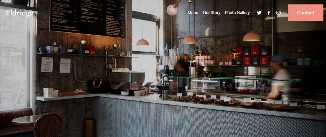
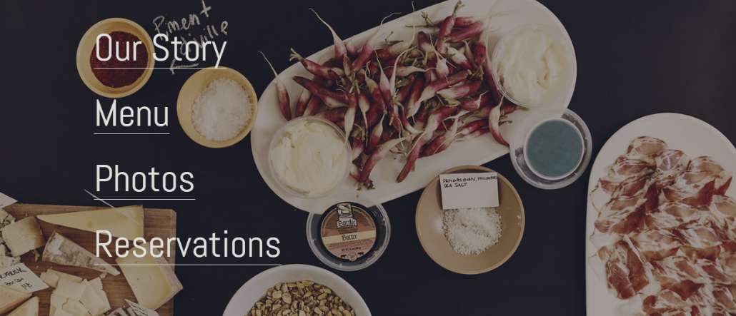
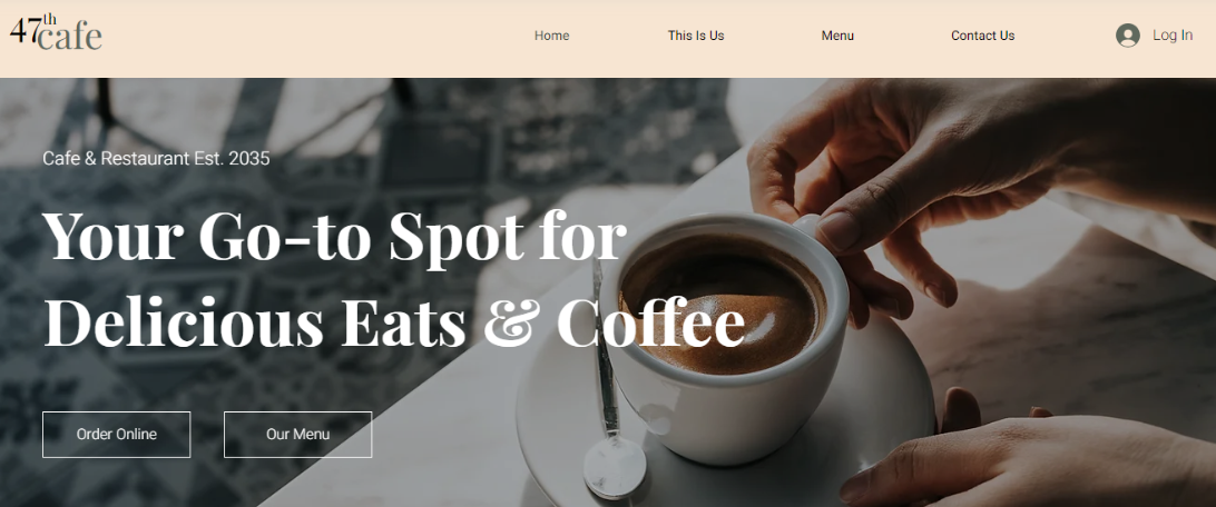
Built with coffee shops in mind, Eldridge is a warm and inviting template that makes you feel right at home. The large cover image lets you showcase your space and gives visitors a feel for your shop from the get-go.
Eldridge puts all your important info up front where visitors can find it. Your story, menu, testimonials, and even a newsletter sign-up are all on the homepage. Social media icons can be found at the top and bottom of each page, making them hard for anyone to miss.
The four pre-built pages include a photo gallery for visitors to get a better idea of your cafe’s vibe, as well as a prominent contact page. The latter features a location plugin as well as a contact form, so customers can easily find you and get in touch.
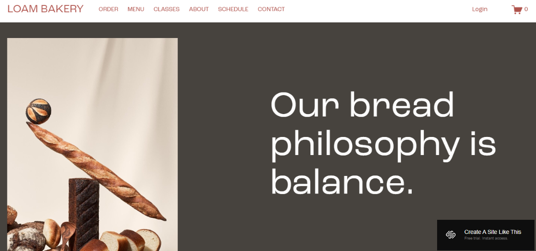
You can find Loam in the Local Business category, and its asymmetrical layout gives it a bit of an edge, letting visitors know right away that something is different about your shop. This is a look that’s difficult to get right on your own, so it’s helpful that Loam does all the heavy lifting for you.
This template includes an online store page, so you can sell products directly from your site. It’s a useful feature if you plan to sell coffee beans, mugs, clothing, or other merchandise in addition to your drinks and menu items.
If you want to share your knowledge about coffee making or cooking in general, a pre-built Classes page lets you design and sell online courses. And with Squarespace’s scheduling tool, you can share your available hours, let your clients book sessions online, accept payments, and more.
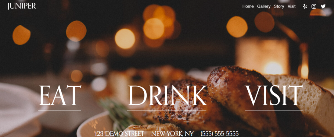
Juniper’s simple homepage relies on a huge cover image to hook customers, which gives you a great opportunity to flaunt your shop’s eye-catching space or signature drinks.
This template is somewhat unique in that there’s not a lot of scrolling space – instead, the title text in the header image links straight to your menu and reservations pages.
Speaking of reservations, Juniper comes with the Tock integration, which is very helpful if your coffee shop serves lots of large parties. It’s an all-in-one system that lets you manage reservations, events, tableside payments, and takeout.

4. Palmer: Display Your Glowing Reviews
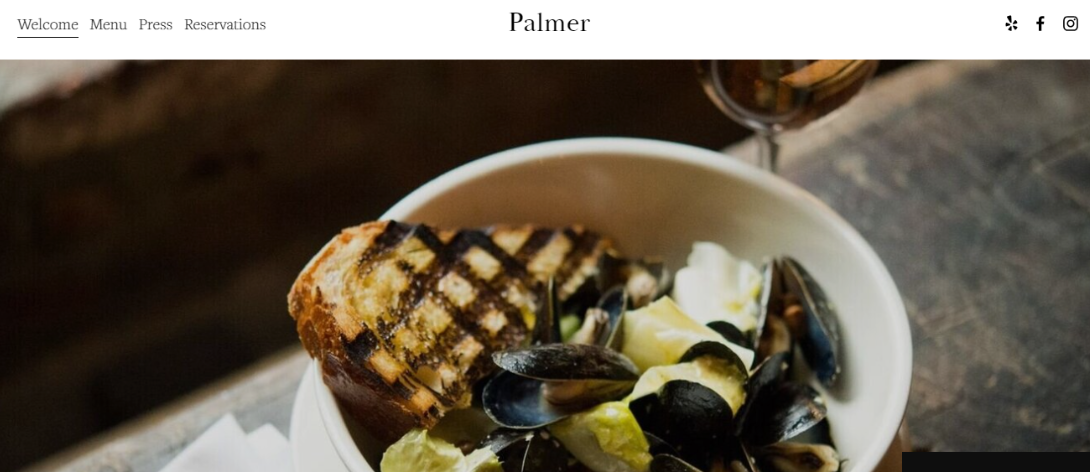
I really liked Palmer’s scrollable Welcome page, which functions as a preview of what visitors can expect from your coffee shop. You can add a short summary about what makes your cafe stand out and include your menu highlights, followed by an attractive photo gallery to awaken the taste buds.
Another standout element is the Press page, which you can use to highlight quotes from various articles or even reviews from satisfied customers, helping you establish credibility. This template also comes with a built-in Tock block, allowing your customers to make online reservations.
You can also embed an up-to-date map next to your contact and working hours information to make it easy for your guests to find you.
5. Vance: Put Your Story Front and Center
Vance is an ideal template if your coffee shop has a particularly interesting tale to tell. The homepage features a large CTA button that links directly to the Our Story page, and as you scroll down you’ll find a couple more such links, together with sections that further explain what your business is all about.
This template does a really great job when it comes to encouraging visitors to take action – the sections with contact information and Make a Reservation CTA button are in matching colors and easy to spot. There’s even a Get Directions CTA that links to a Google map.
Visitors can also subscribe to your newsletter to receive news and updates about your coffee shop, such as new additions to your menu or happy hour promotions.
6. Auburn: Blog About Your Coffee Place
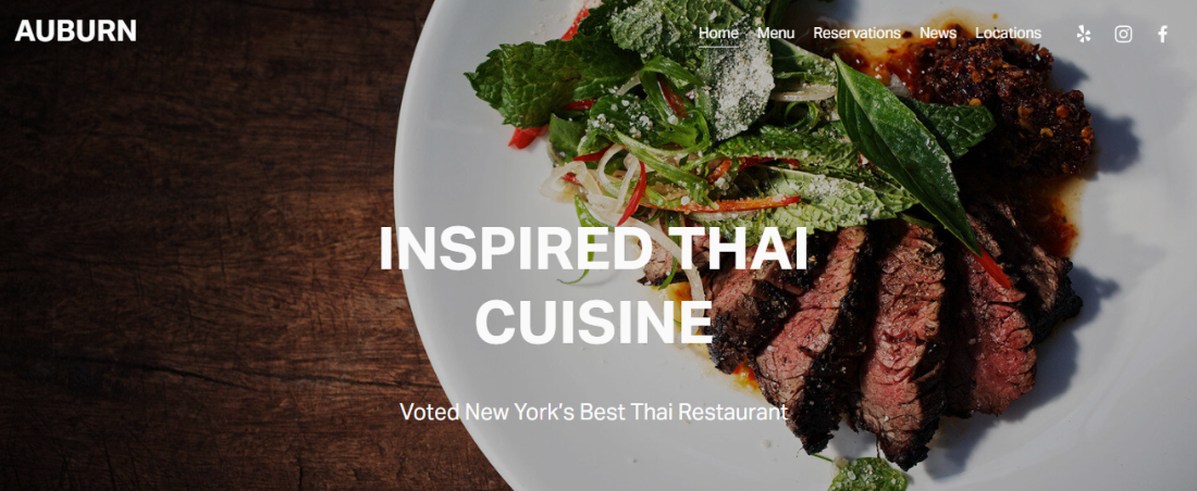
Auburn is a great option for information-rich websites and already established coffee businesses. There’s plenty of room to describe your story and showcase your images, and even a section for presenting members of your team. The Reservations page is also detailed, with specific sections for special events and private parties.
If you have a way with words, you’ll appreciate Auburn’s built-in blog page. You can use it for special announcements, events, or educational posts about the art and science of coffee. A blog can also boost your marketing efforts and increase your traffic rankings, and thanks to Squarespace’s beginner-friendly blog editor, you’ll be able to create compelling posts even if you’re a newbie.
Another plus is a specific page for locations with built-in maps functionality, which is useful if you’re running multiple shops.
7. Atlantic: Information-Rich, Uncluttered Look
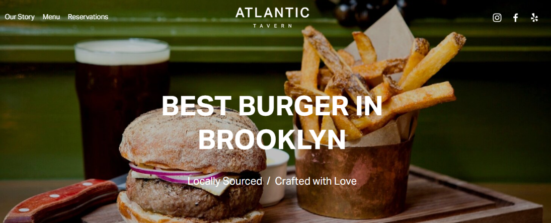
Another pick from the Restaurants category, Atlantic allows you to include plenty of content on your website while retaining a clean look. I liked the structure of the Our Story section, which allows you to place a short introduction of who you are side by side with your coffee shop contact details, location, and hours.
Also, the template fits several different menus – snacks and salads, sandwiches, drinks, etc. – all in one section via a navigation bar for a clean, streamlined feel.
As you scroll down the homepage, there’s a section with a slideshow you can use to highlight your signature dishes or drinks. And thanks to Squarespace’s attractive gallery layouts, you can really make your photos pop.
8. Hester: Bright and Cheerful
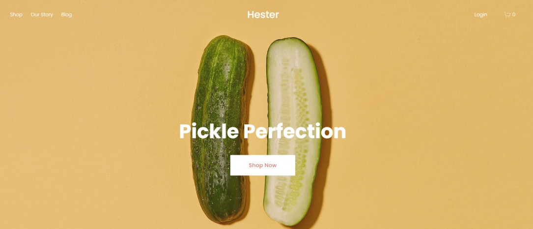
Hester appears in the Online Store, Blog, Popular Designs, Local Business, Food, and Shop categories, so it’s fairly versatile – and I think it could easily be tweaked for a cafe. My first thought when I saw Hester is that it is FUN. The bright colors and square layout give it a whimsical feel that would be ideal for a more modern or funky coffee shop.
As Hester is primarily an e-commerce template, it would work well if you plan to sell signature coffee blends and products along with your lattés. It also comes with a blog page and offers ample opportunity to display photos of your products and space. All you would need to do is add a menu page!
Didn’t Find What You Were Looking For? Check Out These Templates from Our Favorite Site Builders
If you’re still unsure which template would be the perfect choice for your coffee shop website, here are a few more options from Wix, SITE123, and IONOS that are worth considering.
Wix Cafe: Best for Delivery
Wix’s Cafe template brings out the vibe of a typical New York coffee shop, with a soft color palette, neat typography, and full-screen images. I particularly like the design of the CTA buttons – transparent, but still easy to spot.
This template works great if you plan to offer delivery services. The built-in Wix Restaurants Orders app allows you to take orders for pickup and delivery, set areas that you service, and get alerts on new orders by email or SMS. Best of all, you don’t have to pay a commission on your sales.
SITE123 The Tipsy Tumbler: Get Your Coffee Shop Online Quickly
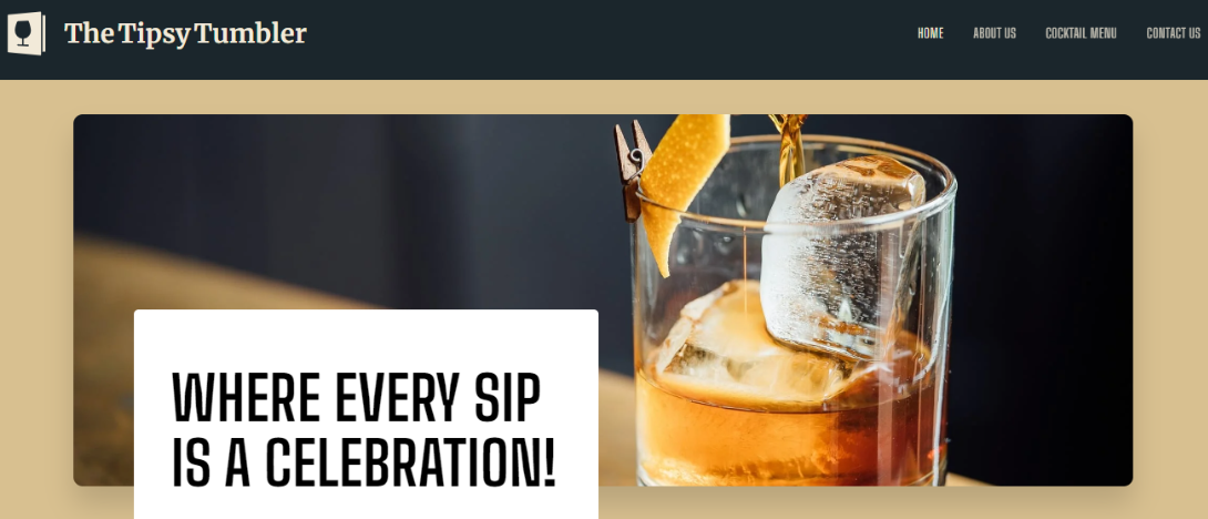
SITE123’s The Tipsy Tumbler template features a one-page, scrollable design, perfect if you want to get your coffee shop website online quickly. It has all the essentials you need – an About Us section to tell your story, a Menu section to showcase your offerings, and a Contact section with a built-in map functionality to make it easy for customers to find you.
What I particularly liked is the little logo in the top left corner of the homepage, which gives you an idea of how you can make your website more recognizable. SITE123 has built-in logo-making tools to help you promote your brand.
IONOS Coffee Shop: Keep It Simple and Classic

IONOS’ Coffee Shop template has a straightforward design with an attention-grabbing header image and dedicated Menu and Contact pages. There’s plenty of room to tell your story and showcase photos of your daily specials.
There’s also a built-in online store, which is quite handy if you plan to sell coffee beans or other items. Your customers can easily get in touch via the online form or social media links.
These Are The Best Squarespace Templates for Coffee Shops
Picking a design that resonates with the feel of your cafe will save you valuable time and energy. The templates on this list contain all the essential features a coffee shop website should have, so take your time to discover the one that aligns with your style the most.