
They say hindsight is 20/20, and in branding this is painfully true. Especially when you try to rebrand.
The last eye-opening study on this came to me from AtomRadar, which revealed that even multi-billion dollars companies fail at rebranding.
After reading their surprising findings (more on that later), I decided to ask 20,000 readers at Website Planet what are the rebrands they hated the most and why.
From awkward name changes to cringey packaging updates to ill-fated logo overhauls, our study reveals the most hated rebrands of all time and the psychological missteps that triggered public backlash.
Each case offers a cautionary tale (and a dash of schadenfreude) for marketers.
1. PayPal Logo Refresh
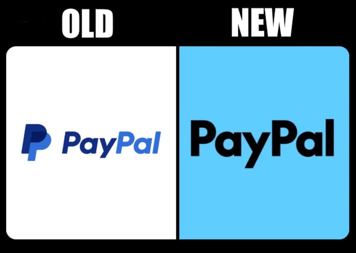
In late 2024, PayPal introduced a refreshed brand identity designed by Pentagram: a new black sans-serif wordmark (PayPal Pro), sharper monogram, and condensed color palette for a “modern, versatile look”.
A survey by AtomRadar found 91% of consumers prefer the previous logo.
Check their study after this one for more insights on how consumers react to logo redesigns:
https://www.atom.com/radar/paypal-brand-refresh-91-favor-old-logo/
Our surveyors agree, and critics have already labeled the new design dull, generic, and lacking personality (hence perfectly fitting in with most fintech brands these days).
“The logo now looks just like everything else”, was another bland tech wordmark.
2. Tropicana Packaging Redesign (January 2009)
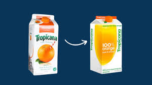
In January 2009, Tropicana (owned by PepsiCo) launched a new packaging design for its Pure Premium orange juice, changing many brand elements at once (logo, typography, slogan, image, lid). Most importantly, they ditched the classic orange-with-straw visual for a minimalist glass-of-juice design with vertical branding.
Within two months, sales fell by 20% (~$30 million), because customers couldn’t find their juice anymore on the shelves. The total cost of the redesign failure, including the $35 million advertising campaign and reverting to original packaging, exceeded $50 million.
Tropicana reverted to the original packaging by late February 2009 to mitigate losses.
Branding experts also slammed it as soul-less, “generic supermarket juice.”, saying that it looked more like photoshopped store-brand packaging than premium Tropicana.
2. Apple “What’s a Computer?” Ad (2017)
Not exactly a rebrand, but I had to include it, since I couldn’t find a single comment in defense of this ad even after sifting through thousands of survey responses.
It’s 2017. Apple releases an iPad Pro ad starring a kid asking, “What’s a computer?” while using a tablet. The goal was to position the iPad Pro as a replacement for a traditional computer, challenging its own conventional definition.
The messaging was met with mixed reactions ranging from uncomfortable to angry
To “God f*cking damnit” for this ad that came off smug and presumptuous, given that many users found iPadOS still limited compared to macOS or Windows.
However, over time, Apple has continued to enhance the iPadOS, adding features like proper windowing and multitasking to address some of these criticisms, Eventually the device carved out its own niche, among professionals that value portability, especially creatives.
3. Sierra Mist changing to Mist TWST (without the “i”)
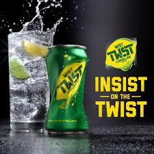
The rebranding of Sierra Mist to Mist Twst in 2016 is widely considered a failure, with PepsiCo reverting the name back to Sierra Mist two years later. The brand was eventually replaced by a new lemon-lime soda, Starry.
The new formula reintroduced high-fructose corn syrup after having used natural sugar and stevia in prior versions. The packaging and branding were refreshed to appear more modern and better compete with market leader Sprite and 7 Up.
The new name confused those loyal to Sierra Mist, and the new high-fructose formula alienated consumers who preferred the previous version with natural sugar. The unusual spelling “Mist Twst” was also criticized as gimmicky, and it was hard to pronounce.
Both sales and market share declined.
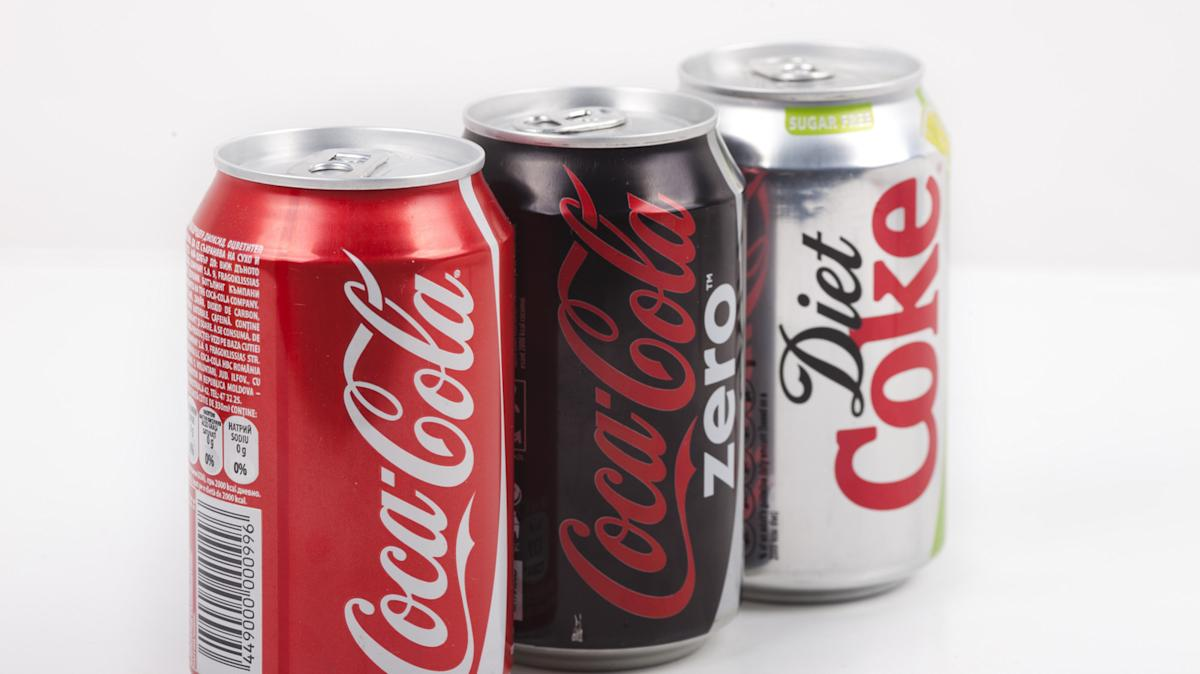
4. Diet Coke’s gender-targeted marketing
This is not just one rebrand, but a full timeline of attempts by Coca Cola to
Since its launch in 1982, Diet Coke became strongly associated with femininity , leading to what marketing experts call “gender contamination” (men’s reluctance to consume products perceived as feminine).
In 2017, Coca-Cola decided to move away from strictly gender-coded marketing and create a more unisex appeal for Diet Coke through defensive commercials filled with humor and quirky characters (such as those featuring the animatronic tortoise “Tort”).
In 2016, Coca-Cola declared that 60% of men were drinking Diet Coke weekly, up from 40% in 2005. But regardless of these arguably positive results, the entire marketing move was seen as defensive and inconsistent by critics and consumers.
“ Coca-Cola’s corporate actions, such as scaling back sustainability goals and facing backlash over plastic pollution, have probably contributed to consumer negativity toward the brand, which spills over into perceptions of the rebrand”, says Roberto Popolizio, managing editor at Website Planet.
5. Mr. Pibb Goes Xtra (2001)
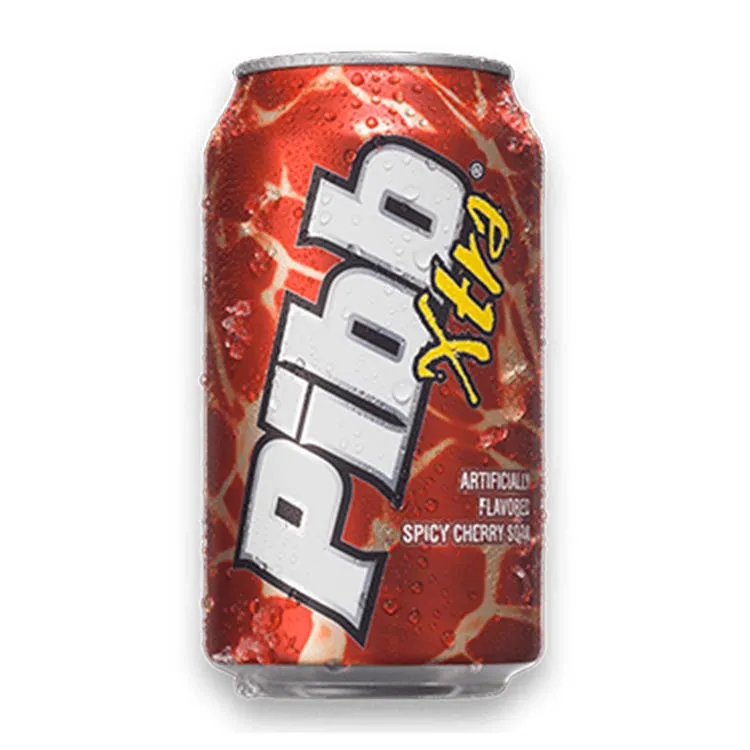
The rebranding of Mr. Pibb to Pibb Xtra in 2001 by — yep, them again — Coca Cola aimed to better compete against Dr Pepper, and although it was arguably not a straightforward failure it did face significant challenges and mixed reception.
The change was more than a simple rebrand: it involved a reformulation adding a stronger cinnamon flavor to create a bolder, spicier taste profile, which was reflected in the new name “Pibb Xtra”.
Both the rebranding and reformulation did not sit well with many core fans, which in part explains why Pibb Xtra never achieved the market dominance Coca-Cola hoped for, whereas Dr Pepper continued to grow its sales significantly up to $15.35 billion worldwide in 2024.
Critics likened it to “a midlife crisis in a PT Cruiser”. One remark said: “Xtra? More like extra desperate”. Needless to say, sales didn’t improve.
6. Comcast to Xfinity
Comcast rebranded its consumer services (TV, internet, phone) as Xfinity in 2010. The goal was to shed the company’s public image as a poor customer service provider and reposition it as a modern tech company.
Surveys showed about 70% of consumers disliked the new name as too confusing, which became a target for jokes and online criticism. Just to mention a couple, our respondents said it sounds like a porn site or a medicine!
Although not a failure in terms of business survival or market share, the rebrand didn’t really help Comcast’s bad rep, because of the accusations for deceptive advertising that Xfinity had to face.
A cautionary example that branding alone cannot fix fundamental customer experience issues.
7. Subway
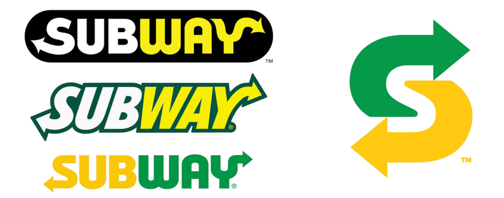
Since the Jared Fogle scandal, consumers feel like Subway has no idea what to do, pointing to awkward repositioning like retro wraps and the loss of the popular $5 footlong.
All signs that the brand is struggling to maintain relevance amid changing consumer preferences and stronger competition. Franchisee complaints and publicized internal conflicts have further tarnished the brand’s image.
Subway closed approximately 631 U.S. locations in 2024, bringing its total below 19,502 (the lowest in 20 years).
8. IHOB Fake Rebrand
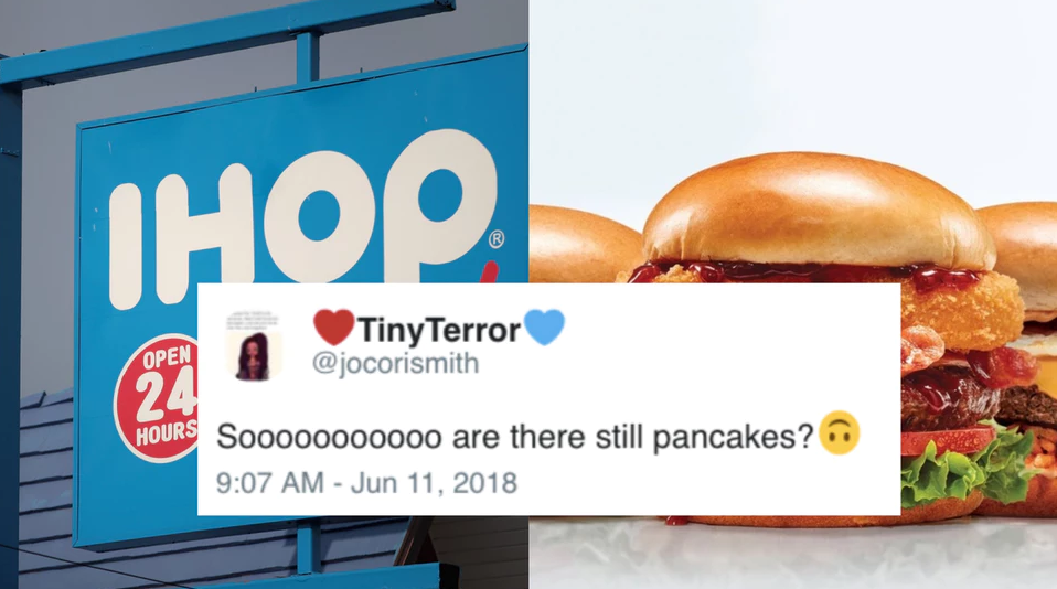
This is a clever but risky marketing stunt that didn’t really increase sales by much while creating attention but also confusion and mixed feelings.
IHOP temporarily rebranded itself as IHOb in 2018 (with the “b” standing for burgers) to promote a new line of burgers and boost its lunch and dinner business. This was not a permanent name change but a clever campaign designed to generate buzz and shift consumer perception beyond just breakfast and pancakes.
While the campaign succeeded in getting people talking (over 1.2 million tweets in 10 days and massive media coverage), the reaction was not overwhelmingly positive. When IHOP revealed it stood for “burgers,” some fans expressed disappointment or frustration, feeling this temporary rebrand was gimmicky, misleading, and straying too far from the company’s pancake roots.
9. Twitter to X

The rebranding of Twitter to X in 2023, initiated by Elon Musk, was one of the most controversial corporate rebrands in recent years, and had a significantly negative impact on the platform’s brand value, revenue, and user perception, especially in the first two years.
Elon aimed to transform Twitter from a microblogging platform into an “everything app” encompassing social media, payments, messaging, and more, inspired by platforms like China’s WeChat.
Twitter’s valuation according to Brand Finance plummeted from $5.7 billion in early 2022 to nearly $3.9 billion in 2023, then down to just $673 million in 2024. Advertising, which accounts for roughly 75% of X’s revenue, saw a dramatic drop from over $1 billion in 2022 to about $600 million in 2023.
Many users were unhappy about losing the familiar Twitter brand and blue bird, and still refer to the platform as Twitter rather than X. The new interface was also considered less user-friendly. Most of these users moved to either Mastodon or Bluesky.
Experts also noted that Twitter had immense brand equity built over 17 years, and abandoning the name risked alienating loyal users and advertisers.
Key Takeaway
There’s an ocean between being different and being distinctive.
This roundup of the worst rebrands is a goldmine of lessons from the top brands in what not to do. A pattern we can see is that all these flops aren’t failures of creativity, but failures of strategy and understanding the customer.
Changing how a brand looks without figuring out how it feels to consumers can backfire fast, so be careful to evolve without alienating.
Any questions about rebranding?
Get in touch with Grant Polachek, CGO at AtomRadar, the world’s #1 brand naming platform.
https://www.linkedin.com/in/grantpolachek/overlay/about-this-profile/