7 Best Landing Page Builders for Better Conversions in 2026
The most comprehensive list of the best landing page builders on the internet

Our team of experts has tested and reviewed the most popular landing page tools on the market and found the best ones for converting visitors into valuable leads and sales. If you’re looking for a builder that’ll fit your needs, budget, and brand voice, we’ve got you covered.


There’s good news – many builders also provide the features, interface, and overall experience you need to create a well-designed and functional landing page. Our team researched and tested the most popular landing page creators on the market to find the ones that provide the solutions they promise. We considered factors like customization, conversion features, ease of use, customer support quality, and value for the price.
To be honest, even on this list, I have my favorites – and you’ll probably find yours too. No tool will be ideal for everyone. That’s why we found landing page builders that stand out in different areas, like marketing or e-commerce. Keep reading to discover the right builder for you.
-

- User-friendly customization features
- Built-in site performance monitoring and optimization tools
- AI tools for copyrighting, section creation, and SEO
- Thousands of third-party apps to expand functionality
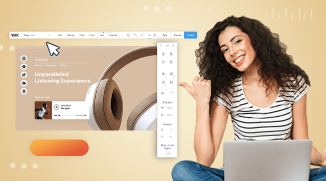
Wix is one of the only platforms that provide a truly unrestricted drag-and-drop builder. That means you don’t have any limitations when it comes to element placement. It also offers granular customization tools like custom animations, scroll effects, and image optimization – not to mention over 110 landing-page templates. If you’re looking for complete customization, Wix is your best choice.
It’s not just a matter of your landing page looking well either – Wix offers plenty of lead generation tools to ensure it’s effective too. These include customizable lead capture forms to obtain lead information, an intuitive contact management dashboard to use that information effectively, and a release manager to help you with A/B testing.
If you need your landing page to serve a particular purpose, like class registrations or restaurant table reservations, Wix offers plenty of native apps and third-party integrations to serve various niches. While other landing page builders might force you to adapt your operations to their restricted set of tools, Wix provides a large enough catalog of niche-specific features to serve your business.
Wix offers a forever-free plan with access to nearly all its design features. However, if you publish your finished site under the free plan, it will display Wix branding and a Wix subdomain, which could hurt your business’s credibility and professional image. That said, the free plan lets you access all of Wix’s customization tools, so it’s a great option if you’re looking to test the service before making a deeper commitment.
-
- Unique editor with guidelines for strong visual design
- Simple built-in analytic tools
- Strong e-commerce and branding features to improve sales
- Large selection of built-in tools for email marketing
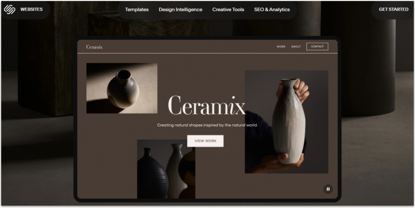
If you’re in a creative or luxury industry where the visuals matter a lot, Squarespace is the right tool for you, as it doesn’t sacrifice user-friendliness for effective design. Its selection of 180+ professionally designed templates, plenty of media editing tools, and an editor built for cohesive designs make it a good choice if you’re looking to create visual impact.
The editor is a bit more restrictive than Wix’s, which can actually be great news if you find the idea of fine-tuning every widget on your page somewhat overwhelming. Squarespace adapts your site’s layout to a grid system that keeps it looking organized. Its editor also focuses on tools for customizing element groups, which helps you avoid clashing design choices. You can also add pre-made section blocks directly for even faster editing, and simply make smaller edits later to add your personal touch.
Thanks to its built-in caching tools for images, videos, and other data, as well as its automatic media optimization and a well-optimized backend, Squarespace delivers good loading speed results. This helps both take your mind away from time-consuming manual optimization and improve your ranking on search engines.
There are plenty of tutorials available directly from Squarespace’s page. This, combined with useful AI tools to create text and templates, as well as a well-thought-out user interface, makes the builder easy to use for both beginners and professionals. Though there’s no free plan, you can make the most of Squarespace’s full 14-day free trial to decide how comfortable you feel before making a commitment.
-
- Dedicated multi-channel marketing platform
- Easy-to-use automation tools
- CRM integration
- AI tools for individualized email marketing
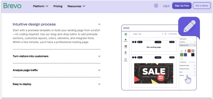
Brevo is ideal for email marketers and anyone looking for a tool that offers both customer relationship management (CRM) and email marketing. Since the landing page editor works mostly by adding pre-designed sections and making small customizations, it can help you get online with little effort. For any lead-capture features, Brevo offers a dedicated redirections menu, with useful instructions for creating a complete lead-generation funnel.
Once your landing page is live and generating leads, Brevo’s dedicated segment management dashboard can help you manage your contacts more efficiently and create better targeted content. When you have enough information, you can use Brevo’s tools to create automations based on visitor data, which allows you to automatically send emails to different segments, trigger reminders, and more.
Brevo also offers a full email marketing suite. In fact, Brevo’s email marketing is also near the top of our list for dedicated services. That’s because it comes with a variety of templates, easy customization, and over 100 integrations. Since Brevo is more of a general marketing platform than just a landing page tool, it’s a good solution if you’re looking to manage your landing page along with your email marketing campaigns.
Brevo offers a fully free plan for its marketing platform, though the landing page builder is only available from the Standard plan onwards.
More on Brevo (formerly Sendinblue)
Visit Brevo (formerly Sendinblue) > -
- Automatic visitor-to-page routing tool
- Client and collaborator roles for agencies
- Proprietary A/B testing tool
- Integrations with over 1,000+ third-party apps
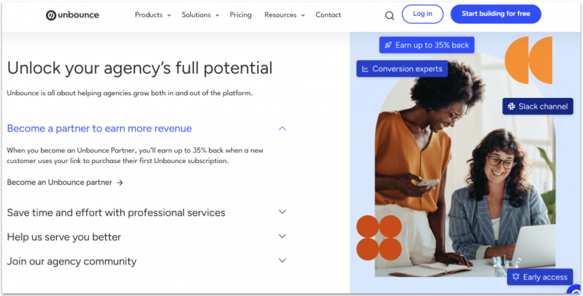
Unbounce offers over 1,000 integrations with third-party apps (including WordPress, Slack, Salesforce, and Zapier), integration with custom code, free access to the Unsplash image gallery, AI tools, and more. If you’re a more experienced marketer, Unbounce is the option for getting the smaller details just how you want them.
If you work with a variety of clients, Unbounce allows you to create custom client roles with limited permissions for more efficient collaboration, and you can add unlimited users to an account if you work as a team. Its audit logs feature also allows you to see which team members did what, which can help you better organize your team.
One particular highlight is Unbounce’s Smart Traffic tool, which uses AI to determine which version of your landing page to show to different visitors, like an automated form of A/B testing that works instantaneously. Unbounce also offers Smart Copy, an AI copywriter with over 45 specialized templates for different use cases.
The main dashboard doesn’t offer much guidance, and the main page editor varies from the industry standard. I wouldn’t recommend it for beginners or solo users, since it can be a bit overwhelming. It also falls on the pricier side of the scale. For agency work, however, its features for client work and teamwork, as well as its in-depth customization features, might make it worth the investment.
-
- All-in-one tool for email marketing, landing pages, newsletters, and more
- Good for users on a tight budget
- SEO tools to rank high in search results
- Mobile chat app for immediate client contact
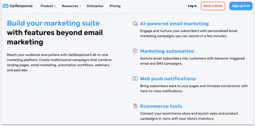
Besides offering an easy-to-use, drag-and-drop landing page builder, GetResponse also comes with email marketing management, e-commerce integrations, and a full website builder (though it is a little basic for my taste). It also has analytic features and even tools to monetize online courses, newsletters, and webinars.
Its landing page builder provides an easy-to-use section editor, and GetResponse offers over 200 templates or the option to create your own template with AI for even faster building. The editor also comes with built-in tools for pop-ups and countdown timers, which help you create a sense of urgency.
I won’t claim that GetResponse does everything better than a specialized tool would, but you won’t find anything lackluster either. If you run a small business and you need an easy-to-use tool that performs multiple functions, GetResponse is a great option. It integrates with popular platforms like Shopify, WooCommerce, WordPress, and more. Though there’s no free plan, you can try out the platform’s 14-day free trial.
More on GetResponse
Visit GetResponse > -
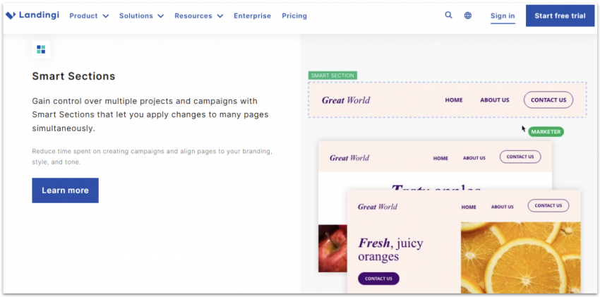
- E-commerce integrations even on the free plan
- Client managing features
- 400+ landing page templates
- Assisted landing page migration
If you’re looking to use your landing page to sell a digital product like an e-book or an online course, Landingi offers the e-commerce templates and integrations you need, even on the free plan. You also get a simple dashboard to manage products and dozens of integrations with different payment processors. If you already have a store with an e-commerce platform, you can integrate it to create single-product landing pages.
You also get access to a straightforward drag-and-drop editor. Its analytic tools, while basic, allow you to measure the effectiveness of your landing pages. These include server-side A/B testing and a detailed visitor tracker that shows you exactly where they might have bounced off the page.
If you’re already using another service, Landingi offers free migration on the Professional plan. You can also connect your site with lead management tools, multilanguage tools, and more. Landingi offers a free plan designed specifically to help you try out and get used to the software, though you should consider upgrading if you decide to actually use it for your business.
-
- Fastest loading speeds
- Collaboration tools for teamwork
- 500+ prebuilt layouts for quick deployment
- 99.99% guaranteed landing page uptime
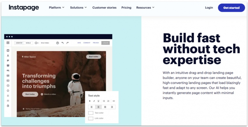
Thanks to its proprietary Thor Render Engine, Instapage automatically optimizes a page’s HTML code after publishing. It also offers impressive loading speeds along with a 99.99% uptime guarantee, both of which have a big effect on diminishing bounce rates.
Instapage offers a few and straightforward customization options. It’s not the best builder for design flexibility or advanced testing features, but it’s beginner-friendly. While the multi-focused approach of other options on this list might be intimidating for beginners, Instapage offers a simple and well-labeled editor that you can use even if you’ve never built a landing page or website before.
Instapage recently adopted AI-powered content generation, which saves even more time in the building process. If you’re working as a team, Instapage comes with real-time collaboration tools for specific sections of your page.
Instapage doesn’t come with a free plan, and its paid plans lean a little to the expensive side. Though you could try the service thanks to its 14-day free trial, I would recommend going with an alternative like Squarespace, which also offers good loading speeds with a larger feature catalog.
The Best Landing Page Builders Compared
| Free Plan | Best For | Dedicated A/B testing tools | Starting Price | ||
|---|---|---|---|---|---|
| Wix | ✔ | Customized landing page designs | ✘ | $17.00 | |
| Squarespace | ✘ | Design-first pages for users without much design experience | ✘ | $16.00 | |
| Brevo | ✔ | Managing leads and creating custom content | ✘ | $8.08 | |
| Unbounce | ✘ | Marketing agencies | ✔ | $74.00 | |
| GetResponse | ✘ | Handling many marketing tools on a single platform | ✔ | ||
| Landingi | ✔ | Unlimited pages on a budget | ✔ | $29.00 | |
| Instapage | ✘ | Top loading speeds | ✔ | $68.00 |
How We Evaluate Landing Page Builders
Choosing the right landing page software for your needs goes beyond just personal taste. Your choice can impact lead generation, engagement, ad ROI, and your overall marketing success. To help you make an informed decision, our team of researchers and testers evaluated each tool using a standardized set of criteria for objective comparison.
When testing landing page builders, we consider the following:
- Ease of use. These tools should be helpful and easy to understand for the business owners and marketers who use them, not just a few web design professionals. We compare our experience with user testimony to avoid personal bias.
- Customization. Getting your specific vision and brand voice across is fundamental to connecting with customers. We considered the type of editor, available widgets, and number of templates.
- Conversion tools. Some services offer long lists of miscellaneous features but neglect the tools that actually help businesses convert. We check for the tools we know will have an impact on the success of a landing page, like lead capture forms, basic analytic features, and a contact management dashboard.
- Pricing and transparency. We compare prices with other services as well as the experience of real users to ensure that the builder offers the right value for its price. We also pay special attention to transparency and whether any service uses deceptive strategies to charge more than advertised.
- Customer support. We test the customer support of each builder first-hand and compare it with the experiences of other users to ensure that you’ll get assistance when you need it.
- Performance and mobile responsiveness. Mobile traffic is now more than half of all web traffic, and poor performance has a direct correlation with a page’s bounce rate. We rely on a mix of performance tests and case studies across the web to evaluate performance and mobile optimization.
What Features Should a Good Landing Page Have?
Even if you go with the perfect landing page creator for your needs, that’s only half the battle. No builder can help you if you neglect the fundamentals of an effective landing page. But don’t worry – there aren’t many, and they’re all quite simple.
You’re looking for your landing page to serve a single specific purpose, as opposed to a website or a web app, so you should only include elements that help you fulfill that purpose. All you need to do is clearly establish what you’re offering, why it’s valuable, and how to get it.
A good landing page often includes the following elements:
- Header. This is a short, direct title that introduces what you offer.
- Subheader. Under the header, write a line or two that goes deeper into what your product or service does, why it’s valuable to your customers, and why they can trust you.
- Call to action (CTA). It’s the next action you want visitors to take. It can be the button you want your visitors to click or the form you want them to fill out.
- Hero image or video. High-quality images or videos of your product or service can boost conversions.
- Testimonials. If you have positive feedback from your products or services, including the testimonials of satisfied customers can help you build trust with your visitors.
- Interactive elements. This one is case-specific, but if your landing page merits it, interactive elements such as quizzes or games can encourage visitors to take action.
Here’s an example of a good landing page that contains a header, subheader, CTA, image, and testimonials:

What your landing page shouldn’t have
Anything that distracts from your main purpose is a big no-no, so make sure that you don’t include the following in your landing page:
- Too much text. A landing page is all about efficiency. Ideally, visitors get there, understand the value proposition being offered to them, and take action. Some copy can help in this process of converting visitors into leads, but too much and you’ll just cause your visitors’ attention to wander and ultimately bounce.
- Navigation elements. A landing page is there for one purpose and one purpose only. Navigation distracts from that purpose and makes your entire design less focused. You want visitors to have a single, logical next step after they arrive on your page.
- Too many CTAs. You can add more than one CTA, especially if your landing page is a little longer (that way, you remind visitors of what they’re there for), but adding too many CTA elements reeks of desperation and can make your visitors feel uncomfortable or even believe that your page is a scam.
FAQ
Why should you use a landing page builder?
Should you choose a dedicated landing page builder or a website builder to create your page?
Can you create a landing page without a website?
What is the best free landing page builder?
What’s the best landing page builder for WordPress?
What’s the best landing page builder for Shopify?


So happy you liked it!