

3.0 Adding a New Page
Since this is our first time adding a new page, let’s see exactly how we do it. The process will be the same for every page we add later on.
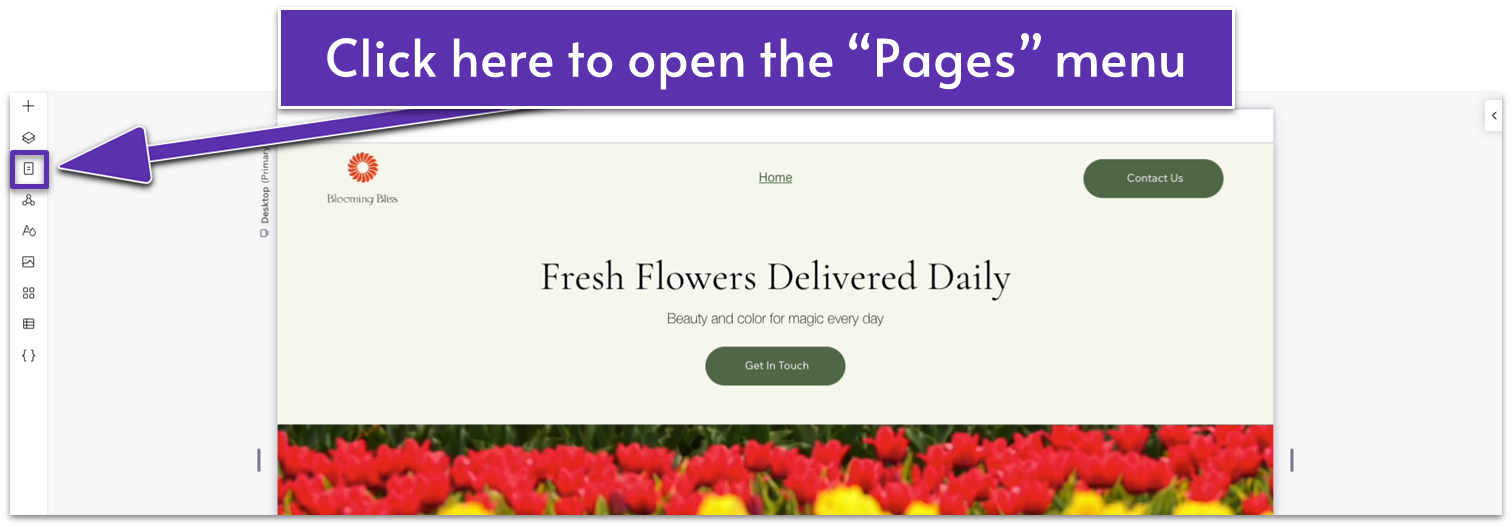
Step 1: Go to the pages menu.
- Click on the icon that looks like a rectangle with some horizontal lines ( ) on the left-side menu. It should be just below the “Layers” menu ( ).
Step 2: Open the pages menu and select “Add a New Page.”
- On the pages menu, click on the plus symbol ( ) next to the search bar to create a new page.
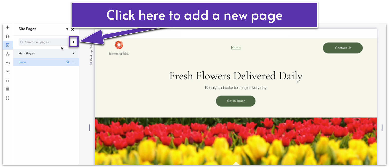
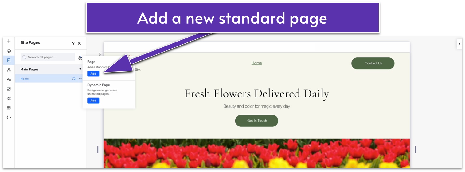
- You will see two options: “Page” and “Dynamic Page.” We’ll select “Page” for this one.
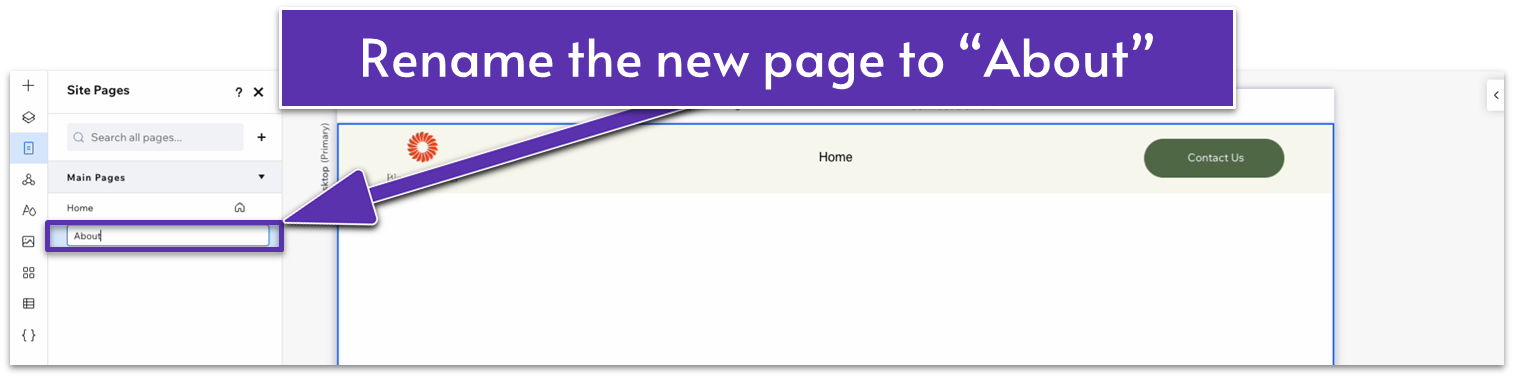
- You’ll be redirected to a blank page. A new name will also appear below “Home” on the “Main Pages” list. Rename the new page. For this example, we’ll use “About.”
Step 3: Close the pages menu.
3.1 Hero Section
Our hero section will consist of a simple bit of text, a contact button, and an image. Since we’ve already created a similar section, we’ll copy and paste many of the elements from our homepage and simply make changes where necessary.
Step 1: Copy the hero section from the homepage.
- Using the “Pages” menu ( ), head back to the homepage.
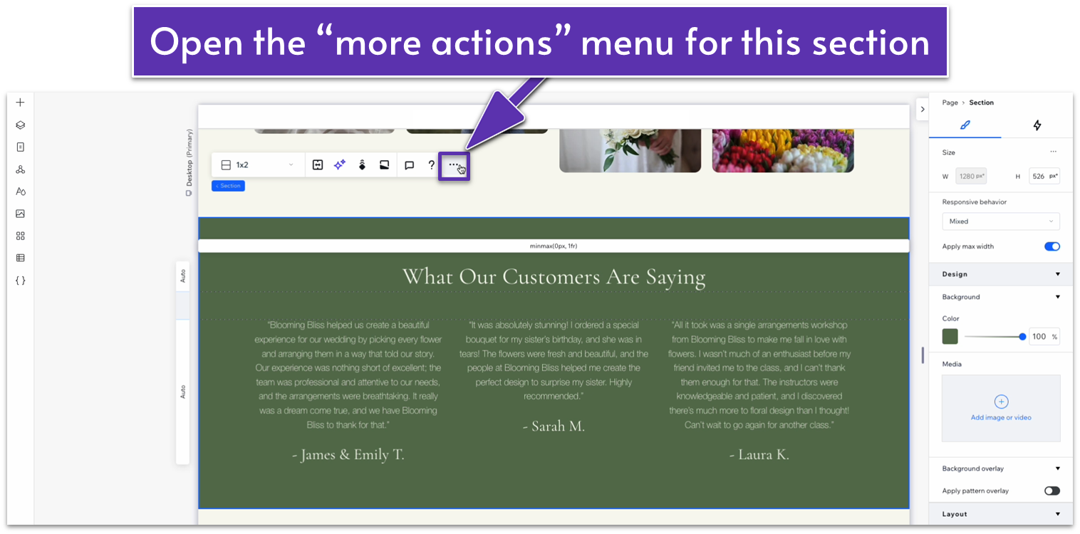
- Select the hero section and then right-click on it or select the three dots ( ) on the pop-up menu to open the “more actions” menu.
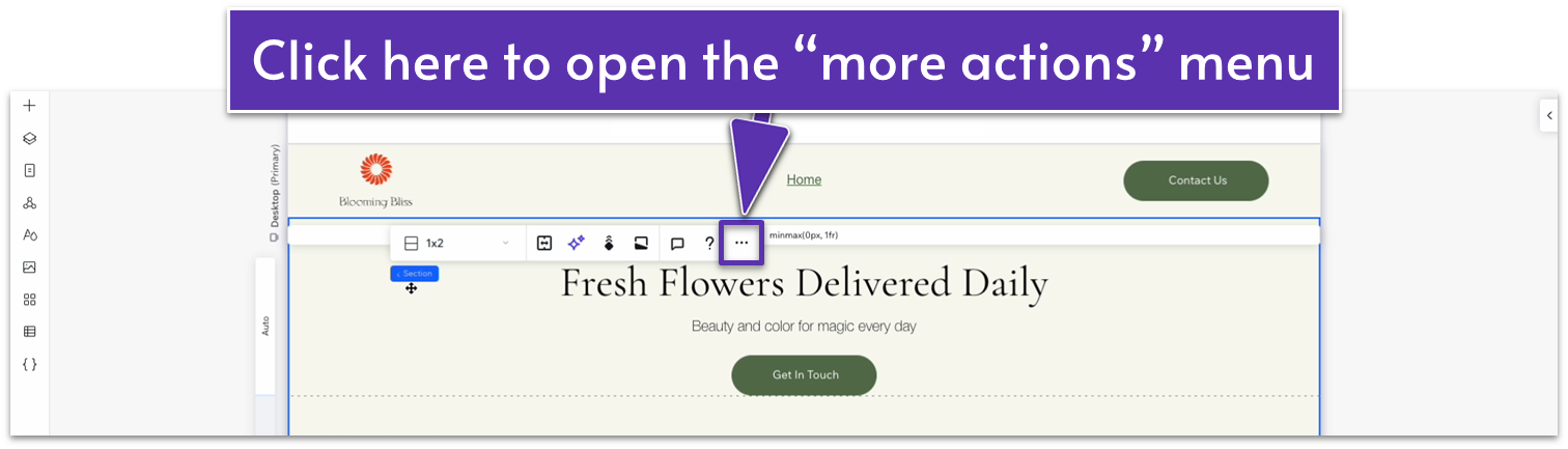
- Copy the section. Ensure you’re selecting the entire section, not just an element or container.
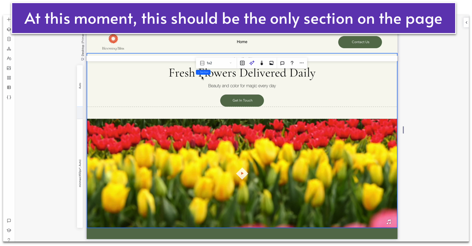
- Head back to the “about” page and paste the section. If the section appears beneath the default blank section for the page, delete the blank section.
Step 2: Style the hero’s text.
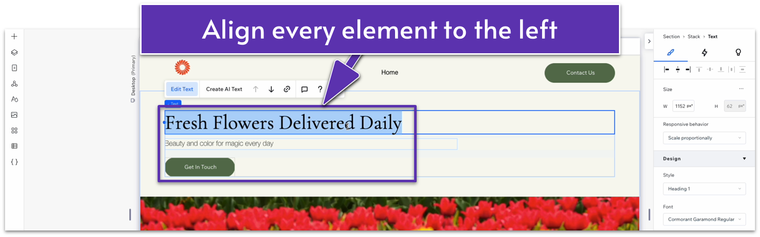
- Align the heading text to the left ( ).
- Align the text underneath the heading to the left ( ).
- Dock the text underneath the heading to the left ( ) and set its left margin to 0.
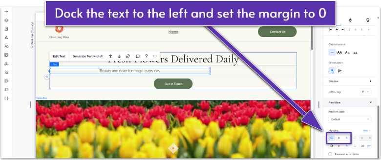
- Dock the button to the left ( ) as well, and set the left-side margin to 0.
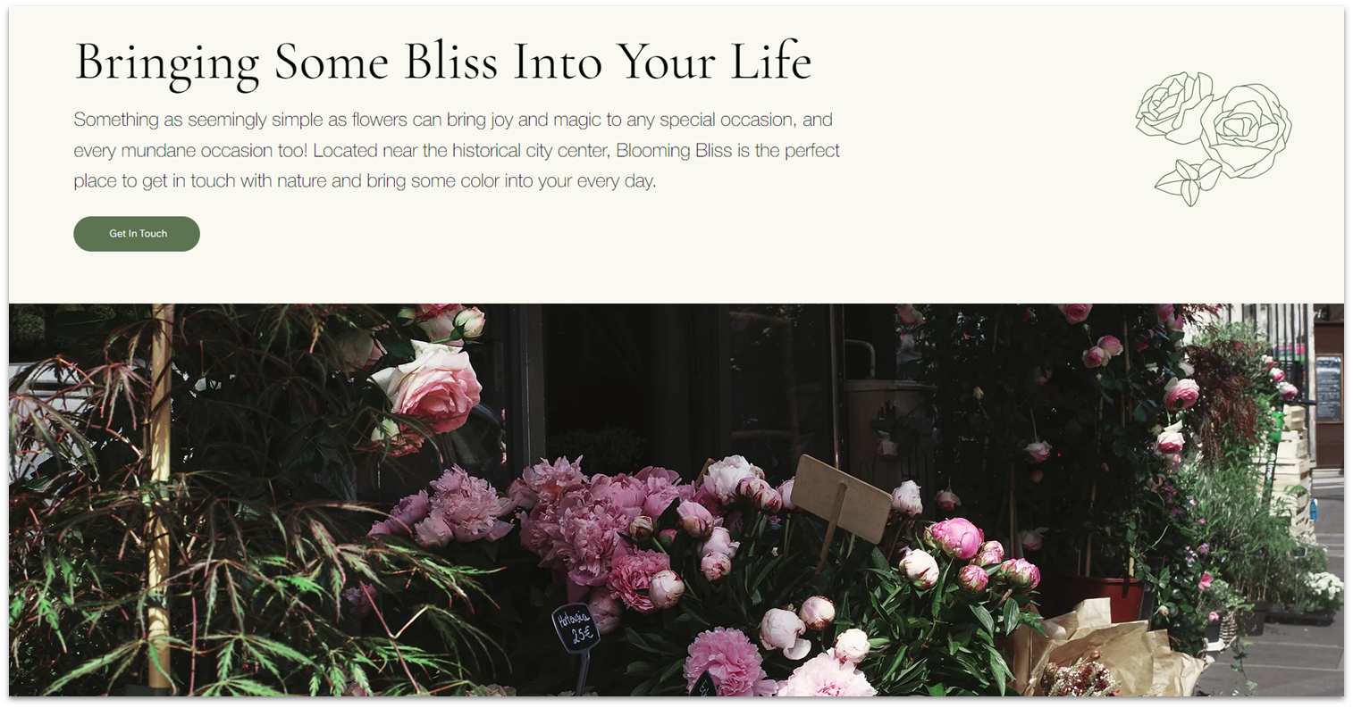
- Replace the heading with something that fits the section better.
- Replace the text under the heading with a brief paragraph about your business.
Step 3: Replace the video on the bottom row.
- Delete the video on the bottom row of the section.
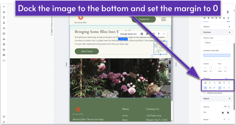
- Drag a high-quality photo to the bottom row.
- Set all margins ( , , , ) for the photo to 0.
- Set the image’s height and width to 100%.
Step 4: Add vector art to the top row.
- On the “Add Elements” menu ( ) head over to “Decorative,” “Basic Shapes,” and then select “More Basic Shapes.”
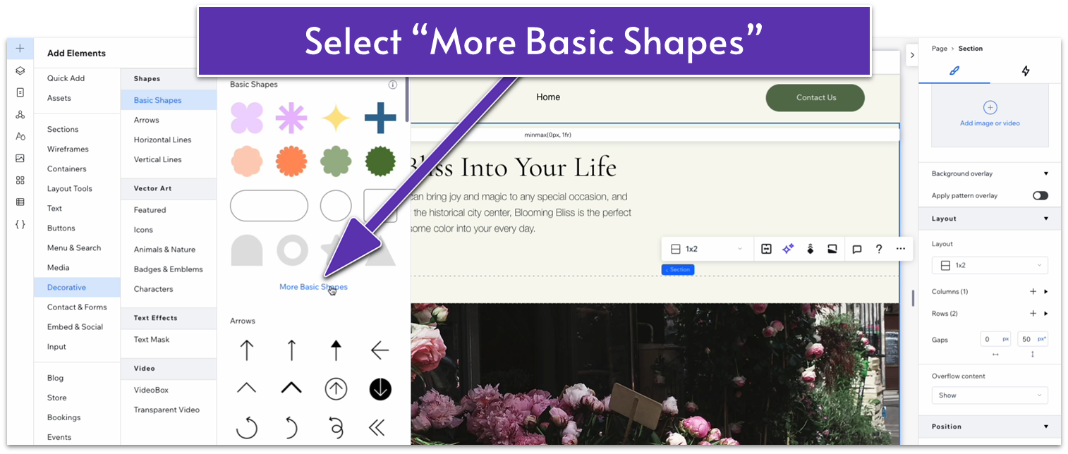
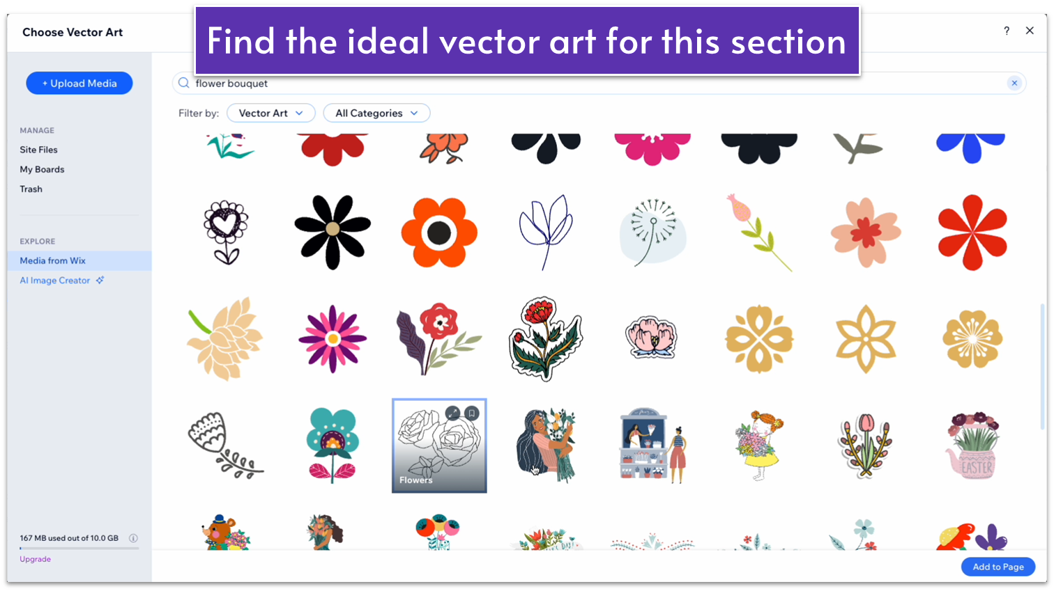
- We’ll use the search bar to find the perfect vector art for our flower shop.
- Move the vector art to the right-side of the top row.
- Change the vector art’s color to a dark green (#5C7452 HEX).
- Change the shape’s responsive behavior to “Scale Proportionally.”
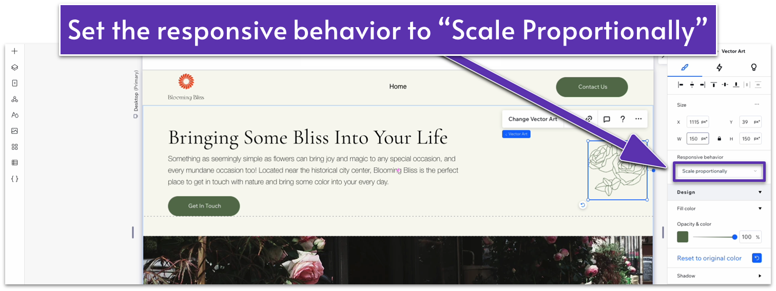
- Set the shape’s width to 150px.
- Dock the shape to the right ( ) and set the right-side margin to 50px scale.
Adapt for Tablet and Mobile Views
Step 1: Adapt for tablet view.
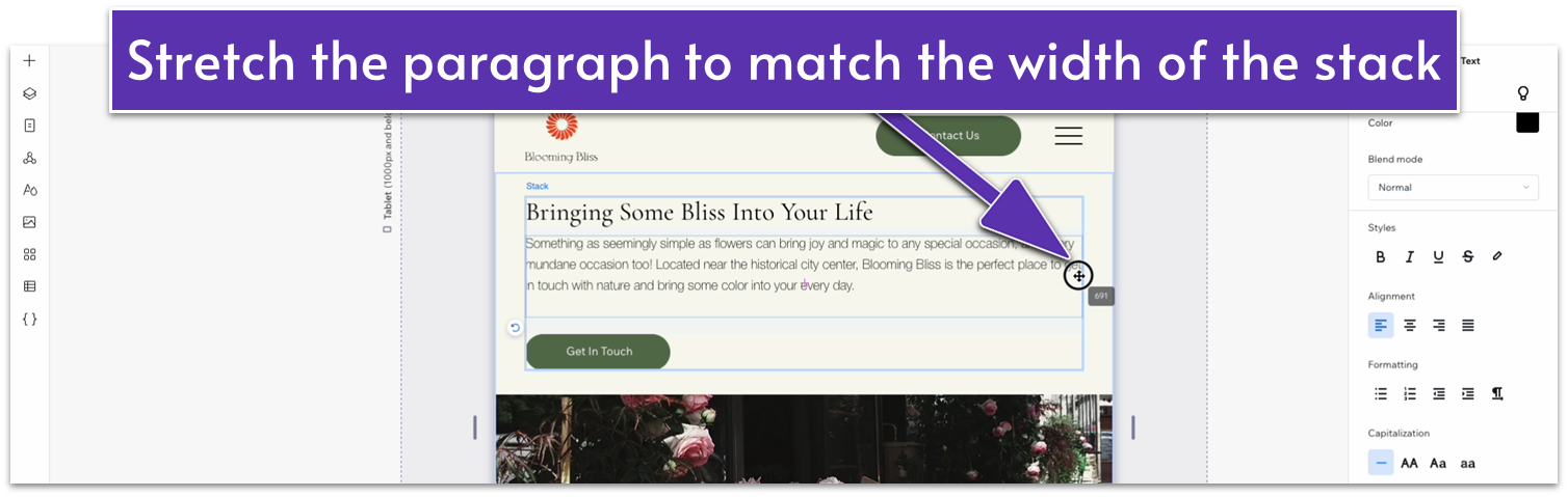
On tablet view ( ):
- Stretch the edges of the paragraph under the heading to match the width of the stack.
- Dock the vector art to the bottom ( ) and set the bottom margin to 0.
- Set the vector art’s width to 100px
Step 2: Adapt for mobile view.
On mobile view ( ):
- Set the width and height of the vector art to 80px.
- Set the right-side margin ( ) for the vector art to 10px.
3.2 “Our Story” Section
We’ll add a really simple section with more in-depth text about this business’s story. Though this section will be easy to build, it will also be the cornerstone of this page, so the copy here is really important. If you don’t have your text ready yet, don’t worry. You can just place about three paragraphs of placeholder text here and replace it before your site is live.
Step 1: Create a new section and apply an advanced CSS grid with a 2×1 layout.
Step 2: Add an image to the right-side column.
- Add an image and set its location in grid cells to the right-side column.
- Set the image’s height and width to 100%.
Step 3: Add paragraph text to the left-side column.
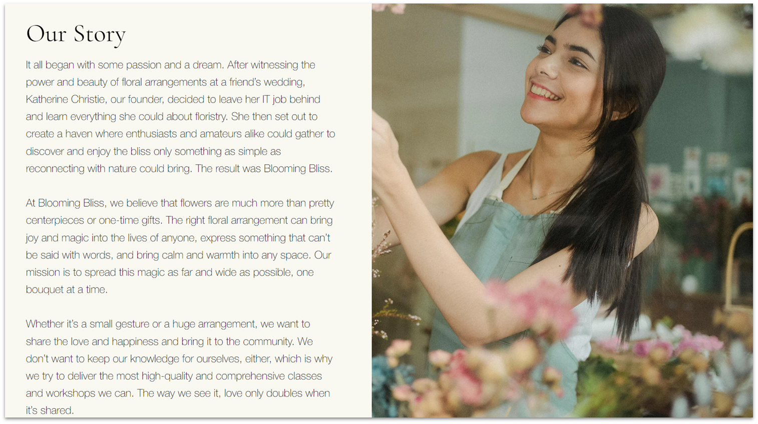
- Head back to the homepage and copy the text stack from the “Our Story” section.
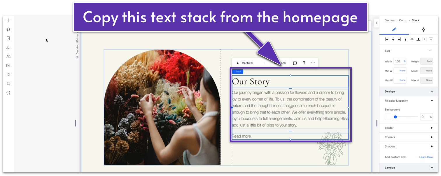
- Paste the stack on the left-side column.
- Delete the “Read more” text link from the stack.
- Set the top ( ) and bottom ( ) margins for the stack to 70px scale.
- Set the left ( ) and right ( ) side margins to 0.
- Set the stack’s width to 520px.
- Change the paragraph text for the copy for this section.
Adapt for Tablet and Mobile Views
Step 1: Adapt for tablet view.
On tablet view ( ):
- Change the section’s layout to 1×2 ( ).
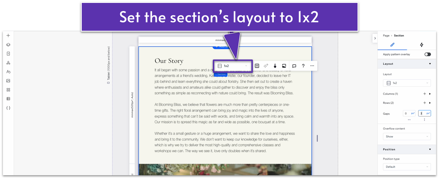
- Set the vertical gap ( ) to 30px.
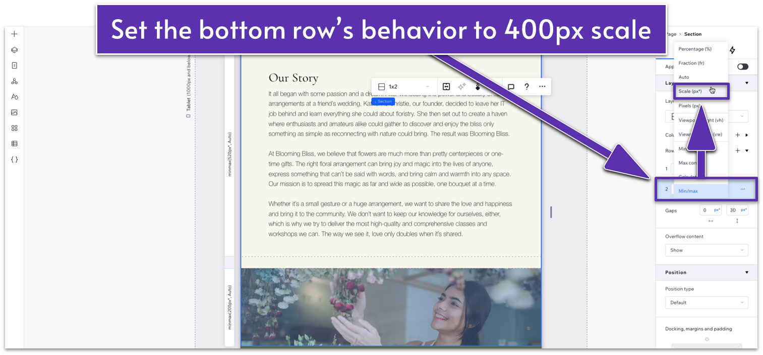
- Set the bottom row’s behavior to a 400px scale.
- Set the text stack’s width to 720px.
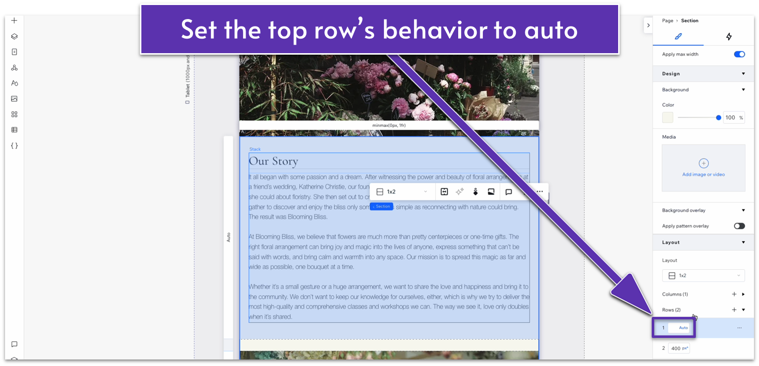
- Set the top row’s behavior to auto ( ).
- Set the top padding ( ) for the top row to 70px scale.
- Set the top ( ) and bottom ( ) margin for the text stack to 0.
Step 2: Adapt for mobile view.
On mobile view ( ):
- Set the top padding ( ) for the entire section to 70px.
- Set the vertical gap ( ) for the section to 30px.
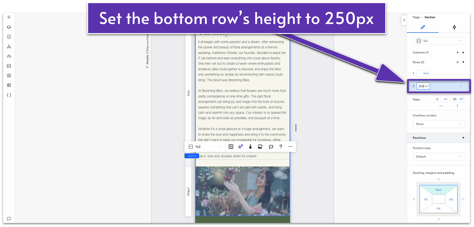
- Set the height of the bottom row to 250px.
3.3 Testimonials Section
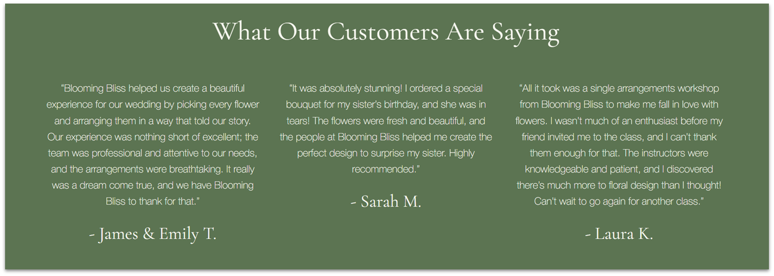
We’ve already created a “Testimonials” section for our homepage, and we might use it for more upcoming pages, so we’ll turn it into a global section for convenience.
Step 1: Return to the homepage and scroll to the “Testimonials” section.
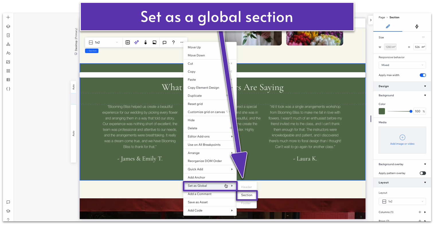
Step 2: Turn the “Testimonials” section into a global section.
- Click on the section and then select the three dots icon ( ) to open the “More Actions” menu.
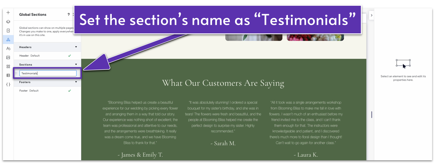
- Go to “Set as Global” and then select “Section.”
- Change the name of the section to “Testimonials.”
Step 3: Add the “Testimonials” global section to the “About” page.
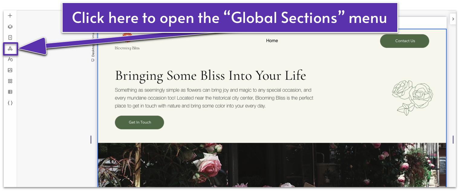
- Head back to the “About” page.
- Click on the icon of a triangle with circles at each vertex ( ) to open the “Global Sections” menu.
- Select “Add to page” next to the “Testimonials” section.
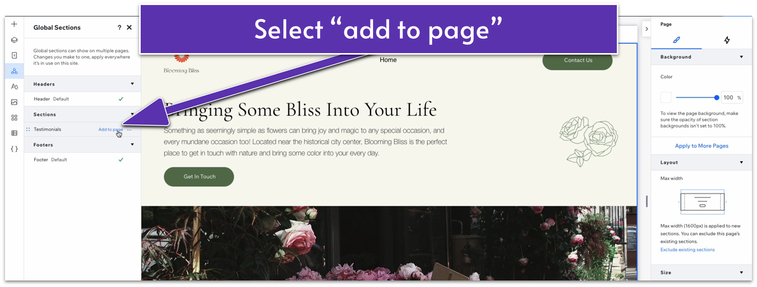
- The section will automatically get added to the top of the page.
- Click on the icon with two squares overlapping ( ) to open the “Layers” menu.
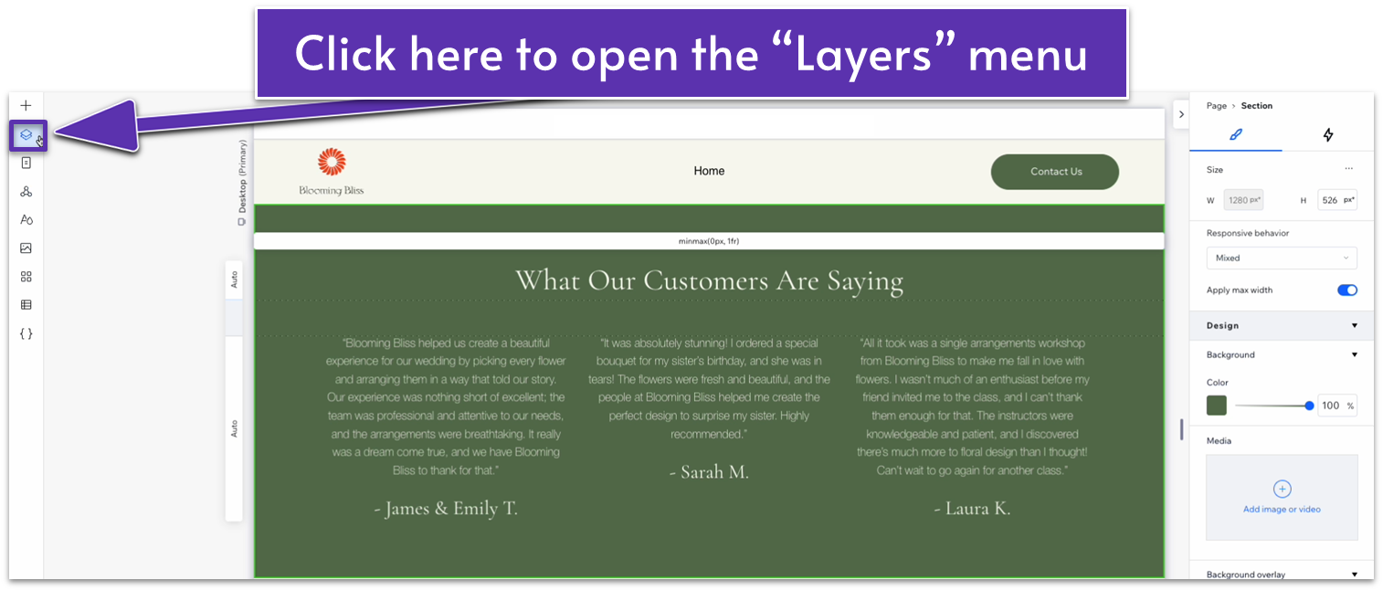
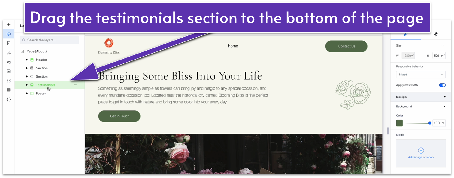
- On the “Layers” menu, drag the “Testimonials” section to the bottom of the page just above the footer.
Adapt for Tablet and Mobile Views
Since we’re using a section that we’ve already optimized for tablet and mobile views, we don’t have to do any work to adapt it again.
3.4 Blog Section
We already have a section on the homepage to entice readers to check out our blog. Instead of creating another global section, we’ll create a different “blog” section that showcases the latest posts from our blog.
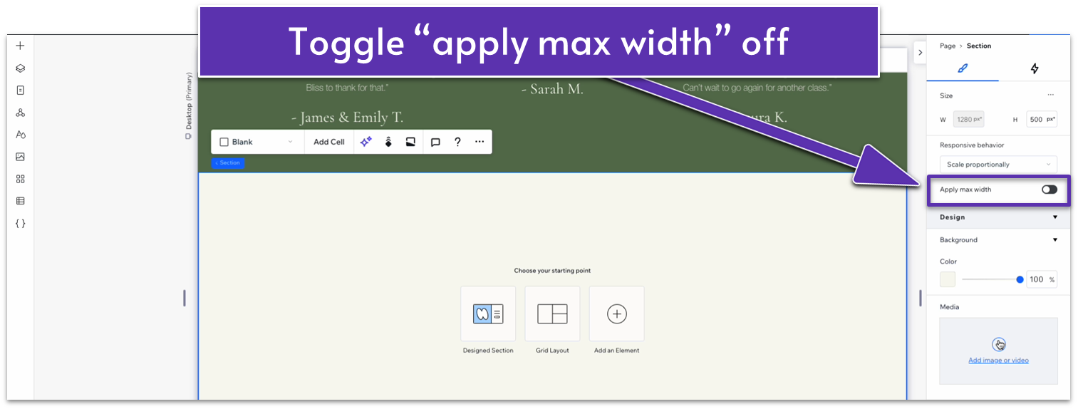
Step 1: Create a new section and apply a 1×2 ( ) CSS grid to it.
- Toggle “Apply max width” off for this section.
- Set the vertical gap ( ) to 50px.
- Set the vertical padding ( ) to an 80px scale.
Step 2: Copy the heading from the section above and paste it into the top row.
- Set all margins to 0.
- Align the text to the center ( ).
- Replace the text for this section’s heading.
- Set the top row’s behavior to auto ( ).
Step 3: Insert a blog element into the bottom row.
- Head to the “Add Elements” menu ( ) and then “Blog.” Then select “Add to Site.”
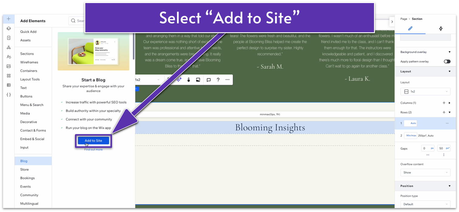
- You’ll get automatically redirected to the “Blog” page. Return to the “About” page.
- Head back to the “Add Elements” menu ( ), head to “Blog,” and then drag a post list into the bottom row.
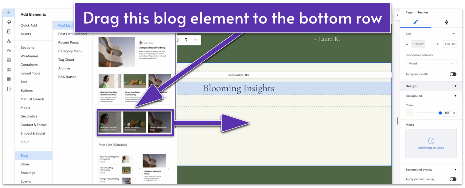
- You’ll see a “looks like you don’t have any posts to show” text.
- Set all margins for this element to 0.
- Set the element’s width to 1080px.
Step 4: Add posts to your blog.
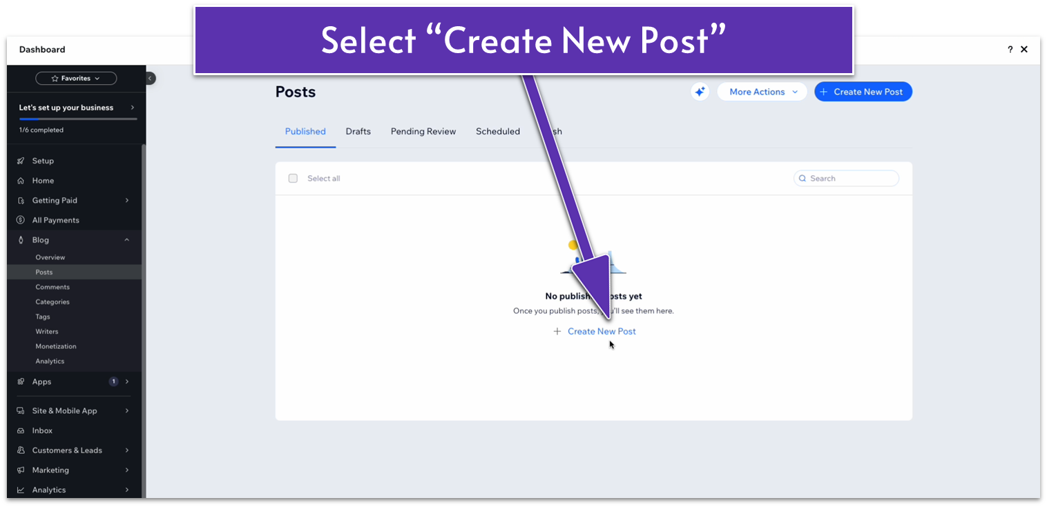
- Click on the blog element and then “Manage Posts” on the pop-up menu.
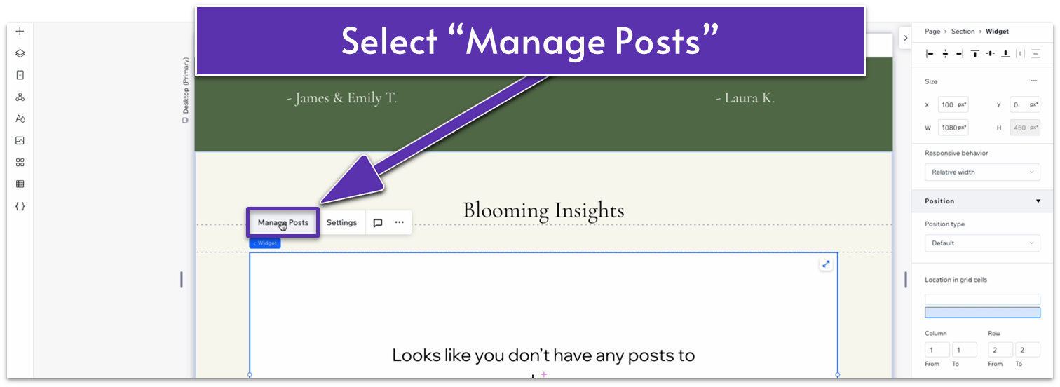
- You’ll get redirected to the blog dashboard.
- The dashboard will show a “no published posts yet” message. Select “Create New Post.”
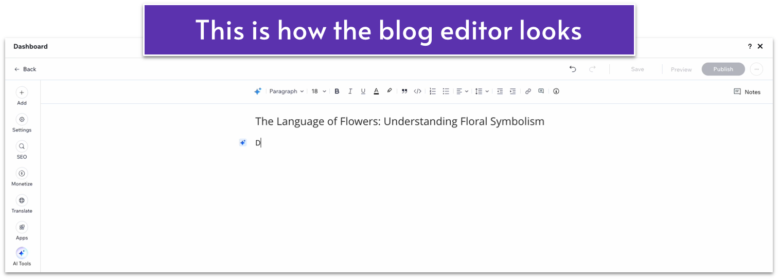
- At the moment, we’ll simply add a heading with no text to this post since we’ll just use it as a placeholder.
- Add an image somewhere on the body of the posts.
- Select “Publish” in the upper-right corner.
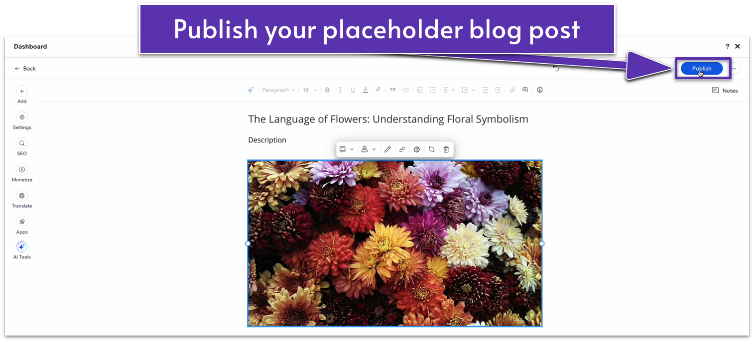
- Create two more placeholder blog posts.
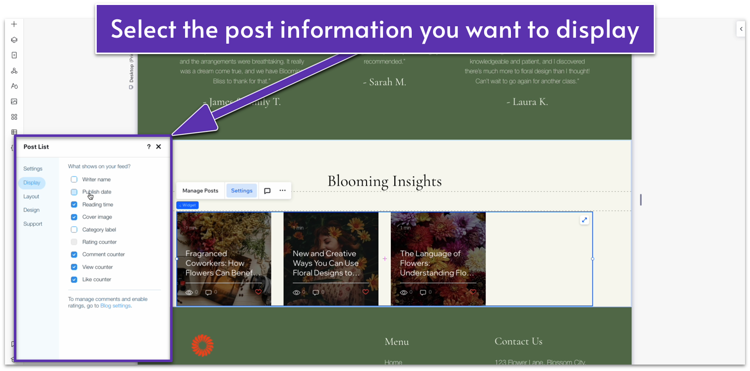
Step 5: Edit the blog post element settings
- Click on the blog posts element and select “Settings” on the pop-up menu.
- Select “Display,” then toggle off “Writer name” and “Publish date.”
- Still in the “Settings” menu, head to “Layout.” Under “Layout settings” select “Set posts per row” under “Cards per row.”
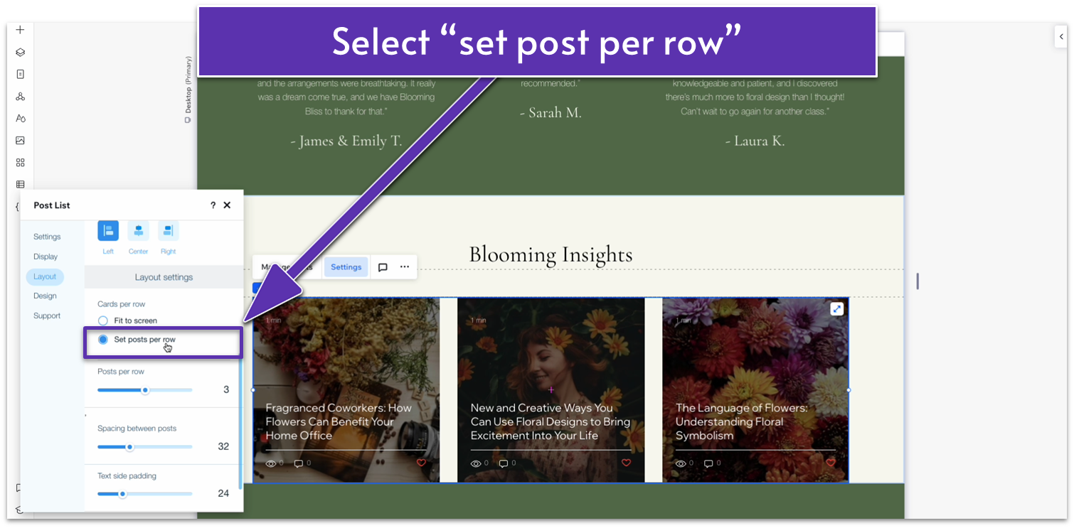
- Set the spacing between posts to 20.
- Head to “Design” and then “Posts.” Change the text color on hover to a dark green (#5C7452 HEX).
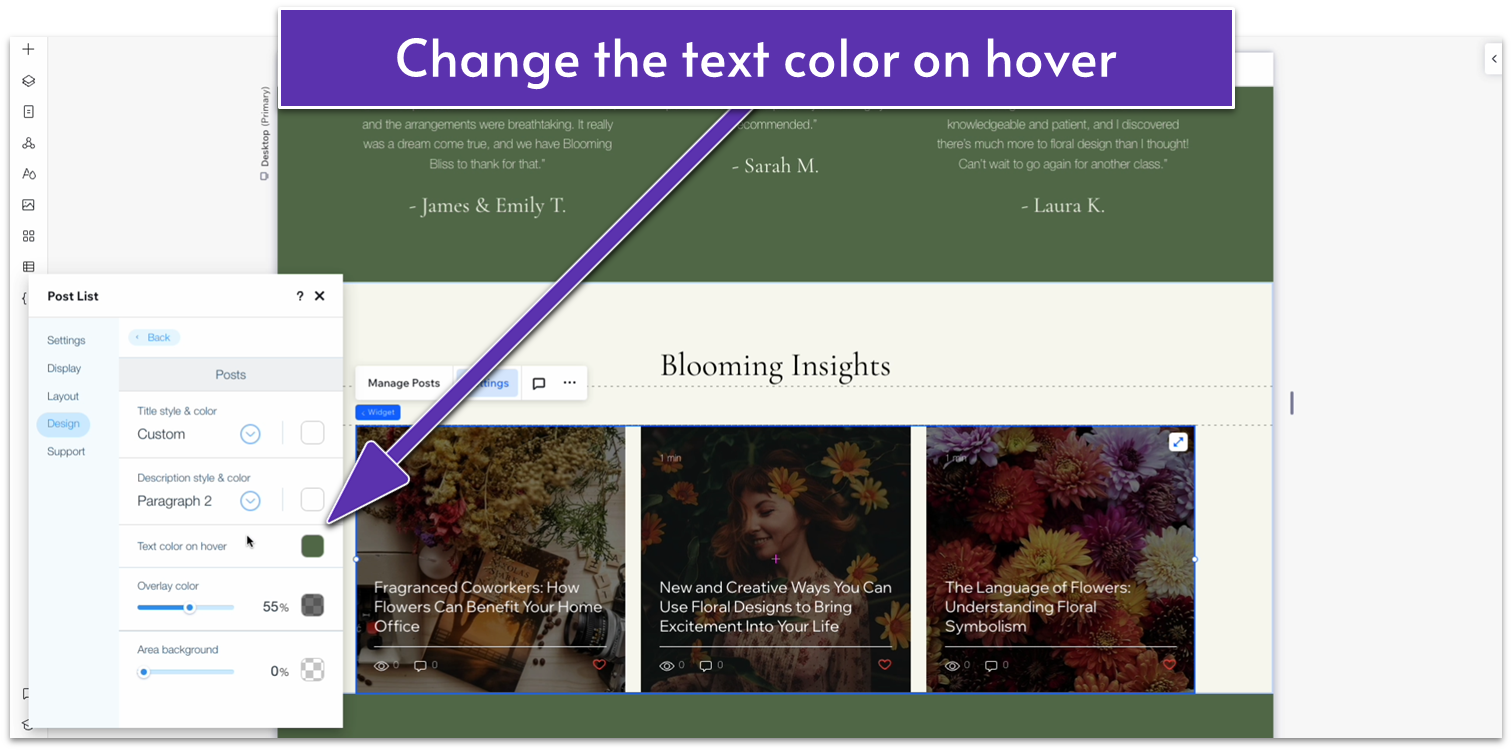
- Head back to the “Design” menu and then “Ratings.” Change the “filled star opacity & color” to the same green.
Adapt for Tablet and Mobile Views
Step 1: Adapt for tablet view.
On tablet view ( ):
- Set the width for the blog element to 720px.
- Set the vertical padding ( ) for the entire section to 70px.
Step 2: Adapt for mobile view
On mobile view ( ):
- Set the vertical padding ( ) for the entire section to 70px.
- Select “Settings” on the pop-up menu for the blog posts element. Toggle “Enable mobile settings” on.
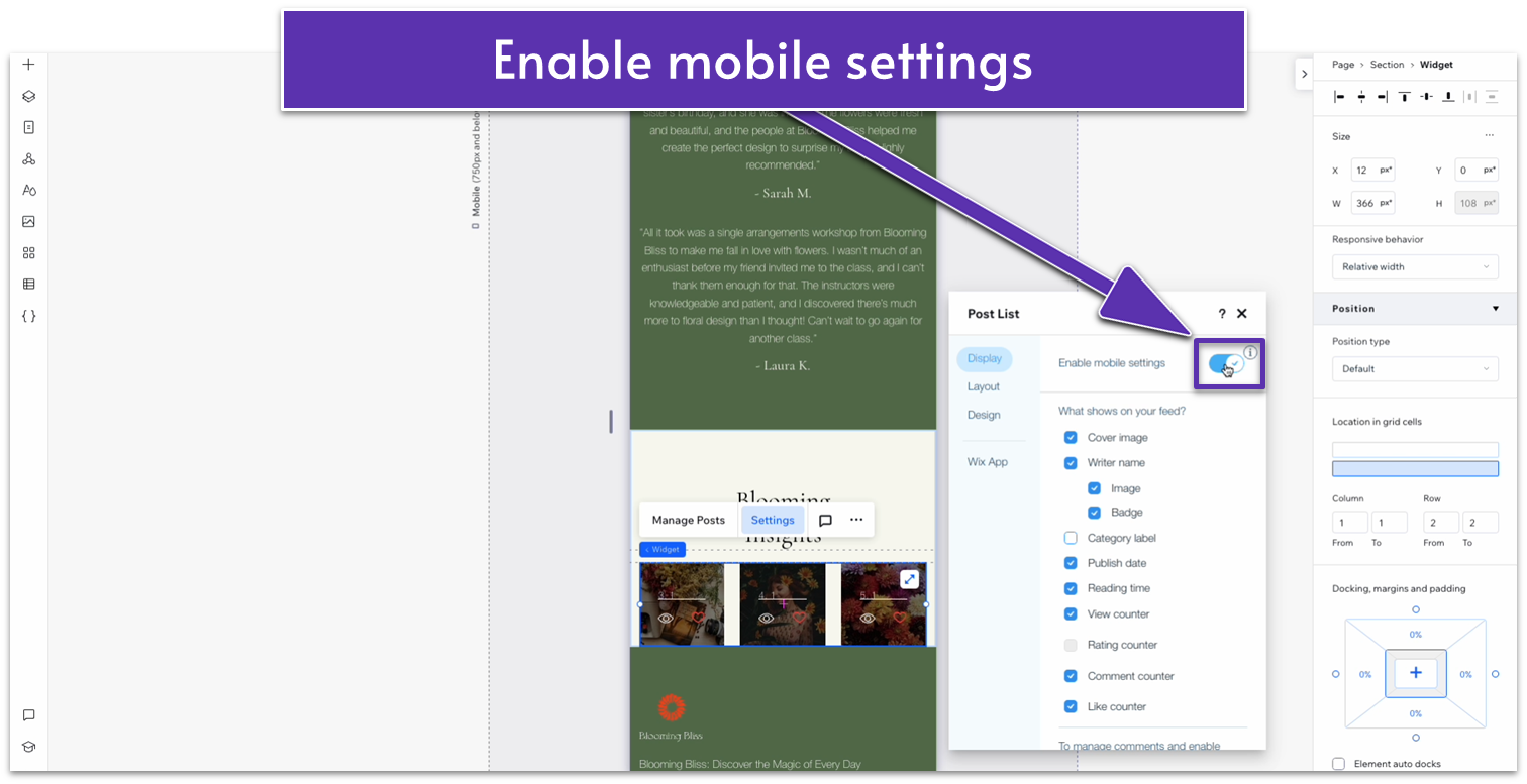
- Toggle “Writer Name” off.
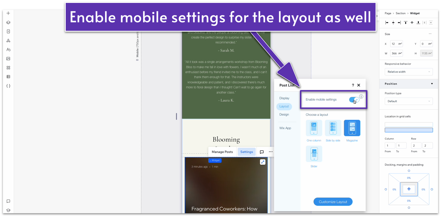
- Head to “Layout” on the “Settings” menu. Then, toggle mobile settings on as well.
- Set the vertical gap ( ) for the entire section to 30px.
- Toggle advanced size settings off for the heading on the top row. Set the text box width to 320px.
3.5 Contact Section
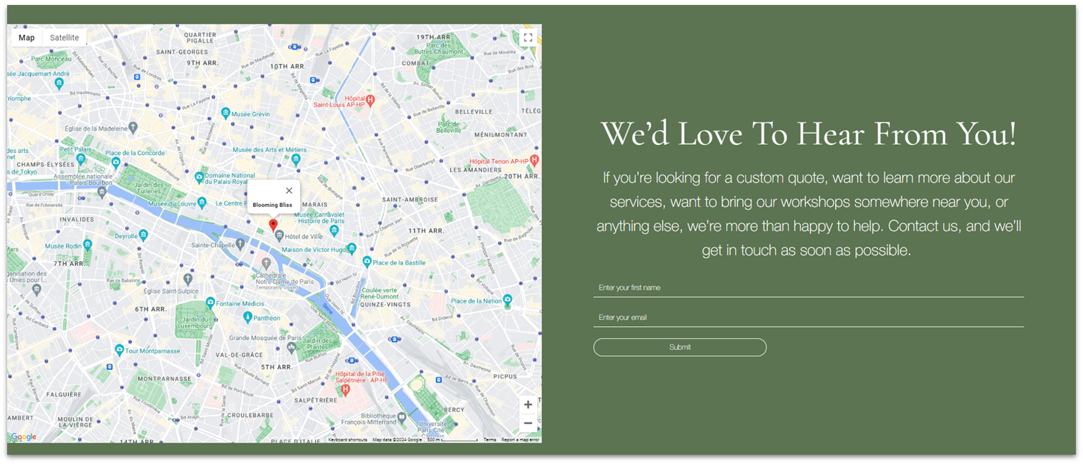
For the contact section, all we need to do is follow the same steps we did for the testimonials to turn them into a global section.
Step 1: Go back to the homepage and set the contact form as a global section.
- Remember to rename it to “Contact” for future reference.
Step 2: Add the contact section to the “About” page.
Step 3: Use the “Layers” menu to drag the contact section to the bottom of the page.
Adapt for Tablet and Mobile Views
We’ve already optimized this section for tablet and mobile views.
3.6 Instagram Section
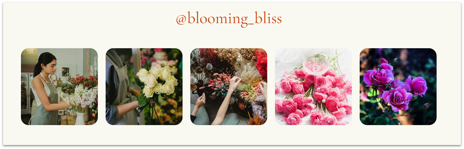
We’ll use the exact same approach for the Instagram section on our homepage.
Step 1: Go back to the homepage and set the Instagram section as a global section.
- Remember to rename it to “Instagram” for future reference.
Step 2: Add the contact section to the “About” page.
Step 3: Use the “Layers” menu to drag the contact section to the bottom of the page.
Adapt for Tablet and Mobile Views
We’ve already optimized this section for tablet and mobile views.
