
Great web design isn’t just about how a site looks—it’s about how it works, how it feels, and how effectively it guides users toward action. From the moment a visitor lands on a page, every element—layout, color, typography, speed, and structure—plays a role in shaping their experience and influencing their decisions.
In this expert roundup, seasoned designers and developers share with Website Planet and its readers practical insights into what truly makes a website perform. From mastering visual hierarchy and balancing aesthetics with usability, to optimizing speed, building trust, and knowing when it’s time for a redesign, these perspectives go beyond surface-level trends and dive into the strategic thinking behind high-performing websites.
Whether you’re creating a new site or refining an existing one, these tips will help you design with clarity, purpose, and results in mind.
How do you use visual hierarchy to guide user behavior?
To build high-converting digital products, I don’t just “place” elements; I engineer a visual path. Visual hierarchy is the strategic arrangement of interface elements to influence user behavior, ensuring the most critical information—and your primary Call to Action (CTA)—is the first thing your audience instinctively focuses on.
My workflow leverages these core principles to guide the user journey:
1. Information Architecture & Wireframing
Before I touch the aesthetics, I define the “skeleton.” By establishing a clear structural hierarchy during the wireframing stage, I map out the natural path a user’s eye takes when they first land on a page. This ensures the foundational layout prioritizes a logical flow and business goals over simple decoration.
2. Visual Emphasis: The “Signal-to-Noise” Ratio
I use a precise mix of Size, Color, and Contrast to manage information and dictate where a user looks first:
- Scale: I use size to signal importance and create a clear sense of order.
- Contrast & Color: I reserve bold, high-contrast colors for your “Primary Actions,” pulling the eye away from less important details.
- Whitespace: I treat empty space as a functional tool to “frame” content, preventing clutter and keeping the user focused on the task at hand.
3. Interaction Design & Flow
The final layer bridges the gap between seeing and doing. By implementing consistent visual cues—like subtle shadows for buttons or clear hover effects—I remove guesswork. This creates an intuitive environment where the user is naturally drawn toward the CTA and knows exactly how to take the next step.
The result is a polished, professional interface where every pixel serves a purpose: driving user action and fulfilling your project’s objectives.
Aaron Hähner, Web Designer & Conversion Expert
How do you balance aesthetics with usability in modern website design?
How do you balance aesthetics with usability in modern website design?
Form follows function is a principle I adhere to. When designing a new website, I always start with the navigation. It is the most important element on every website and must be understood instantly and provide relevant information: Where am I currently? What are my options? (As a user nothing frustrates me more than having to figure out how a site wants to be navigated.) Aesthetically this becomes a problem on complex sites with several levels where a full-screen overlay menu is the easy way out. But that always requires an extra click and forces users to process an entirely new visual layer while not providing the orientation mentioned above. If I can find a clever way to avoid that and make the navigation an integral part of the design, I did a good job.
Most web designs nowadays, especially those provided by WordPress templates or site generators, prioritise components that adapt easily in a responsive context, that work out-of-the-box on any device. While this approach is viable in terms of costs, efficiency and maintainability, it often results in generic visuals that are instantly recognisable and cannot be disguised by increasingly tiresome scroll animations which risk becoming the Flash intros of our time.
If the budget allows, I like to think about how to fully use a landscape screen in a way that enhances the user experience on desktop devices – not just fill up space with large images or make everything bigger but add value in terms of information, layout, clarity and interactivity. Breaking this down to mobile devices often requires a lot of extra work. I am aware this is an outdated approach – the (rightful) demand for accessibility and device independence enforces more universal and recognisable design patterns. Regarding informational or commercial – not representational – websites, this brings us back to print design, where colours, use of space and especially typography are more important and viable than “reinventing the wheel”.
When it comes to movement (video, animations), less distraction is always better for the user. A cool background video is an easy way to impress a customer, but hardly ever works if the user is supposed to focus on a site’s content. The same applies to excessive decorative animations. Interactivity only makes sense when it enhances the user experience, not if it is used to hide important information which the designer could not figure out to include directly.
In the end, I believe that good design does not demand attention but guides it.
Christopher Martin, Independent Developer, CMCM Webdesign – www.cmcm.info
What are the key elements of a high-converting homepage?
A high-converting homepage is less about visual trends and more about clarity, structure and intent. In my experience, the most effective homepages answer three questions almost immediately: What do you do? Who is it for? And why should I trust you?
The first priority is a clear value proposition above the fold. Visitors should understand, within seconds, what problem you solve and the outcome you deliver. This doesn’t need to be verbose or clever; clarity almost always outperforms creativity at this stage.
From there, hierarchy is everything. A strong homepage guides the user through a logical narrative: establishing credibility, explaining the offer, demonstrating proof, and then prompting action. Social proof; such as testimonials, recognisable clients, case studies or measurable outcomes; plays a critical role in reducing friction, particularly for higher-value services where trust is essential.
Design also needs to support cognition. Clean layouts, restrained colour palettes and considered typography help users process information quickly and confidently. Overdesigned or cluttered pages often feel impressive, but they can dilute focus and reduce conversion.
Finally, calls to action should feel natural rather than forced. Instead of pushing visitors to “buy now,” effective homepages offer the next logical step; whether that’s exploring work, reading a case study, or starting a conversation.
Ultimately, high-converting homepages balance persuasion with reassurance. They don’t shout. They guide; quietly, confidently, and with intent.
Jason Miller, Founder & Brand Identity Designer at JM Graphic Design – www.jmgraphicdesign.com
What design trends are worth adopting, and which should be avoided, in 2026?
- Dark Background, Accent Colors;
- The world is going gaga over “Dark Theme.” Dark backgrounds are bound to work in 2026. Complement them with vibrant, accent colors. This creates a beautiful contrast, making content consumption easier;
- Small And Meaningful Movements;
- Make a number count up when the cursor hits it. Have a button react when it is clicked. These small but meaningful movements improve user experience;
- Asymmetric Card Layouts;
- The world of web design has moved on from balanced columns. They are boring. Please don’t hesitate to give bigger cards to more important content on your page. This attracts attention and makes the layout quirkier;
- Number And Results Over Decoration;
- Especially in the case of business tools and agency sites, data matters a lot. Focus on showcasing results and impressive data on the page instead of meaningless decorations and generic office photos.
- Scroll-based Animations: Every scroll doesn’t need complex effects and animations. This can be exhausting for mobile users;
- AI-generated Images: Such images make everything look identical across websites. Go for real, photographed images. Do not be scared of imperfections;
- Immediate Chatbots: Chatbots popping up as soon as a page loads will definitely irritate users;
- Meaningless Movement: Limit the movement of the elements on your page. When everything moves, it looks sketchy and confuses users.
How can businesses design websites that remain effective as user expectations continue to evolve?
How do you approach designing websites for audiences with very different levels of technical expertise?
We usually approach this by designing each website tailored to its audience needs and expectations. For a low level technological audience, such as would be a Medical center, the website must explain the value clearly, with simple navigation, strong messaging and obvious next steps. For a more technical audience, we can bet on more modern ways to dispose information and navigation items. The important thing is not to simplify everything too much or make everything too complex. It is about creating a clear journey where each type of user can find the level of information they need. A good website should guide, not overwhelm. Even though, at the end of the day, what would tell us if we did a great work, it will be the data measuring afterwards and adjusting the experience to the reality of each case.
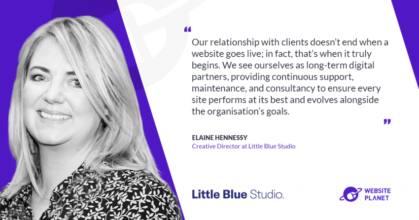
Jordi Ensenyat, Founder & Digital Director of Code Barcelona
What are the advantages and disadvantages of highly customized websites compared to template-based designs?
Template-based websites are often a good starting point for small businesses with limited budgets and simple requirements. They can be launched quickly, and the initial investment is usually lower. However, templates also come with limitations. Businesses often need to adapt their processes and content to fit the template rather than having the website built around their actual needs. Over time, customization can become difficult, performance may suffer due to unnecessary features, and maintaining a heavily modified template can become costly.
Highly customized websites require a larger upfront investment, but they provide significantly greater flexibility. Every aspect of the website can be designed around specific business goals, workflows, branding requirements, and future growth plans. Custom development typically results in cleaner code, better performance, stronger security, and easier integration with external systems such as CRMs, ERPs, booking platforms, or internal tools.
The main disadvantage of custom development is the higher initial cost and longer development time. For businesses that only need a simple online presence, a custom solution may be unnecessary. However, for companies that rely on their website as a key sales, marketing, or operational tool, custom development often delivers better long-term value and lower total cost of ownership. In our experience, the choice should not be based solely on budget. It should be based on the role the website plays within the business and how important scalability, efficiency, and differentiation are for future growth.
Bc. Michal Ripňák, Web Developer at ICESIGN STUDIOS
What trends are emerging in the use of photography and visual imagery in web design, and how can brands use them to create more engaging user experiences in 2026?
The rise of AI-generated imagery is changing the digital landscape at a rapid pace. On the one hand, AI offers unprecedented and affordable creative possibilities; on the other, a massive counter-movement is emerging precisely because of this, craving real, tangible authenticity. Authentic team portraits will always hold greater value in sleek web design. Similarly, atmospheric images of a restaurant must be real. When a visitor sees a face with genuine emotion, natural lighting, and a unique personality, it immediately builds trust. AI portraits risk quickly appearing too perfect, soulless, or simply fake. Real photography remains the ultimate way to showcase the human factor within a company.
In a world that values what is real, professional photography remains the benchmark. It is no longer merely visual filler; it has become a strategic tool to protect a brand’s credibility and unique identity. Content creators who have professional photography in their toolbox will be major assets to brands. After all, consumers are developing a radar for AI-generated content at lightning speed. In an online world flooded with synthetic perfection, brands distinguish themselves precisely through their imperfections and authenticity.
The reality is that AI stock shots are here to stay. They are ideal for abstract concepts, backgrounds, or quick mock-ups. However, web designers who rely solely on AI produce generic, uninspired work. The real trend for the future is a hybrid approach, using AI for the generic, functional atmospheric elements that used to drain budgets, while reserving professional photography for the unique core of the company—such as the team, original products, and the actual business location.
This approach keeps budgets manageable without sacrificing the website’s soul and authenticity. At the same time, freed-up resources can be reinvested into other critical areas, such as a stronger focus on mobile-first principles. More budget and time become available to optimize photos—making them featherlight and adjusting them to exact aspect ratios so they load faster on mobile devices. This, in turn, leads to better user experiences and higher rankings in Google. And that, of course, is what it is all about. Content, speed, and compute are the new revenue model of the future.
Désiré Naessens, Web Designer and Content Creator – beeldconnectie.com
How do you create a website that feels modern without requiring frequent redesigns?
A website that feels modern for a long time usually comes from having a strong foundation, not just following the latest design trends. Trends change very quickly, so I prefer focusing on things that continue to work well over time, such as clean layouts, readable typography, good spacing, mobile responsiveness, and fast loading speed. For both Minlovecat.sg and Re-prompts.com, I try to create websites that feel visually current without becoming overly complicated. Instead of relying heavily on trendy effects or animations, I focus more on usability, clarity, and flexibility. This makes the website easier to maintain and update as the business grows.
I also believe the creative process is important. Before finalizing a design direction, I usually explore different visual styles, moods, and layouts to see what best fits the brand and audience. Recently, AI-assisted creative workflows have also become useful during the early idea stage, especially for experimenting with different visual concepts and creative directions more efficiently. In my experience, websites tend to age better when they focus on user experience and clear communication rather than constantly trying to look trendy.
Wayne Ooi, UI Designer & WordPress Developer at MinLoveCat – minlovecat.sg
How do you test whether a web design is actually effective?
Designing intuitive navigation starts with understanding user intent. Visitors don’t think in terms of a company’s internal structure—they’re trying to complete a task. Navigation should reflect that by using clear, familiar labels such as “Services,” “Pricing,” and “Contact,” rather than creative or ambiguous wording. Simplicity is key: limiting top-level items to five to seven choices helps reduce friction and makes menus easier to scan. Consistency across pages and mobile-friendly design—such as collapsible menus and clear tap targets—further improve usability.
Testing effectiveness requires moving beyond assumptions and focusing on data. Before evaluating a design, it’s important to define success metrics, such as conversion rate, bounce rate, or user engagement. Analytics tools can then reveal how users actually navigate the site, highlighting drop-off points or underperforming pages. A/B testing is especially valuable for comparing variations in navigation labels or layout, allowing decisions to be based on real behavior rather than opinion.
In addition, tools like heatmaps and session recordings provide visual insight into where users click, scroll, or hesitate. Usability testing—observing real users completing tasks—can quickly expose friction points that analytics alone may miss. Ultimately, effective web design is an ongoing process of testing, learning, and refining to ensure the experience remains intuitive and results-driven.
Robin Davis, Owner of EyeBenders – eyebenders.com
How to approach website modernisation when dealing with legacy platforms and outdated digital experiences
Start with a comprehensive audit before touching a line of code. For organisations with a single site, that means a content audit first: what is actually there, what is outdated, and what is genuinely serving a purpose. From that baseline, you can branch out to map every live web property including subdomains, its owner, operating costs, and current integrations. Larger organisations will often uncover outdated campaign sites, overlapping tools, and siloed data. Modernisation without this map is guesswork. Once you have full visibility, address the transition in three strategic layers.
The surface layer (SEO, GEO and UX). Consolidate fragmented sites and redundant microsites into one main domain. This recovers diluted SEO authority and gives modern, AI-driven search engines a single, clear source of truth to index.
The interaction layer (tech stack). Audit your CMS platforms, CRM, and marketing tools. Most organisations find two or three duplicated features spread across separate budgets. Streamline what you have before investing in replacements.
The data layer (personalisation). This matters most. Modern analytics and tailored customer experiences are only as good as the underlying data. Trapped customer information means your digital experiences will always operate from an incomplete picture. Throughout this process, remember that a total rebuild is often slower and more disruptive than reworking what you already have. Your audit may reveal that your existing infrastructure simply needs better governance. Treat old, unmaintained properties as compliance risks too: privacy and accessibility regulations are tightening, and enforcement is increasing. The sequence matters: audit, streamline, then build.
Toyosi Wilhelm, Senior Strategist, JBi Digital
What Are the Main Principles of Clean and Modern Web Design in 2026?
Web design has quietly shifted over the past few years. The trend toward minimalism isn’t new, but in 2026, it feels more intentional than ever. Less about aesthetics for aesthetics’ sake, and more about genuinely respecting the person on the other side of the screen. The basics still hold. White space, consistent typography, and a clear visual hierarchy aren’t going anywhere. When a layout is well structured, users don’t have to think. They just move through it naturally. That frictionless feeling is honestly the goal. Good navigation should be almost boring in how predictable it is.
Responsiveness is basically non-negotiable at this point. People switch between devices constantly, and a design that falls apart on mobile isn’t really finished. The same goes for performance. Bloated pages with slow load times quietly erode trust, even when users can’t quite articulate why. What’s felt more prominent lately is the emphasis on accessibility. Not as a checklist item, but as a genuine design constraint that usually makes things better for everyone. Strong contrast, readable font sizes, logical structure. These aren’t compromises; they actually improve the experience across the board.
Animations have their place, too. A subtle transition or a gentle scroll effect can make an interface feel alive and polished. The key is intention. When animation serves a purpose, like guiding attention or confirming an action, it adds real value. When it’s just decoration, it becomes noise. Simple is hard to get right. That’s probably why it’s still worth talking about.
Darko Todic, Founder & Designer at DT Creative Studio – www.dtcstudio.com
What role does website speed play in user experience and conversions?
Let me explain this in relatable terms. Imagine you need to buy rice. You go to Supermarket A, pick it up, and head to the cashier. There are 15 people in line ahead of you, each with full carts. One by one, they unload their items while chatting casually with the cashier, as if time doesn’t matter. After standing there for 20 minutes with a single packet of rice in your hand, you start wondering whether you should just go home and cook the potatoes that you have at home
Now imagine Supermarket B. You pick up the rice, walk to the cashier, and there is no line. You pay and leave within seconds. The potatoes never crossed your mind.
Which store resonates more with you — Supermarket A or B? Which one would you return to?
The supermarket had 20 minutes to shape your emotional response; a website has milliseconds. Speed plays a significant role because it shapes the user’s emotional reaction before any content is processed. Slow loading times create friction and can negatively impact trust and conversion rates. Speed communicates competence and reliability. Delays trigger impatience and can cause users to leave for another website.
Speed shapes how a website is perceived before any content is processed. If loading times are slow – even by just a few milliseconds -, the decision-making process gets interrupted, which again can negatively impact conversions. This is especially true on mobile devices, where attention spans and patience are very limited.
How do you design a website that builds trust within the first few seconds?
You know that we judge people within the first seconds of an encounter—well, it’s pretty much the same with a website. Trust is formed almost instantly. If you miss those first few seconds, you’ll have a hard time catching up. I believe this is also one of the hardest things a designer has to convey to clients. So we stand behind a few necessary design principles that help build trust even before a single line of text is read: Consistency, Balance, Hierarchy, Authenticity and Usability.
Consistency means typography, imagery, and icons all speak the same visual language, creating a sense of coherence that feels intentional rather than accidental. When visual elements align, you don’t stop to question them, you simply move forward, confident that what you’re seeing belongs together.
Balance comes from a clear and well-structured layout that guides you through the website naturally, without overwhelming or confusing you. A balanced design doesn’t fight for your attention, it directs it.
Hierarchy ensures that first things come first, removing unnecessary clutter and showing you clearly what matters most, so your mind doesn’t waste energy trying to figure out where to look. Instead, it follows a path that has already been thoughtfully prepared.
Authenticity means being real, something more important than ever since the rise of AI, by using real images, concrete messaging, and visible proof points.
Usability is about intuitive navigation that never makes you guess and always provides clear structures. When a website is easy to use, you don’t notice the design itself, you notice how effortless everything feels. That effortlessness is not accidental
Trust is not built through a single element, but through the overall experience.
Cornelia Rammler, Founder of visual.addiction
What design trends are worth adopting, and which should be avoided?
Trends to Adopt (The New Standard)
- Accessibility-first design
Meeting WCAG standards and optimizing Core Web Vitals ensures better SEO rankings and user trust. Accessibility is now a baseline expectation. - AI-powered personalization
Move beyond “Welcome back” greetings—use AI to tailor content based on user behavior, industry, or intent. This boosts conversions and engagement. - Organic layouts & gradients
Anti-grid designs, flowing shapes, and soft gradients humanize digital spaces, making sites feel approachable and modern. - Immersive but efficient visuals
Lightweight 3D/WebGL previews, kinetic typography, and scroll-driven animations add depth without sacrificing performance. - Bento grid layouts
Modular, story-driven sections (popularized by Apple) create rhythm and scannability, ideal for product launches and portfolios. - Expressive typography
Oversized, variable fonts can replace stock hero images, delivering impact while remaining performant.
- Overloaded animations
Heavy parallax or unoptimized motion effects slow down sites and hurt Core Web Vitals. Users now expect speed first. - Generic Stock Imagery & “Corporate” Fatigue
The era of smiling people in boardrooms is over. Users in 2026 value authenticity and can spot a generic stock photo instantly. - Fake personalization
Superficial greetings without meaningful content adaptation feel outdated and erode trust. - Excessive minimalism
Ultra-clean designs that strip away context or navigation frustrate users. Balance simplicity with clarity. - Decorative-only gimmicks
Glassmorphism or dopamine-driven UI can work in moderation, but overuse risks looking trendy rather than timeless. - The “Mega Menu” and Information Clutter
Trying to put everything “above the fold” or cramming 50 links into a single dropdown menu is a major turn-off. It leads to “decision paralysis” where the user doesn’t know where to click and leaves.
|
Feature
|
Adopt (The “Do”)
|
Avoid (The “Don’t”)
|
|
Accessibility-first
|
Essential
|
Never skip
|
|
AI personalization
|
Smart use
|
Fake greetings
|
|
Speed
|
Edge-loaded, lightweight assets
|
Heavy video backgrounds & scripts
|
|
Navigation
|
Simplified, intent-based menus
|
Cluttered Mega Menus
|
|
Visuals
|
Custom 3D & Authentic Photos
|
Overused stock photography
|
In 2026, the trend isn’t just about a single website revamp; it’s about building a Design System. Instead of designing individual pages, focus on creating a modular library of components (buttons, headers, cards). This allows for faster updates and ensures that your brand remains consistent across all digital platforms, from your main site to mobile apps. Web design in 2026 is defined by intentionality, accessibility, and immersive storytelling. The most successful projects don’t chase every trend—they selectively adopt those that align with brand identity, user needs, and performance goals. Bento grids, expressive typography, scroll-driven motion, and accessible color systems are shaping mainstream design, while brutalism, claymorphism, and spatial layering offer creative edges for niche audiences. Ultimately, the takeaway is clear: design trends are tools, not rules. The best websites in 2026 use them purposefully to communicate authenticity, enhance usability, and deliver memorable experiences.
Farzath Faiz, Web Consultant at MooiWebs Solutions
How do you decide when a website needs a redesign versus minor optimization?
In the South African digital landscape, a website isn’t just a digital business card; it’s a high-performance tool that has to work in an environment of high data costs and unpredictable infrastructure. At Pixelweb, we approach the “Redesign vs. Optimization” debate with a dose of brutal, anti-corporate honesty: If your current tech stack is a liability, optimization is just putting a fresh coat of paint on a sinking ship.
We generally trigger a full redesign when the “Technical Debt” starts costing more than the “Technical Interest.” If you are fighting a bloated, legacy CMS or a heavy JavaScript meta-framework that requires a specialized team just to change a layout, you don’t need a “tweak”—you need an exit strategy. We advocate for a “Solo-Maintainable” architecture. By moving to a lean, modern stack—specifically Laravel 12 and Tailwind CSS v4—we replace “maintenance hell” with a fast, semantic, and resilient machine. A redesign is the right move when the underlying foundation prevents you from pivoting quickly in a competitive global market.
Conversely, we stick to minor optimization when the “Bones” of the site are architecturally sound but the conversion rates are lagging. If the site is already utilizing server-side rendering, clean HTML5, and utility-first CSS, then we focus on the “Engine.” This involves tightening the UX, improving Largest Contentful Paint (LCP) scores, and trimming third-party script bloat.
In a world obsessed with “shiny object” trends, the Pixelweb philosophy is about longevity and ROI. We ask: “Can a solo entrepreneur maintain this for the next three years without a massive agency retainer?” If the answer is no, we redesign for freedom. If the answer is yes, we optimize for growth. Ultimately, the decision comes down to whether your website is an asset that works for you, or a legacy burden you are working for. In the grit-heavy South African market, we always choose the former.
Kobus Venter, Owner of Pixelweb – pixelweb.co.za