We rank vendors based on rigorous testing and research, but also take into account your feedback and our commercial agreements with providers. This page contains affiliate links. Advertising Disclosure
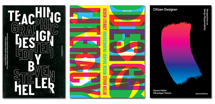
With the release of his latest book, The Logo Design Idea Book which he authored with Gail Anderson, Steven Heller has brought the Idea Book series to completion. With his decades of experience in graphic design, we were fortunate to sit with him and discuss the components of successful logo design as well as his thoughts on how the advent of the digital age and its tools has affected the graphic design industry.
Please give us some highlights of your very distinguished and extensive career.
Since the 1970s I have worked on over a hundred and eighty books. I’ve edited various publications including the AIGA (American Institute of Graphic Arts) Journal of Graphic Design and contributed to several magazines. For 33 years I was an art director at the New York Times, originally on the OpEd Page and for almost 30 of those years with the New York Times Book Review. I am the co-founder and co-chair of the SVA MFA Design / Designer As Entrepreneur at the School of Visual Arts in New York.
How has moving from the mechanical to the digital world affected the graphic design industry?
Well, the digital world has done two things. Firstly, it has streamlined all those tedious layout procedures and made it easier to try things out with a certain amount of economy. Also, so much of what graphic design firms used to outsource, like typesetting and Velox making, is now self-contained in the computer.
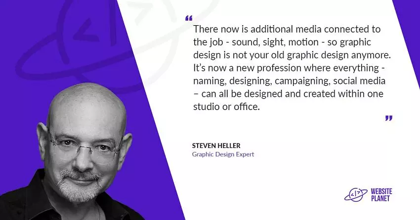
What it’s done from a content or conceptual point of view is added more layers of media to the job. A graphic designer used to just layout type and images in an aesthetically pleasing and powerful way. Now there is additional media connected to the job – sound, sight, motion – so graphic design is not your old graphic design anymore. It’s now a new profession where everything – naming, designing, campaigning, social media – can all be designed and created within one studio or office.
Logo design is very specialized because it must visually represent a company’s identity. What is the design process of a successful logo?
A successful logo is a mark. There are different kinds of marks you can make, such as pictorial marks, typographic marks, gestural marks, even a word can be made into a logo. For example, the initials of the Museum of Modern Art, MoMA has become their logo.
I think that the most important thing is understanding what the client wants out of that mark; otherwise, you are lost in a world with a million options. So, if you’re starting from scratch, the important thing is to listen to what that client is thinking. If they’re a farm and want something artisanal, you’re not going to design something that looks corporate. If they’re an industrial farm, then a corporate mark and perhaps some sub marks for the different divisions are in order.
Logos are a visual representation that becomes a company’s trademark forever and ever, and consumers have to identify not just with the mark, but with the product as well. So, if the mark serves the consumer well, then that’s a good logo even if (God forbid!) it’s poorly designed.
What tips do you have when designing a logo?
Well, I don’t design logos, but I could give you my instinctual tips. When I look at a logo, I say, “wow that was done well “or “oh that was not done so well” or “ooh that looks like somebody else’s logo.” So, I think it’s important to make sure you know what’s out there so that you don’t recreate an existing logo. For example, eyes were used back in the 1920s, decades before the creation of the CBS eye. So, if you’re going to turn an eye into a logo, make sure that you do it with distinction.
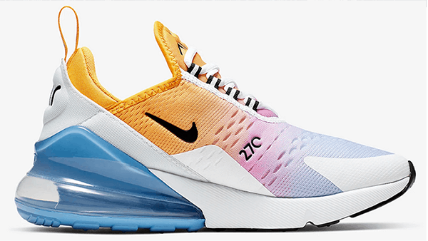
Another tip is to determine whether you want the logo to be literally or symbolically representative of your branding. For example, the Swoosh symbol has no relationship whatsoever to a shoe, but once Nike used it, it became about running shoes. But they could just as easily have used a foot or a toe, and if it had enough variation and was aesthetically pleasing it could have been the Nike logo as well.
Has moving to digital drawing tools affected the process?
From a creative point of view, I don’t think it has. However, it has made it a little quicker to create several versions which can be a negative. Paul Rand would create several versions, put most of them in his pocket, and only show the ones he was convinced of. He felt that given too many options, clients would say “I’ll take a little of that, and a little of this, and a little of that” which ends up being a stew rather than a final intelligent product.
What was your motivation for writing the Logo Design Idea Book?
It’s the last book of a series I authored with Gail Anderson that include The Graphic Design Idea Book, the Illustration Idea Book, and The Typography Idea Book. The Logo Design Idea Book fills out the series as representative of the four major buckets of this profession. Graphic design seeps into logo design and vice versa. Typographic design seeps into logo design, and graphic design and illustration seep into all three, so all these aspects interplay with one another.
In your book, you showcase logos such as Lego which have changed over the years. Why would a company rethink their logo and how can they make sure that the updated logo still maintains strong brand recognition?
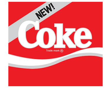
When starting a company, there are many logo options to play with. However, once a logo becomes familiar you have to be careful what you do, for as we’ve seen in the past, people get very attached to logos. When The Gap tried changing their wordmark, they got all sorts of pushback from its consumer base. Coca-Cola didn’t just try changing their recipe but their logo as well which created a lot of backlash. I know it sounds illogical, but when logos change, some people actually turn off from a product.
Lego is an interesting case because although their first logo is quite different than today’s, it honestly always seemed the same to me. When I put it in the book and read about the variations, it all made sense, but they never changed it so much that I, a casual user, ever noticed the changes.
I think companies refine their logos because somebody in the in-house art department or some new creative director or a marketing person says there’s something a little bit wrong with it.
So, they call in the experts who might recommend just moving a dot in the logo over just a couple of picas. Well, now that makes sense, so they do it. Paul Rand once told me he would have updated the UPS logo by making a subtle change to the bow in the box. Since that conversation, UPS has made the unfortunate decision to radically change their logo.
When Paul Rand was called to redesign the American Express and Ford Motor Company logos, he told them at the outset he didn’t think it was necessary. So, he took the essential components of both logos and streamlined them. It was very evident that changes were made, but he very cleverly managed to maintain the corporate identity while making it more contemporary.
Why do you think Ford was so insistent on changing their logo even though Paul Rand didn’t think it was necessary?
Because I think change is something that happens all the time and you want to explore all those options and then make a decision. I recently saw a program about the redesign of the Canadian flag in 1965. The old flag had the Union Jack in the corner with the Canadian shield to the right. Although they are a Commonwealth, they no longer wanted to be so overtly connected to the United Kingdom, so there was an overwhelming demand for a new flag. The Canadian shield had a mark with three maple leaves – and it was decided to go with a single maple leaf making it more graphic – and more powerful. The reason for that redesign was political, social, cultural, and patriotic.
Which of the logo designs in your books have passed the test of time and what has made them successful?
Well, that’s a good question because 40% – 50% of the logos in the book are relatively contemporary for companies that are not very well known. There’s a very effective logo for a Swiss sailing club’s public restaurant where all the Es were designed to look like waves. Will it stand the test of time? I don’t know; it really depends on whether the restaurant stands the test of time.
But there are others like Paul Rand’s variation of IBM logo, which is a rebus – an eye, a cute little bee, and the M, which is the M from the IBM wordmark. IBM itself as a logo has stood the test of time because there’s no reason to change it and it’s emblazoned in our brains.
I think the oldest logo we feature in the book is the AEG, the Allgemeine Elektricitäts-Gesellschaft which was one of the first corporate identities created by Peter Behrens in Germany. It’s an A, a G and an E in a honeycomb shape. It has passed the test of time because it doesn’t specify what the company does, but rather became the representation of the company. Had it been more specific, it might have included a light fixture or electrical device which while contemporary to that era, is now long obsolete. You never want to put something that’s going to become outdated in a logo, unless of course you’re doing something retro and then obsolescence and nostalgia are your tools.
The Braun logo has also been around for a long time. It has been redrawn several times, but it’s always got that center A which is the mnemonic of the logo, and the thing you remember most. That little bump, which some people say looks like an old-time radio, makes it a graphic element that takes your eye to one level, then up and then down again.
In the book, there is also an entire section on secret signs like the FedEx logo with its hidden arrow between the E and X. Those surprises are always good because they involve the user, and once you’ve seen it you can never not see it.
Secret signs may get people talking but does that still make it an effective logo?
Yes, it’s a little game, you know, because even if you’re not thinking about it, you’re always aware of it. Uncovering these surprises make you feel like you’ve successfully completed a crossword puzzle, so anything that you can hide like an Easter egg in a logo is playful and makes it memorable.
Gail is a Technical Editor and Interviewer for Website Planet. Her first PC was a TRS-80 which required a cassette tape to boot up. Producing websites, emails, and banners combines her love for design, technology, and of course, writing.
Thank you, - your comment was submitted successfully!
We check all user comments within 48 hours to make sure they are from real people like you. We're glad you found this article useful - we would appreciate it if you let more people know about it.
Share this blog post with friends and co-workers right now:
Thank you, , your comment was submitted successfully!
We check all comments within 48 hours to make sure they're from real users like you. In the meantime, you can share your comment with others to let more people know what you think.
Thank you for signing up!
Once a month you will receive interesting, insightful tips, tricks, and advice to improve your website performance and reach your digital marketing goals!
So happy you liked it!
Share it with your friends!
Or review us on
963682
50
5000
8732655
This page isn't yet translated into . If you wish to volunteer and translate it, please contact us using the contact us page