Inside this Article
Major Mistakes When it Comes to Choosing Your Logo’s Font
It’s all too easy to take your font for granted. After all, the most important thing is simply that the letters are readable, right? But make no mistake — there’s much more to it than that. In fact, one oversight in your font can make your business a laughing stock, damage its reputation, and plummet your revenues. So it’s crucial that you avoid committing the following font fiascoes when it comes to designing your company’s logo:Packing in too many fonts
Experts say that a logo works best with a maximum of two fonts. Putting more than two fonts in a logo is like trying to show an entire photo album at once. People need time to process and recognize each typeface.Using an overused font
Remember the font on the poster for the blockbuster movie “Avatar”? The film’s marketing efforts were heavily criticized for the use of the font Papyrus: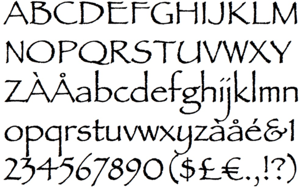 Not only has it already been overused in print media, but it’s also an unprofessional and ugly font that you can find on everything from movie posters to birthday cards, which annoys typography critics. Other overused fonts include Comic Sans and Arial.
Using an outdated font
Brush Script and Copperplate Gothic come to mind when thinking of outdated fonts. The first was used for numerous postcard headlines from the mid-1900s, and the second — which was inspired by ancient Roman stone carvings — was used decades earlier than that. Don’t age your brand by using these aged fonts.
Using a font with poor typographic clarity
This means that the font is hardly legible or readable, and it may have poor leading.- Legibility is about how easy it is to differentiate one letter from another in the same typeface
- Readability is about how easily words, phrases, and blocks of text can be read
- Leading pertains to the distance between lines of type; bad leading, which occurs when the spaces between letters are too big or too small, is the culprit of many major logo font failures
Using a font that’s not scalable
Scalability is important especially for digital typography. A font that is scalable guarantees legibility in all browsers, screen sizes, screen orientations, connection speeds, etc. A good typeface will render crisply in different sizes and screen resolutions, and will provide a good reading experience.9 Fonts That Fail To Get Your Message Across
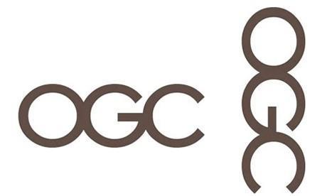
Since the logo is supposed to be a representation of an organization, it’s astonishing how so little time and resources some businesses have invested in it — only later to find out, once the logo went public, what an epic fail it was. These are nine examples of the worst fonts in logos that completely failed to get the right message across. Don’t make the same mistakes.1. Office of Government Commerce
2. Locum
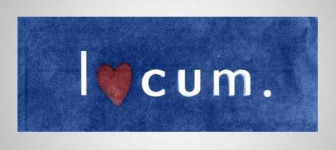 Here’s a clear example of poor typographic clarity. Is it “o” or “love”?
3. The Detail Doctor
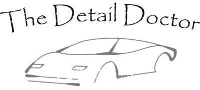 I don’t know how much I should trust “The Detail Doctor” with my car if they didn’t really pay much attention to the details on the car and the font in their logo. First, Papyrus is overused and makes the brand look cheap. Second, where are the tires? Not much attention to detail there.
4. The Computer Doctors
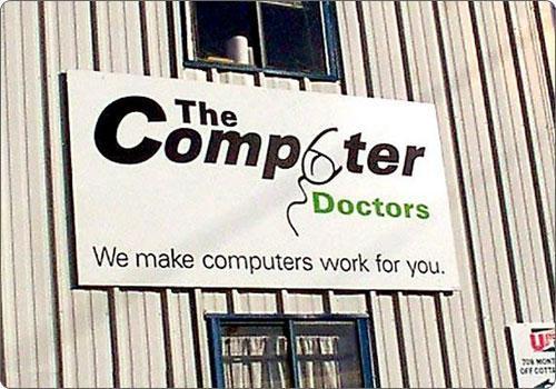 Sure, we get the mouse concept, but this is one example where a plain “u” would have been a better option. In addition, The Computer Doctors use way too many fonts. The logo and slogan combo here looks confusing and unprofessional.
5. Massage Therapist
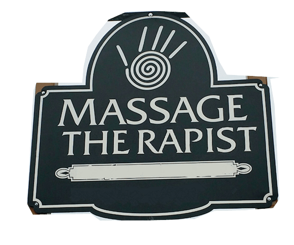 The distance between the letters “e” and “r” in the word “therapist” is problematic. Specifically, the leading is too big, giving rise to a totally undesired meaning. Again, be mindful of typographic clarity.
6. Bull Titan US
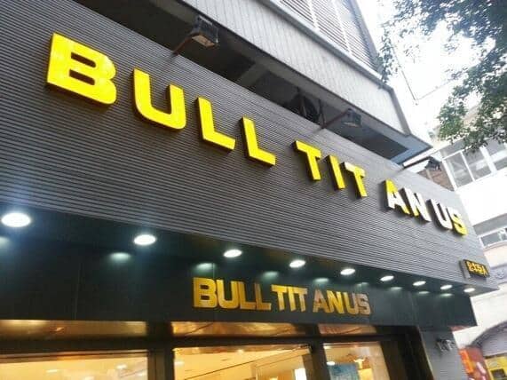 Because of spacing issues, “BULL TITAN US” became “BULL TIT ANUS.”
7. Megaflicks
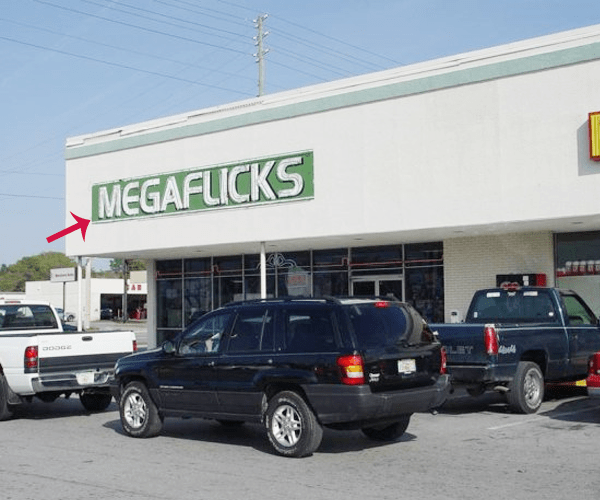 Unlike the previous two examples, here the leading is too small — two letters look like they’ve merged into one. These flicks probably aren’t very family-friendly.
8. Kids Exchange
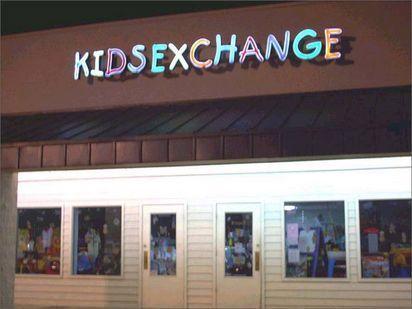 Again, the leading is too small, and two words can easily be read as three.
9. Click Lovers
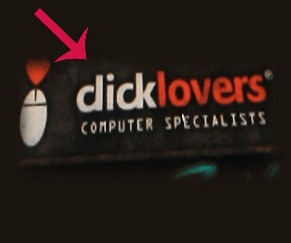 Here, it’s hard to distinguish one letter from another, and so legibility is poor, to say the least.
The Best Fonts Have These Qualities
In addition to being unique, modern, and typographically clear, make sure your logo’s font possesses the following qualities:
Here, it’s hard to distinguish one letter from another, and so legibility is poor, to say the least.
The Best Fonts Have These Qualities
In addition to being unique, modern, and typographically clear, make sure your logo’s font possesses the following qualities:
Matches your brand’s personality and speaks to your audience
Think of your logo with its design and color as your modern signature. You don’t want to choose a font that goes against the style and colors you want to be known for. Also ask yourself this question: “Who is your brand for?” If it’s for an authoritative and professional audience, there’s little need to experiment with quirky fonts. In that case, serif fonts might be more appropriate, as they tend to look more traditional. On the other hand, if you want to convey playfulness and fun, you might do better with fonts that have rounded edges. Toy companies provide many good examples: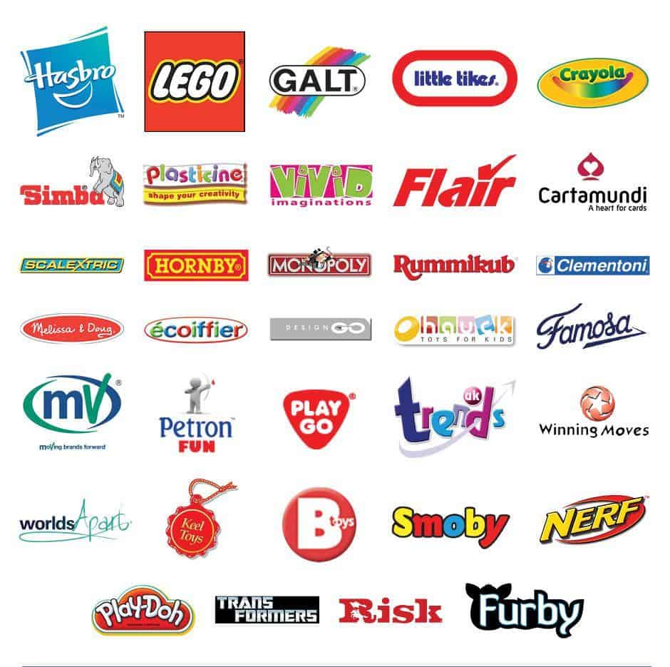
Is available in different weights and styles
Some fonts are available only in one weight, which limits you on how your text can be displayed. Before choosing the main font for your branding purposes, check the weight types (e.g., light, regular, bold, black, italic, condensed, etc.). Even if you may not be using certain weight types now, you might need to use them later. The final product may look sloppy if you don’t consider weight when choosing the font for your logo.Includes all outliers
When choosing a font, usually you’re paying attention to the standard elements such as letters, numbers and the most common symbols. But don’t forget to also consider the outliers, which can include anything you don’t often use, like rare symbols, ligatures, and wingdings. Keep in mind that some fonts are incomplete, and they don’t include all the necessary elements.Use the Right Font to Get the Right Message Across
It can be all too easy to take your font for granted, but don’t. This is one element of your branding that you want to get right the first time. Otherwise, the wrong font can make your brand look unprofessional, dated, or cliche; and even alienate an entire segment of your market if it rubs them the wrong way. So use a font that’s readable, legible, and professional. You can make your font fresh and unique, or draw inspiration from timeless classics, like Times New Roman, Helvetica, Gotham, Baskerville, and Georgia. They’re clean, versatile, and elegant — fonts that never go out of style. And if you’re ever unsure and need a professional designer’s eye, look into the logo-making services of a platform like Tailor Brands, DesignCrowd, or HiretheWorld. Fonts, like brands, have their very own personality, and you want yours to complement your brand’s image. So be careful when choosing your font, and make sure yours conveys the right message to your target audience.Logos with different fonts: https://graphicdesign.stackexchange.com/questions/53711/what-font-characteristics-are-associated-with-luxury-and-wealth