Inside this Article
Before You Write a Word
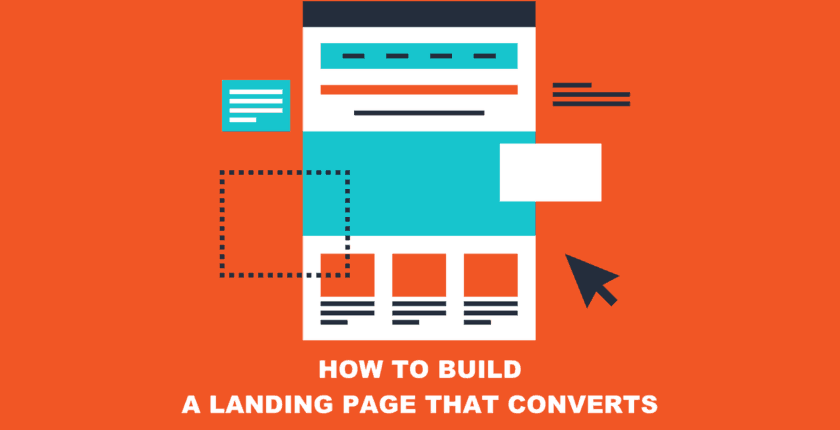
Yes, you want to bring your ebook over the finish line and get the landing page online. But pause. Take a minute. And think about what your goal is with your ebook. Maybe you created the ebook to get leads for your sales department. But you don’t need just any kind of leads. You need simmering warm leads that are pretty darn likely to convert. You also want the people who read the ebook to think it’s interesting and relevant and helpful, so they build a trusting relationship with your brand. That way, they will have a positive impression of your company and feel that you understand their needs – all because you gave them this awesome ebook. But if they aren’t the right audience for the ebook, you risk having the opposite effect. So it’s not simply “people” you want to get to download the book, but visitors who will find its content relevant and helpful. This means your landing page must weed out people who are not a good fit for the ebook, as well as convince your target audience to click the download button. That said, it’s not that there’s one single thing you can do right or wrong with the landing page. It’s a lot of small things that work together to give you a landing page worthy of your incredible ebook. Let’s look at ebook landing page examples for the different elements that can help you create a landing page that converts the right people into readers – and then, loyal customers.An Uncluttered Design
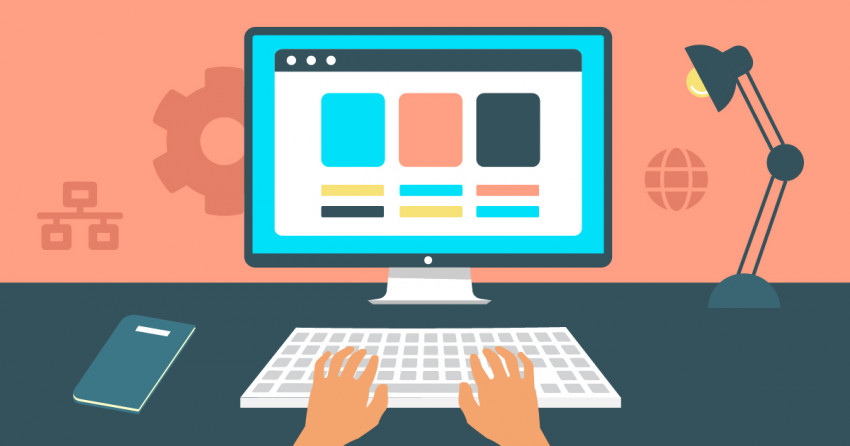
It’s easy to think that the more things you put on the page – images, text, testimonials, the table of contents, the kitchen sink – the better. But it’s actually the opposite. You want the overall look of the page to be clean and simple. And everything on the page should have one goal: to get the right readers to download the book. Keep the design elements to a minimum, meaning one to two colors and fonts. We recommend including three to four paragraphs at the most – the very most. And only include a single image, preferably of the cover of the ebook (assuming it’s meaningful to the content and easy on the eyes). We would have bet our lunch money that it would be impossible to have three ebooks on a page that was simple and pretty. Then we saw Johnathan Kranz’s website. It’s got two colors (we don’t count the image colors), a single image for each book, and plenty of whitespace.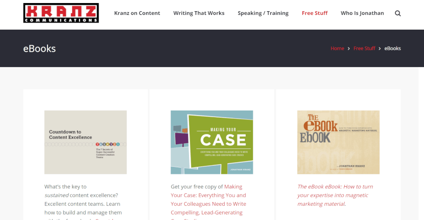 Consider using an ebook landing page template from your website builder to quickly create a professional design.
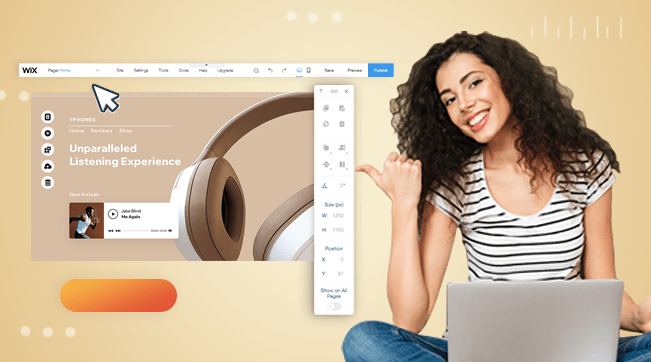
Wix offers several pre-styled templates that save time and go with your website design. To see the available templates without having to sign up, go to the Wix homepage and click the Templates link in the top menu. In the template library, scroll down to the bottom of the left menu and click on Landing Pages.
Squarespace users, however, should consider creating a custom page instead of using the Cover Page design, which does not connect with email marketing software.
If you aren’t using a website builder or don’t like the themes your current builder has to offer, don’t worry. You can purchase an individual ebook landing page template from TemplateMonster for cheap. WordPress users can get a theme for even less from ThemeForest.
After you have the ebook landing page design completed, look at it with a critical eye and try to pare it down even more. Most importantly, embrace the white space and resist the urge to fill it with stuff. Yes, we know it’s hard, but your sales department (and your customers’ eyes) will thank you.
Consider using an ebook landing page template from your website builder to quickly create a professional design.
Wix offers several pre-styled templates that save time and go with your website design. To see the available templates without having to sign up, go to the Wix homepage and click the Templates link in the top menu. In the template library, scroll down to the bottom of the left menu and click on Landing Pages.
Squarespace users, however, should consider creating a custom page instead of using the Cover Page design, which does not connect with email marketing software.
If you aren’t using a website builder or don’t like the themes your current builder has to offer, don’t worry. You can purchase an individual ebook landing page template from TemplateMonster for cheap. WordPress users can get a theme for even less from ThemeForest.
After you have the ebook landing page design completed, look at it with a critical eye and try to pare it down even more. Most importantly, embrace the white space and resist the urge to fill it with stuff. Yes, we know it’s hard, but your sales department (and your customers’ eyes) will thank you.
An Intriguing Headline
The headline matters. A lot. But there is no tried and true formula to plug in. Because the best headline is one that is meaningful to your specific audience. Whatever else you do, spend time on crafting an appropriate headline. We love this headline from Industrial Strength Marketing. It’s relatable. It’s sorta funny. And it’s a struggle we can all relate to. Plus, it makes you want to read more.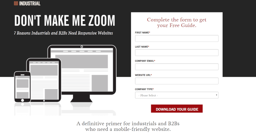 As you design your headline, think about SEO and keywords. What is your audience likely to search for? And, even more importantly, what is their biggest challenge? By putting this into the headline, you increase the odds that they will not only click, but that they’ll continue reading.
Click here for some expert tips on creating an awesome landing page headline.
As you design your headline, think about SEO and keywords. What is your audience likely to search for? And, even more importantly, what is their biggest challenge? By putting this into the headline, you increase the odds that they will not only click, but that they’ll continue reading.
Click here for some expert tips on creating an awesome landing page headline.
The Word “Free”
Put in the headline. Put it in the copy. And put it on the button. You want there to be no question that you are giving away the information – assuming that it’s true, that is. If visitors think there’s any chance that there’s a cost involved, you will likely lose downloads (and visitors). We recommend noting that the ebook is free in at least three places on the page. In the following example, PhotoWorkout followed our advice almost to the letter. The word “free” comes before the ebook title and is mentioned three times in total.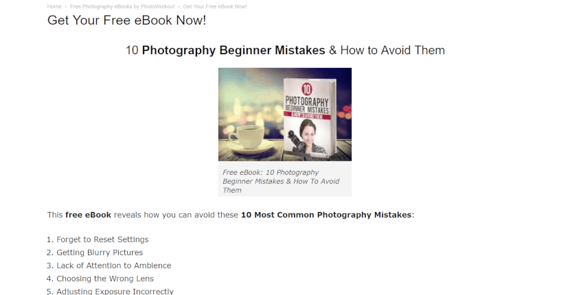
Super Clear Benefits
Your visitors only want to read something that is valuable to them. Like you, they’re busy people. And it’s irritating to download something and then have it not be a fit. So the text on the landing page needs to clearly list the benefits the reader is going to get from reading the ebook. Don’t talk about your company. Don’t talk about your products. Focus on the needs of your potential customers. To make the landing page as scannable as possible, use bulleted lists – and resist the urge for graphic bullets or whatever shiny object you are currently obsessed with. Keep your focus on the text. The wording needs to be actionable and clear. Use as few words as possible. Yes, we know that is not an easy assignment. But the effort you put into clearly defining why the reader should download your ebook will pay off. This Upwork ebook does it perfectly – simple, actionable, clear, and bulleted.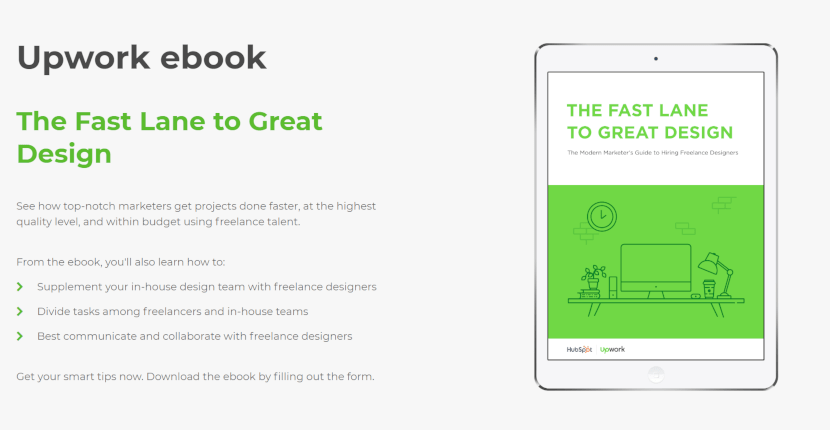 One more thing: don’t just rely on only your own opinion. Have a customer you trust (several is even better) look over the landing page text and share their thoughts. Make the changes. Then do another review. Get different perspectives. Tweak until you feel really good about the positive feedback.
A Really (Really, Really) Simple Form
People want to spend as little time giving out as little information as possible to get the biggest benefit. Don’t make people click to another page to fill out a form. That’s not nice and no fun. Put the form directly on the landing page. Think about what information your sales department actually needs. And only include that information on the form. The more fields there are to fill out, the less likely it is that people will do it. Instead, they’ll just leave. If possible, ask only for the person’s name, organization, contact information, and a maximum of one to two qualifying questions. But don’t be afraid to go super simple. This Optimizely landing page goes down to the bare basics – just an email address. And we like it. A lot.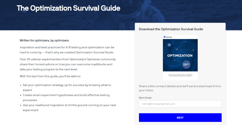 The good news is, you don’t have to design your form from scratch. For example, if you are using Weebly for your site, just use the built-in Online Form Builder. With a click to its grid and design template, you can spend your time focusing on the content and creating quick field captions. “Straightforward and simple” should be your motto.
Easy-to-Find CTA Button
This is what it all comes down to. Since getting people to click that CTA button is essentially your whole goal, don’t just slap on any old button anywhere on the page. Make the button design both fit in and stand out on the page. Yes, we know that sounds confusing. But you want it to be visually pleasing within the design scheme, so it doesn’t look out of place. At the same time, you want visitors to spend zero seconds searching for it. When you look at MeetEdgar’s landing page, the first thing you see is the giant red download button. And you can’t miss it because it’s the only thing red on the page. But because the font is the same as the rest of the page, it walks the fine line between blending in and jumping right out at you. Very well done. (Read our interview with MeetEdgar founder and CEO Laura Roeder here.)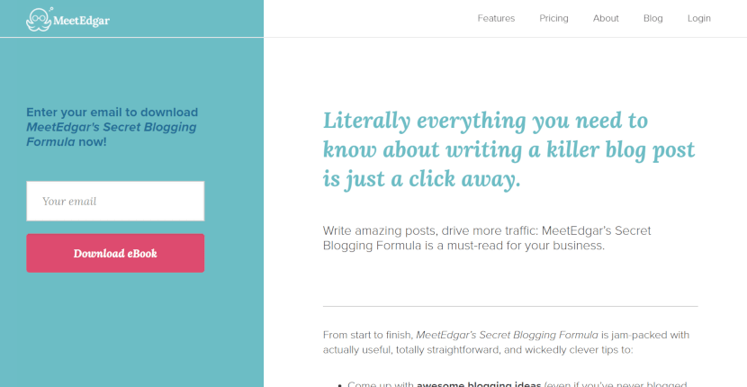 Please refrain from using overly clever button text. Opt for simplicity and avoid overly exciting phrasing. For instance, something straightforward like “Download eBook” works perfectly. If you’re overflowing with creative energy, feel free to channel it into writing a poem, composing a song, or creating a drawing. Just remember to reserve your creativity for elements other than the CTA button.